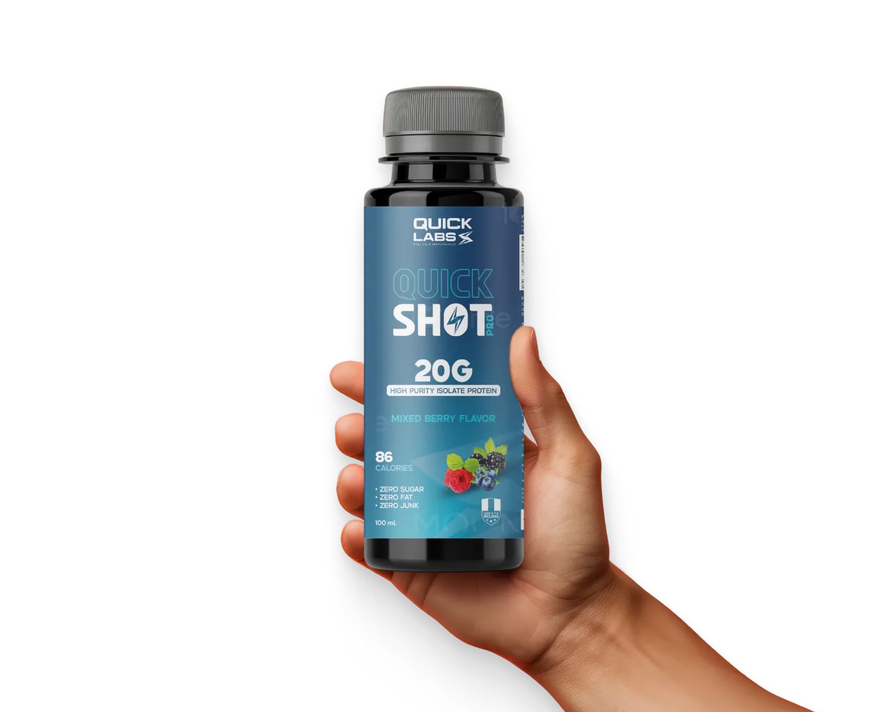
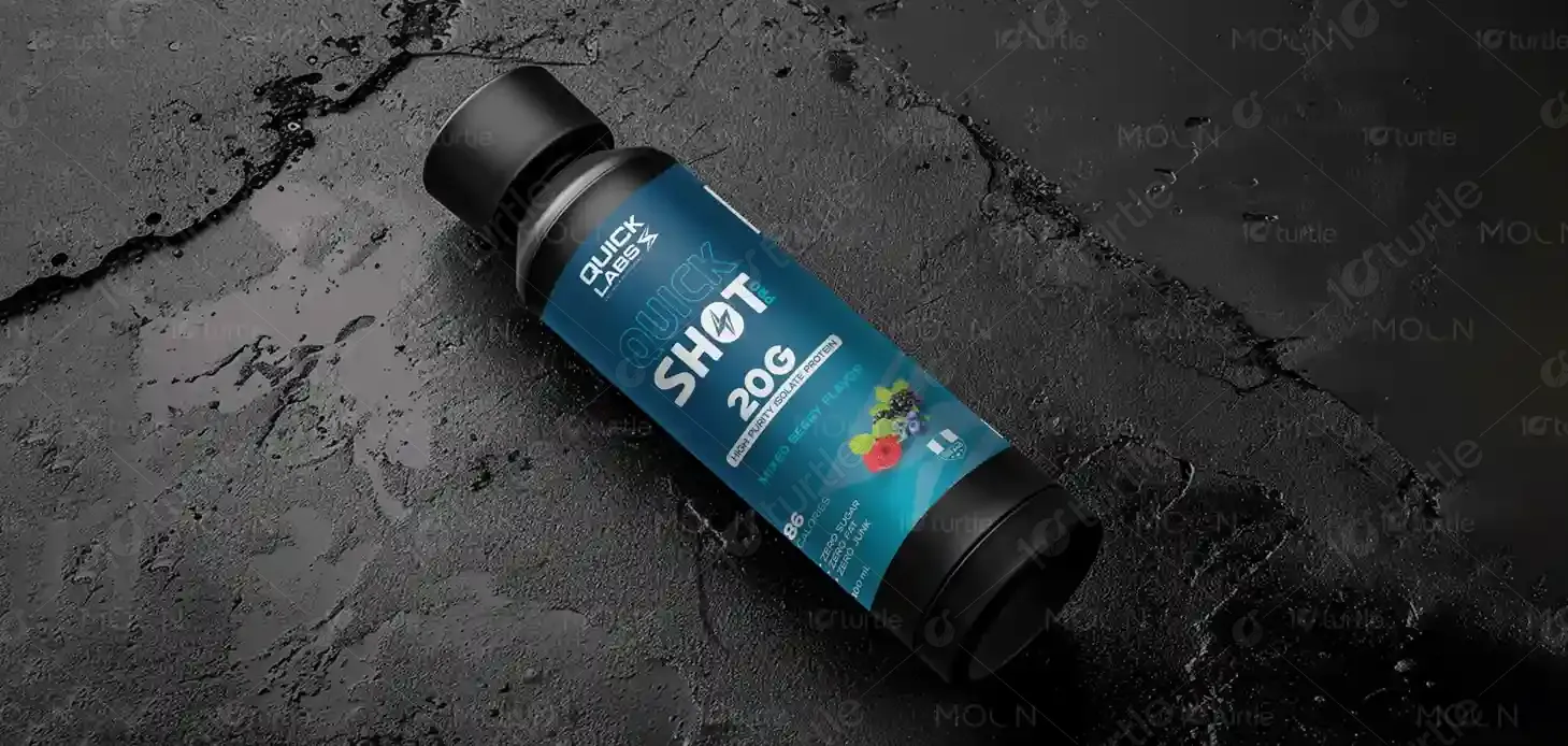
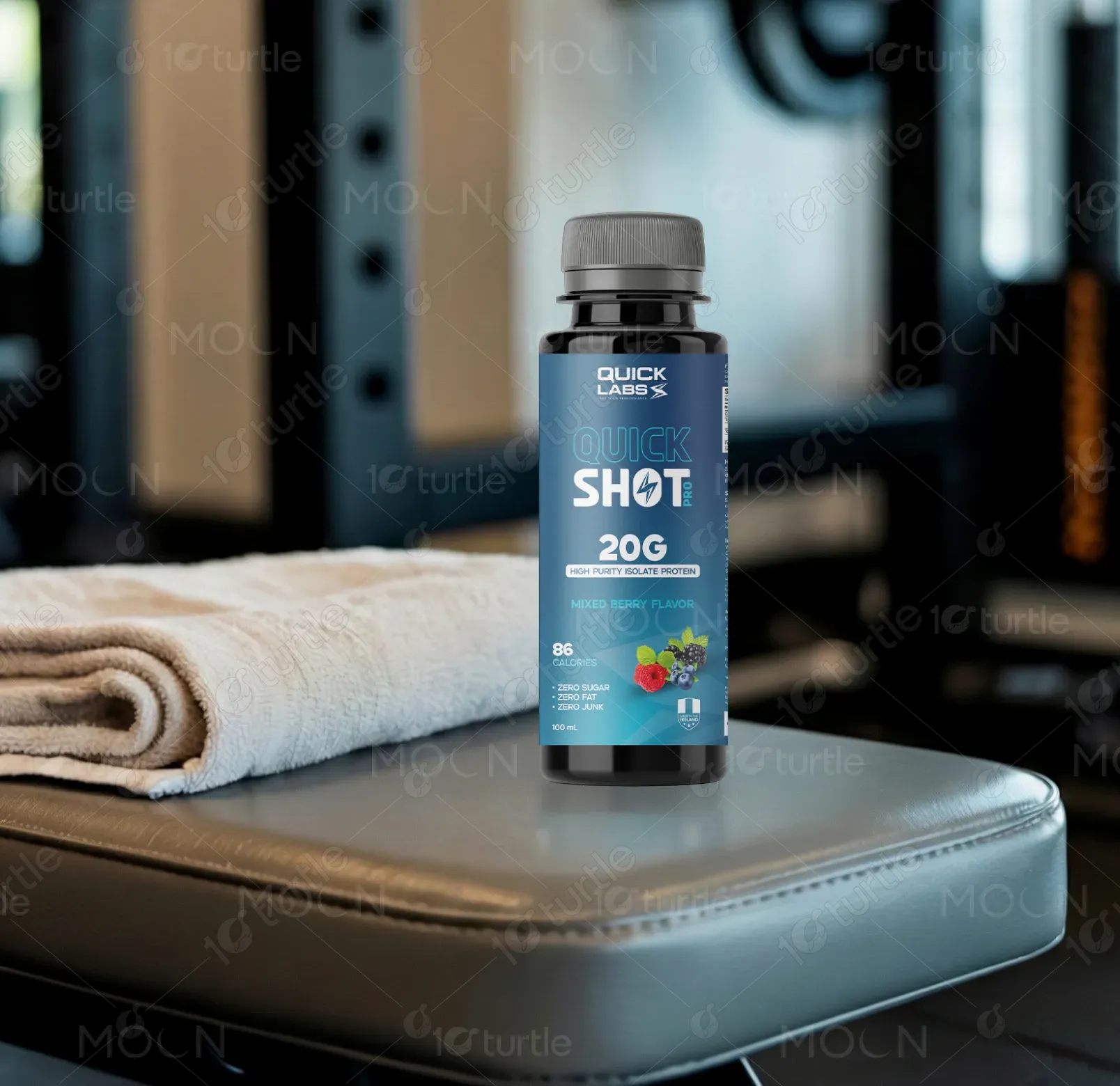
The design uses bold typography with high contrast, ensuring easy readability. The blue background conveys a sense of energy and trust, while the mixed berry imagery emphasizes the refreshing, healthy nature of the product. The layout clearly differentiates the key product features, with icons highlighting zero sugar, zero fat, and zero junk, creating a clean, modern look that appeals to fitness enthusiasts. The use of white space balances the design, guiding the consumer’s eye toward essential product information.
Label Design
Graphic Design
Industry
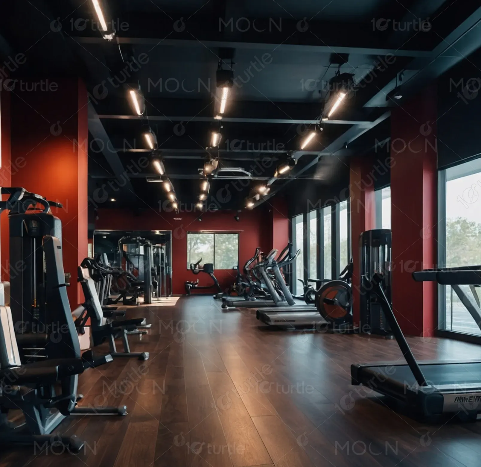
Healthcare & Wellness
Tools we used


Project Completion
2025
Key Market
Global
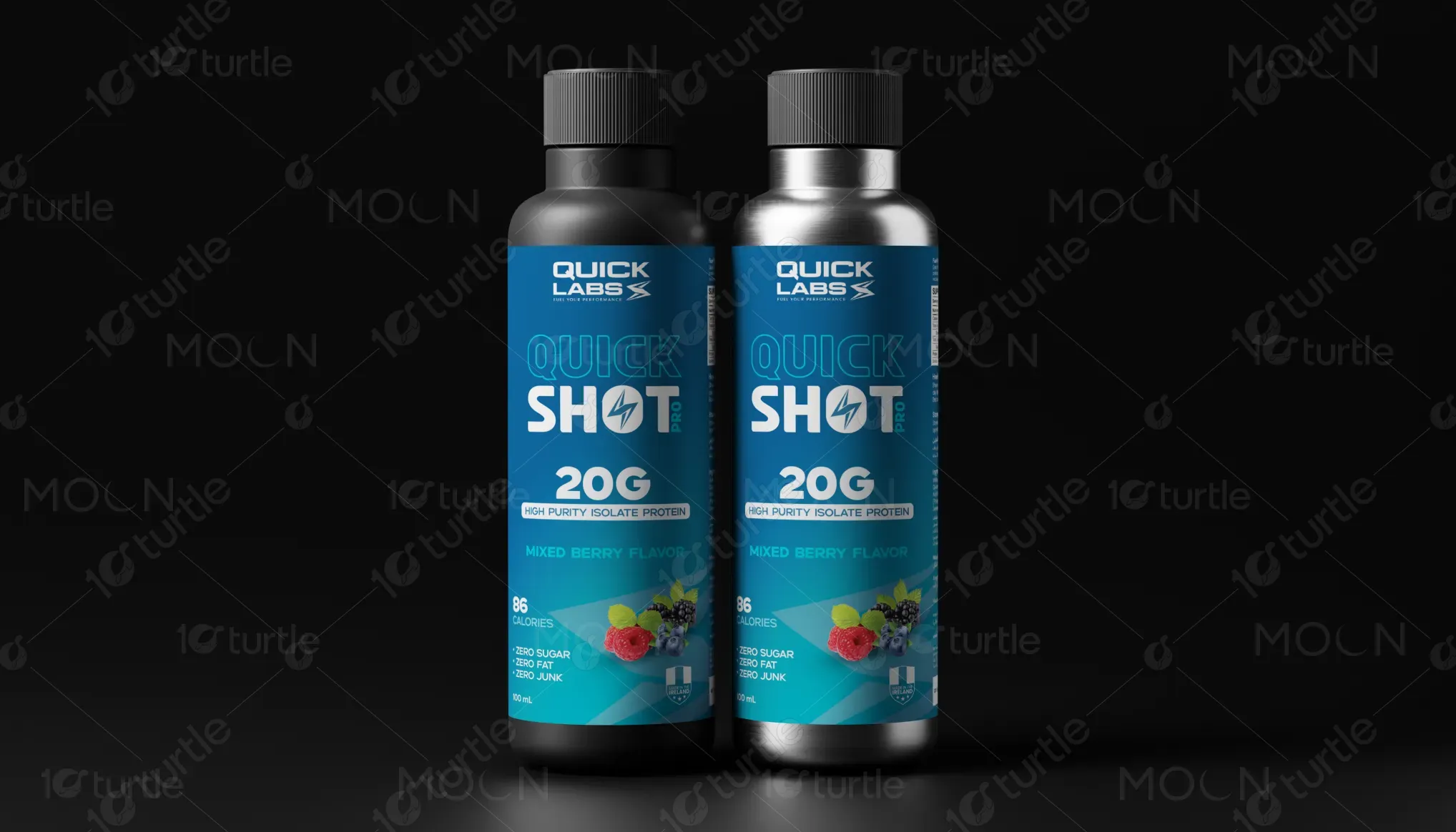
Quick Shot Pro delivers 20 grams of high-purity isolate protein in a 100 ml shot, offering a convenient solution for muscle recovery and daily performance. The product is aimed at fitness-conscious individuals seeking quick, high-quality protein without added sugar, fat, or junk. Positioned in the health and fitness market, it caters to consumers who value purity, performance, and simplicity.
Industry
Healthcare & WellnessWhat we did
Label DesignGraphic DesignPlatform
-In a saturated protein supplement market, many products suffer from unclear messaging or overly complex designs that dilute their core benefits. Consumers often face difficulty in quickly understanding what a product truly offers, especially when it comes to nutritional integrity and convenience. There is also a lack of visually appealing, straightforward packaging that instills trust and stands out on the shelf.
This design solves the problem by offering a clean, straightforward layout with clear icons and typography that communicate essential benefits. The bold and modern design quickly captures attention while the color scheme and hierarchy ensure that the product’s advantages—zero sugar, fat, and junk—are immediately visible. The sleek design increases engagement by fostering trust and presenting the product as premium and effective, perfect for on-the-go consumers.

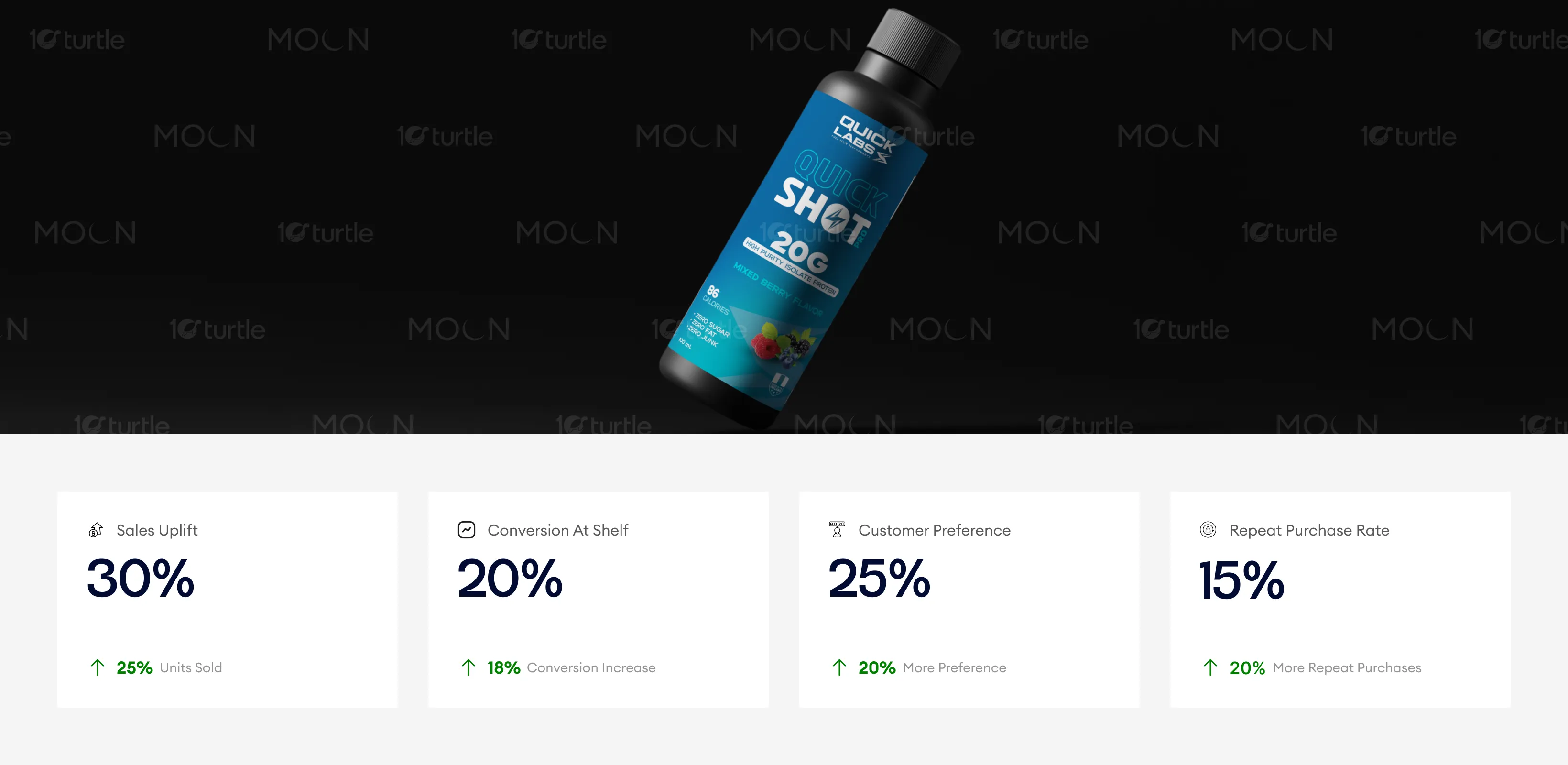
The design’s bold typography and high contrast effectively communicate key product attributes, enhancing its appeal to fitness-conscious consumers. The use of vibrant imagery and modern design principles increases both conversion and customer preference, driving higher sales and encouraging repeat purchases. These results show how impactful design can drive immediate sales while fostering long-term customer loyalty.
The design aligns with Quick Labs long-term vision of becoming a leader in high-performance nutrition products. By establishing a visually distinctive and trustworthy design, the product is set to grow within the fitness and wellness sector, appealing to consumers who prioritize both health and efficiency. The adaptable design will support future expansion across different product lines and marketing touchpoints.
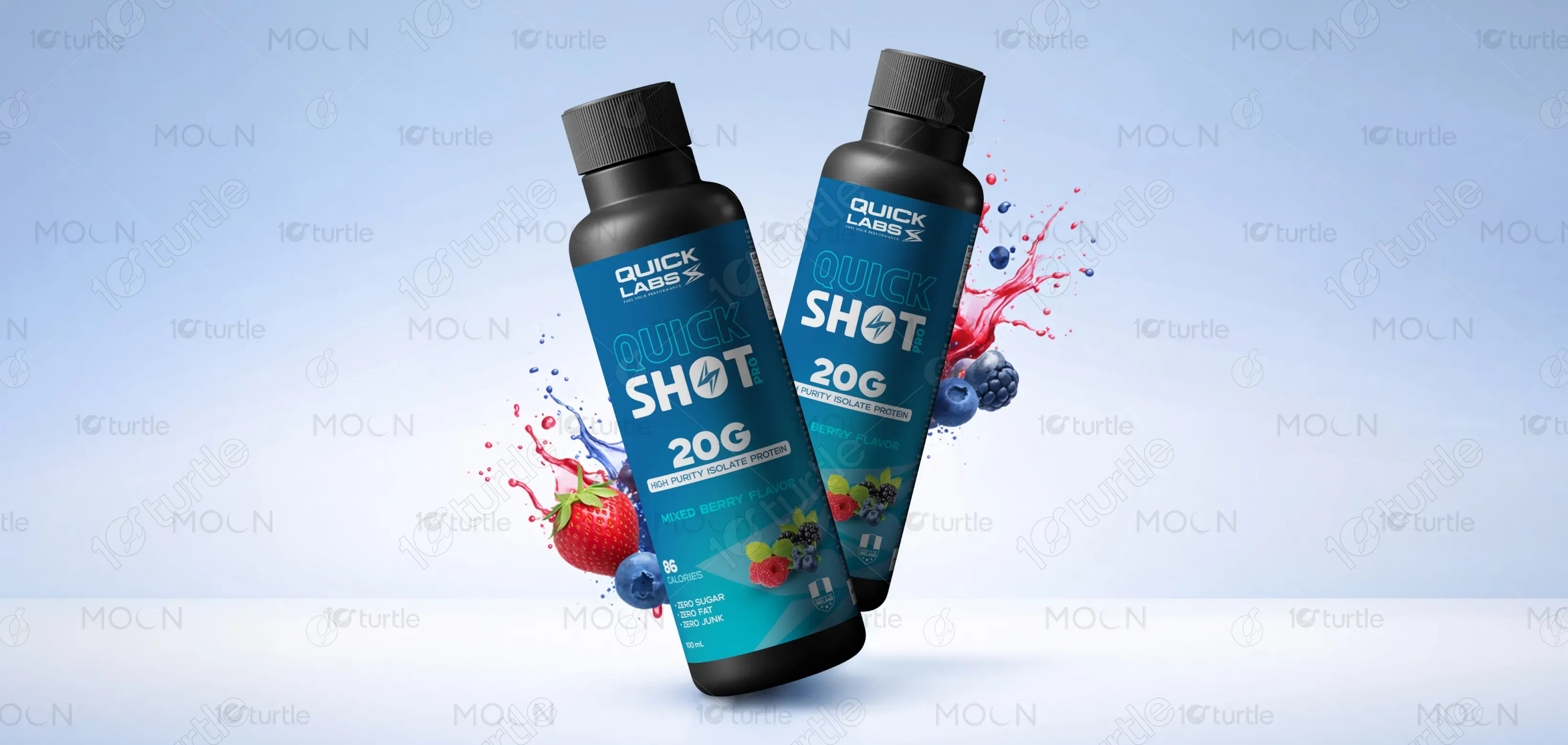
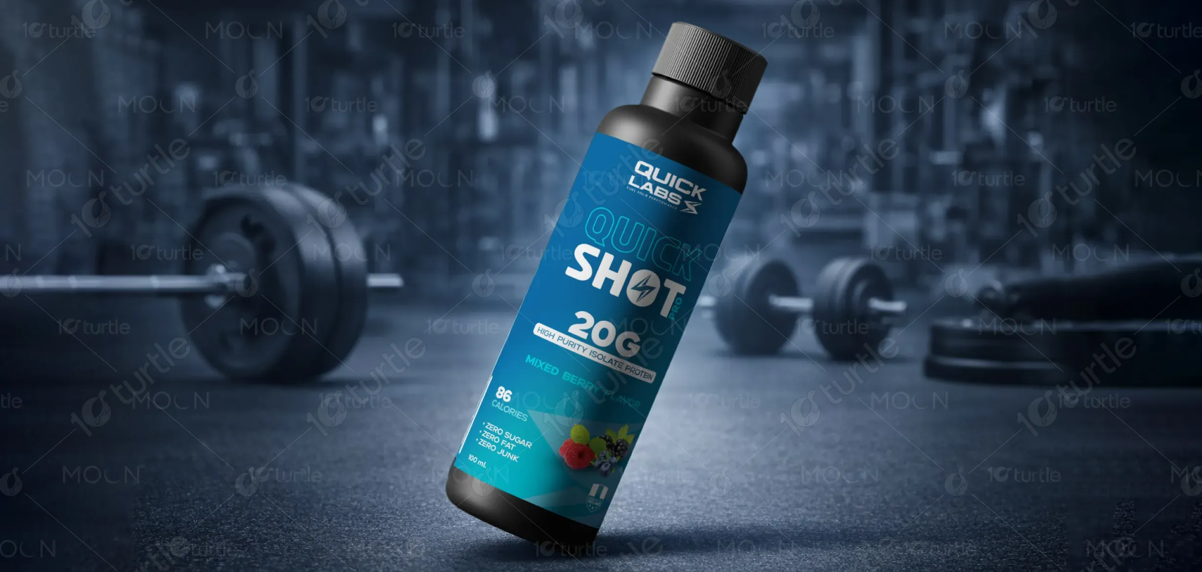
The design uses a Dark blue as the primary color, symbolizing energy, trust, and performance. This is paired with white and accents of berry tones to enhance the product’s fresh, healthy image. The icons and text are optimized for readability, ensuring the key features stand out against the dynamic background. This color palette not only reflects the brand’s active, performance-driven personality but also ensures high visibility and recognizability in a competitive market.