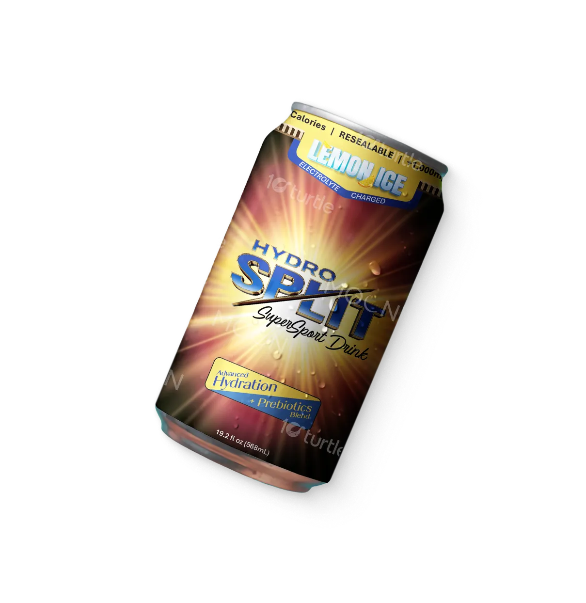
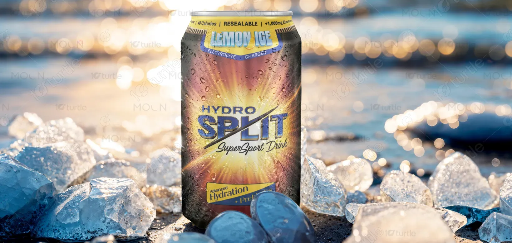
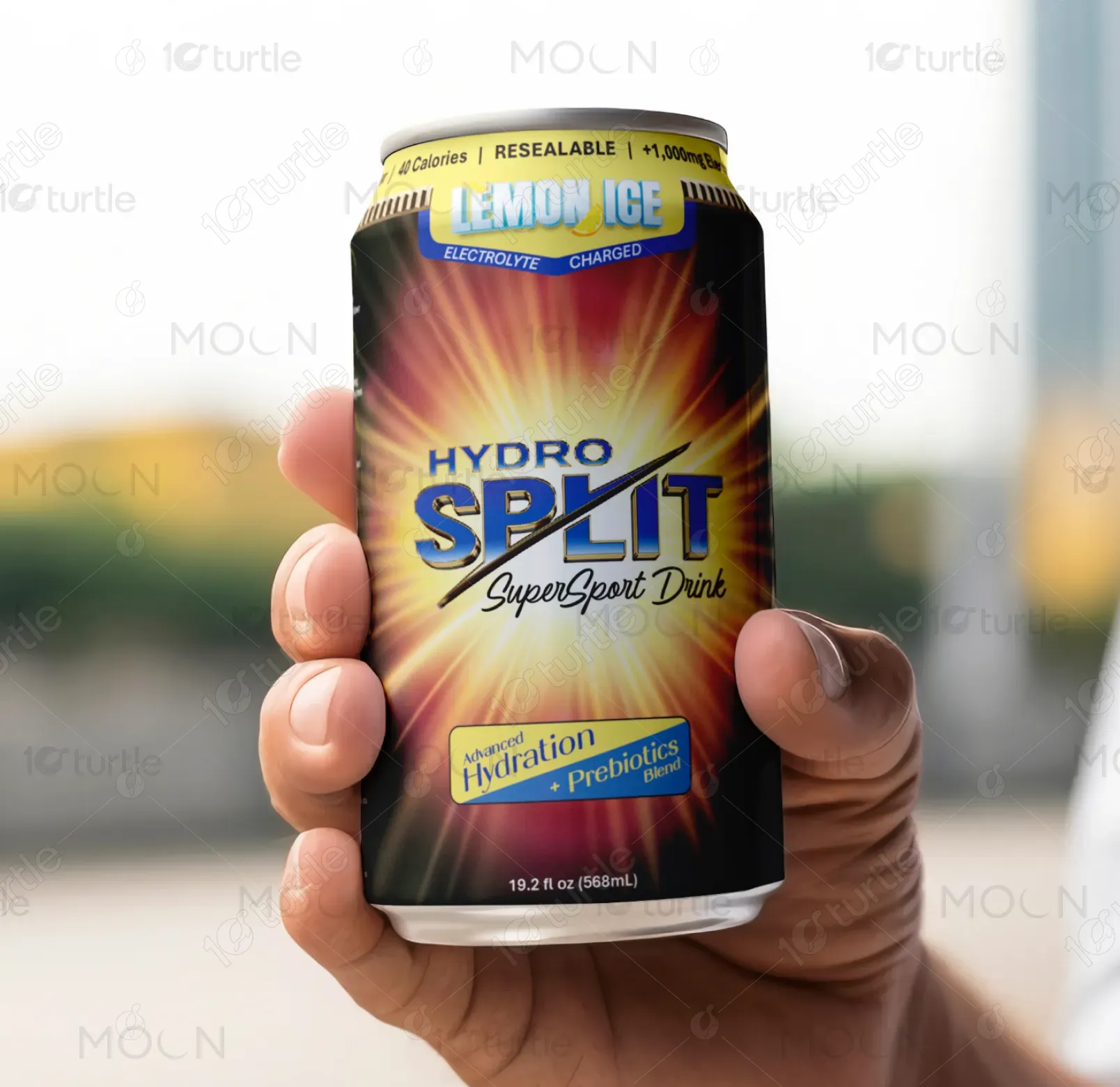
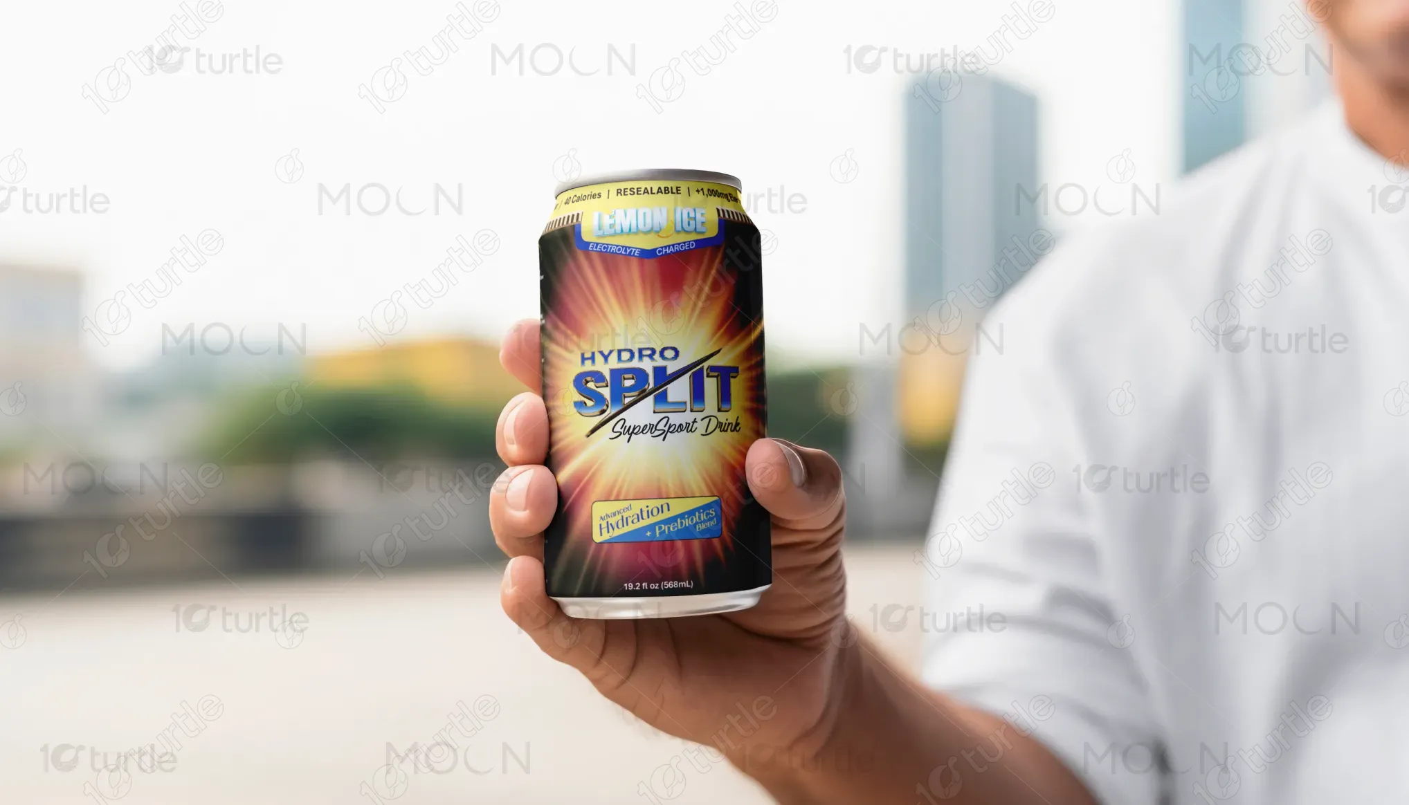
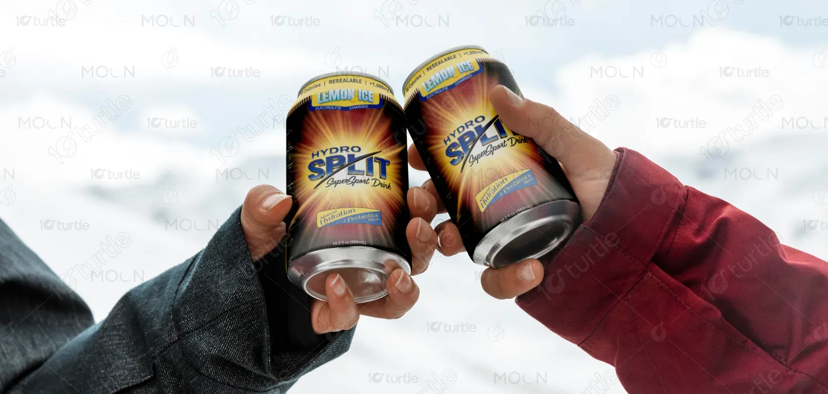
This design blends high-impact energy visuals with a clean, premium layout to communicate performance, purity, and innovation. The radiant burst background symbolizes instant hydration and vitality, while modern metallic typography reinforces the product’s advanced, science-driven identity. Clear iconography and structured content guide the viewer through key benefits effortlessly. The overall aesthetic merges bold athletic appeal with nature-inspired wellness cues, creating a balanced look that feels both powerful and trustworthy on the shelf.
Label Design
Graphic Design
Industry
Consumer Goods & Retail
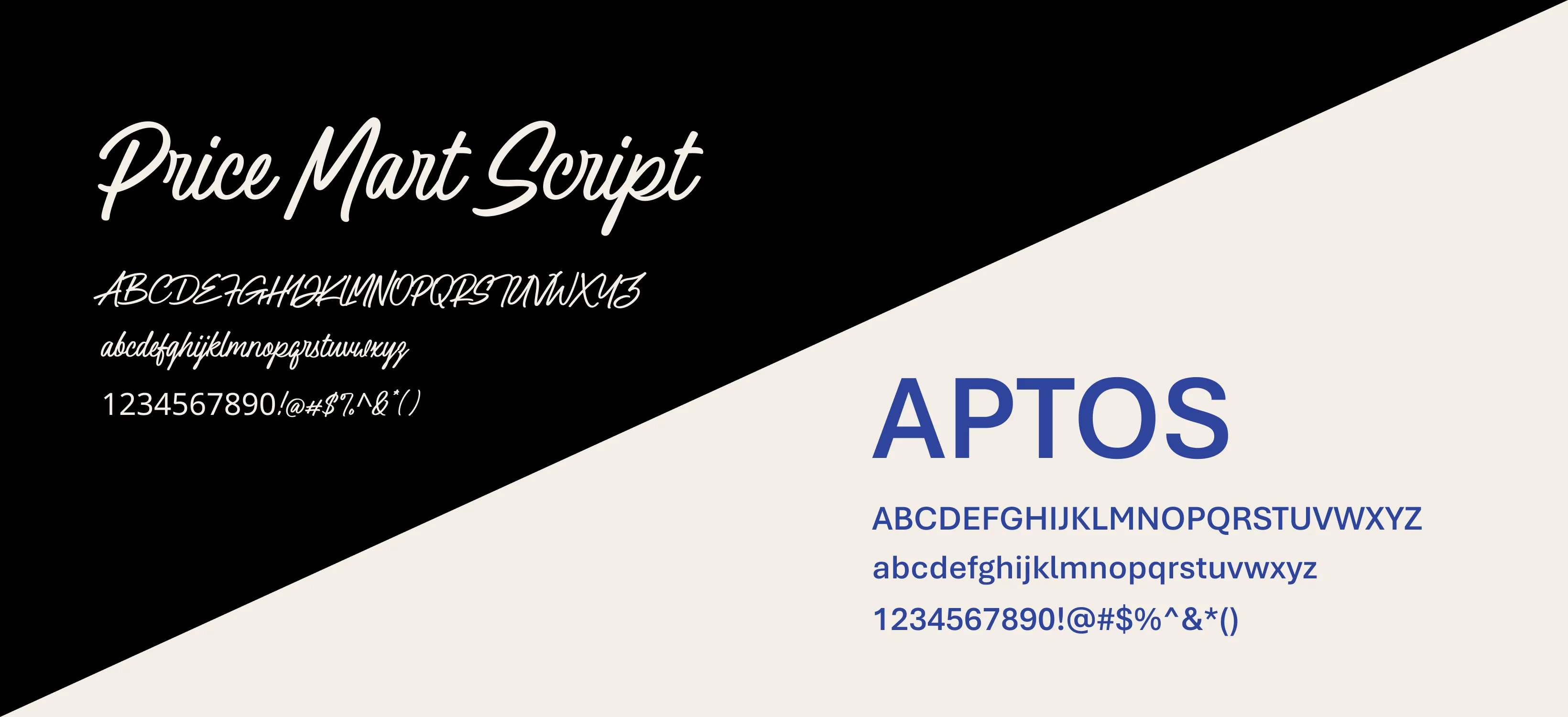
Tools we used


Project Completion
2025
Key Market
Global
Hydro Split SuperSport Drink is a next-generation hydration beverage built for health-conscious consumers seeking clean performance without compromise. Packed with electrolytes, vitamins, prebiotics, minerals, and antioxidants, it stands out as a functional drink that fuels the body naturally. Its aesthetic blends bold energy with clarity, helping it compete in the sports drink market while differentiating itself through premium ingredients, zero added sugar, and nature-inspired benefits like prickly pear juice and trace minerals.

Industry
Consumer Goods & RetailWhat we did
Label DesignGraphic DesignPlatform
-Hydro Split SuperSport Drink is a next-generation hydration beverage built for health-conscious consumers seeking clean performance without compromise. Packed with electrolytes, vitamins, prebiotics, minerals, and antioxidants, it stands out as a functional drink that fuels the body naturally. Its aesthetic blends bold energy with clarity, helping it compete in the sports drink market while differentiating itself through premium ingredients, zero added sugar, and nature-inspired benefits like prickly pear juice and trace minerals.
This design solves the communication gap by using concise benefit icons, strong hierarchy, and clean messaging. The ingredient advantages—electrolytes, prebiotics, vitamins, minerals, antioxidants—are visually highlighted for instant recognition. The radiant energy burst connects emotionally to hydration and performance, while the structured typography ensures clarity. By merging scientific credibility with natural elements, the label makes it easy for consumers to recognize Hydro Split as a genuinely better, cleaner alternative.

The long-term vision is to build Hydro Split into a leading wellness-performance hybrid brand. The design aims to create a recognizable identity that can extend across multiple flavors, product lines, and merchandising displays. Over time, it seeks to redefine sports hydration by setting a new standard of transparency, natural ingredients, and functional innovation—ultimately fostering a loyal community that values premium quality and long-term wellness.
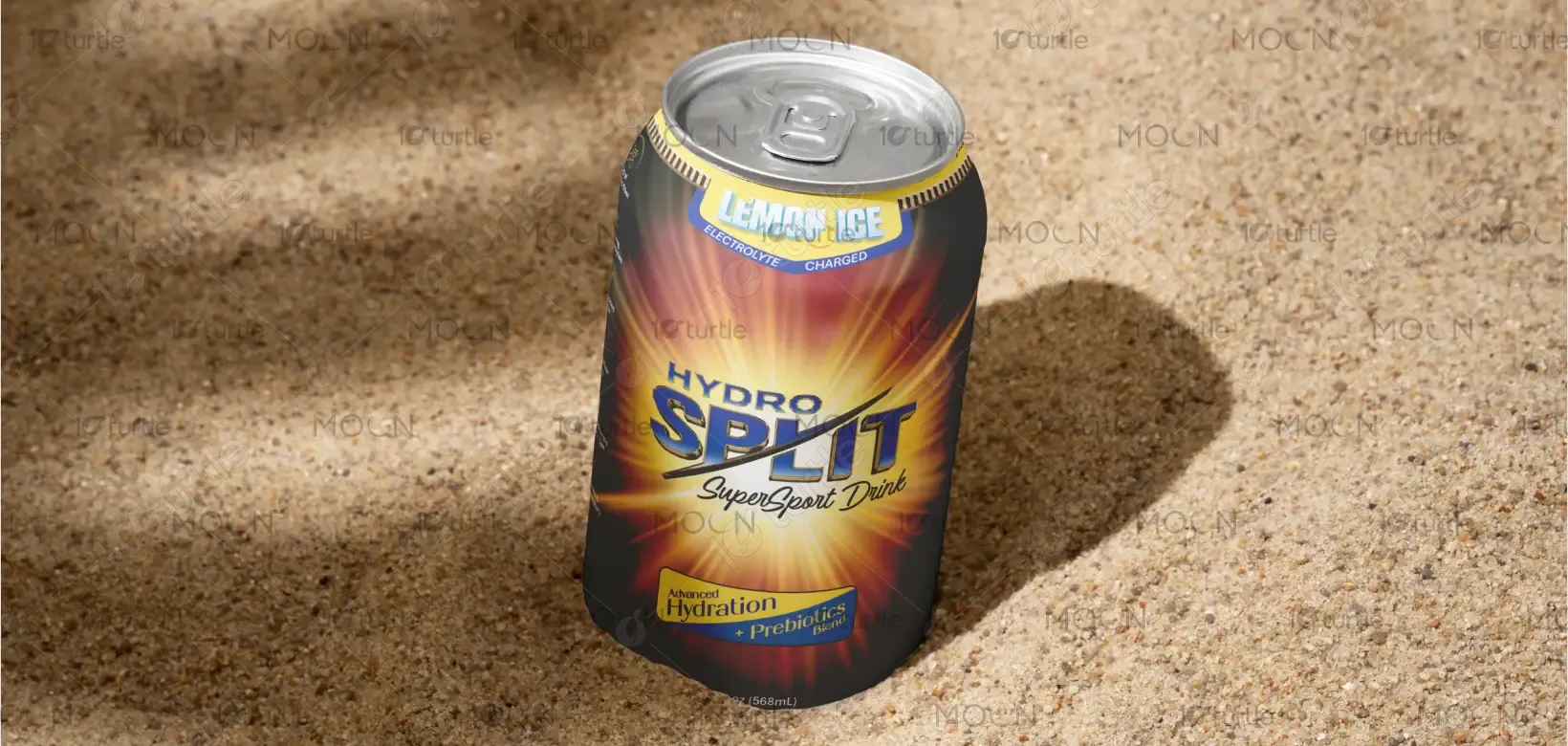
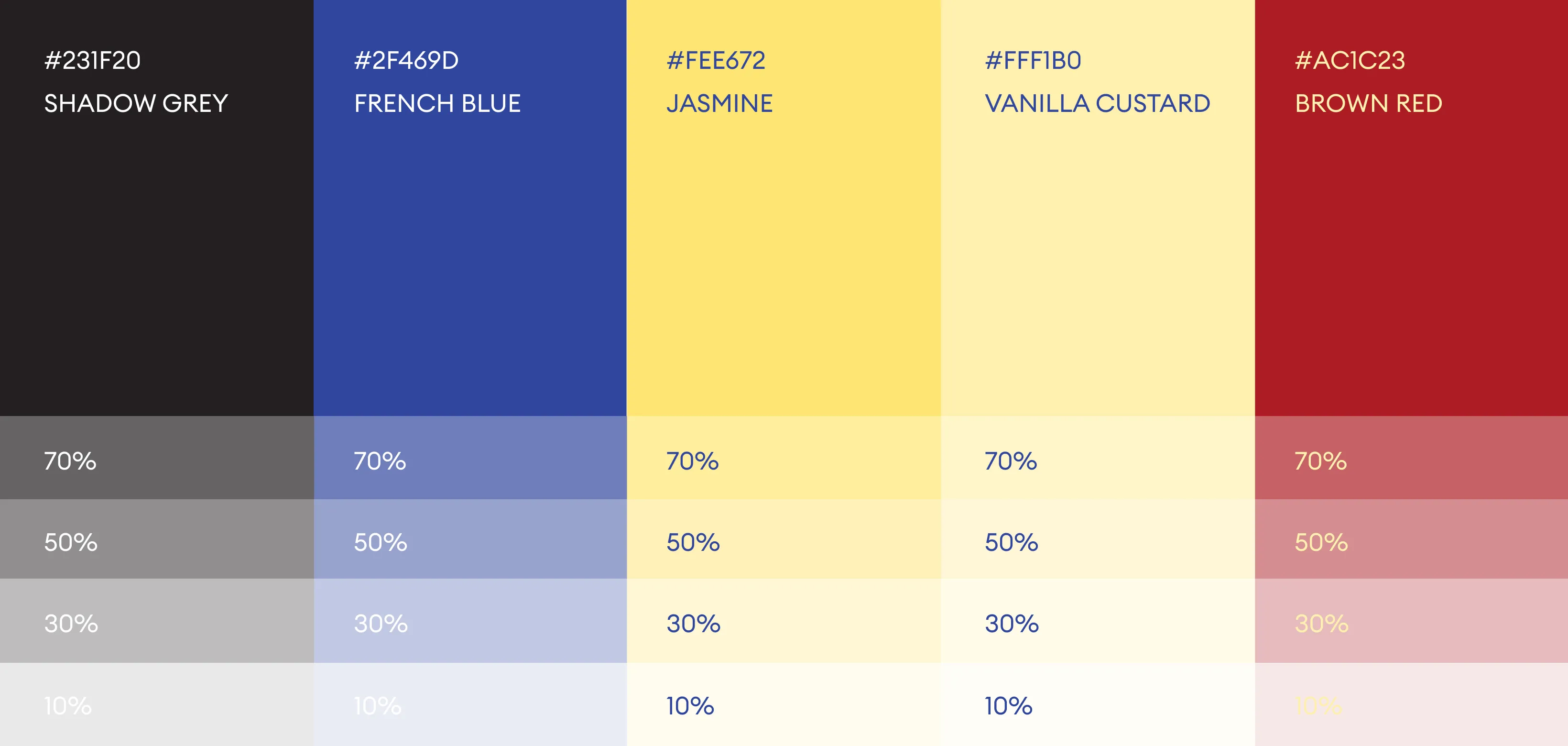
The palette combines strength, clarity, and freshness. Shadow Grey adds depth and contrast, while French Blue reinforces trust and performance. Jasmine and Vanilla Custard bring energy and warmth, supporting flavor and vitality cues. Brown Red adds natural richness for balance. Together with their tints, these colors create a cohesive, premium, and versatile system across all brand and packaging applications.