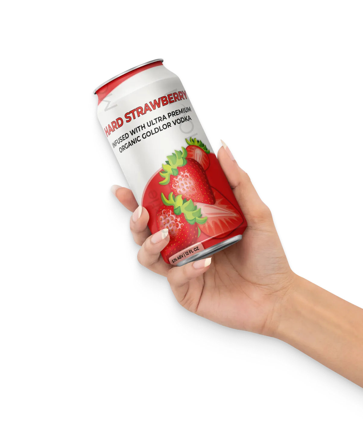
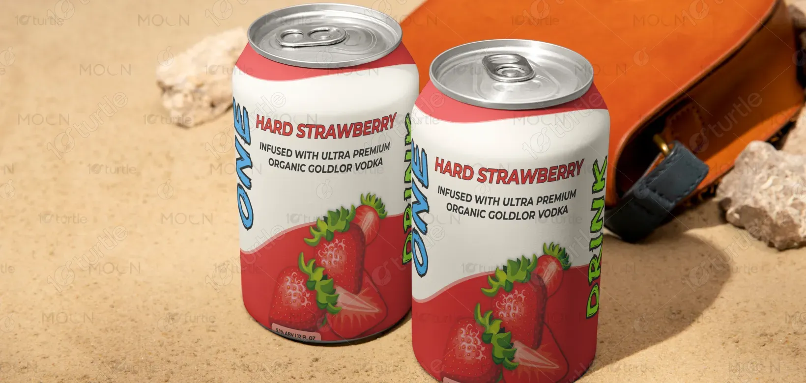
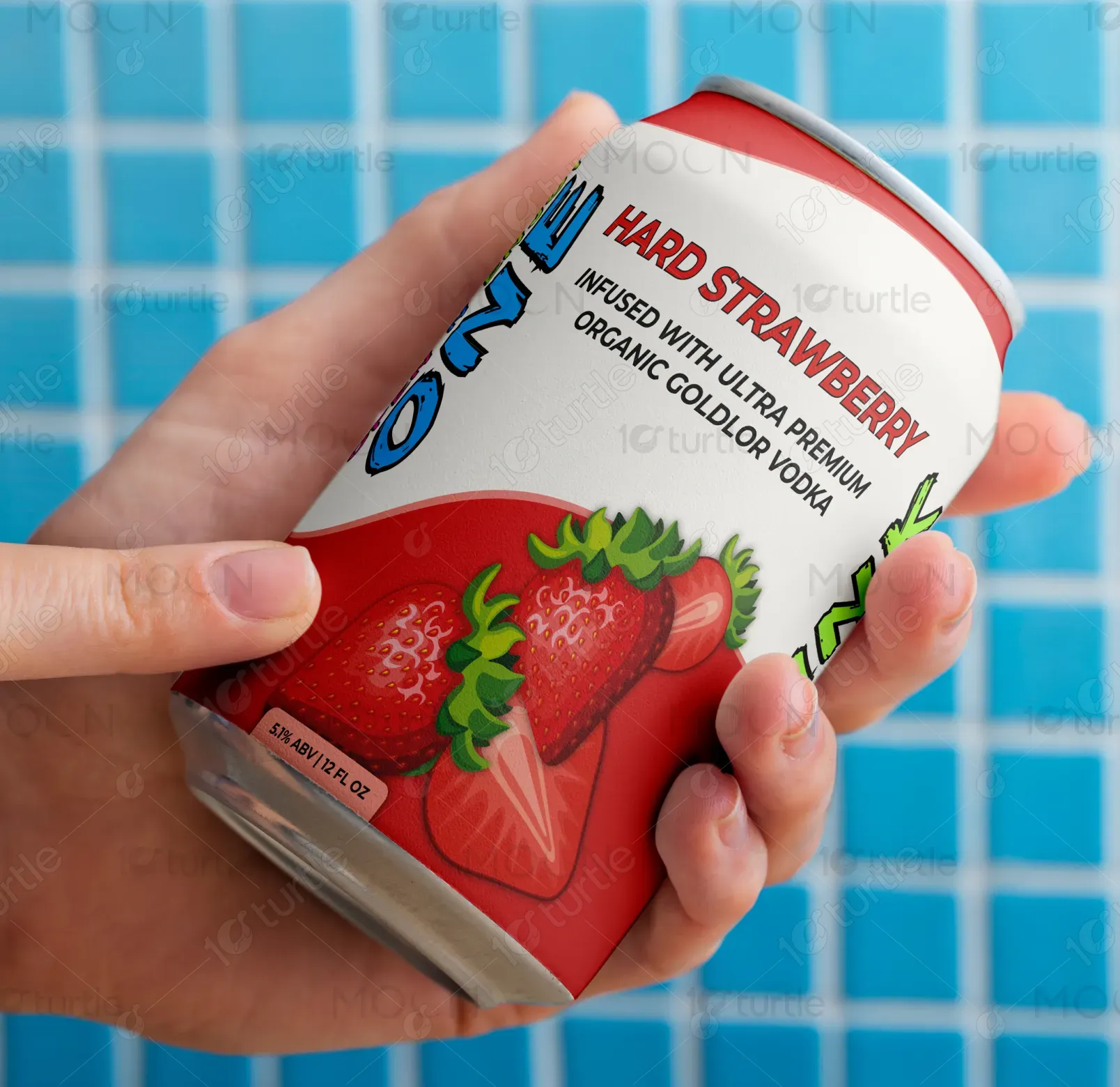
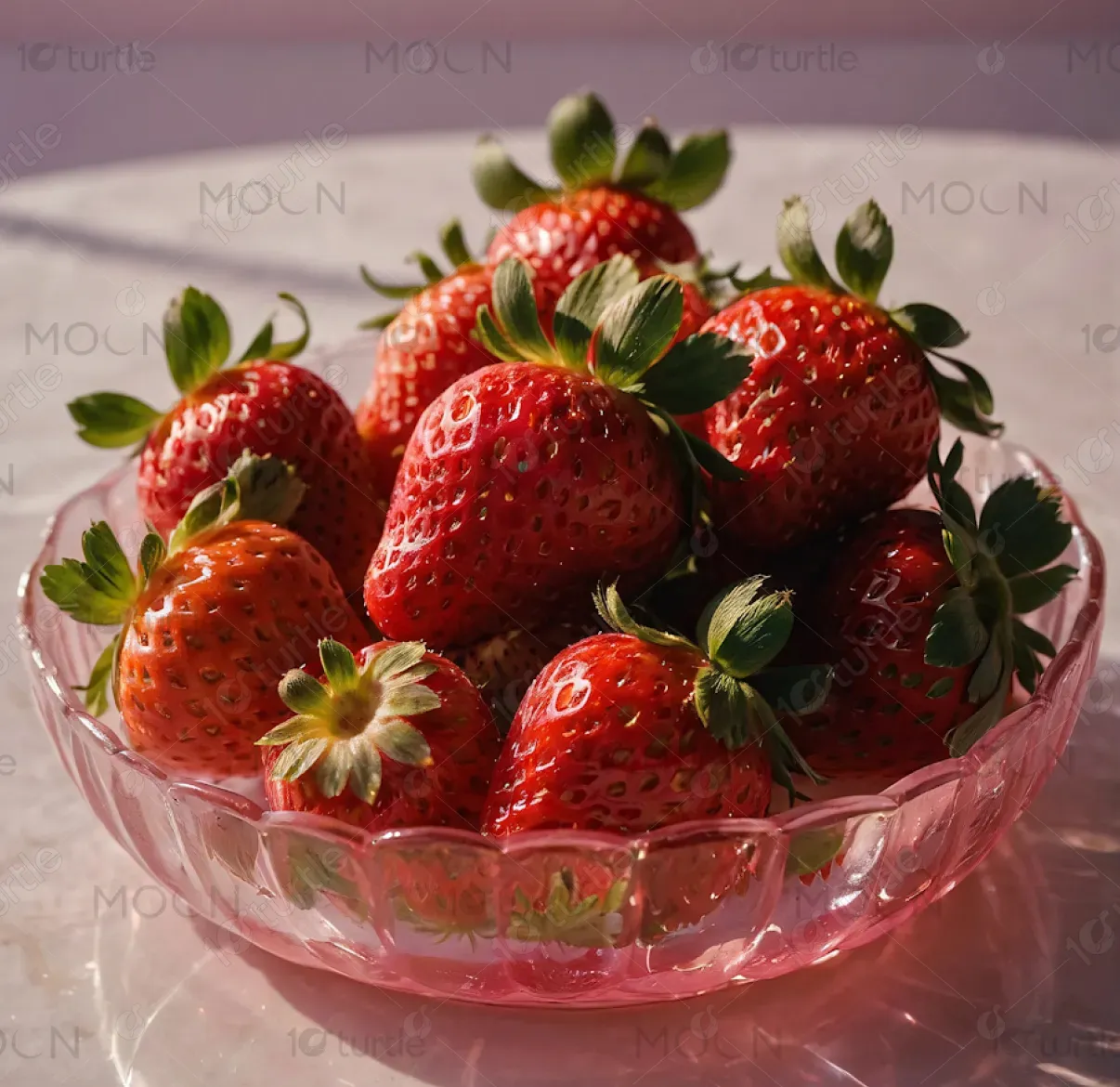
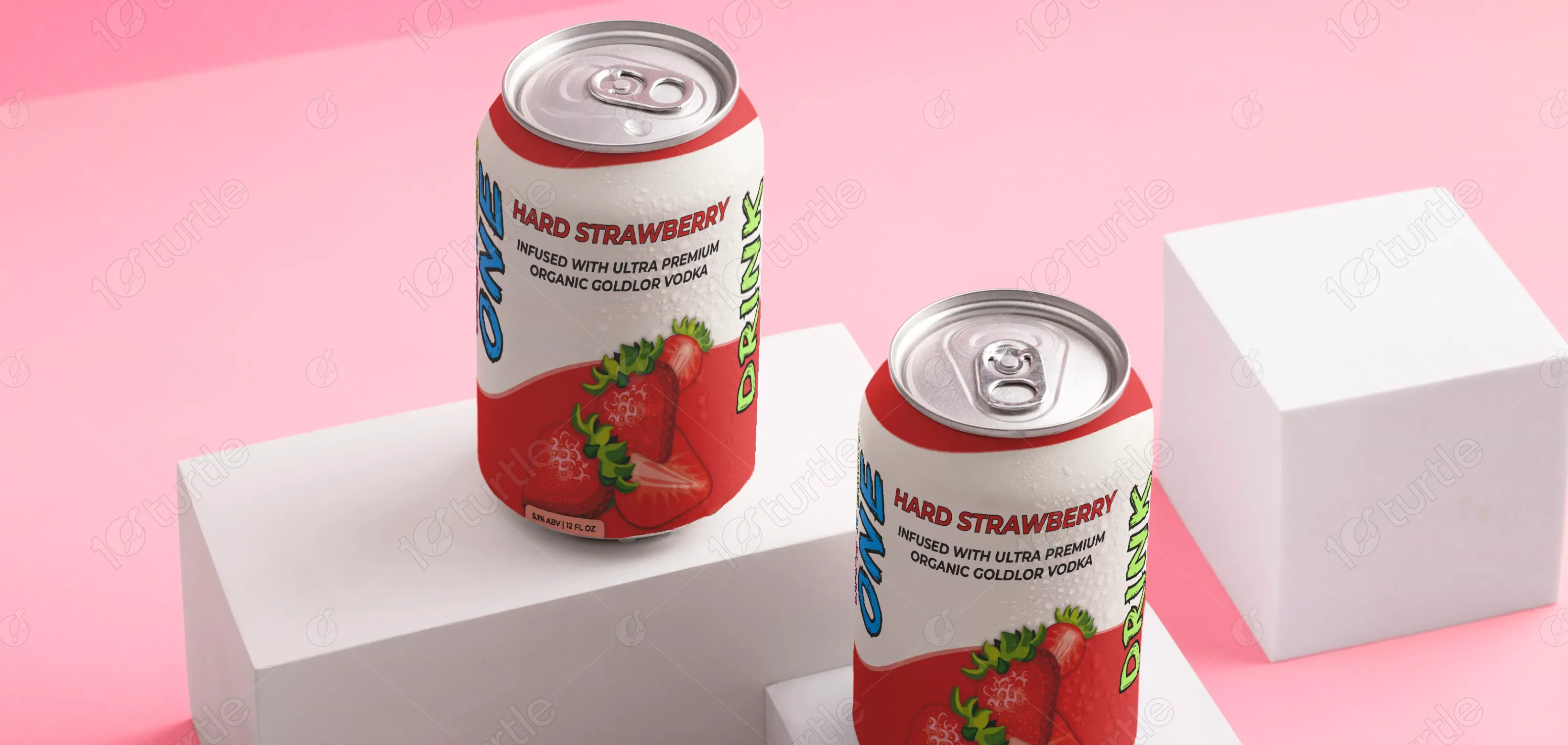
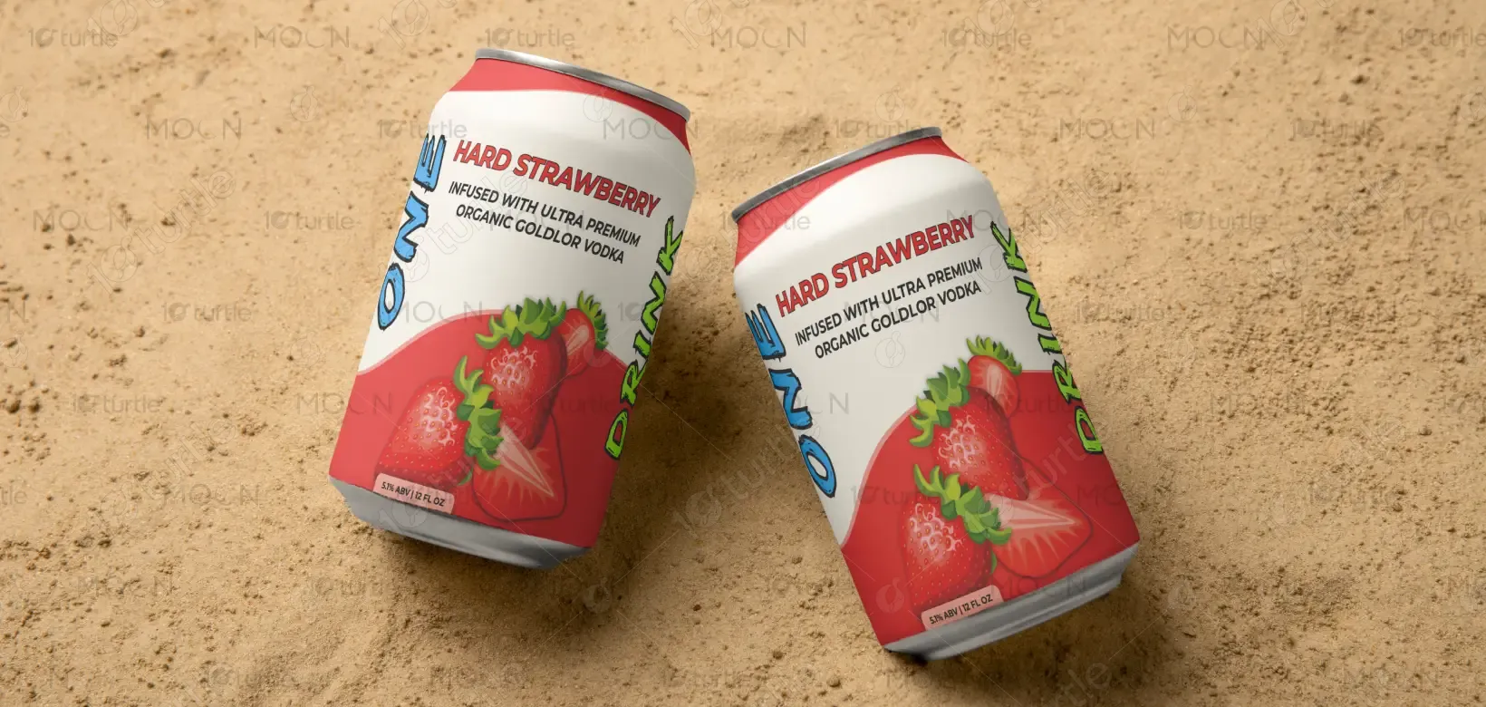
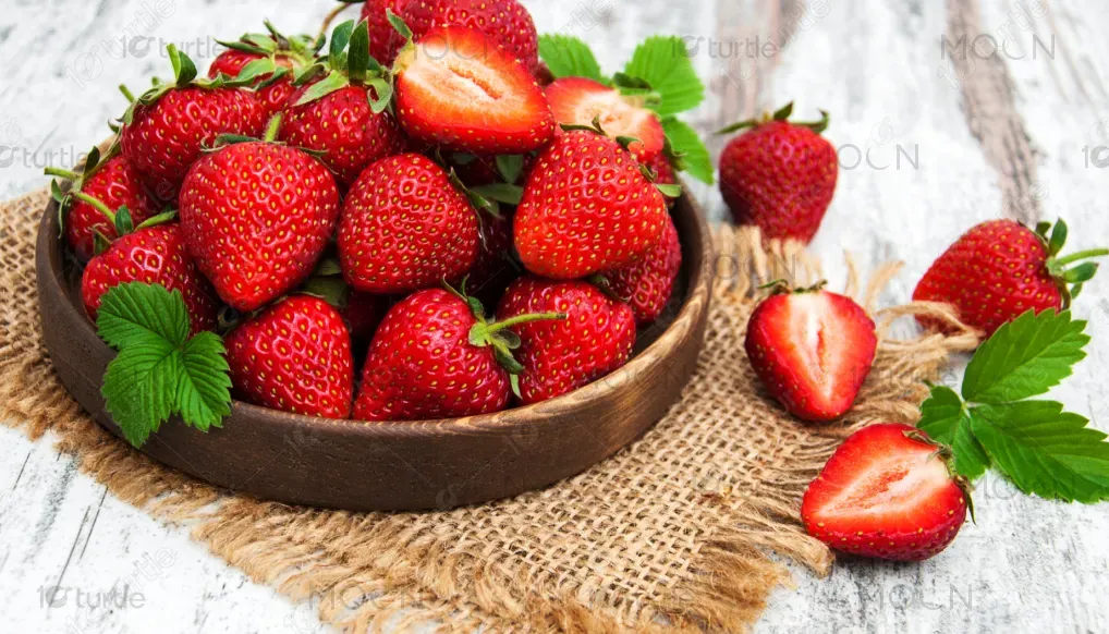
The Hard Strawberry label blends bold modern aesthetics with natural freshness. The design features hyper-realistic strawberry imagery set against a crisp white and vibrant red background, creating an instant sense of flavor and energy. Metallic textures and water droplet effects give a chilled, refreshing feel, aligning with the drink’s ultra-premium quality. The typography is bold yet minimal, ensuring clarity and sophistication. Every visual element—from the color palette to layout—emphasizes freshness, luxury, and an inviting sensory experience.
Label Design
Graphic Design
Industry
Food, Beverage & Hospitality
Tools we used


Project Completion
2025
Key Market
Global
Hard Strawberry is a premium ready-to-drink beverage infused with organic Goldlor vodka and natural strawberry essence. Positioned between luxury spirits and fruit-infused refreshers, it targets young, trend-conscious consumers seeking a balance of quality and taste. The label design highlights its ultra-premium positioning through minimal elegance and realistic fruit visuals. With sleek can aesthetics, tactile freshness, and clear information hierarchy, the product stands out as both visually enticing and functionally effective on the retail shelf.
Industry
Food, Beverage & HospitalityWhat we did
Label DesignGraphic DesignPlatform
-In the competitive beverage industry, fruit-infused vodka products often face challenges in balancing premium appeal with natural freshness. Many labels rely on over-saturated graphics or generic fruit imagery, which can make the product look artificial or mass-produced. Consumers increasingly seek authenticity—visual cues that reflect real ingredients, purity, and craftsmanship. This gap in visual trust often prevents high-quality beverages from standing out in a crowded market filled with flashy but unrefined designs.
The Hard Strawberry design addresses this by combining photo-realistic fruit visuals with a refined minimalist layout. The fresh strawberries instantly communicate flavor authenticity, while the soft gradients, metallic highlights, and water-droplet realism evoke a premium, chilled experience. The typography reinforces sophistication, with the brand name commanding attention and supporting text maintaining elegance. This harmony between realism and restraint creates a label that feels luxurious, credible, and irresistibly refreshing—perfectly reflecting the drink’s high-end, organic positioning.
The vision behind Hard Strawberry is to redefine fruit-infused alcoholic beverages through authentic design and premium formulation. The brand aspires to become a lifestyle statement—modern, fresh, and crafted for quality seekers who value both aesthetics and taste. Over time, the goal is to expand the Hard Collection with other natural infusions like citrus and berry blends, maintaining consistent design cues that celebrate craftsmanship, purity, and the pleasure of refined indulgence.
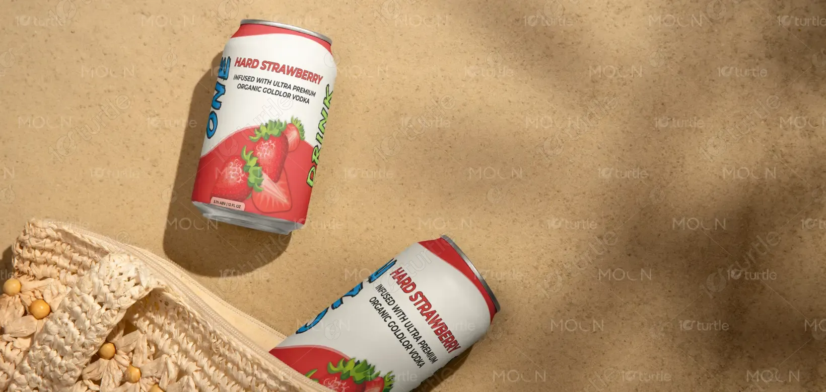
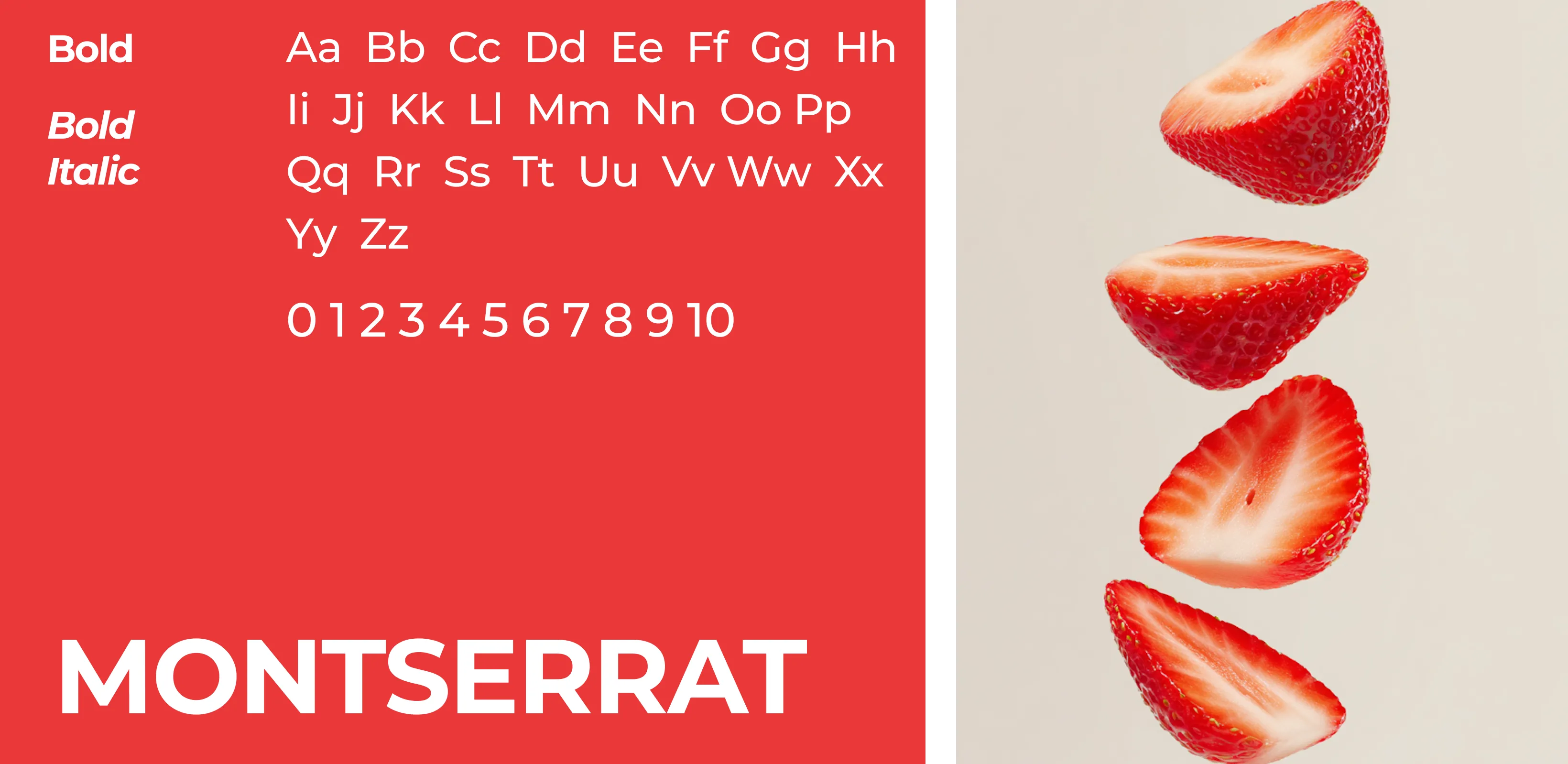
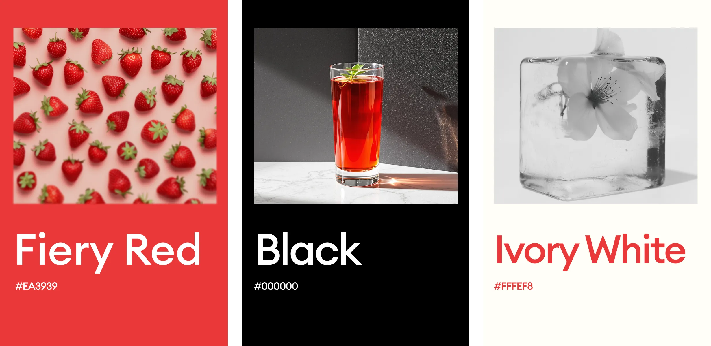
The color palette centers around fiery red, pure black, and ivory white, creating a powerful yet refined visual harmony. Fiery red captures intensity, passion, and the freshness of ripe strawberries, instantly drawing attention. Ivory white introduces softness and purity, balancing the boldness with a clean, elegant touch. Pure black, used primarily for typography and accents, ensures contrast, clarity, and sophistication. Together, these colors express energy, authenticity, and modern luxury, perfectly aligning with the brand’s premium identity.