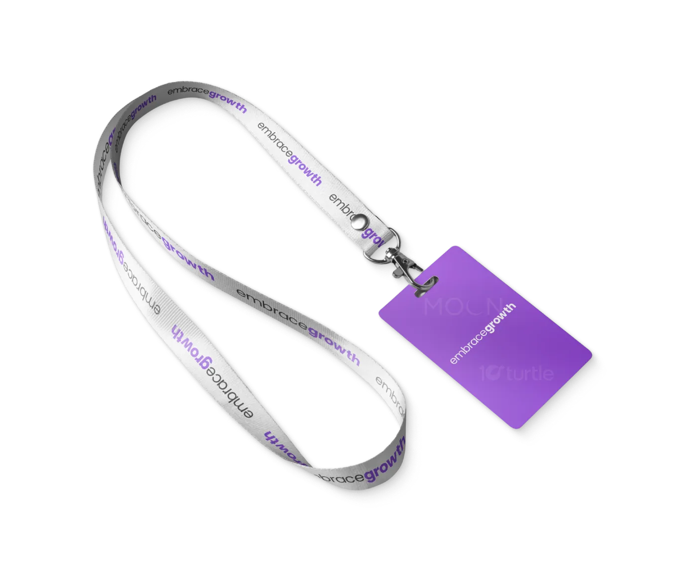
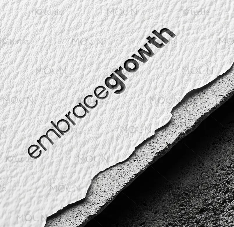
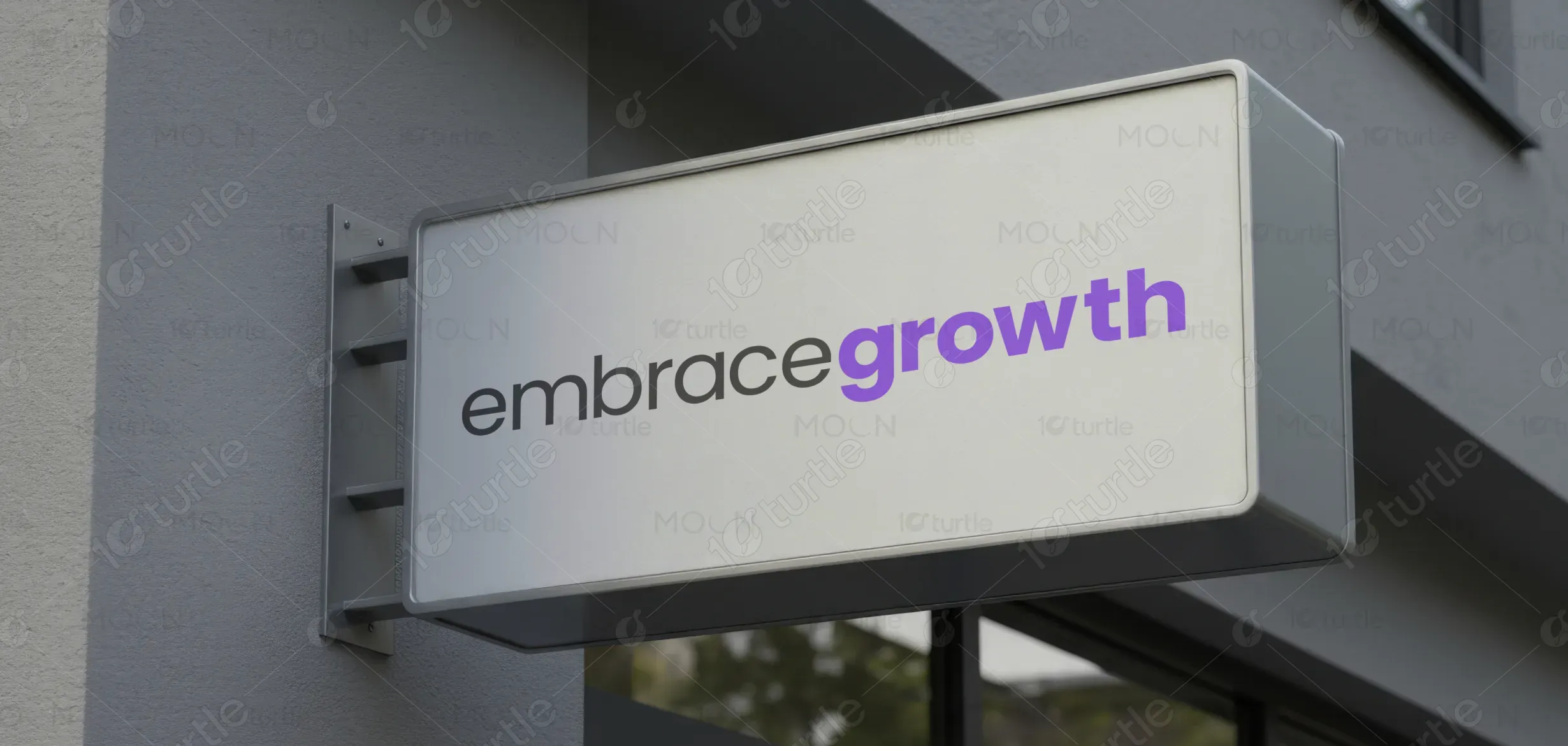
The design follows a minimalist, type-driven approach where clarity and emphasis guide the visual experience. The word “embrace” appears in a neutral, understated tone, establishing trust and approachability, while “growth” is highlighted in a vibrant accent color to create instant focus and meaning. The clean layout, generous white space, and modern sans-serif typography work together to communicate confidence, simplicity, and forward momentum. Visual hierarchy is achieved through color contrast rather than complex graphics, ensuring the message remains clear and adaptable across mediums.
Logo Design
Graphic Design

Industry
Technology, SaaS & Startups
Tools we used


Project Completion
2025
Key Market
Global
This design represents a brand philosophy centered on personal, professional, or business development. It positions Embrace Growth as a modern, purpose-driven brand that encourages progress through clarity and intention. Whether applied to coaching, consulting, education, wellness, or technology, the design functions as a flexible identity that communicates evolution, positivity, and momentum within a competitive, growth-oriented market.

Industry
Technology, SaaS & StartupsWhat we did
Logo DesignGraphic DesignPlatform
-Many growth-focused brands struggle with overcomplicated visuals, generic symbolism, or messaging that feels vague and uninspiring. This often results in low memorability, weak emotional connection, and poor brand differentiation. Audiences seeking growth-oriented solutions want clarity, trust, and direction—but are frequently met with cluttered or cliché design approaches that dilute impact.
The design addresses these challenges by stripping the message down to its essence. A simple wordmark paired with strategic color emphasis ensures instant readability and recognition. The restrained visual language prioritizes clarity and accessibility, while the bold highlight on “growth” reinforces the brand’s core promise. This scalable approach allows the identity to perform consistently across digital platforms, print materials, and marketing touchpoints without losing strength or meaning.

The long-term vision is to build a brand identity that evolves alongside its audience. The design is intentionally timeless, avoiding trends that may quickly feel outdated. Its simplicity allows for easy expansion into future brand assets, campaigns, or sub-brands while maintaining a cohesive core identity. Over time, Embrace Growth aims to become synonymous with steady progress, trust, and meaningful transformation within its industry.
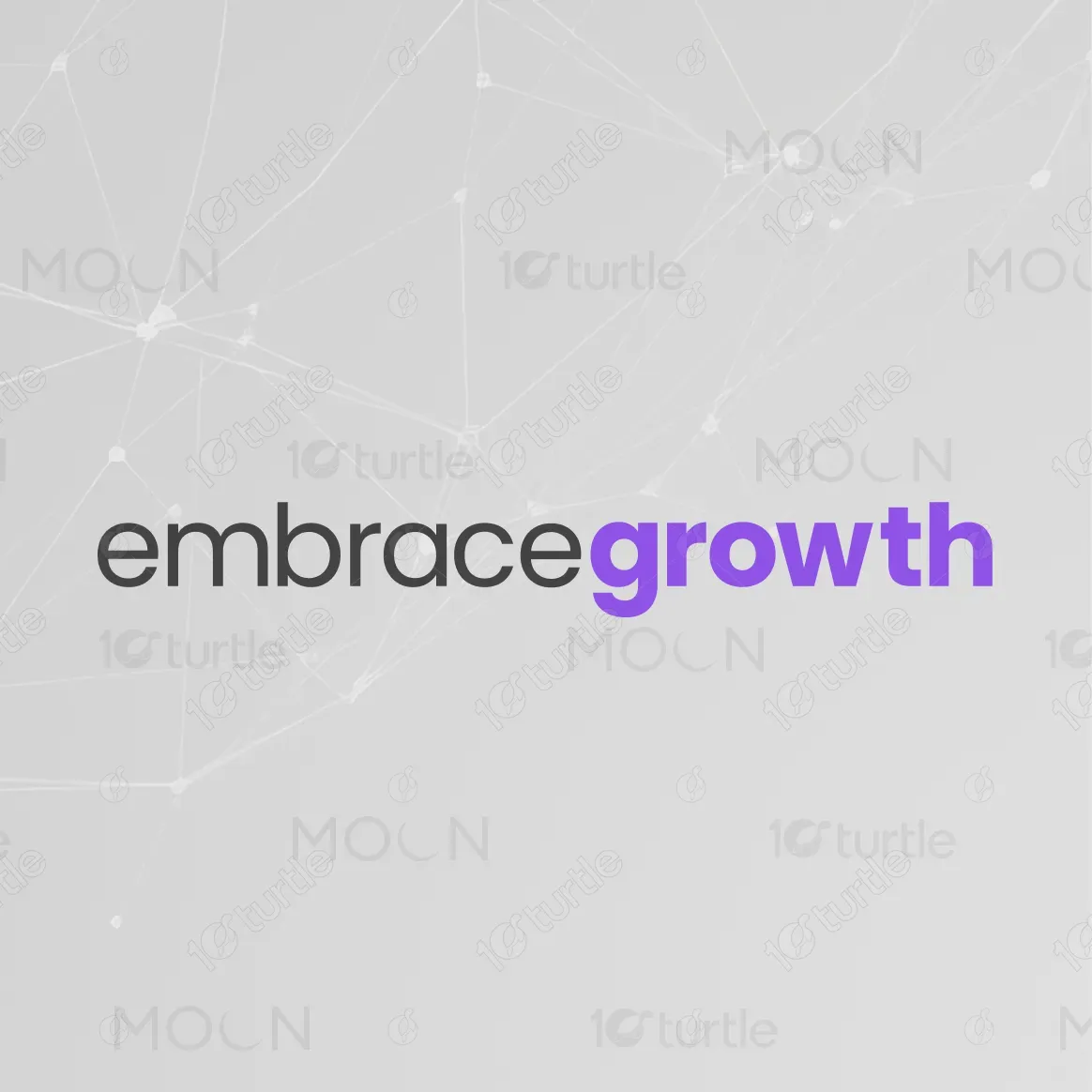

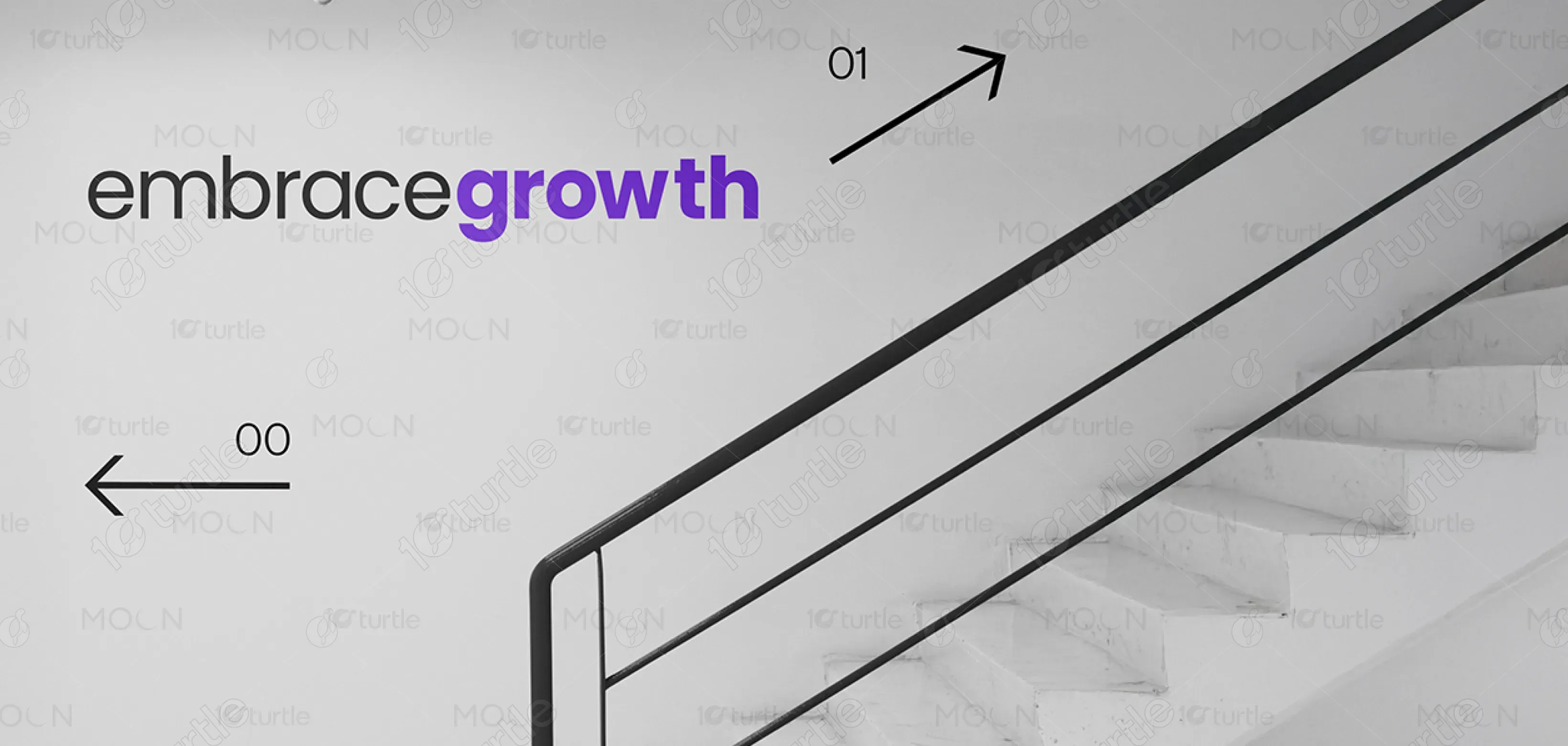
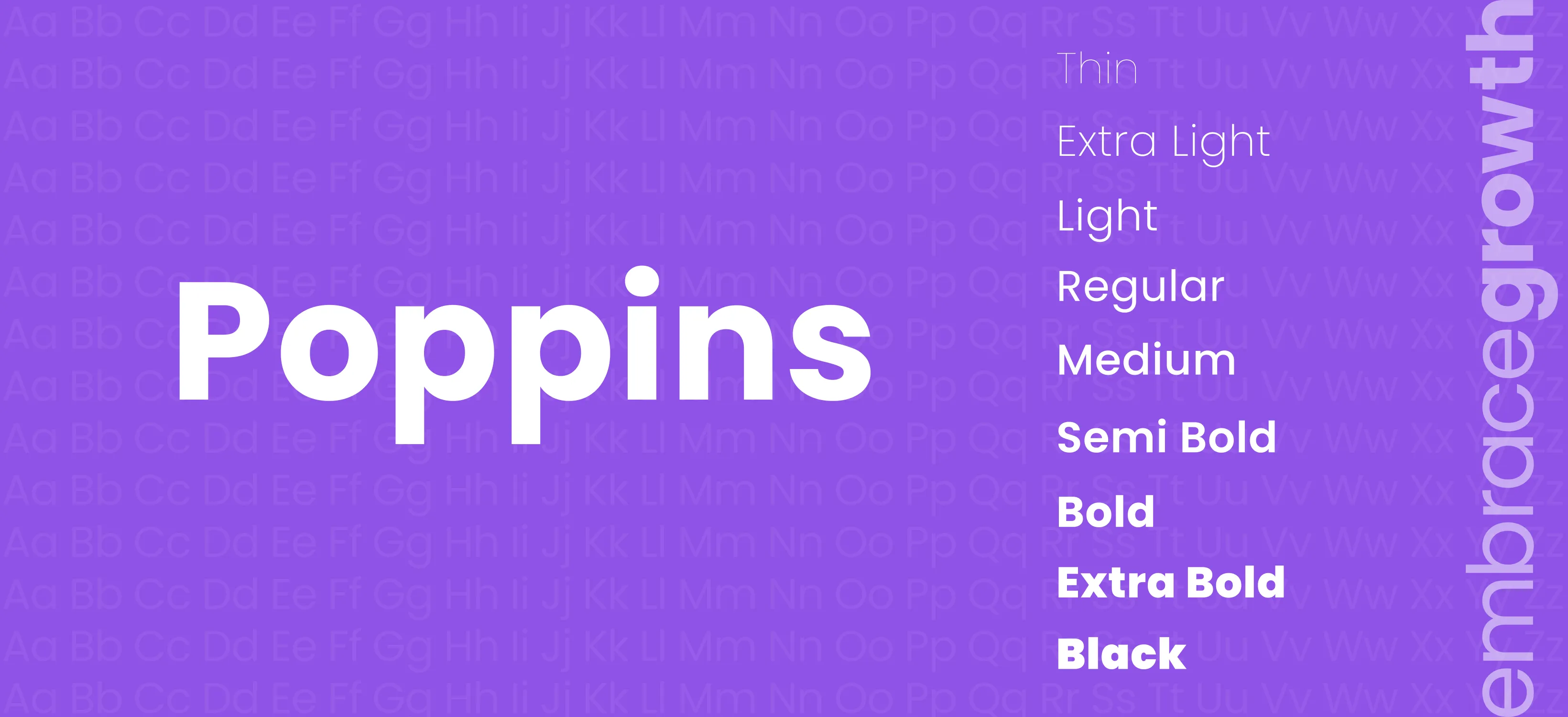
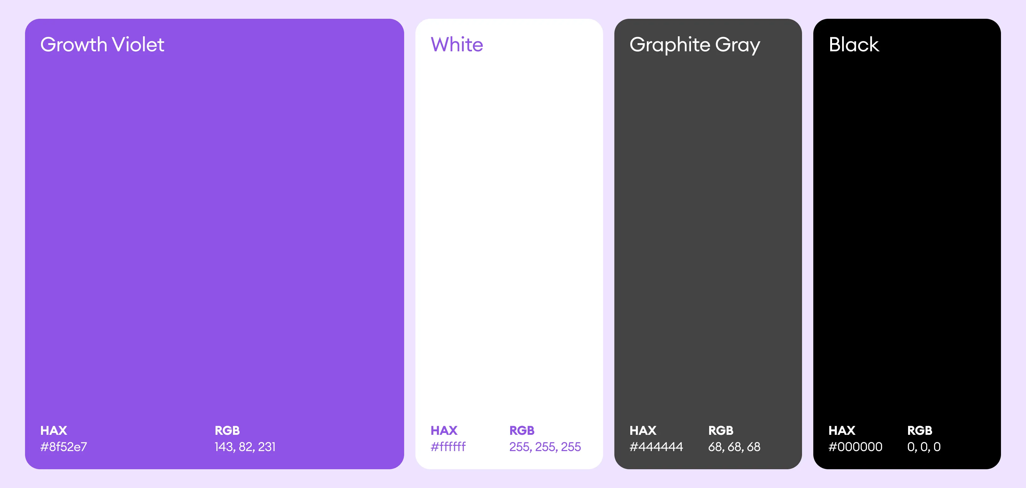
The color palette combines a neutral gray with a bold violet accent. The gray establishes balance, professionalism, and calm, while the violet introduces energy, creativity, and forward thinking—symbolizing growth and transformation. This contrast enhances readability and ensures visual interest without overwhelming the viewer. The overall visual language remains clean, modern, and adaptable, allowing the brand to remain consistent across various formats and environments.
