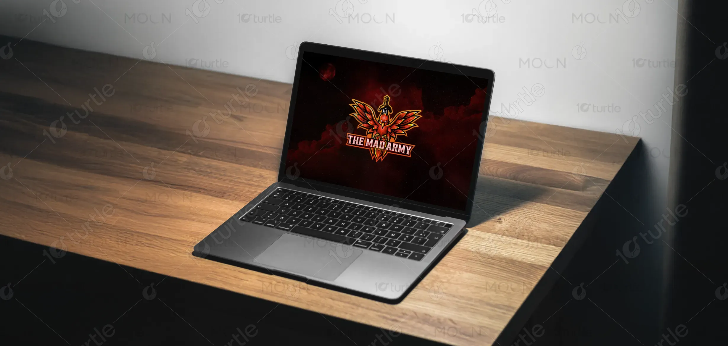
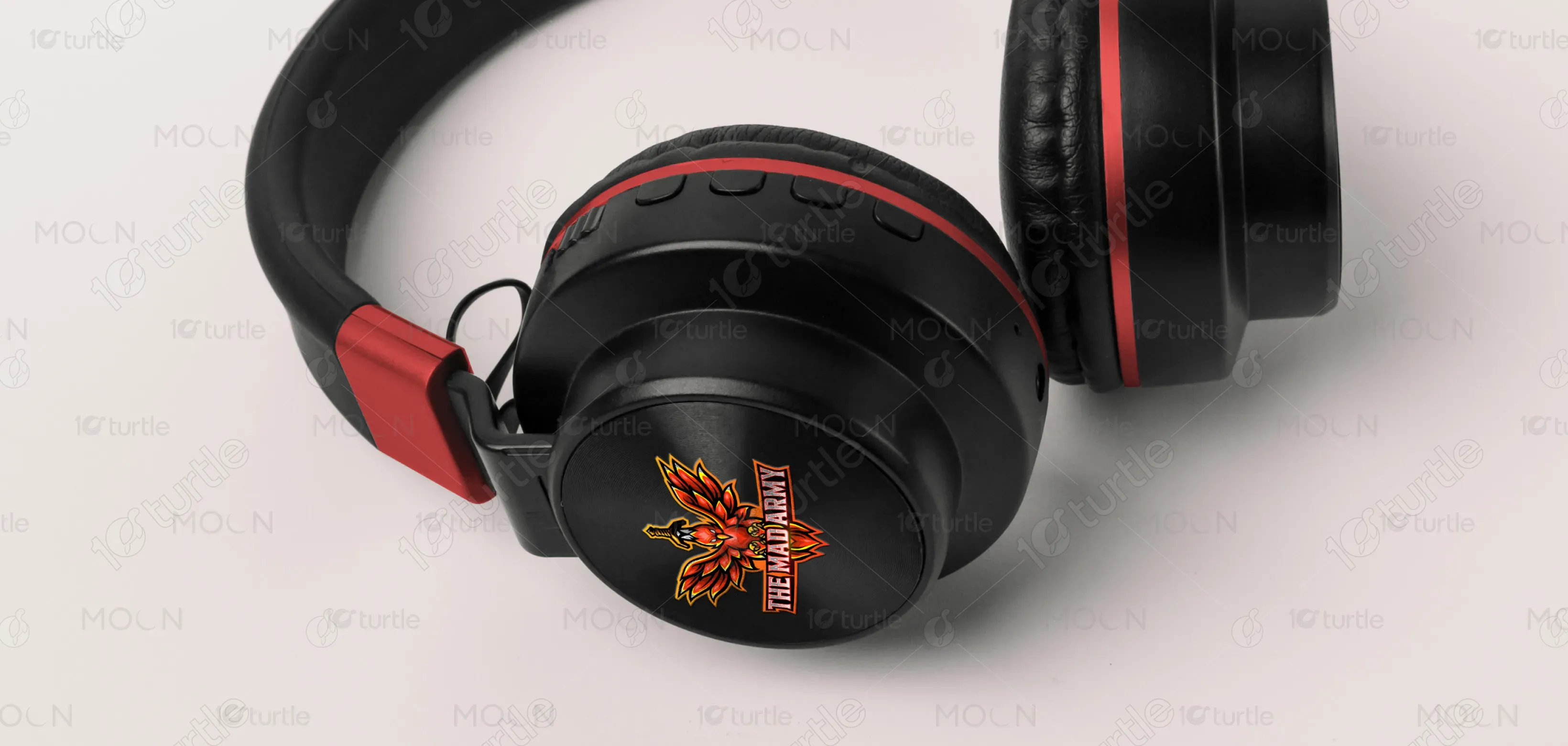
The logo showcases a powerful, bold Phoenix with stretched wings, symbolizing strength, rebirth, and resilience. The design combines the duality of light and shadow, with the dark, intense shades representing the Phoenix's mad side, and the brighter elements illustrating its noble, empowering attributes. The color palette of red, orange, and black creates a striking contrast, further emphasizing the logo's energy and determination. The text "The Mad Army" anchors the design, representing a unified, unyielding gaming community.
Logo Design
Graphic Design
Industry
Arts, Culture & Entertainment
Tools we used


Project Completion
2025
Key Market
Global
"The Mad Army" is a vibrant gaming community centered around the Warframe game. The logo represents both the struggle and triumph within the gaming world, embodying themes of betrayal, passion, and resilience. With a phoenix rising from the ashes, it mirrors the community's growth, facing challenges and embracing its identity. The color palette and intricate design give it a unique edge, making it stand out in the competitive gaming space while fostering a sense of belonging and power for its members.

Industry
Arts, Culture & EntertainmentWhat we did
Logo DesignGraphic DesignPlatform
-The challenge in designing "The Mad Army" logo lies in capturing the intensity of the gaming community while portraying both the destructive and the triumphant aspects of the Phoenix. The logo needs to convey power and rebellion, while also embracing themes of resilience and rebirth. Many gaming logos are overly generic, so creating a design that reflects both the chaotic and empowering elements of the community is key to differentiating this brand.
The Phoenix design addresses this challenge by embodying the dual nature of the community. The wings’ sweeping stretch symbolizes both strength and defiance, while the balance of light and dark reflects the struggles and victories that the gaming community experiences. The red, orange, and black color scheme enhances the fiery, intense nature of the logo, perfectly capturing the spirit of "The Mad Army" and setting it apart in the gaming industry.
The long-term vision for the "Mad Army" logo is to create a lasting symbol that represents not just a gaming community but a movement. Over time, the logo will evolve to incorporate new elements of the community’s growth and expansion, potentially involving other gaming aspects or collaborations. It aims to become an iconic emblem that fans will identify with, signifying strength, unity, and an undying will to persevere through adversity.


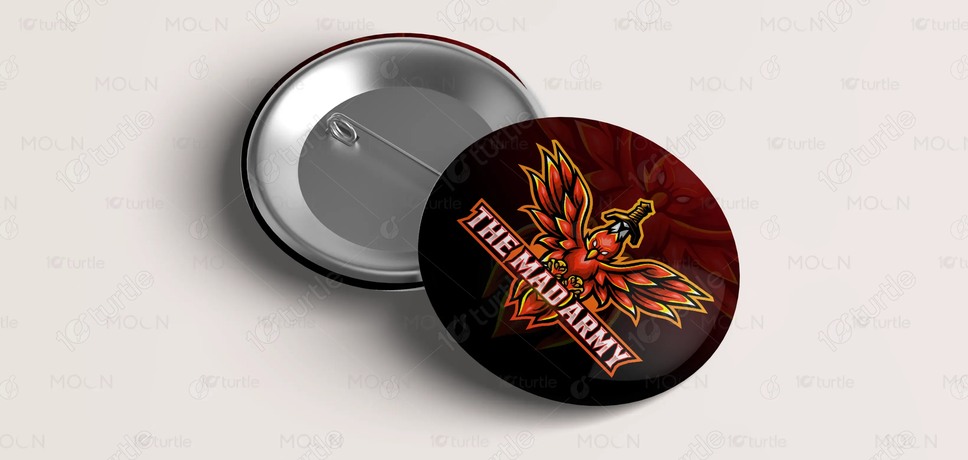
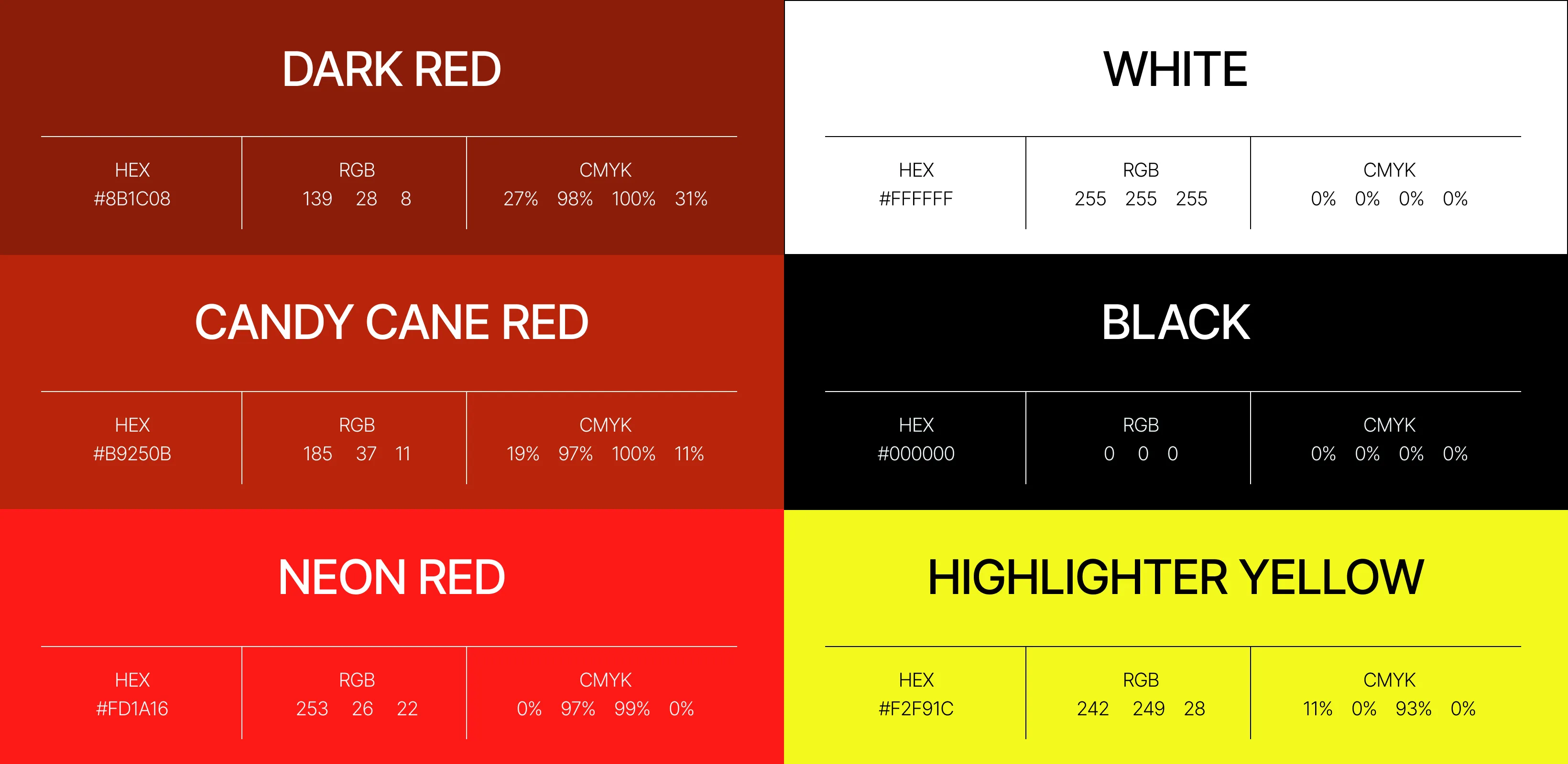
The color palette of red, orange, and black is carefully chosen to evoke strong emotions. Red and orange symbolize energy, passion, and transformation—key themes associated with the Phoenix and the gaming community. Black adds depth and intensity, providing a sense of mystery and power. The blend of these colors represents the balance between light and darkness, echoing the community’s journey of triumph over trials. The fiery tones amplify the aggressive yet determined spirit of the brand.