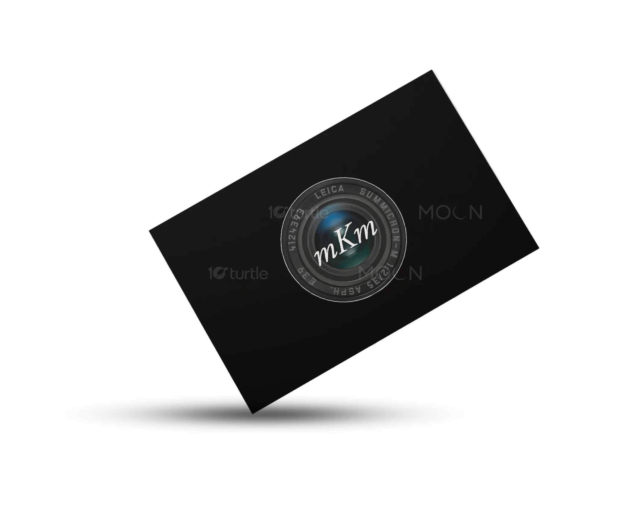
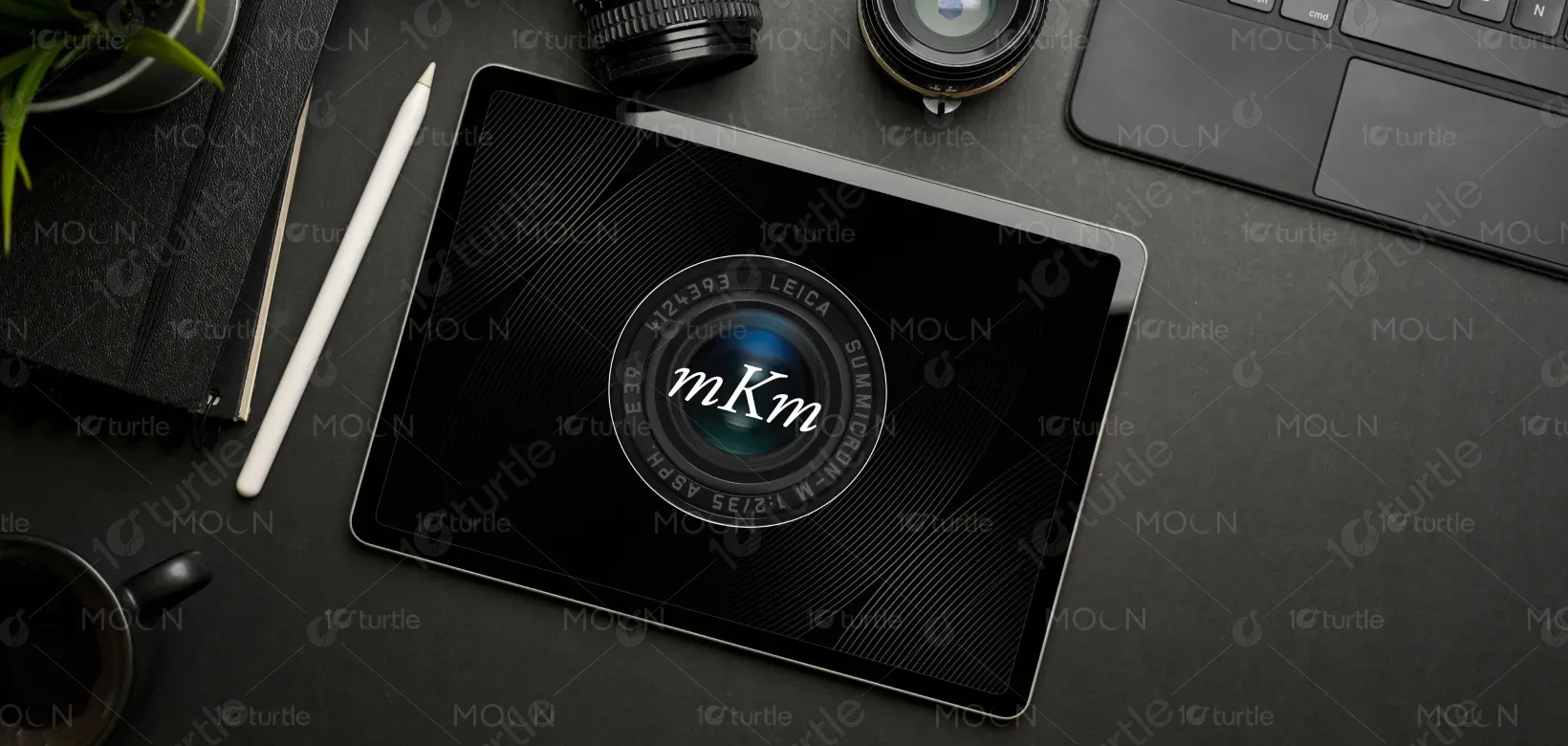
The logo design is inspired by the essence of photography and storytelling, integrating the symbolic camera lens with the initials mKm to represent Mary Motley Kalergis’ artistry. The clean, circular form of the lens conveys focus, depth, and vision, while the elegant serif typography balances professionalism with creativity. The subtle gradient within the lens reflects light and perspective, signifying her ability to capture authentic human connections. Overall, the design merges sophistication and artistry, embodying both her literary and photographic identity.
Logo Design
Graphic Design
Industry
Arts, Culture & Entertainment
Tools we used


Project Completion
2025
Key Market
Global
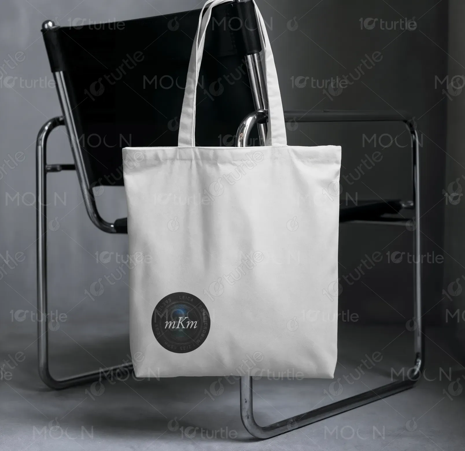
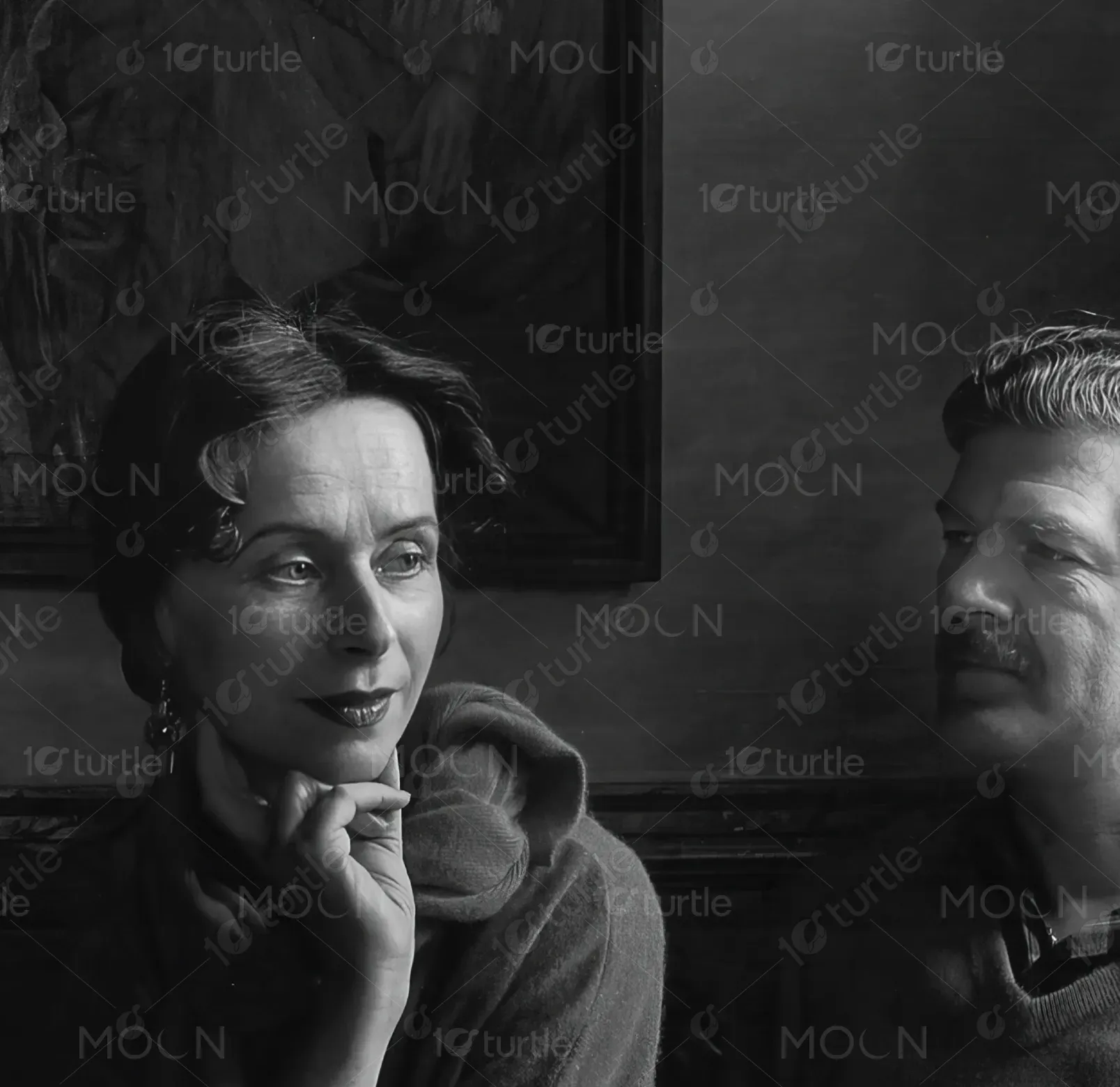
This logo represents Mary Motley Kalergis, a distinguished author and photographer known for documenting the beauty of family and community life. The design highlights her dual role as storyteller and visual artist, using a camera lens as a universal symbol of perspective. The initials mKm establish a recognizable and personal brand identity. Its purpose is to serve as a signature mark across books, exhibitions, and media, setting her apart with a refined yet approachable visual identity.
Industry
Arts, Culture & EntertainmentWhat we did
Logo DesignGraphic DesignPlatform
-One of the primary challenges in designing this logo was to merge literary artistry with visual storytelling in a single cohesive symbol. Traditional author logos often lean heavily on typography, while photography brands frequently use abstract or technical imagery. This disconnect risks underrepresenting either side of Mary’s work. Additionally, the photography market is saturated with generic camera icons, which often fail to capture individuality. The key gap lay in creating a timeless mark that reflects both her personal identity and artistic depth.
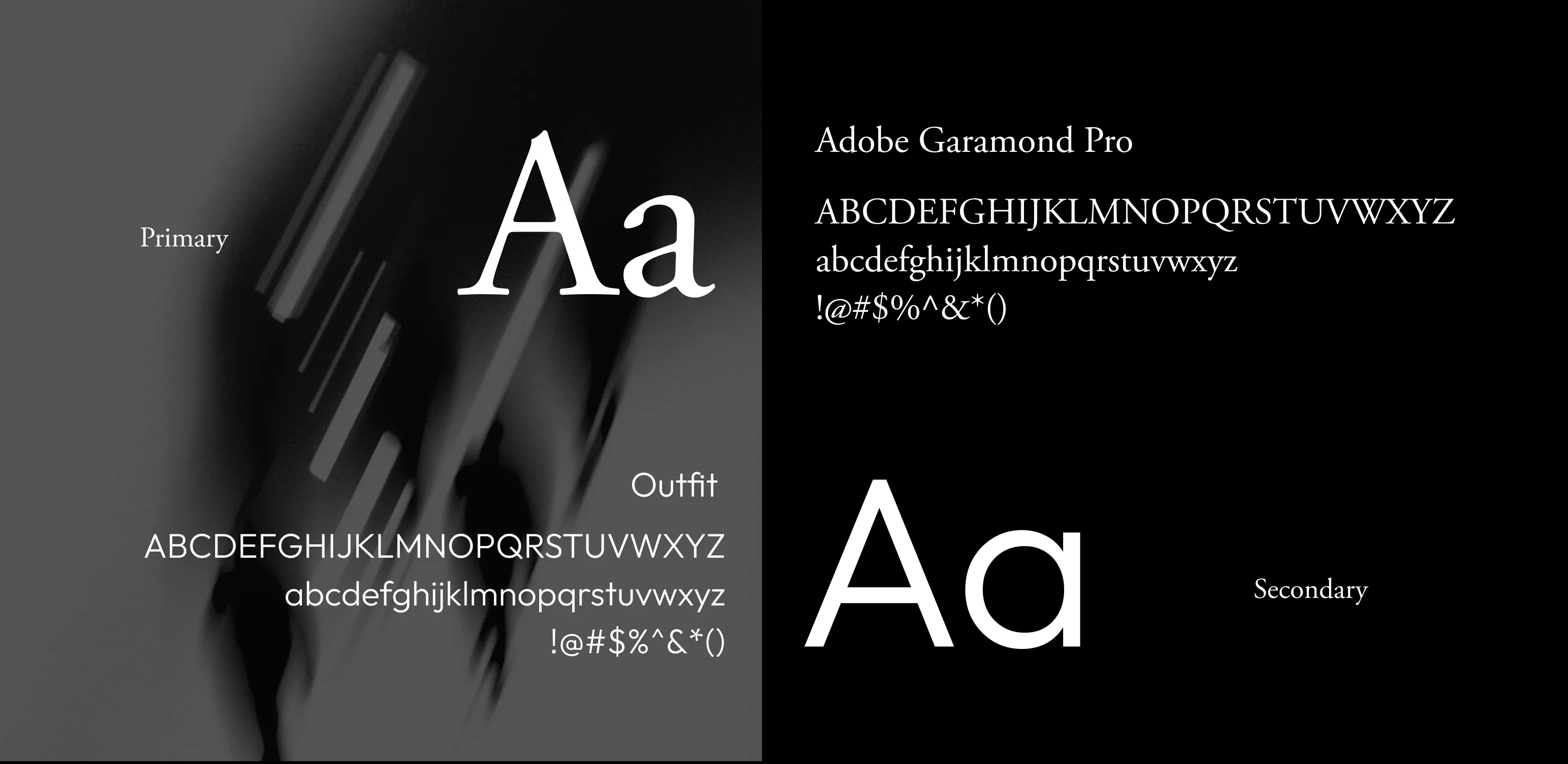
By incorporating a realistic camera lens with her personal initials, the design bridges the gap between literature and photography. The initials "mKm" rest at the center, symbolizing perspective and vision through her lens. The choice of elegant, serif-inspired typography reflects her credibility as an author, while the camera design roots her firmly in the world of photography. This hybrid solution creates a distinctive, authentic brand symbol that communicates her unique voice and artistry, ensuring memorability in both literary and visual spaces.
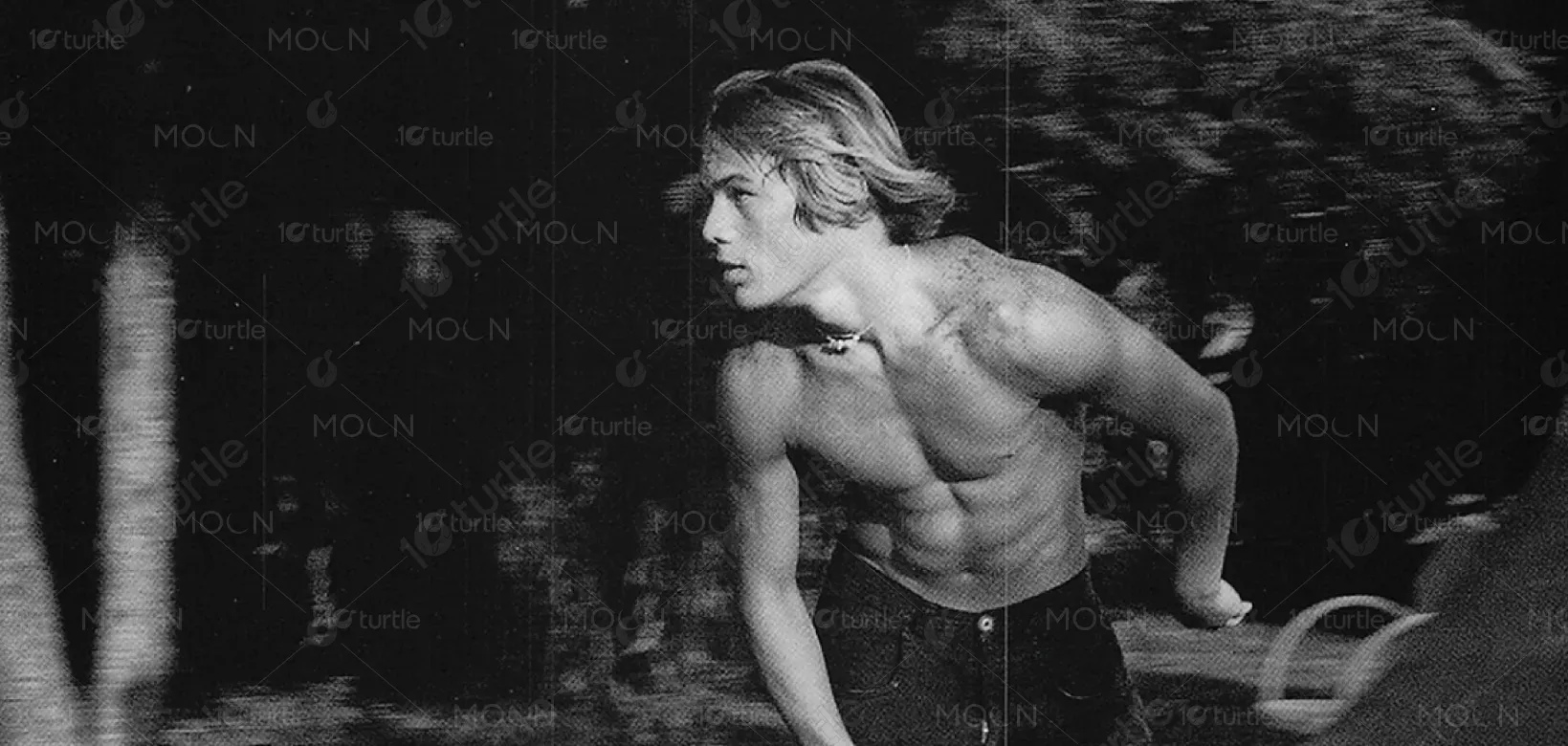
The long-term vision for this logo is to establish a timeless and recognizable brand identity for Mary Motley Kalergis. It aspires to become her signature mark across diverse platforms—books, galleries, digital publications, and exhibitions. Beyond personal branding, the design aims to inspire confidence, authenticity, and warmth, mirroring the themes of her work. As her audience grows, the logo will serve as a beacon of connection and storytelling, symbolizing her lasting impact on how communities and families are seen and remembered.
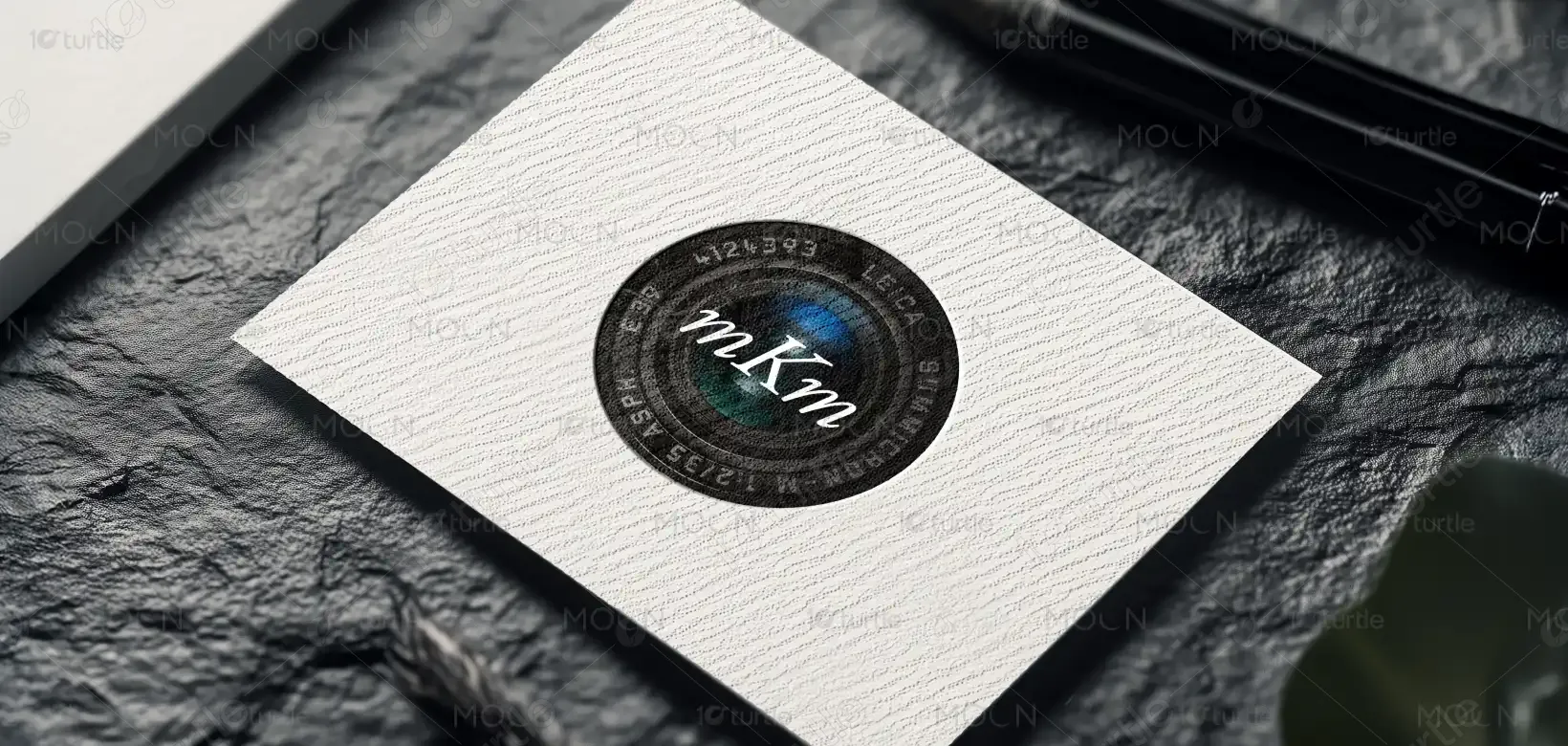
The "mKm" logo design blends modern elegance with professional photography elements. Featuring a classic Leica camera lens, it embodies precision and creativity. The sleek and minimalistic design is perfect for a photography brand that wants to communicate expertise and artistry in every shot.
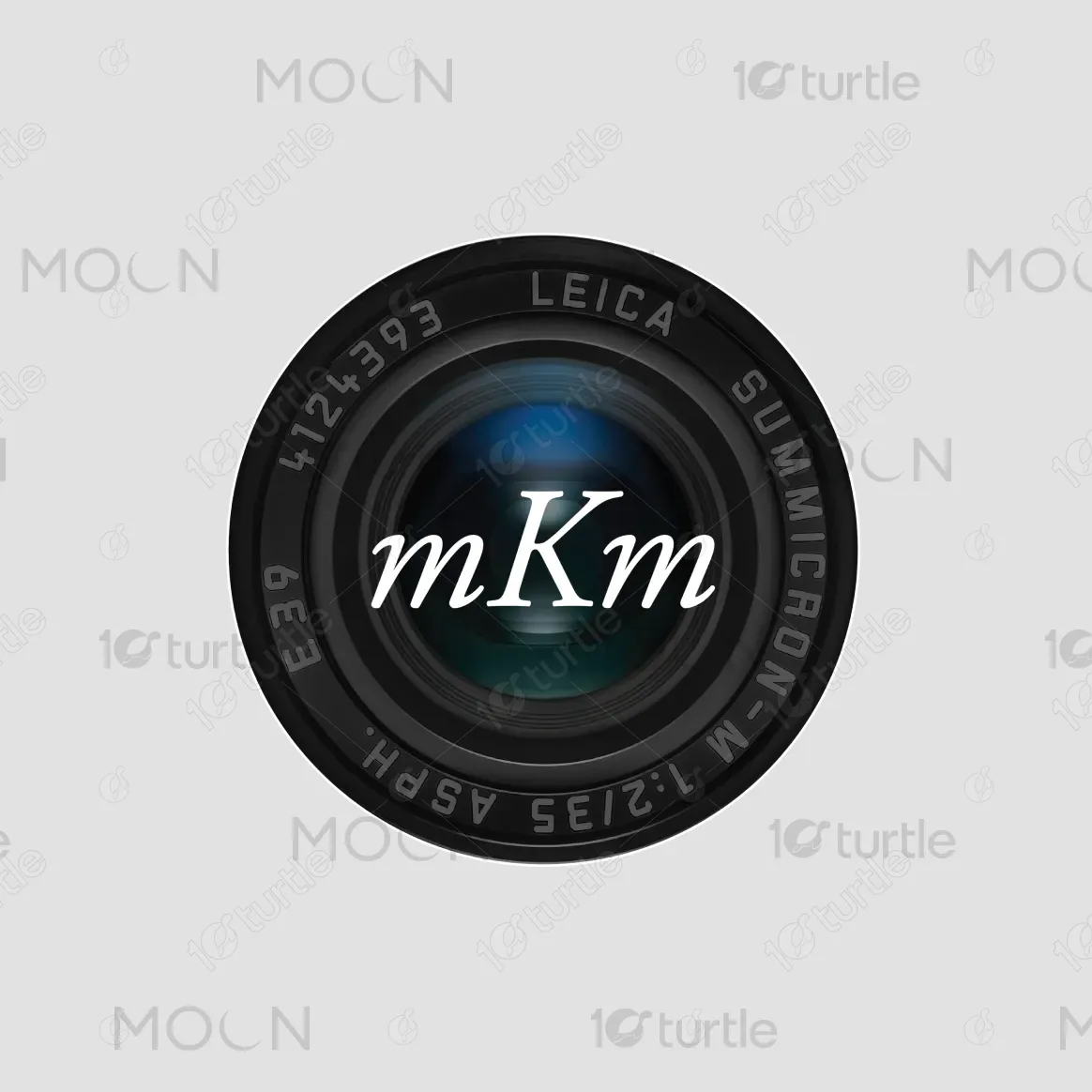
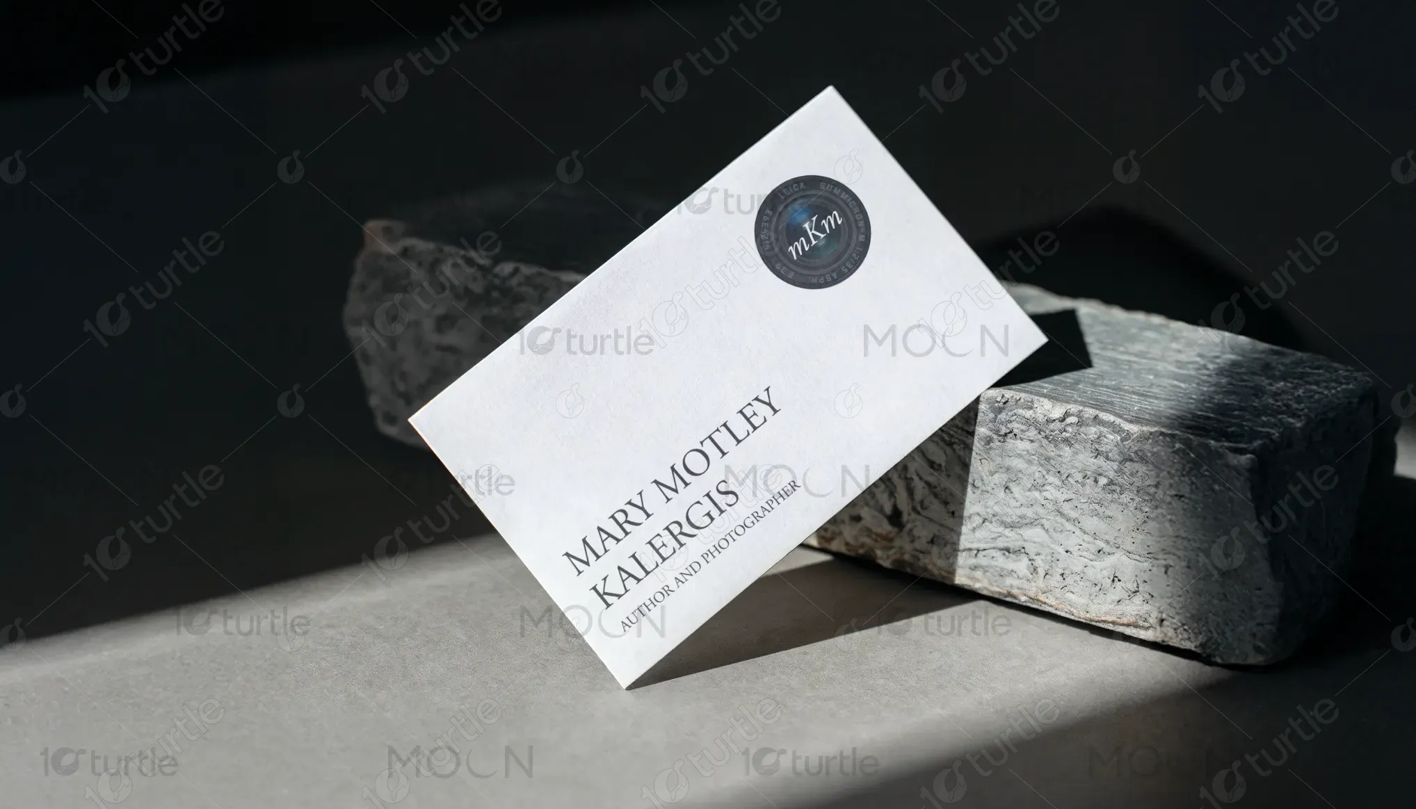
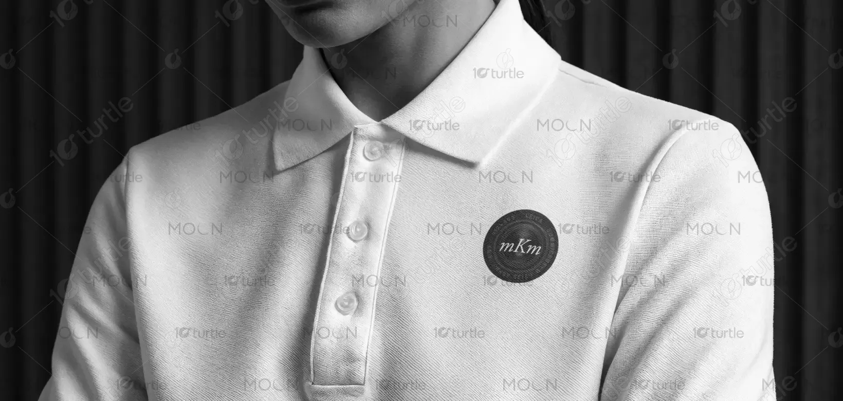
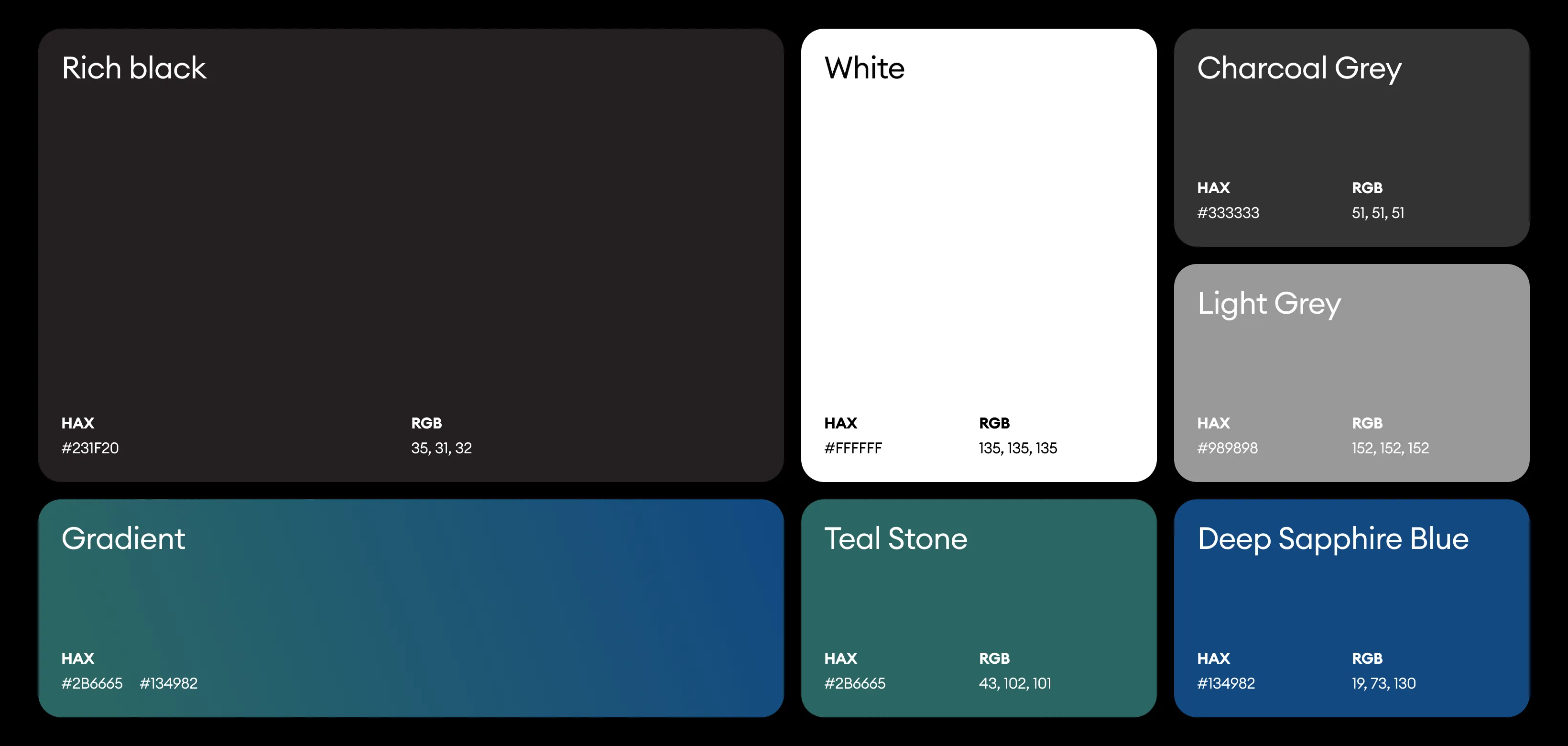
The logo primarily uses a black and white base with subtle blue and teal reflections within the lens. Black conveys sophistication, professionalism, and timelessness, aligning with her established reputation. White represents clarity, truth, and authenticity—qualities central to her interviews and portraits. The soft gradient of blue evokes calmness, trust, and emotional depth, reflecting the intimate human connections she captures. Together, this palette enhances the overall aesthetic appeal, positioning her brand as both elegant and approachable, while resonating deeply with her audience.
