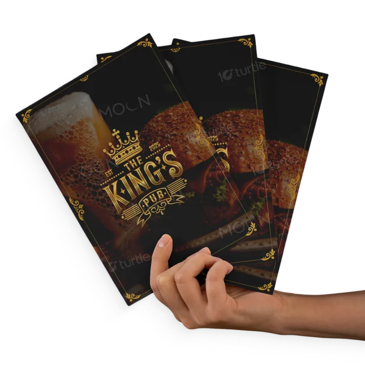
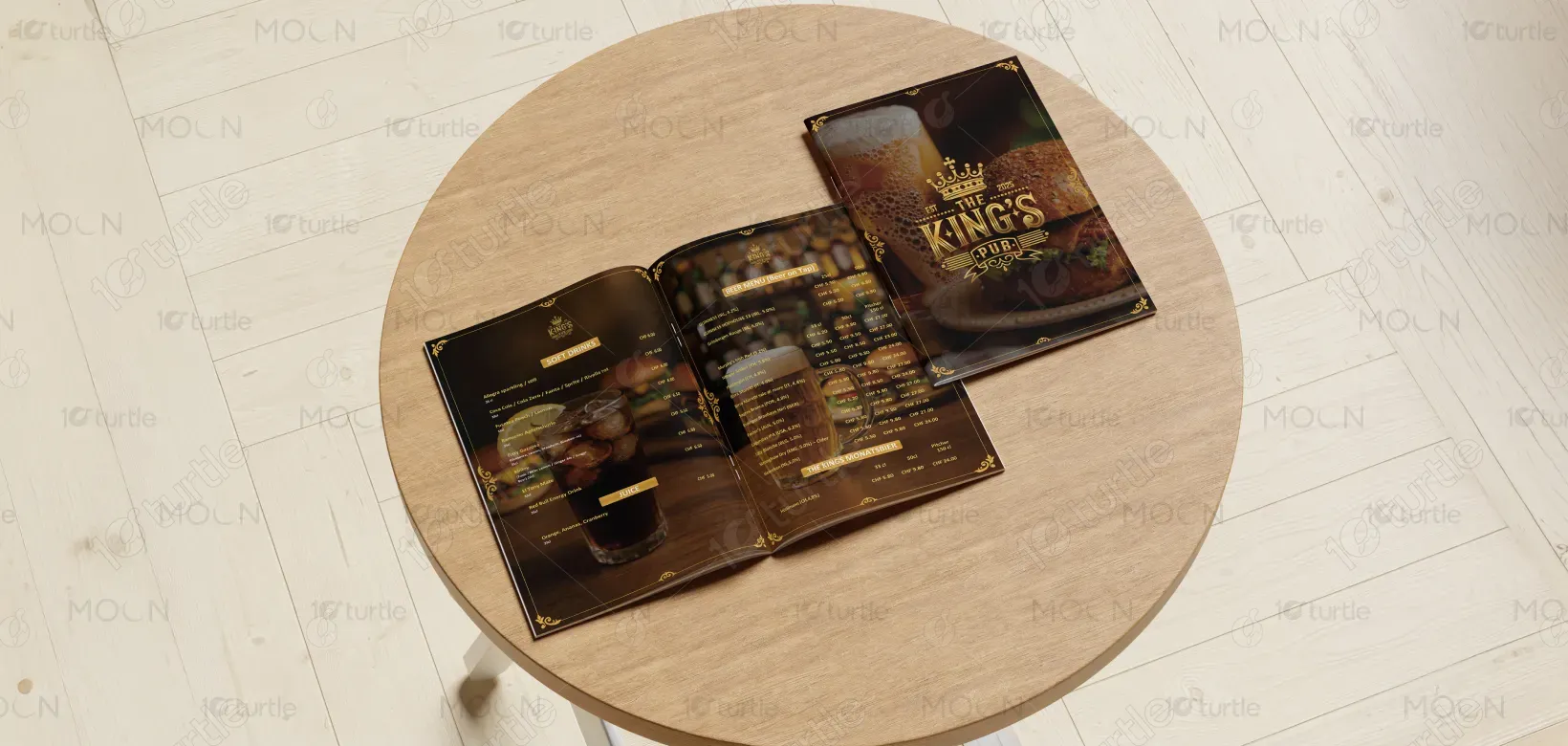
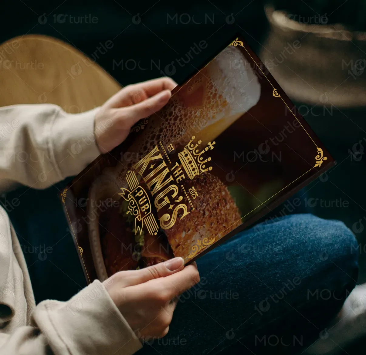
The design follows a premium vintage-pub aesthetic, combining rich, dark tones with elegant gold detailing to create a sense of luxury and heritage. The layout is structured with a clear visual hierarchy, where headings, categories, and pricing are easily scannable while maintaining a refined look. Typography blends classic serif styles with modern readability, reinforcing both tradition and clarity. High-quality imagery with soft blur backgrounds adds depth without overpowering the content, ensuring the menu remains both visually engaging and functional in low-light dining environments.
Menu Design
Graphic Design
Industry
Food, Beverage & Hospitality
Tools we used


Project Completion
2025
Key Market
Global
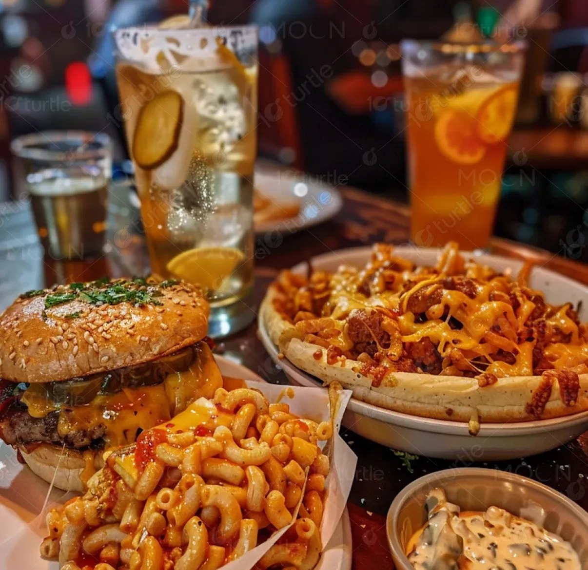
This menu design represents King’s Pub, a premium dining and beverage destination focused on delivering a curated experience of craft beers, wines, cocktails, and gourmet bites. The primary purpose of the design is to present offerings clearly while enhancing the perceived value of the brand. Positioned within the hospitality industry, the menu acts as both an informational tool and a brand experience piece, reflecting quality, sophistication, and comfort.
Industry
Food, Beverage & HospitalityWhat we did
Menu DesignGraphic DesignPlatform
-Many pub and restaurant menus suffer from cluttered layouts, poor readability in dim lighting, and lack of brand identity, which can reduce customer engagement and slow decision-making. Inconsistent typography and weak hierarchy often make it difficult for customers to quickly find items, impacting ordering efficiency and overall experience. Additionally, generic designs fail to create a memorable brand impression, limiting repeat visits and emotional connection.
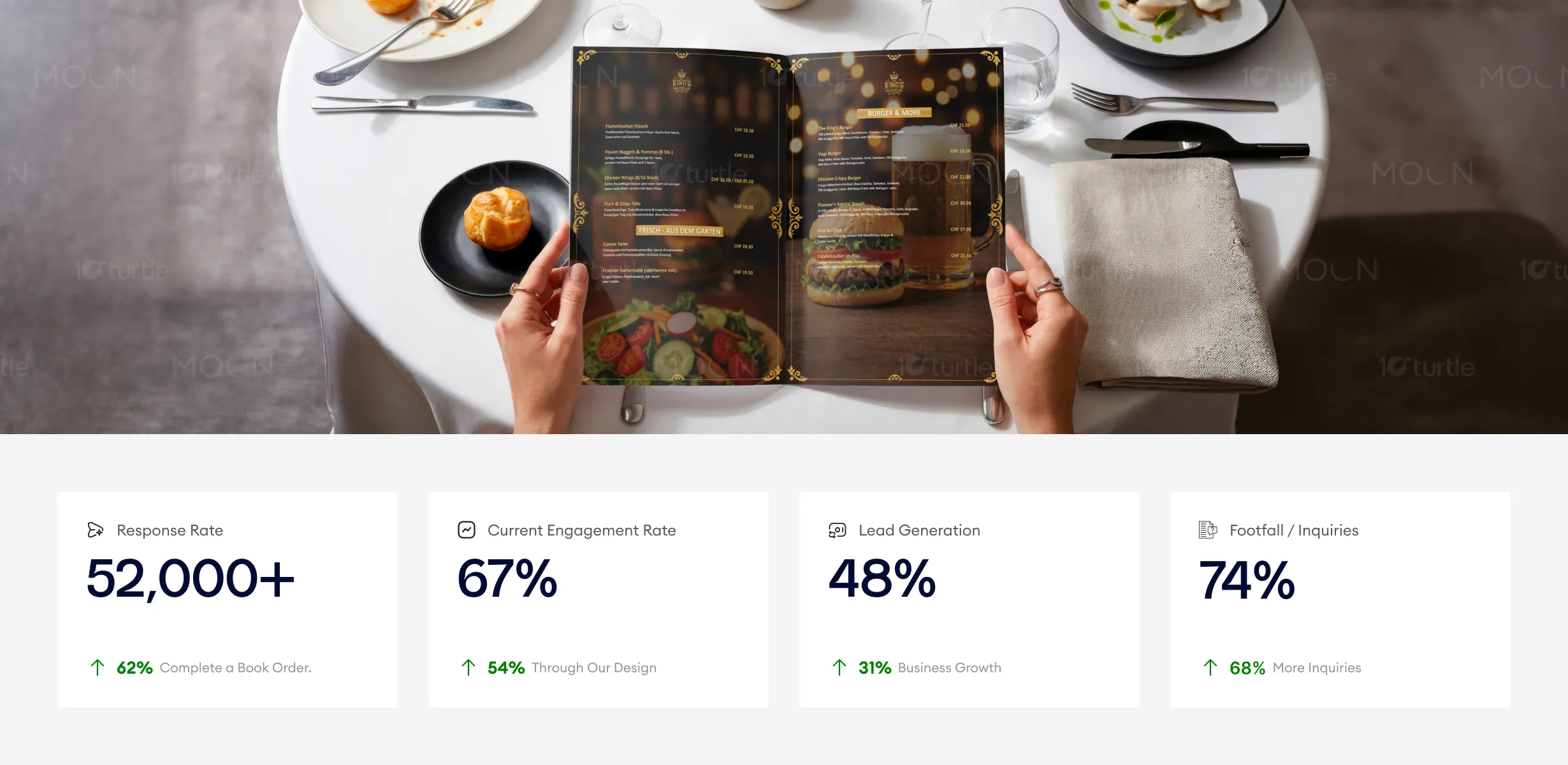
The design addresses these challenges through a structured and user-friendly layout, ensuring easy navigation across categories like bottled beer, wine, and cocktails. High-contrast text (gold on dark background) improves readability, especially in ambient lighting. A consistent design system—using borders, icons, and section headers—creates visual clarity and brand cohesion. The use of subtle imagery and spacing enhances the browsing experience without distraction, resulting in a menu that is both efficient to use and visually distinctive.

The menu system improves readability while reinforcing a premium dine-in experience, helping customers navigate categories faster and notice featured items more consistently. Stronger visual hierarchy, premium material presentation, and clearer product grouping contribute to increased upsell performance, longer menu engagement, and higher average spend per customer.
The long-term vision is to establish King’s Pub as a recognizable premium brand that blends tradition with modern hospitality. This design system is scalable across future touchpoints such as digital menus, social media, in-house branding, and promotional materials. By maintaining a consistent visual identity, the brand can build strong recall and customer loyalty, positioning itself as a refined yet approachable destination in the competitive pub and dining market.
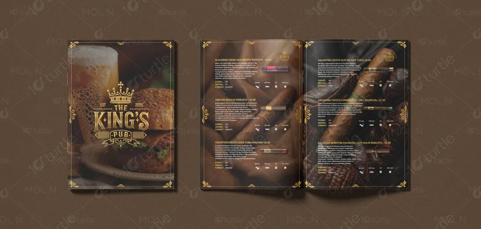
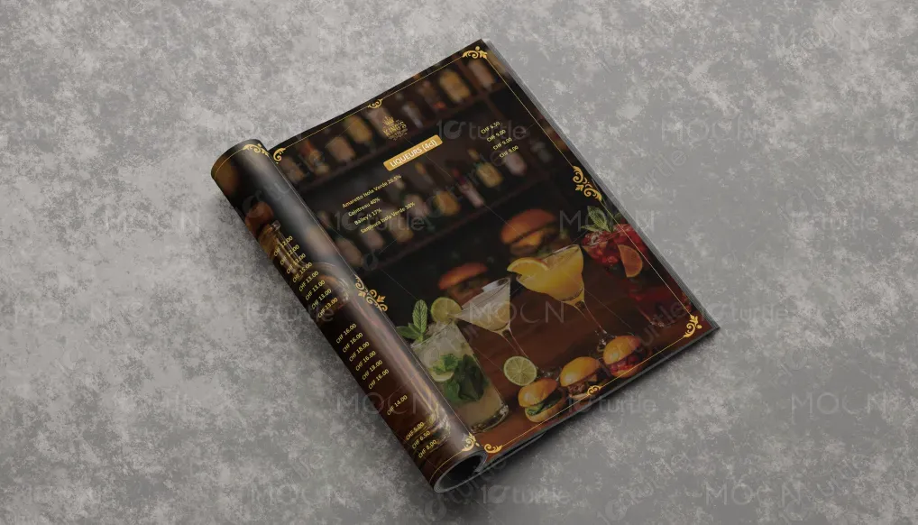
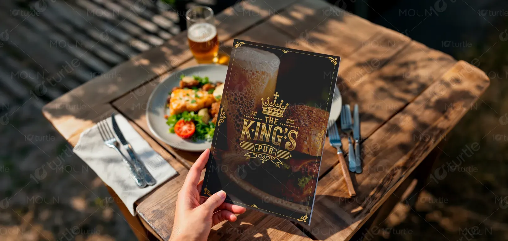
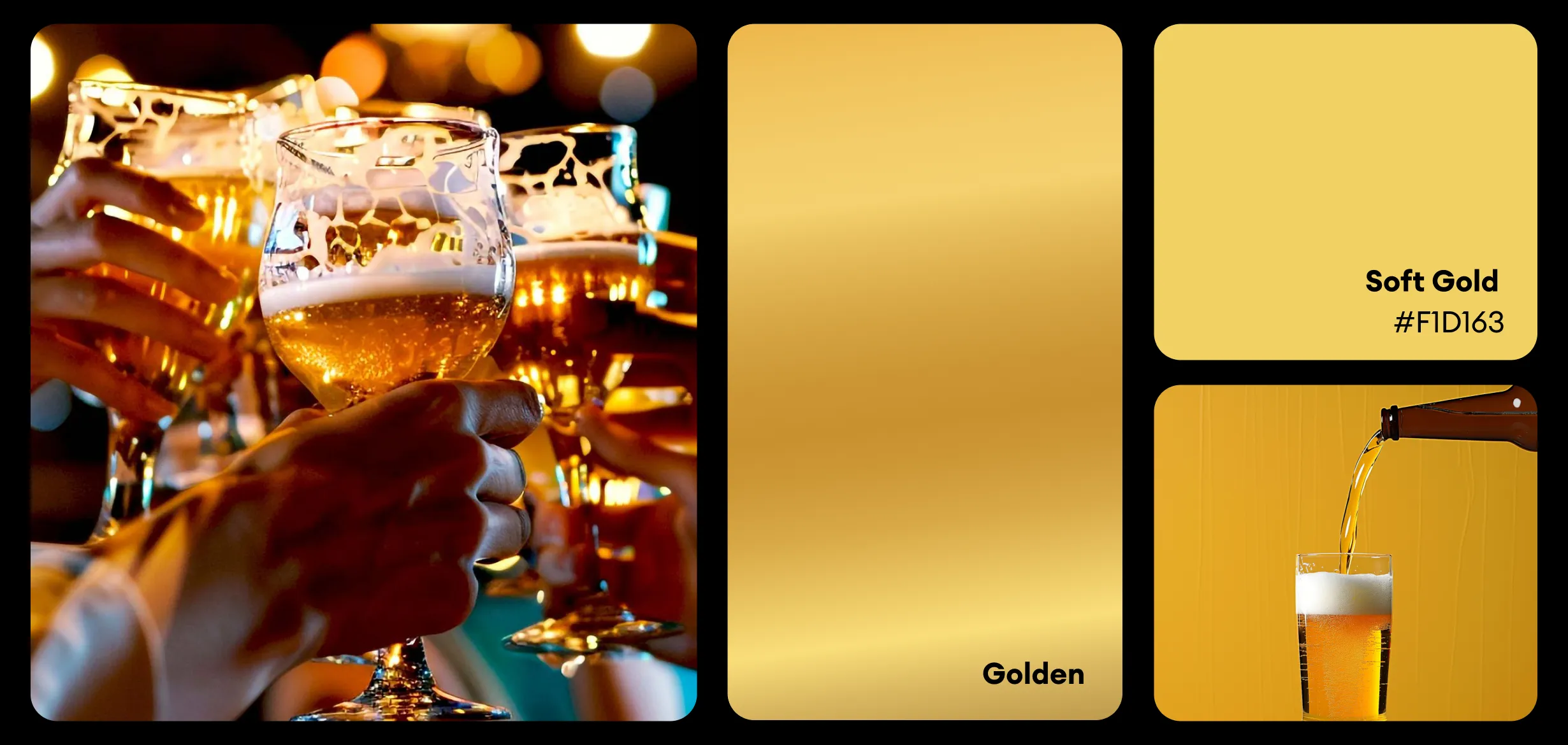
The color palette is centered around deep blacks and warm dark browns, paired with metallic gold accents. This combination conveys luxury, warmth, and sophistication, aligning with a high-end pub atmosphere. Gold elements highlight key information and add a sense of refinement, while the dark background ensures strong contrast and readability. Supporting visual elements like ornamental borders, subtle textures, and soft-focus imagery reinforce a timeless, classic identity that remains consistent across print and digital applications.