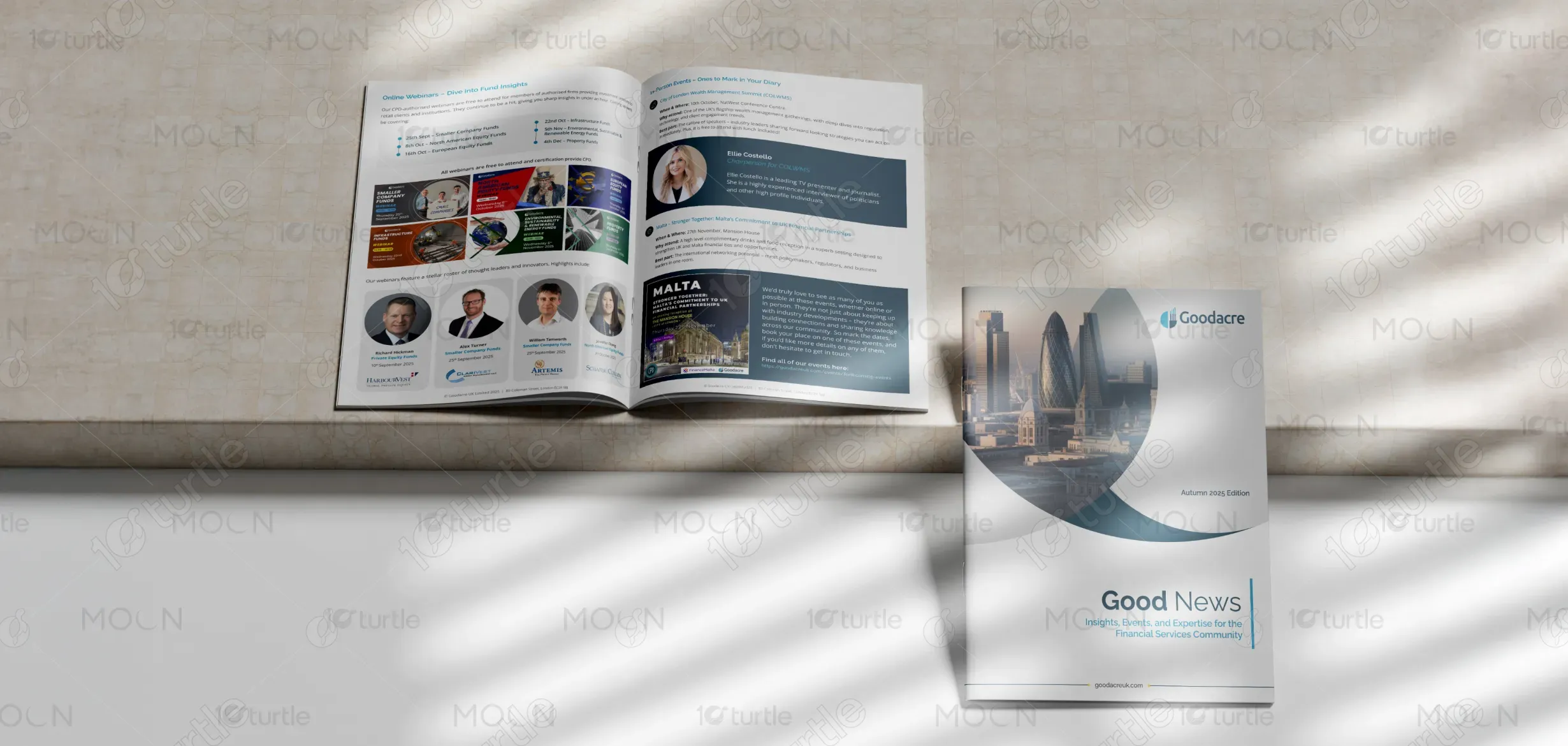
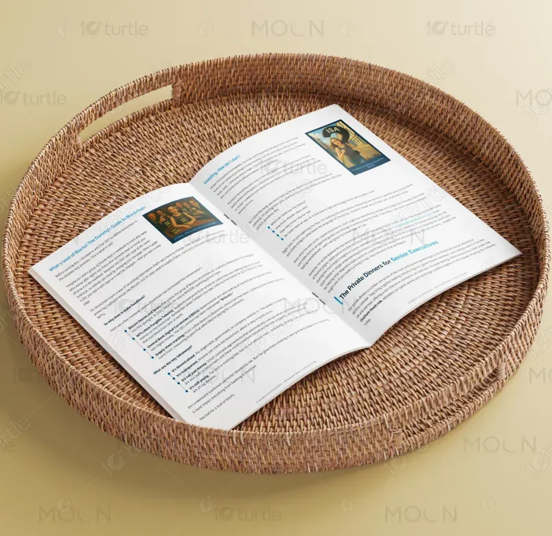
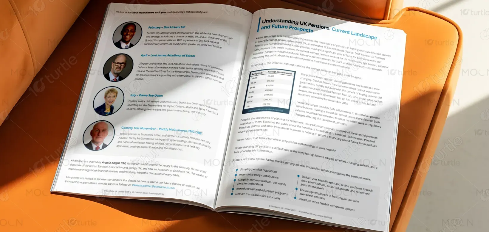
The newsletter design follows a structured, editorial-led approach that balances authority with accessibility. A clear grid system, consistent typography, and disciplined spacing guide readers through long-form content without overwhelming them. Hierarchy is established through strong section headers, clear subheadings, and modular content blocks, allowing readers to scan or deep-dive as needed. A restrained color palette reinforces trust and professionalism, while imagery and visual breaks maintain engagement across a text-heavy format designed for digital and print consumption.
Newsletter Design
Graphic Design
Industry
Finance, Legal & Insurance
Tools we used


Project Completion
2025
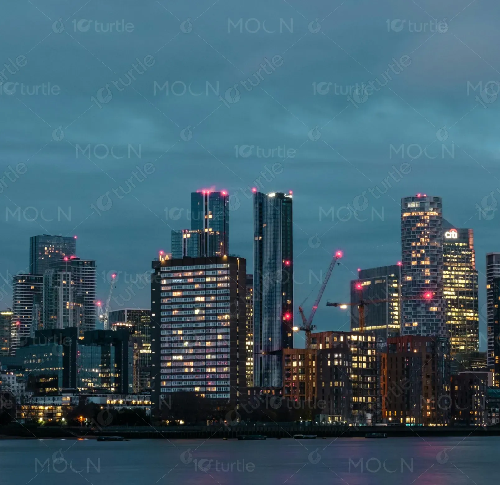
Key Market
Global
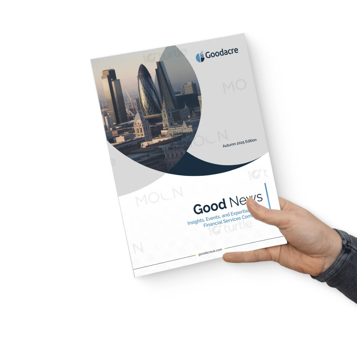
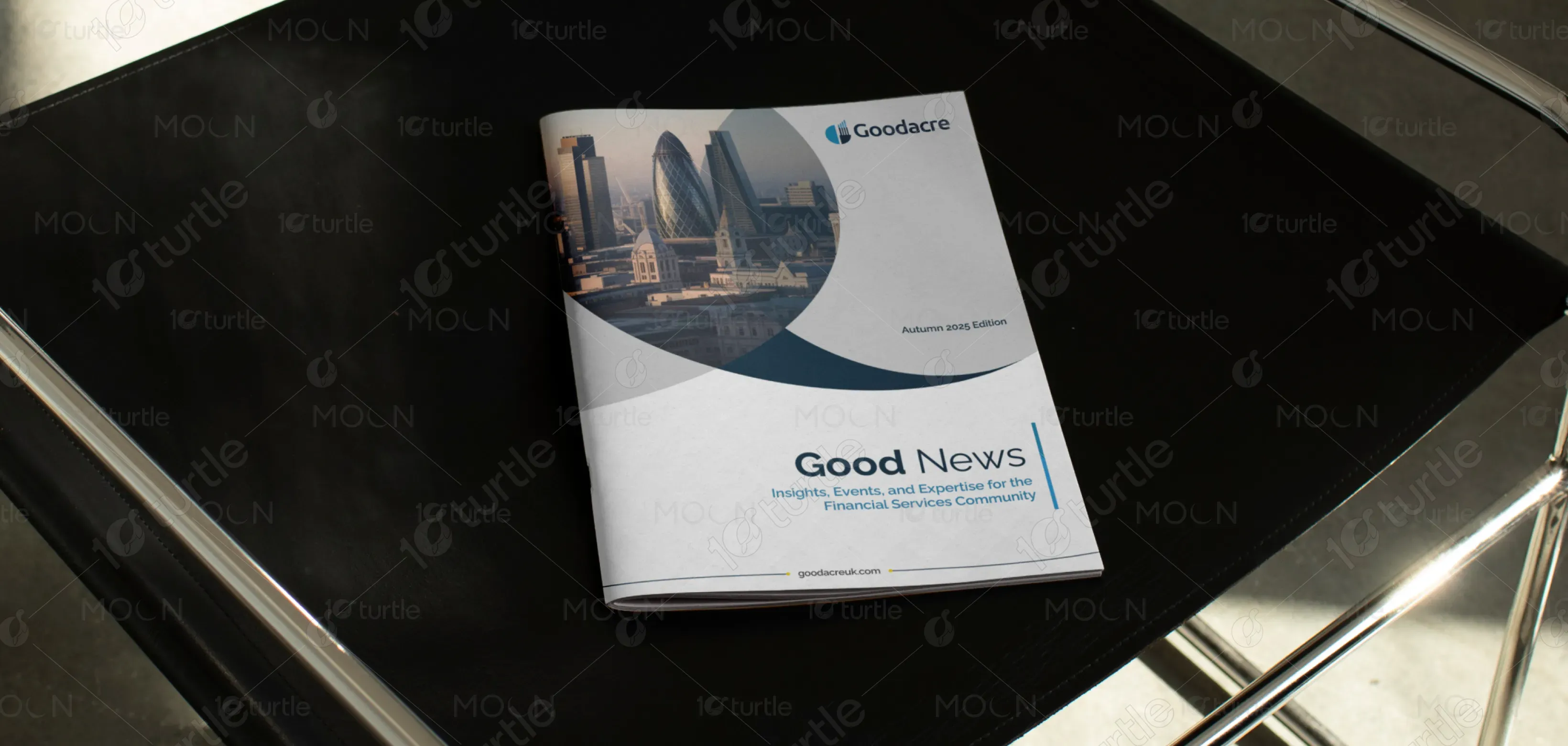
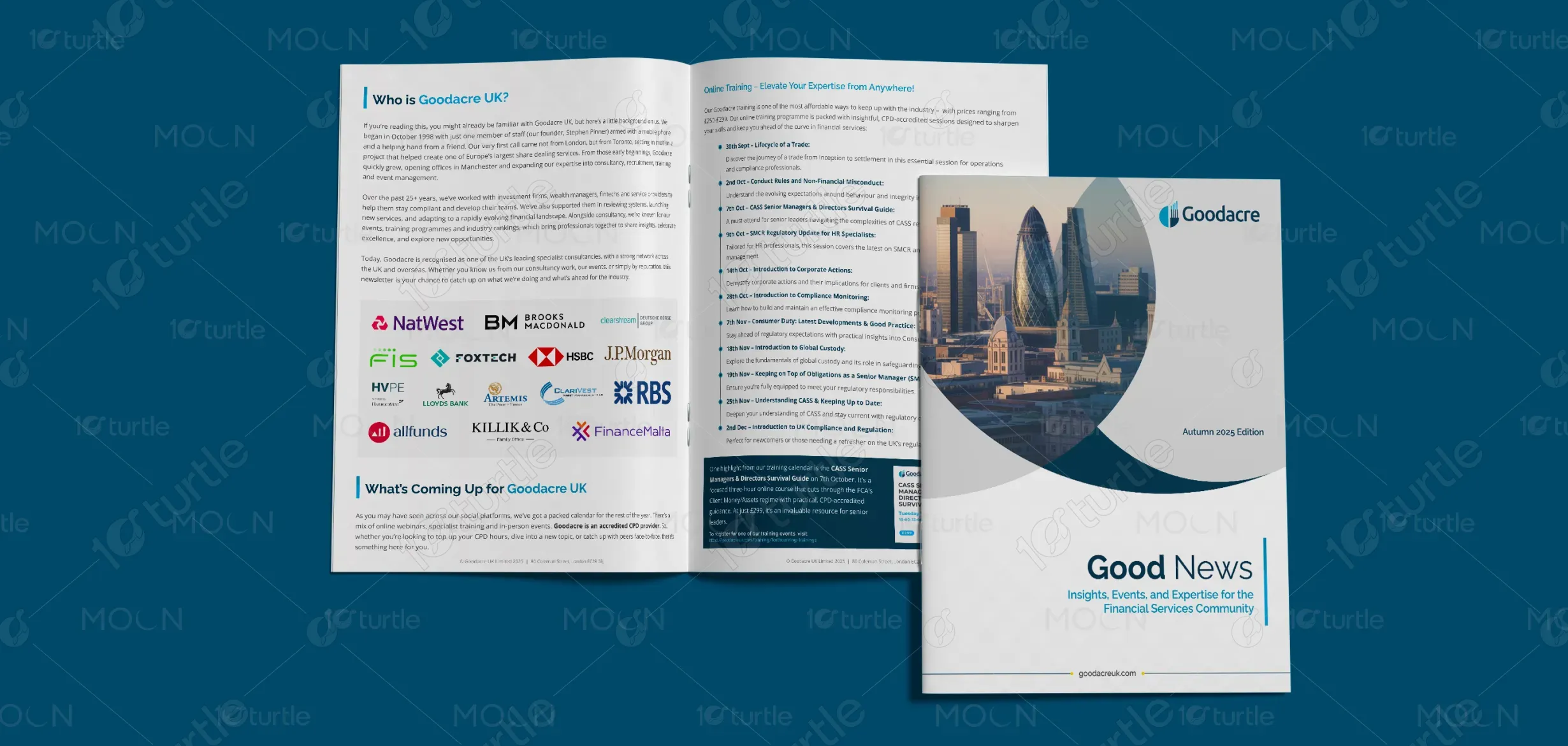
This newsletter serves as Goodacre UK’s primary thought-leadership and engagement tool for the financial services community. It communicates upcoming events, training opportunities, industry insights, and editorial content in a single cohesive publication. Positioned within the financial consultancy and professional services sector, the design supports Goodacre’s role as a trusted industry connector—bringing together compliance, regulation, education, and networking in a clear, authoritative format.
Industry
Finance, Legal & InsuranceWhat we did
Newsletter DesignGraphic DesignPlatform
-Financial services audiences are time-poor and often disengage from communications that feel cluttered, overly promotional, or difficult to navigate. Industry newsletters frequently suffer from dense layouts, unclear hierarchy, and inconsistent messaging, resulting in low engagement and missed opportunities. The challenge was to present a high volume of varied content—events, training, editorial, and announcements—without sacrificing clarity, credibility, or reader trust.
The design addresses these challenges through a modular, user-centric layout that prioritizes readability and information flow. Content is broken into clearly defined sections, each with consistent visual cues and spacing. Typography choices emphasize legibility and professionalism, while repetition of layout patterns builds familiarity across pages. Strategic use of headlines, callouts, and visual separators ensures key messages stand out, improving comprehension and encouraging sustained engagement across the full newsletter.
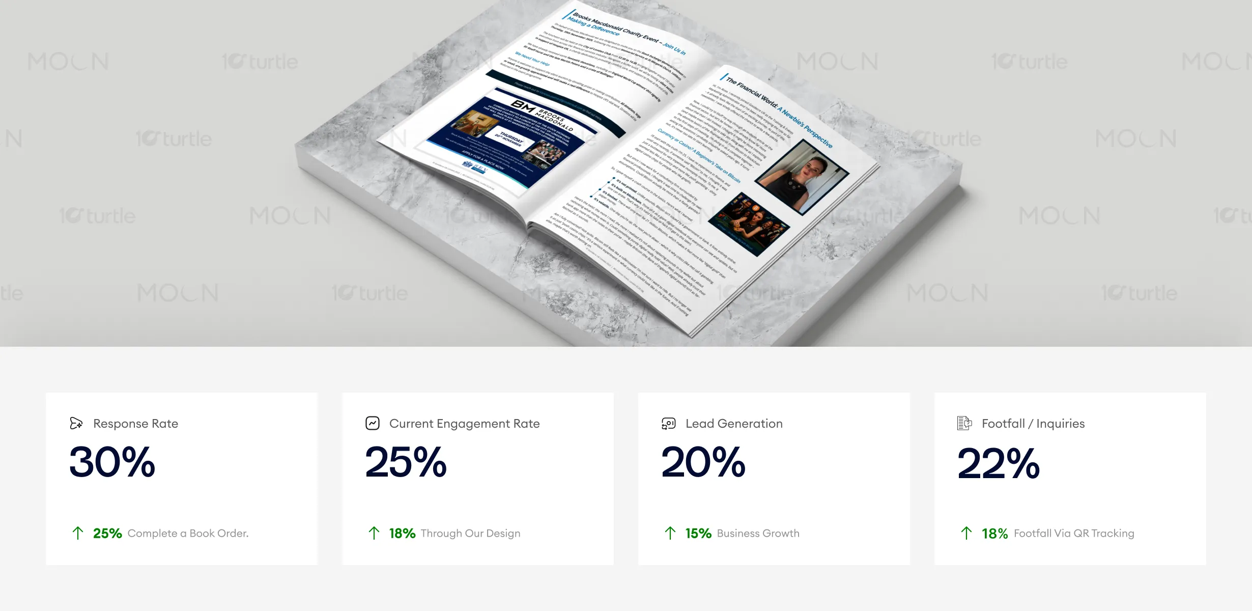
The newsletter’s structured, editorial-driven design effectively balances accessibility with authority. Its clear hierarchy and professional color palette enhance readability, which leads to better engagement and more responses. This design is optimized for both digital and print consumption, driving increased interest in events and fostering higher levels of lead generation and customer inquiries.
The newsletter design supports Goodacre UK’s long-term vision of being a central, trusted voice within financial services. Built with scalability in mind, the system can adapt to future editions, new content formats, and evolving communication needs. The design reinforces brand consistency across digital and print touchpoints, strengthening recognition and positioning Goodacre as a reliable source of insight, education, and industry leadership over time.

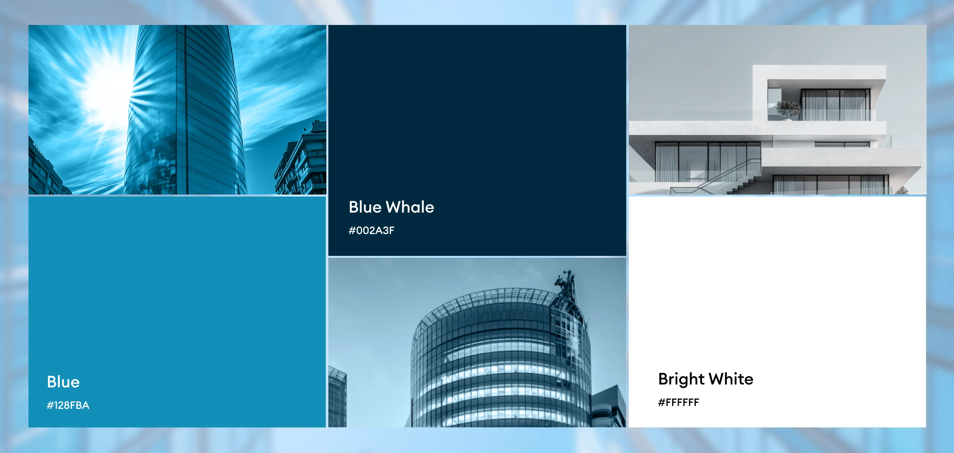
The color palette is understated and professional, reinforcing Goodacre UK’s credibility within a regulated industry. Neutral tones dominate, supporting readability and long-form content, while subtle accent colors are used to guide attention and distinguish sections. The visual language is clean and editorial, avoiding unnecessary decoration in favor of clarity, consistency, and functional elegance—ensuring the design performs reliably across screens, devices, and print formats.