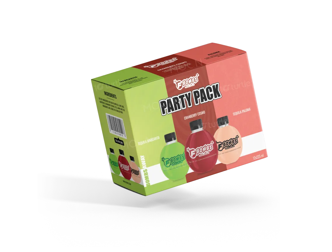
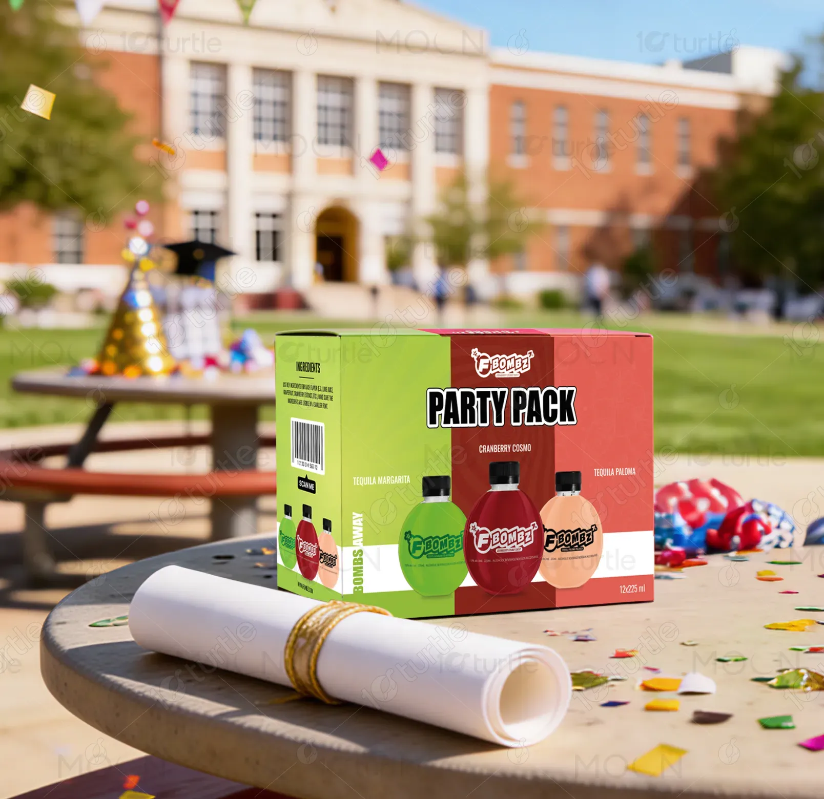
The design uses a three-color segmented layout to visually represent the product variety while maintaining a cohesive brand presence. Bold, high-contrast typography communicates the product name and variant clearly, supported by bottle imagery that reinforces flavor recognition at a glance. The composition balances visual energy with structured hierarchy—brand mark at the top, product name centered, and variants below—ensuring clarity on both retail shelves and digital platforms. The overall direction is vibrant, youthful, and consumer-friendly.
Packaging Design
Graphic Design
Industry
Food, Beverage & Hospitality
Tools we used


Project Completion
2025
Key Market
Global
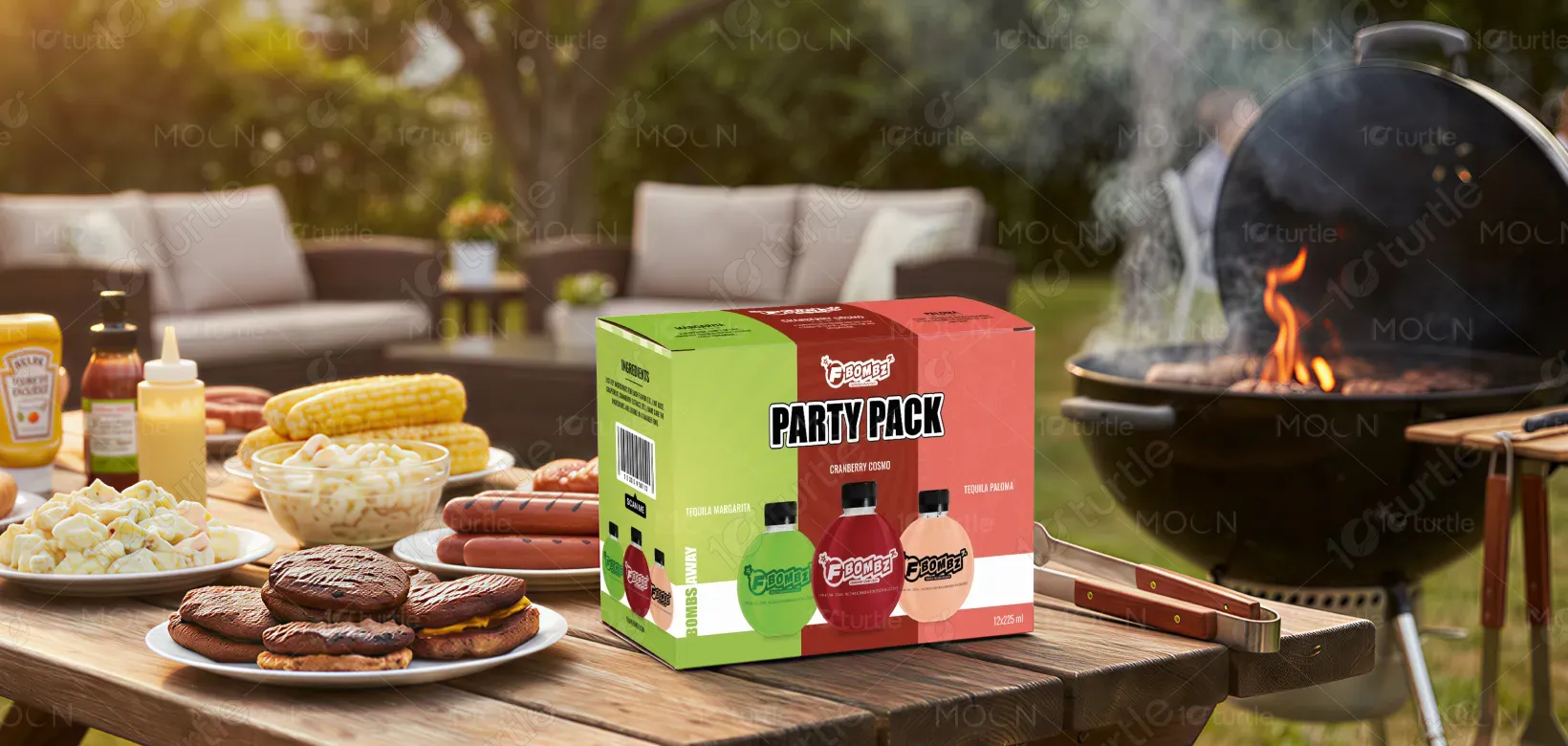
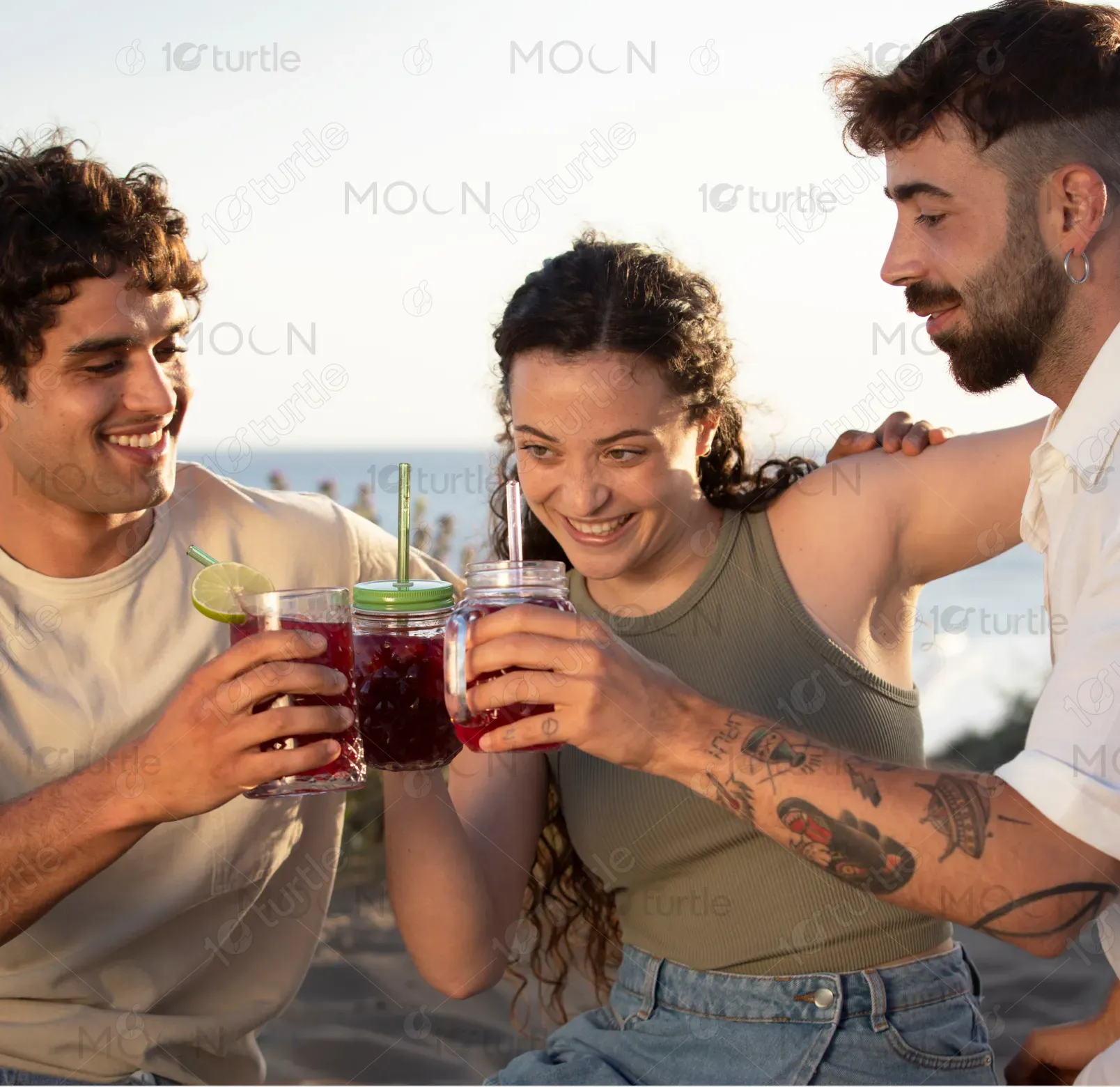
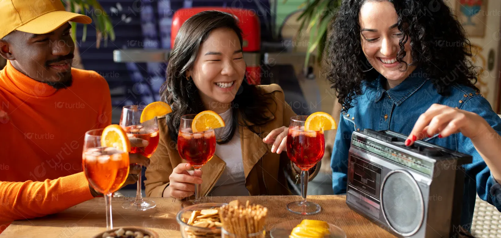
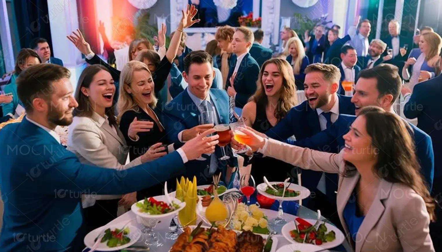
This packaging design represents a ready-to-drink cocktail assortment marketed as a convenient “Party Pack.” Its primary purpose is to attract on-the-go social consumers—from party hosts to casual drinkers—seeking variety without preparation. Within the growing RTD alcohol category, the design positions the product as fun, shareable, and easy to consume. The visible flavor assortment, compact form factor, and lifestyle-driven branding support both impulse purchases and planned social buying.
Industry
Food, Beverage & HospitalityWhat we did
Packaging DesignGraphic DesignPlatform
-RTD alcohol brands often struggle with shelf visibility, flavor differentiation, and communicating convenience in a crowded, color-heavy retail environment. Without clear messaging, consumers may overlook product benefits or fail to understand what the package contains, reducing purchase intent. Additionally, multi-flavor packs can appear confusing if visual hierarchy is poorly managed, impacting brand clarity and perceived value.
The packaging addresses these issues through color-coded segmentation for instant flavor recognition and a straightforward product title that communicates intent (“Party Pack”). Prominent bottle visuals eliminate ambiguity about form and consumption style. Flavor names are placed clearly beneath each bottle, supported by consistent iconography, typography, and spacing to avoid confusion. The use of clean information panels, scannable barcode areas, and ingredient organization enhances shopper usability and aligns with retail requirements.
By refining the visual hierarchy, simplifying layout structure, and elevating the overall aesthetic to a premium standard, the photobook experience became more intuitive and emotionally compelling. The improved storytelling flow encouraged users to add more pages, spend more time customizing, and complete their orders with confidence. The result was not just faster performance, but deeper engagement — transforming the photobook from a functional product into a keepsake-worthy purchase.
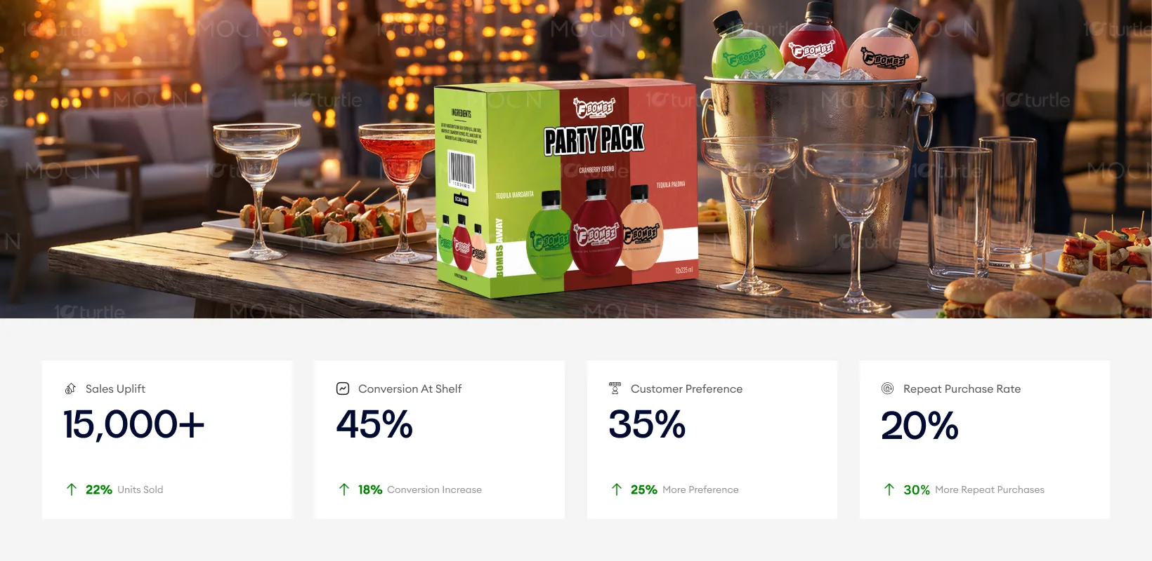
The long-term vision is to establish the product as a recognizable, scalable RTD cocktail brand that thrives across retail, event, and hospitality channels. The design supports future line extensions through modular flavor colorways and replicable layouts adaptable to cans, bottles, or mixed packs. As the product expands, consistent visual language will strengthen brand recall and help the packaging operate effectively across e-commerce, POS displays, and promotional materials.
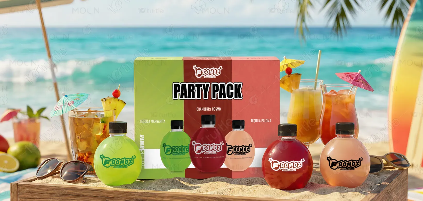
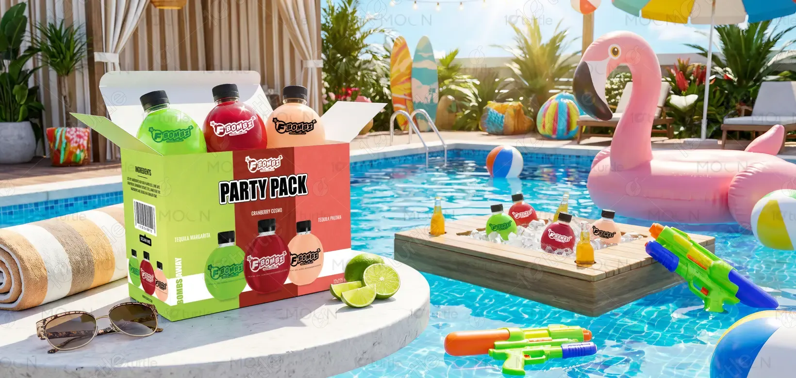
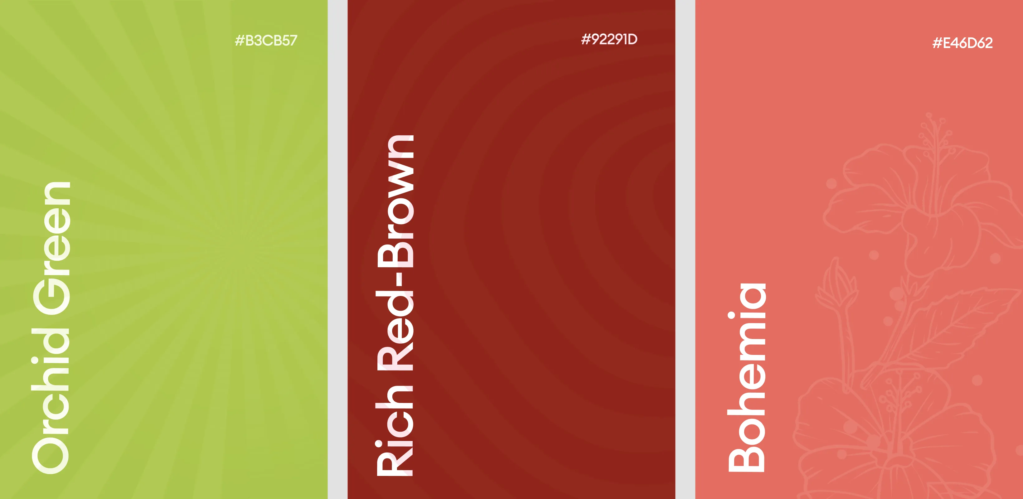
The palette features three distinct hues—lime green, cranberry red, and blush peach—representing Margarita, Cosmo, and Paloma variants. These colors convey refreshment, fruit-forward flavor cues, and occasion-driven energy. High-contrast white typography ensures legibility across all backgrounds, while black outlines add structure and shelf impact. Subtle background patterns enhance depth without compromising readability. The visual language is playful yet organized, supporting fast recognition, intuitive navigation, and strong brand cohesion across formats.