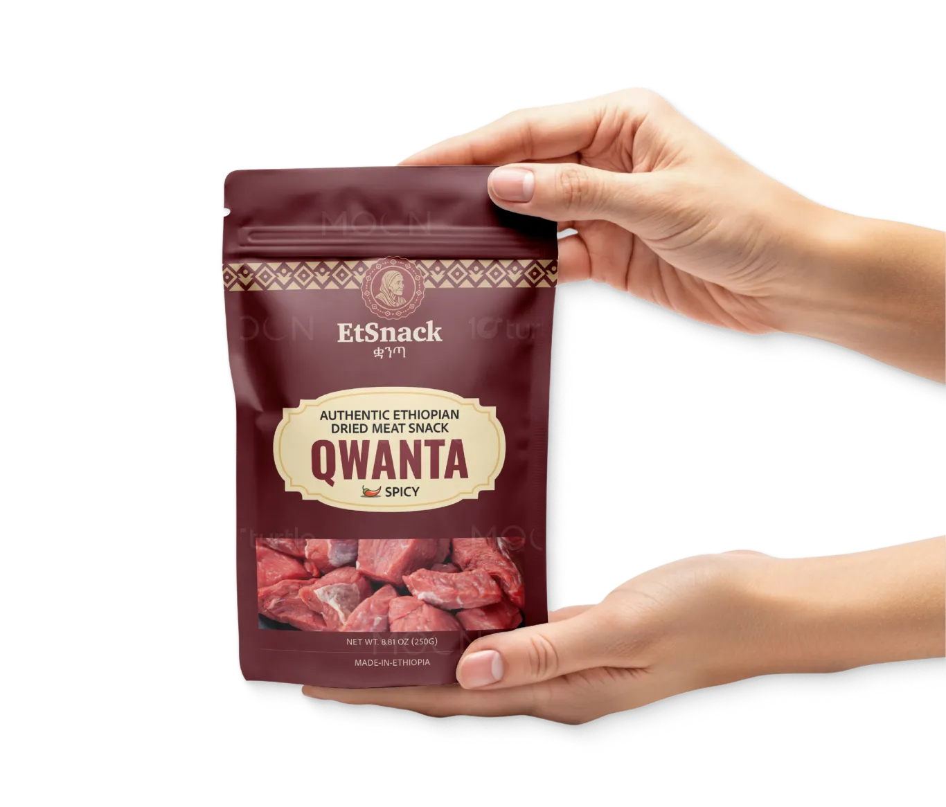
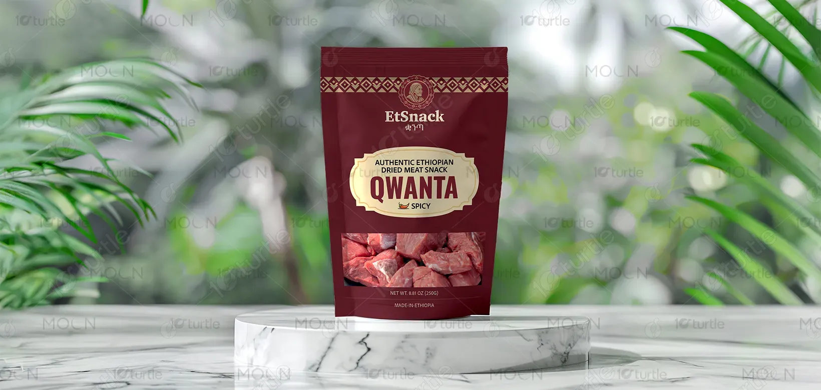
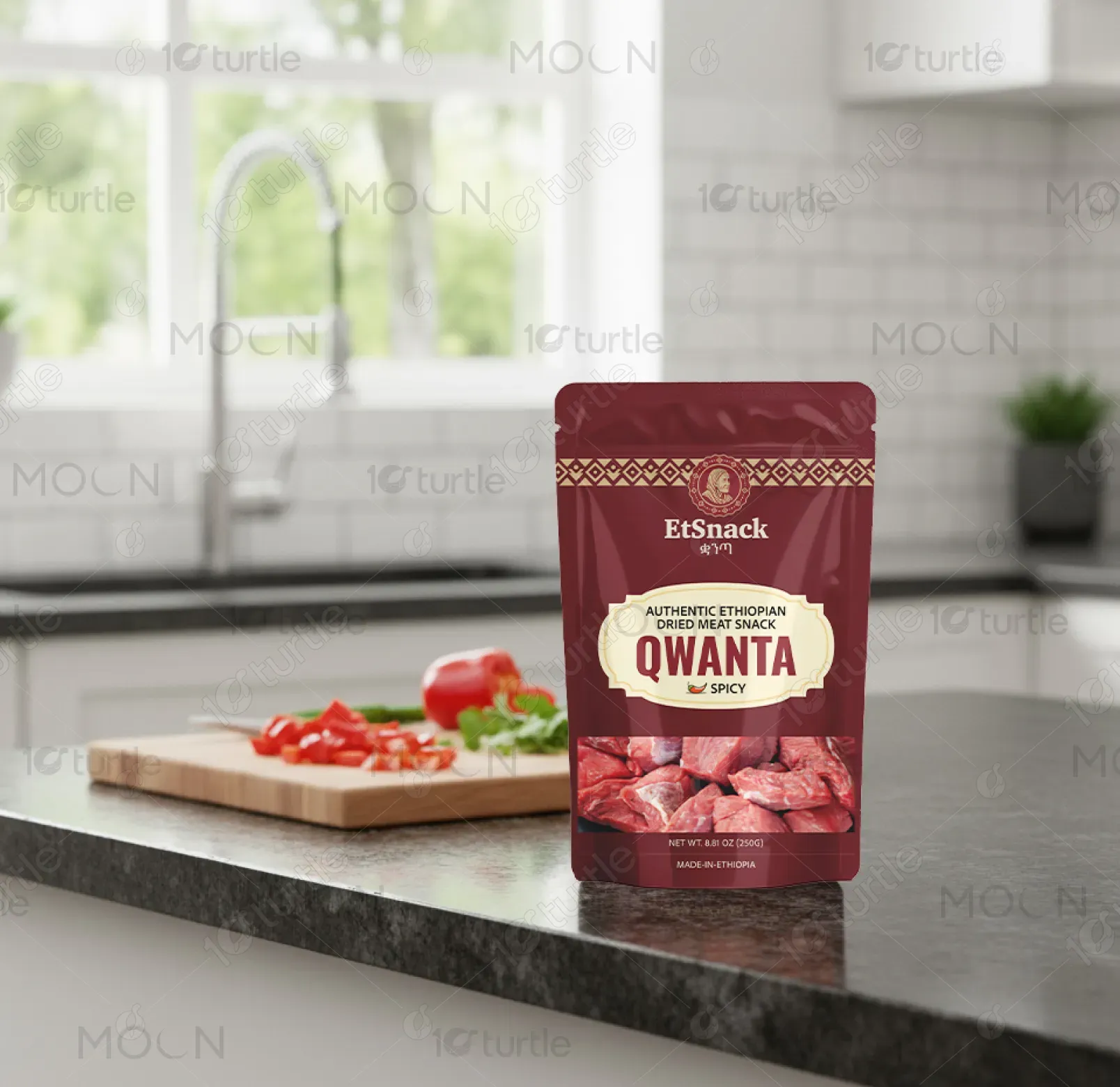
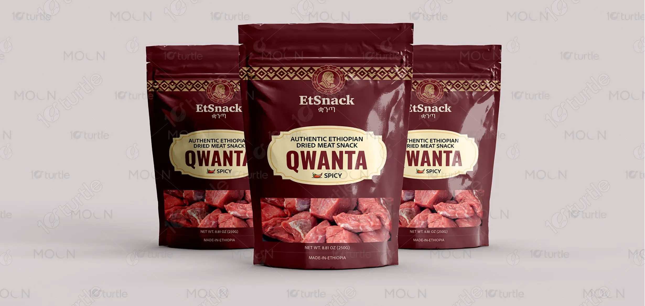
The EtSnack packaging embraces a vibrant yet authentic Ethiopian aesthetic, blending traditional cultural motifs with a bold modern layout. The design highlights “QWANTA” with clarity, ensuring instant recognition while maintaining visual harmony through earthy tones and red accents representing spice and warmth. The minimalist typeface and cultural tagline create an inviting, premium feel. This approach balances heritage and modernity—appealing to global consumers seeking authenticity, flavor, and a genuine connection to Ethiopian culinary tradition.
Packaging Design
Graphic Design
Industry
Food, Beverage & Hospitality
Tools we used


Project Completion
2025
Key Market
Global
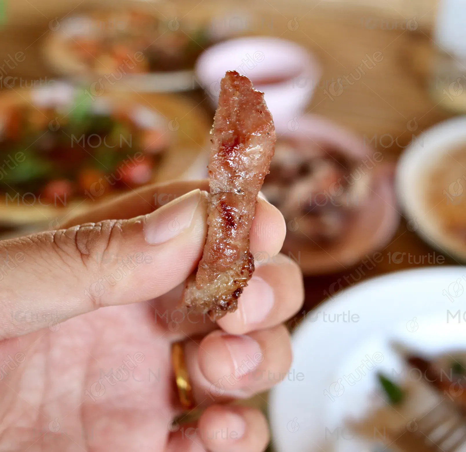
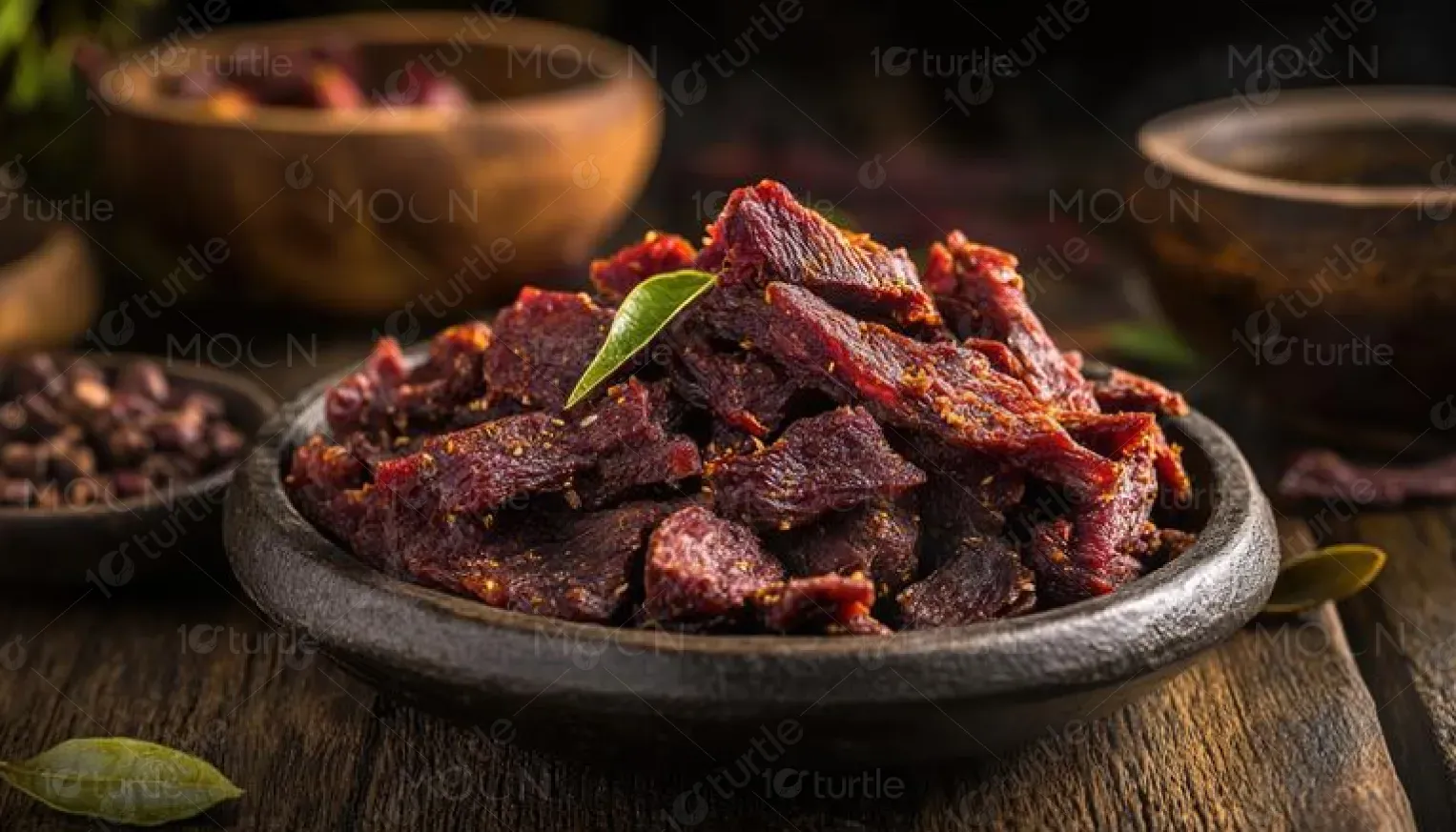
EtSnack’s “QWANTA” is an authentic Ethiopian dried meat snack crafted with traditional spices like berbere and korerima. Designed for both diaspora communities and global snack lovers, it celebrates Ethiopian culture through taste and storytelling. The packaging combines convenience, heritage, and bold flavor, positioning it as a high-protein, preservative-free alternative to generic meat snacks. With clear labeling and warm, inviting visuals, it captures the essence of Ethiopia—making every bite a cultural experience for conscious, adventurous consumers.
Industry
Food, Beverage & HospitalityWhat we did
Packaging DesignGraphic DesignPlatform
-The key challenge was creating packaging that communicates authenticity without alienating non-Ethiopian consumers unfamiliar with the culture. Many ethnic snack brands struggle with balancing local identity and global appeal—either appearing too traditional or too generic. In the case of Ethiopian food, limited global recognition of ingredients like berbere or mitmita makes it harder to attract new audiences. The goal was to design a product that feels premium, understandable, and emotionally resonant across diverse markets.
The design bridges cultural richness with modern retail appeal. It uses clear typography and clean layout to ensure readability while featuring traditional Ethiopian patterns and color cues that symbolize spice, heritage, and warmth. The storytelling element—“Taste Ethiopia. Share the Culture.”—builds emotional connection and brand trust. Nutritional clarity and minimalistic icons enhance consumer confidence, while the logo placement and bold “SPICY” tag ensure shelf visibility. The result: a culturally authentic yet globally approachable product identity.
EtSnack envisions QWANTA as more than a snack—it’s a cultural ambassador. The long-term goal is to expand globally as a symbol of Ethiopian pride, connecting people through authentic taste experiences. The design aims to set a benchmark for African snack branding, merging heritage with innovation. Future iterations may adapt to different flavor lines, regional markets, and eco-friendly packaging, maintaining the same mission—to share Ethiopia’s culinary soul with the world in a modern, premium format.
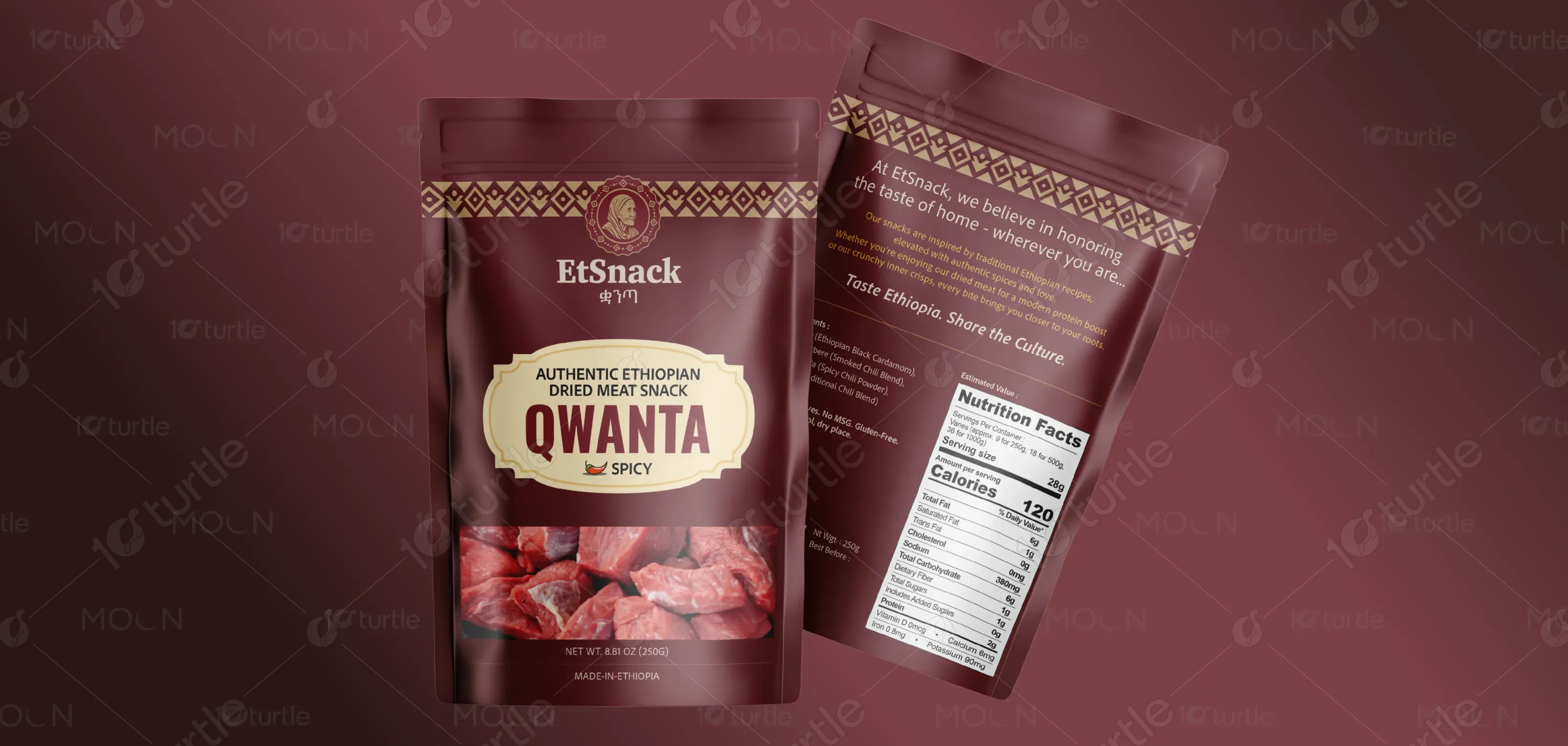
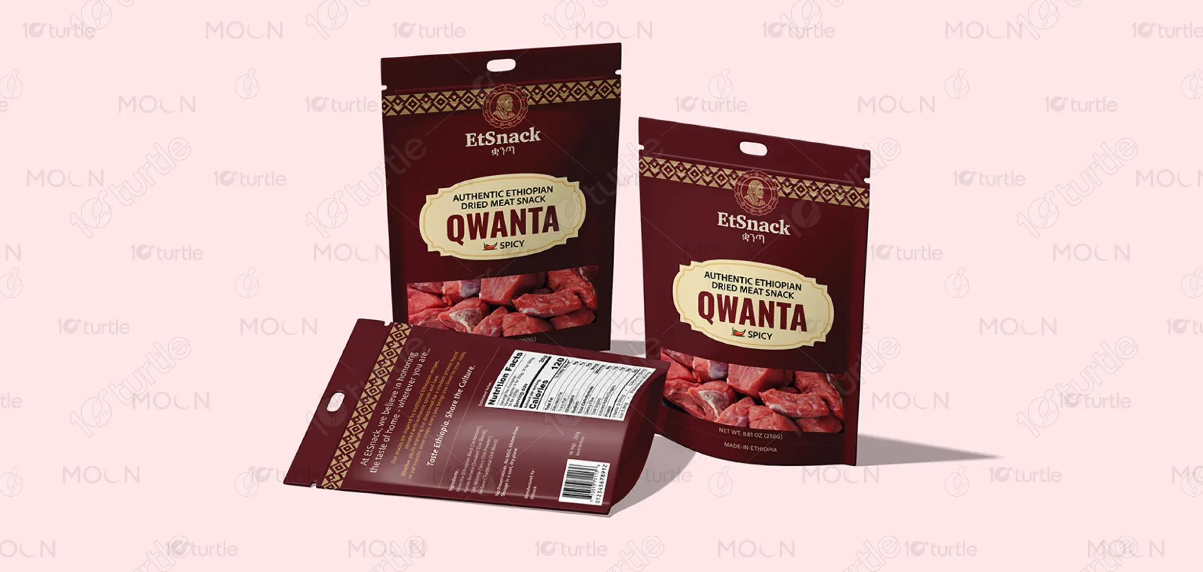
The palette centers on earthy reds, deep browns, and warm yellows, symbolizing spice, authenticity, and natural ingredients. The red accent embodies heat and passion, aligning with the “Spicy” flavor profile, while neutral tones ground the design in trust and quality. These colors reflect Ethiopian landscapes and culinary warmth, evoking appetite and cultural richness. Together, they create a visually balanced, energetic, and culturally resonant identity that reinforces EtSnack’s brand promise—bold, natural, and proudly Ethiopian.