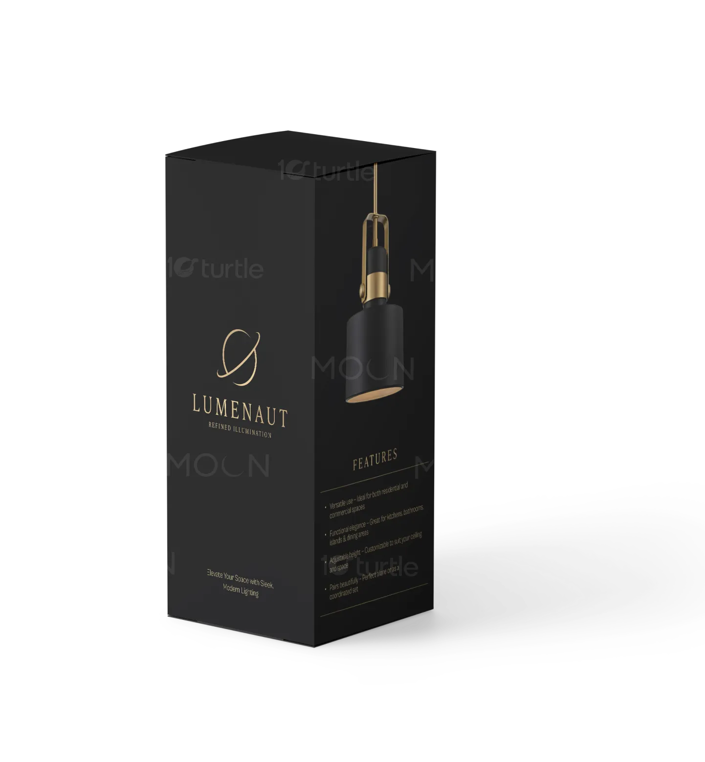
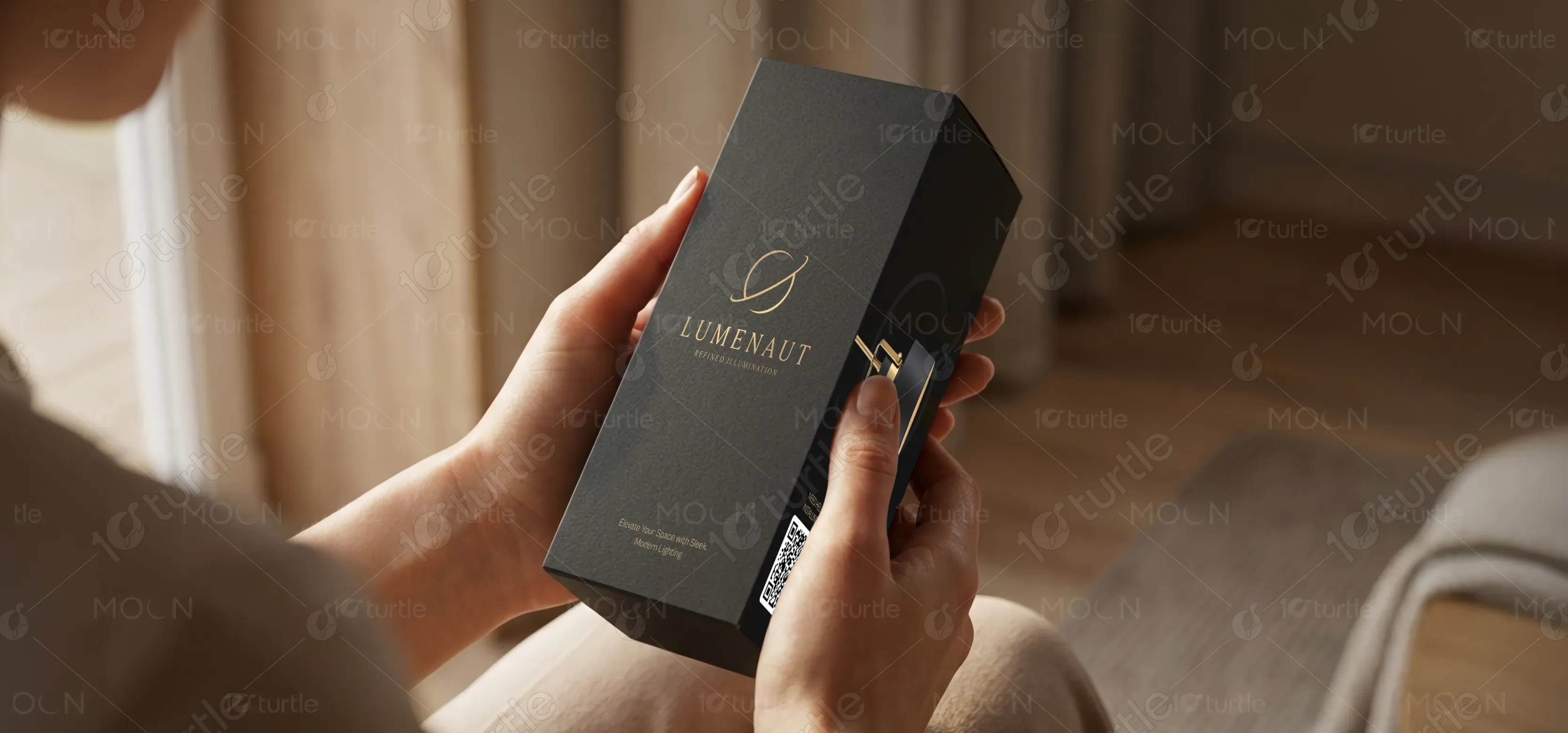
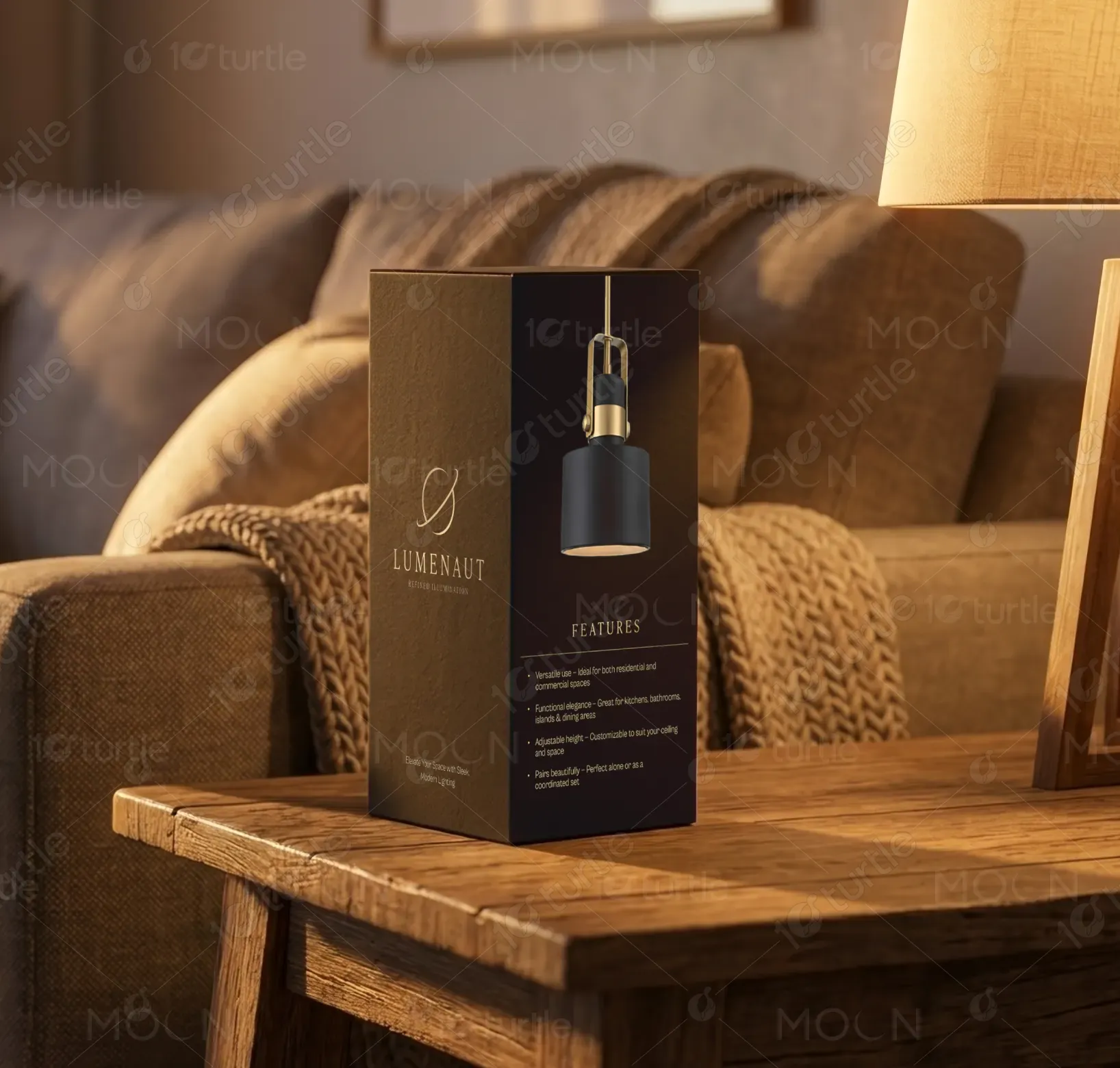
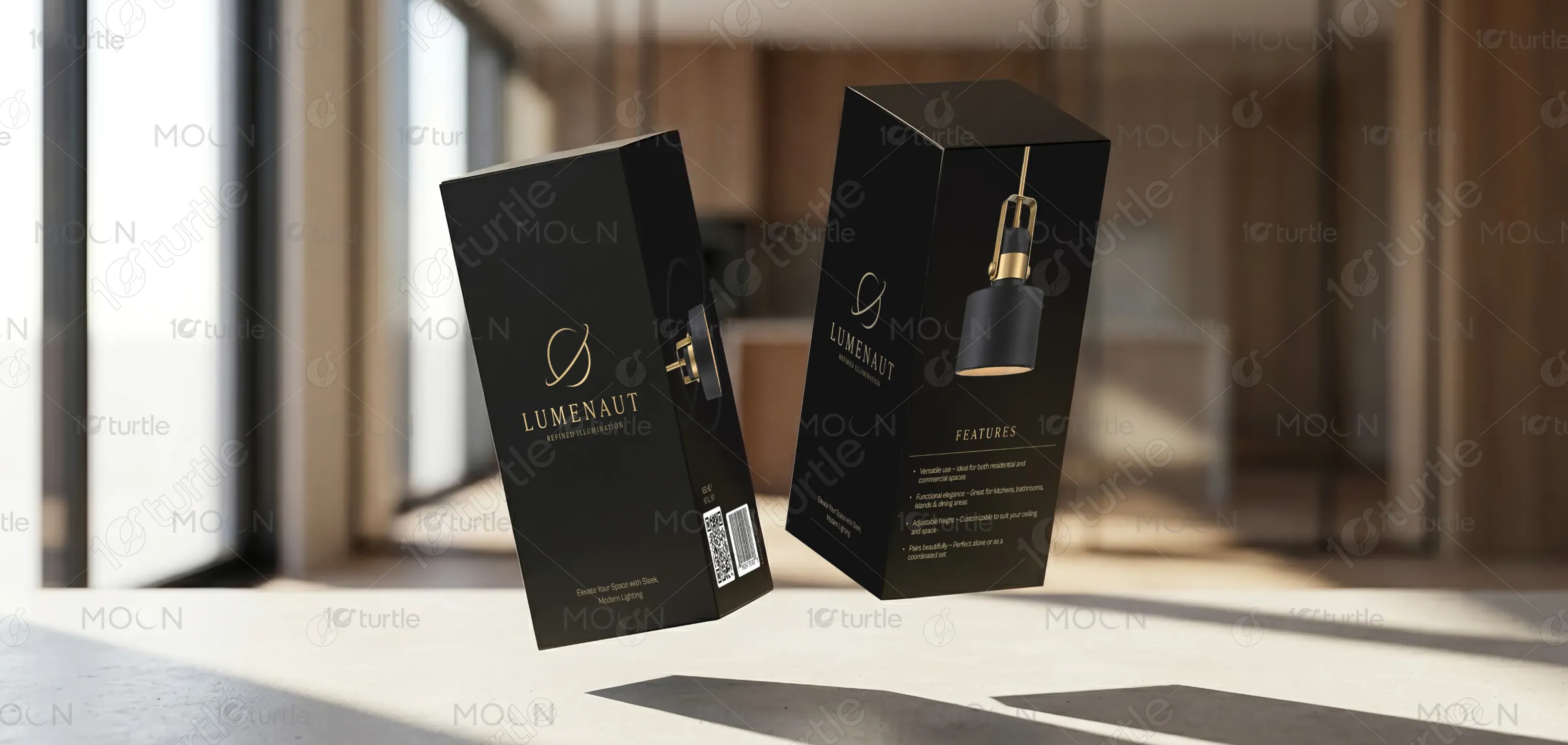
The design adopts a premium, minimalistic approach that emphasizes sophistication and clarity. A dark matte base combined with gold-accent typography creates a strong sense of luxury and refinement. The layout is clean and structured, allowing the product visualization to stand out while maintaining balance with the brand identity. Subtle spacing, elegant typography, and a focused hierarchy guide the viewer’s attention seamlessly from logo to product to features, ensuring both aesthetic appeal and functional communication.
Box Design
Graphic Design
Industry
Consumer Goods & Retail
Tools we used


Project Completion
2025
Key Market
Global
This packaging represents a high-end lighting product designed for modern interiors. Its purpose is to communicate quality, style, and reliability at first glance while protecting and presenting the product effectively. Positioned within the premium home décor and lighting market, the design highlights the brand’s commitment to refined aesthetics and functional excellence. It serves both as a protective container and a visual marketing tool that enhances shelf presence and reinforces brand value.
Industry
Consumer Goods & RetailWhat we did
Box DesignGraphic DesignPlatform
-Many lighting product packages lack visual distinction and fail to communicate quality effectively. Overcrowded layouts, inconsistent branding, and unclear product representation often result in low customer engagement and weak shelf impact. This creates confusion for buyers and reduces perceived value, especially in competitive retail or e-commerce environments where first impressions are critical.
The design resolves these challenges through a clean, user-focused layout and a strong visual hierarchy. By limiting visual clutter and focusing on essential elements—brand identity, product image, and key features—it ensures clarity and quick comprehension. The premium color palette enhances perceived value, while the structured typography improves readability. The design is scalable across different packaging sizes and formats, ensuring consistency across the brand ecosystem.
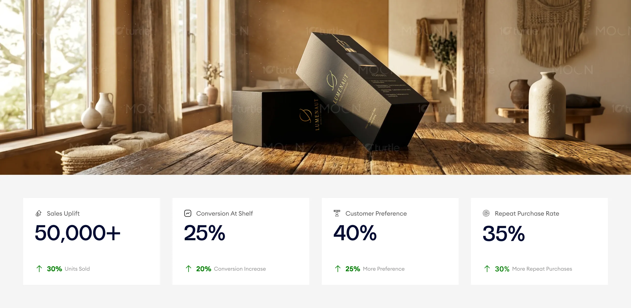
This packaging design performs exceptionally well in communicating luxury and refinement, with the dark matte base and gold accents successfully appealing to a premium customer base. The sophisticated aesthetic has been key in increasing sales and customer preference, while its clean, structured layout enhances shelf conversion. Future improvements could include adding tactile elements or interactive features to further boost repeat purchases and strengthen brand loyalty.
The long-term vision is to position the brand as a leader in refined, modern lighting solutions. This packaging design lays the foundation for a cohesive visual identity that can extend across future product lines, marketing materials, and retail environments. It supports brand recognition, builds trust, and creates a consistent premium experience that evolves with the brand while maintaining its core aesthetic values.
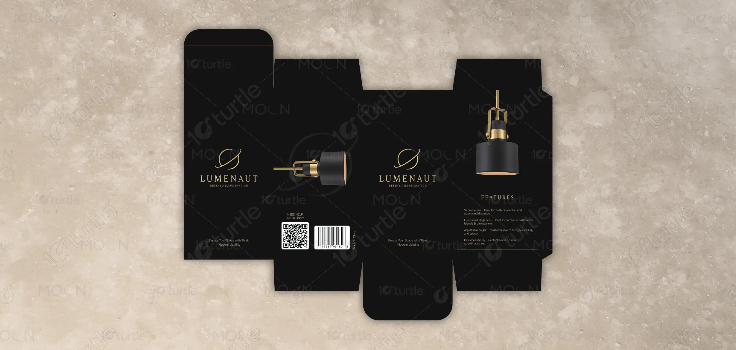
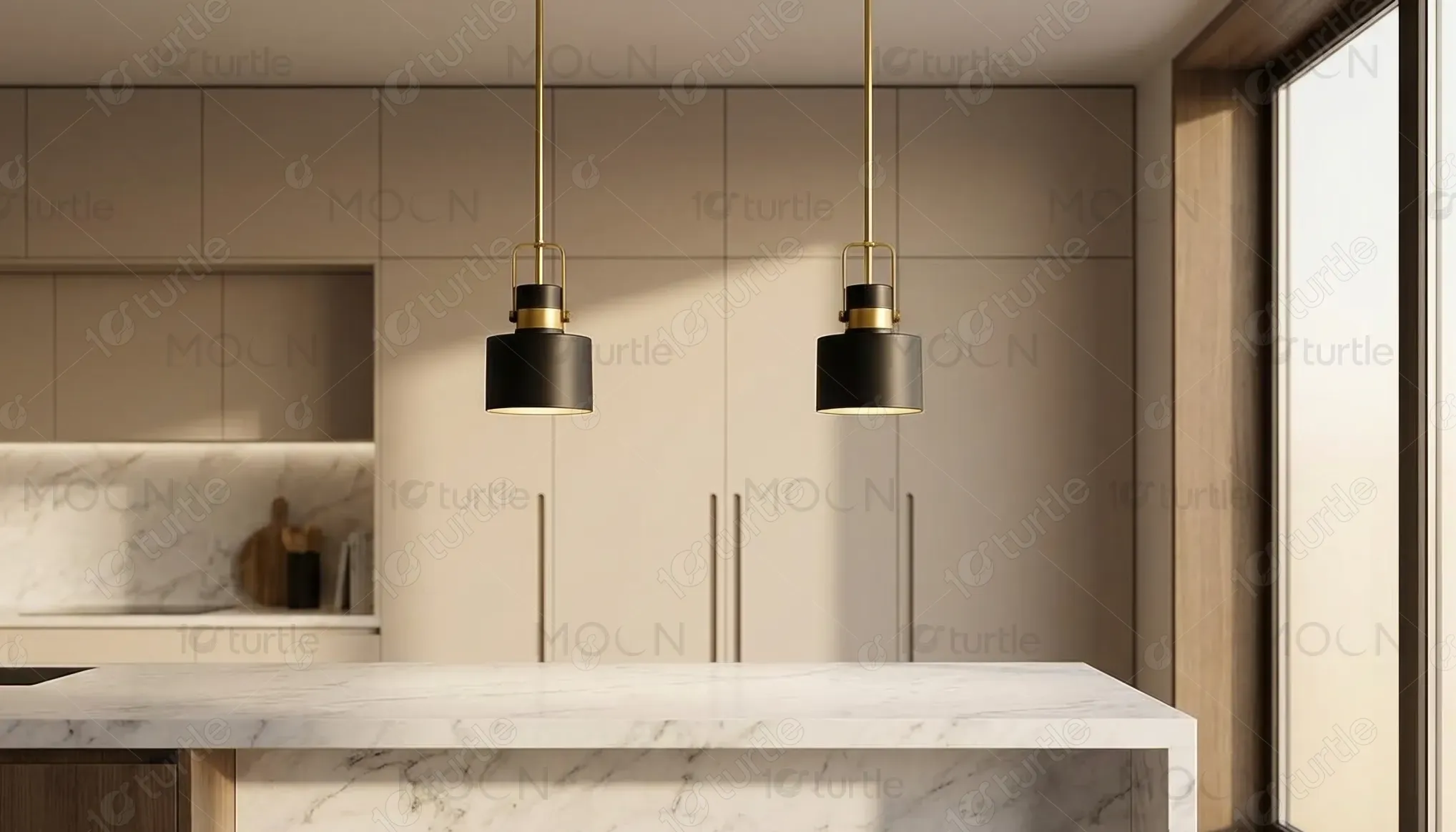
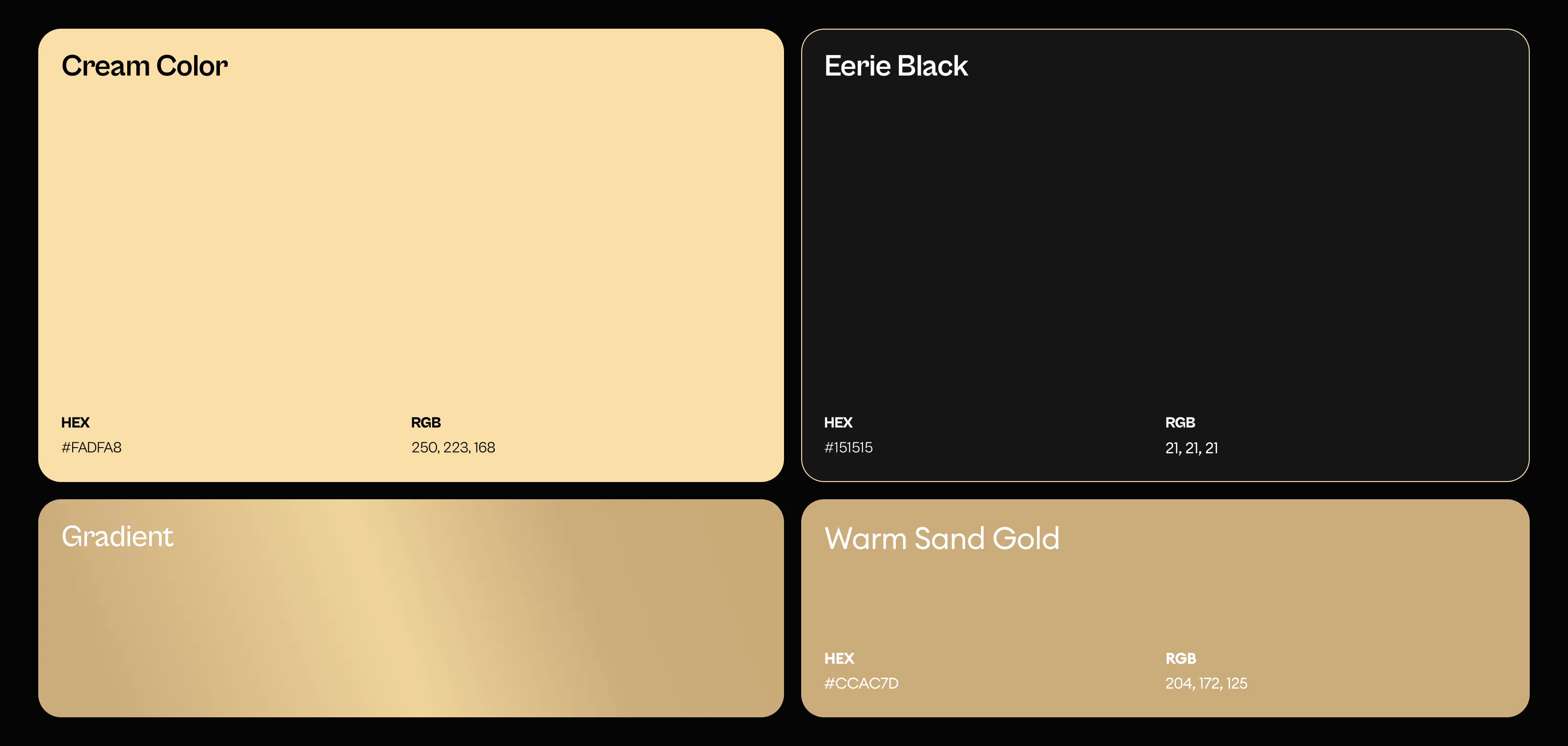
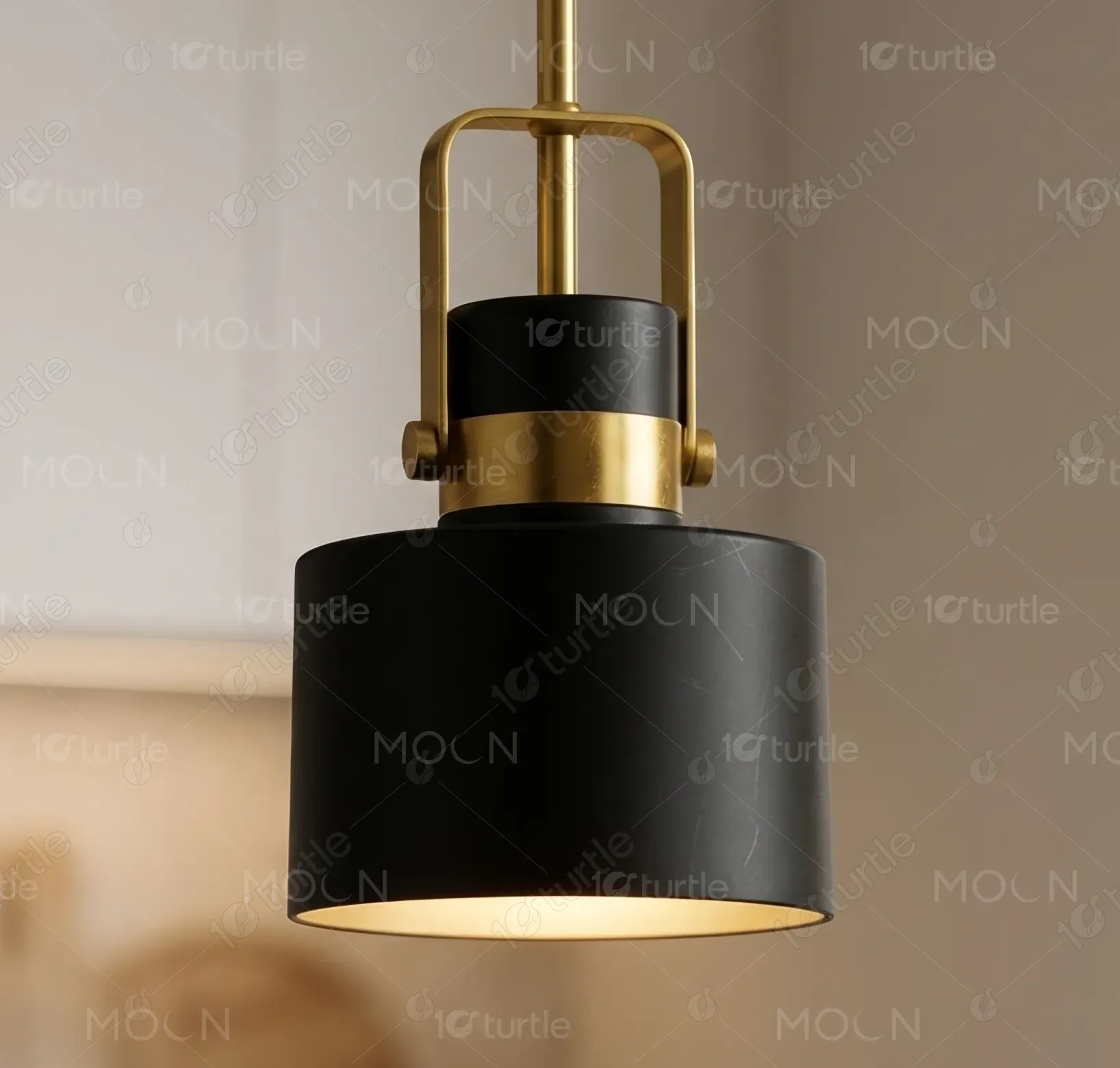
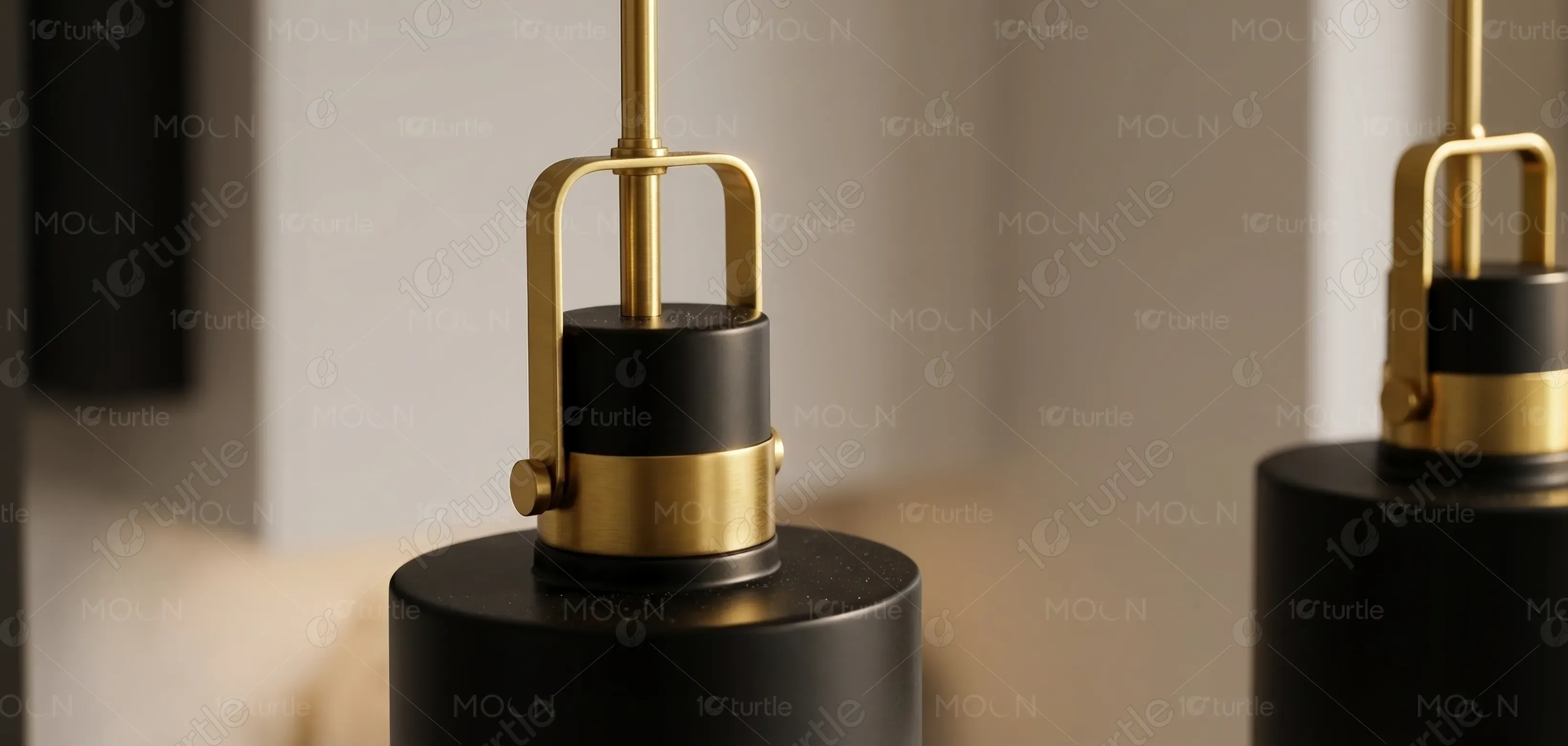
The design utilizes a deep black base paired with warm gold accents to create a sense of elegance and exclusivity. This combination conveys luxury while maintaining modern simplicity. The neutral tones ensure versatility across different environments, while the metallic highlights add visual interest and premium appeal. Supporting elements such as minimal icons, clean typography, and soft lighting visuals reinforce a cohesive and sophisticated visual language that enhances readability and brand recognition.