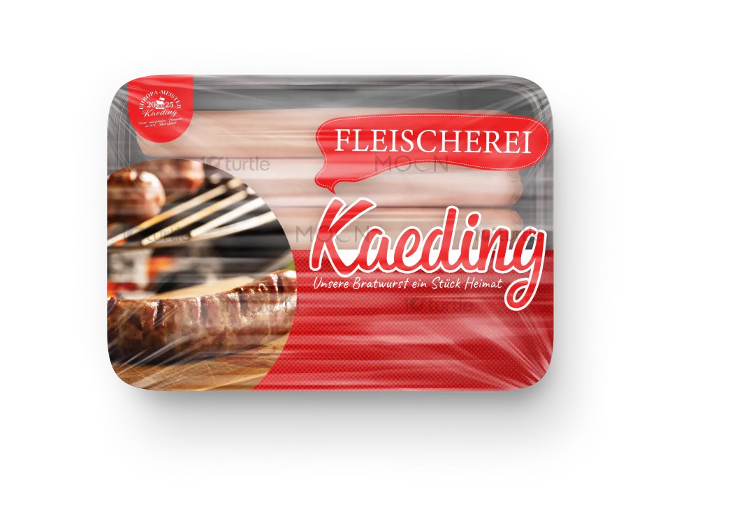
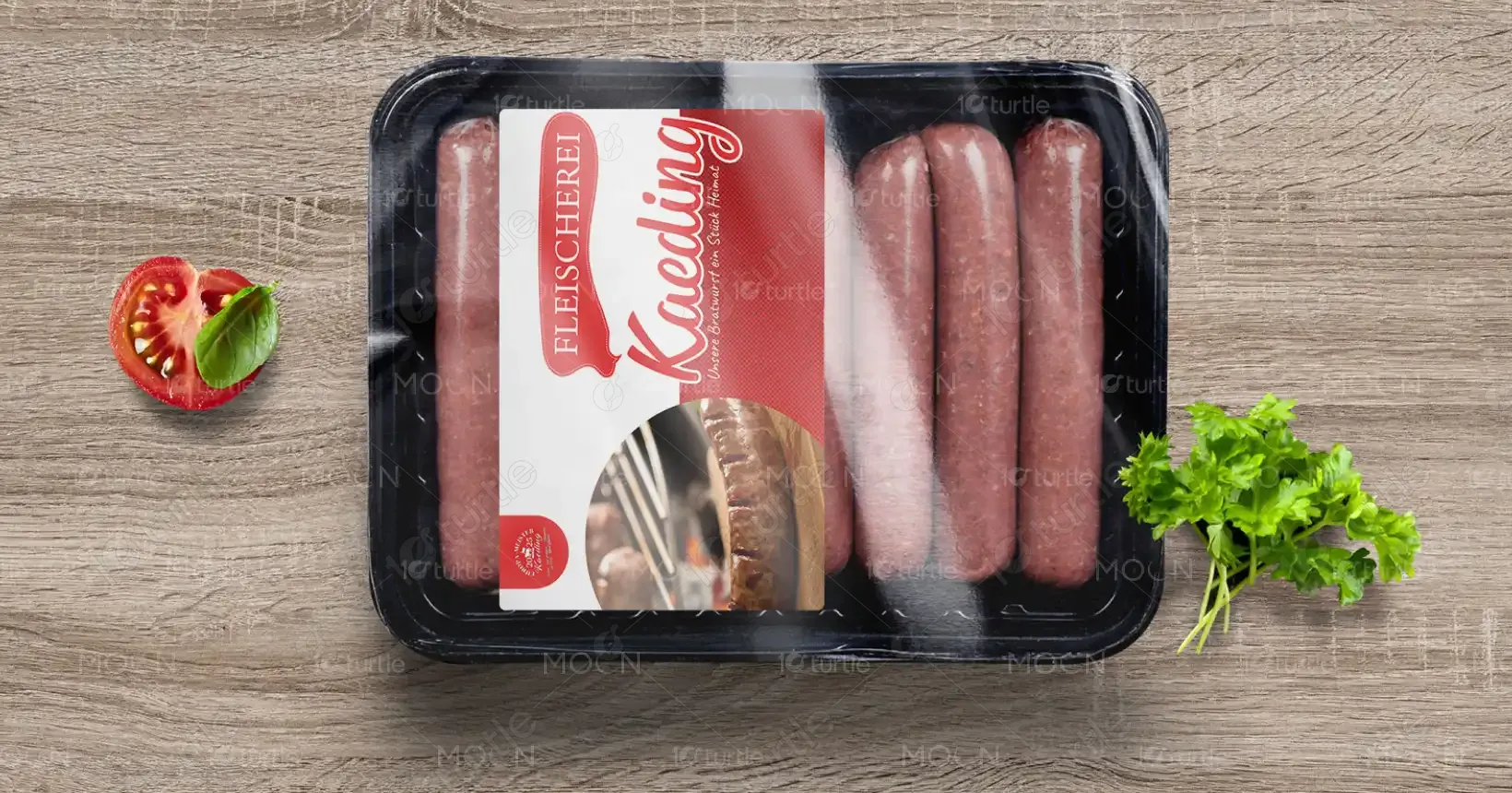
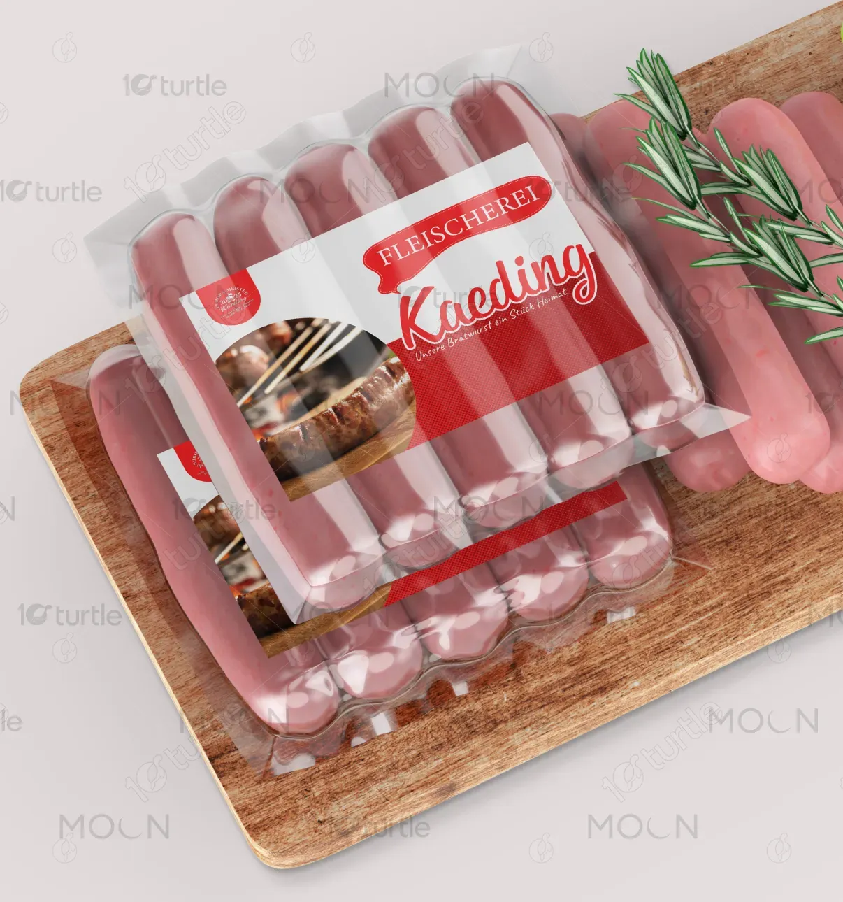
The packaging design for Kaeding – Unsere Bratwurst ein Stück Heimat embraces a warm, rustic aesthetic that conveys authenticity and tradition. The use of textured elements, vintage typefaces, and heritage-inspired iconography reflects a nostalgic connection to regional roots. A clean layout with ample white space elevates the artisanal character while ensuring modern shelf appeal. The overall direction celebrates craftsmanship and familiarity, evoking a comforting sense of “home” while remaining distinctive in a competitive market.
Packaging Design
Graphic Design
Industry
Food, Beverage & Hospitality
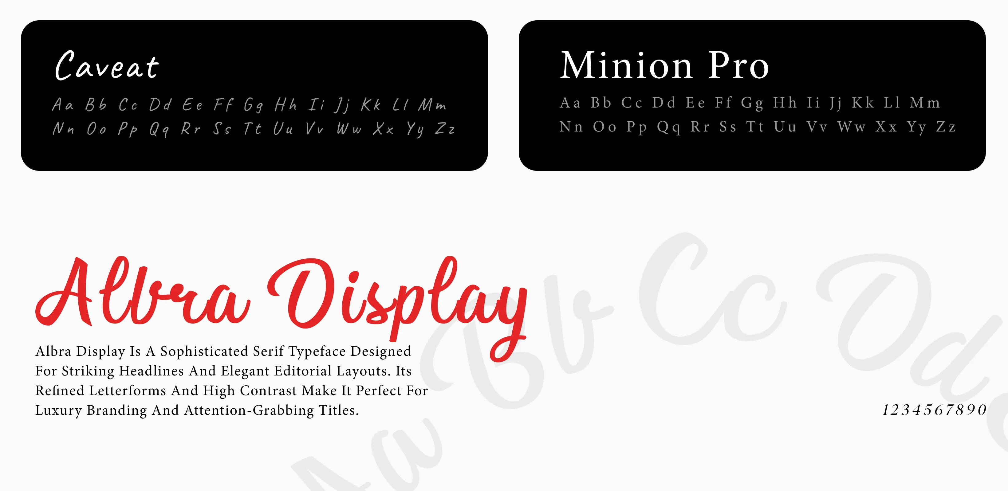
Tools we used


Project Completion
2025
Key Market
Global
This packaging showcases Kaeding’s Bratwurst, a premium sausage rooted in traditional German recipes. Designed to evoke heritage and quality, the packaging balances rustic charm with modern clarity. It targets consumers seeking authentic, locally-inspired food experiences. The prominent slogan “Unsere Bratwurst ein Stück Heimat” (Our Bratwurst – a Piece of Home) captures the emotional pull, while the artisanal aesthetic reinforces its handmade quality. It stands out for its nostalgic feel, premium cues, and cultural authenticity.
Industry
Food, Beverage & HospitalityWhat we did
Packaging DesignGraphic DesignPlatform
-In the crowded sausage and meat product sector, packaging often fails to distinguish between mass-produced goods and artisanal quality. Many traditional products lose consumer trust due to generic, uninspired visuals. The challenge was to bridge this gap—how do you visually communicate heritage and craftsmanship without seeming outdated? Furthermore, ensuring cultural relevance without alienating a broader audience was crucial. The design needed to feel authentic yet accessible in today’s diverse retail environment.
The Kaeding design uses strategic visual storytelling: heritage fonts, earthy textures, and nostalgic symbols (like classic emblems and traditional wording) communicate authenticity at a glance. The restrained color palette and clean composition avoid clutter, giving prominence to the product’s message. This approach differentiates the product from competitors by visually reinforcing quality and emotional resonance. It positions the brand as trustworthy, rooted, and premium—without relying on gimmicks.
The long-term vision is to establish Kaeding as a leading heritage food brand that evokes emotional connection and pride in regional culinary tradition. This design is meant to serve as a flexible visual system that can be extended to future product lines, creating consistency and brand recall. As the brand grows, it aims to be a cultural ambassador—bringing “a piece of home” to diverse markets, both local and international.
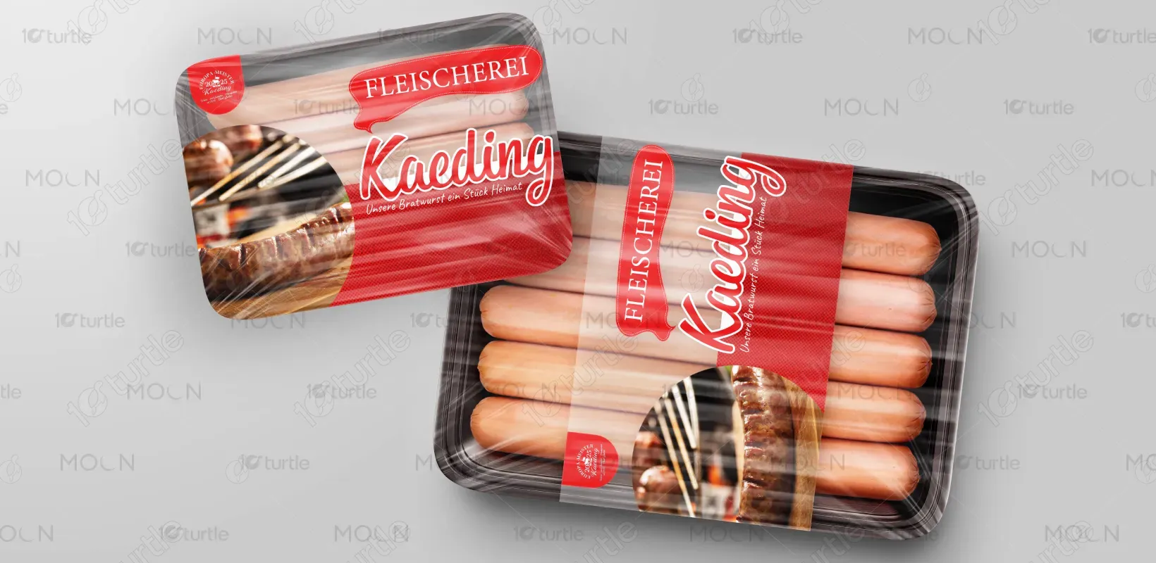
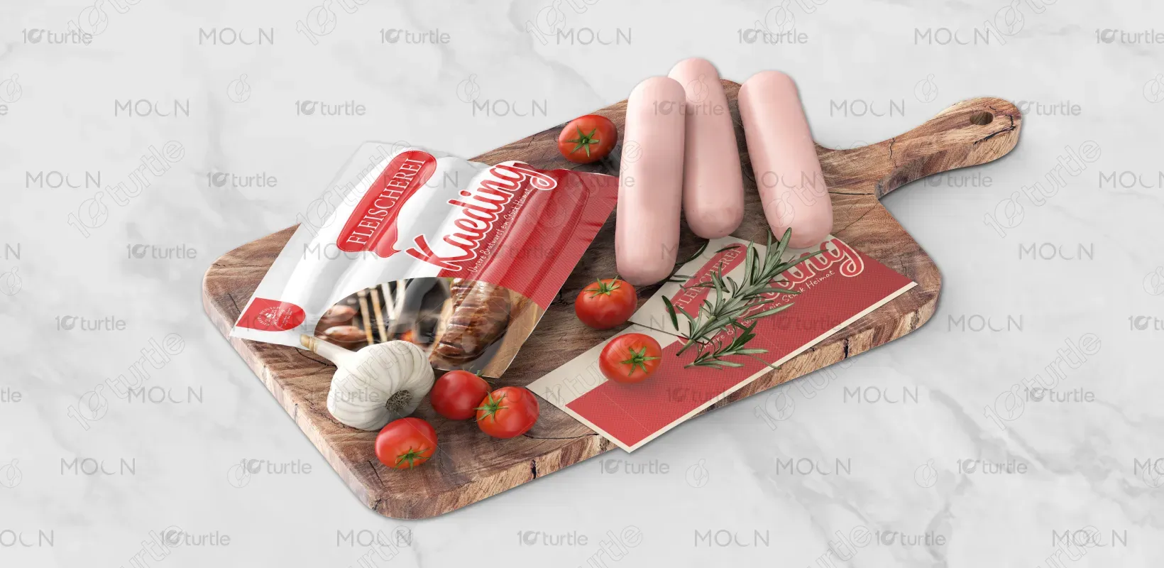
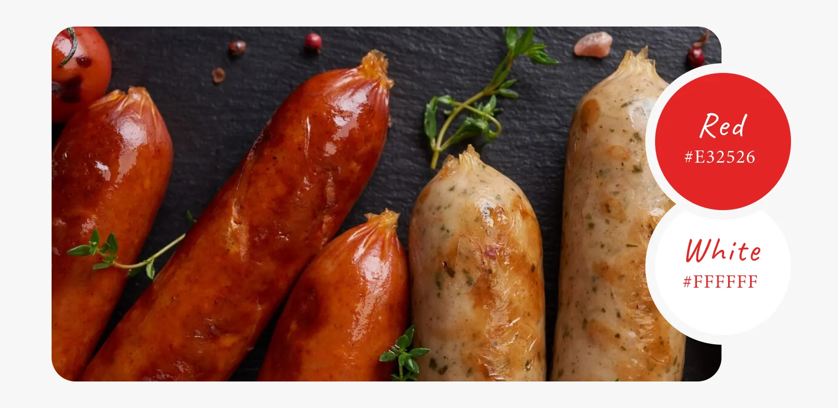
The chosen palette is grounded in warm, earthy tones—muted browns, rustic reds, and creamy whites. These colors reinforce the artisanal, farm-to-table ethos of the product. Brown suggests wood, smoke, and tradition, while red hints at hearty flavor and warmth. The neutral off-white provides clarity and balance, ensuring legibility and cleanliness. Collectively, the palette enhances the emotional tone of heritage, comfort, and culinary honesty—deeply aligning with Kaeding’s brand identity.