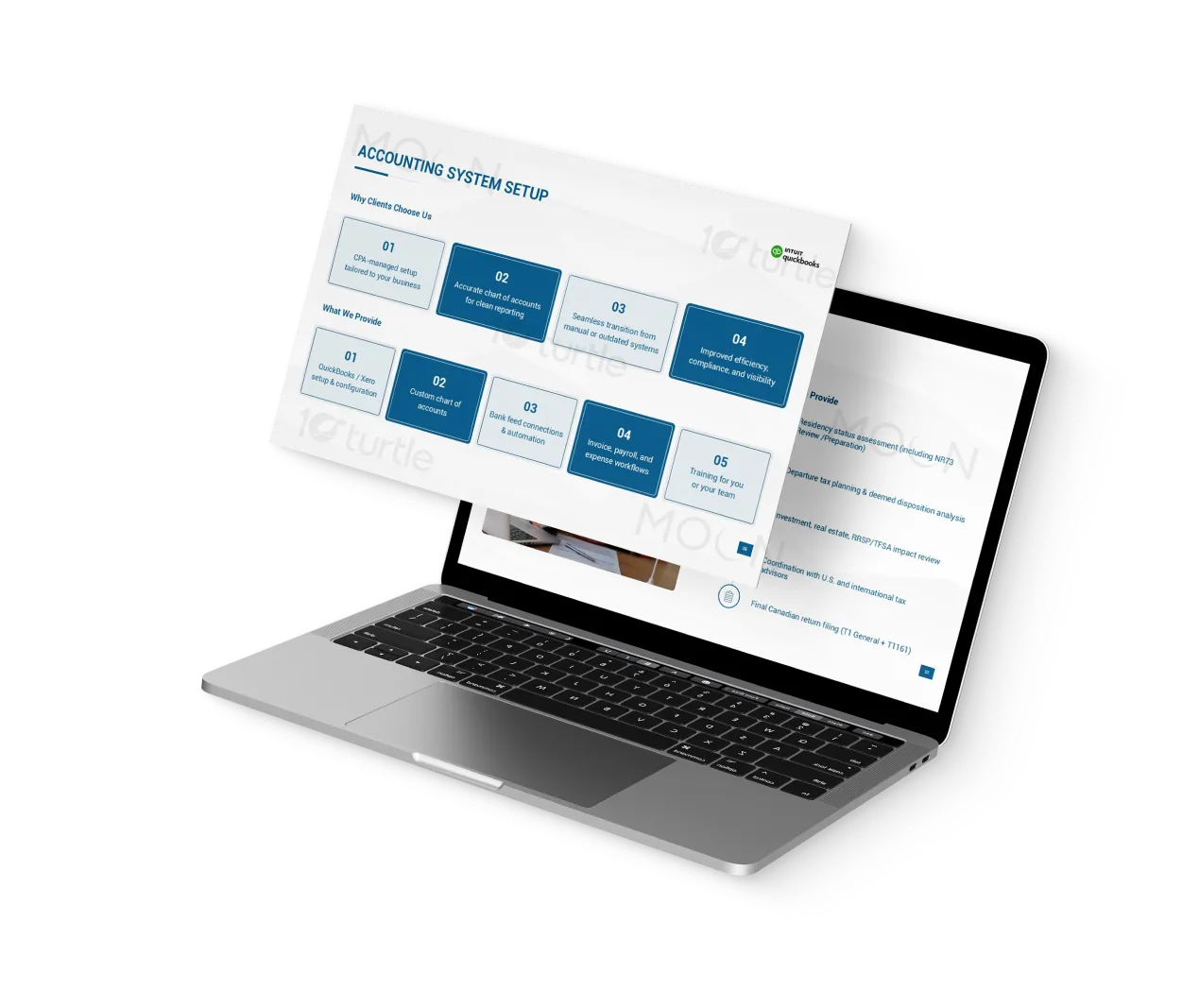
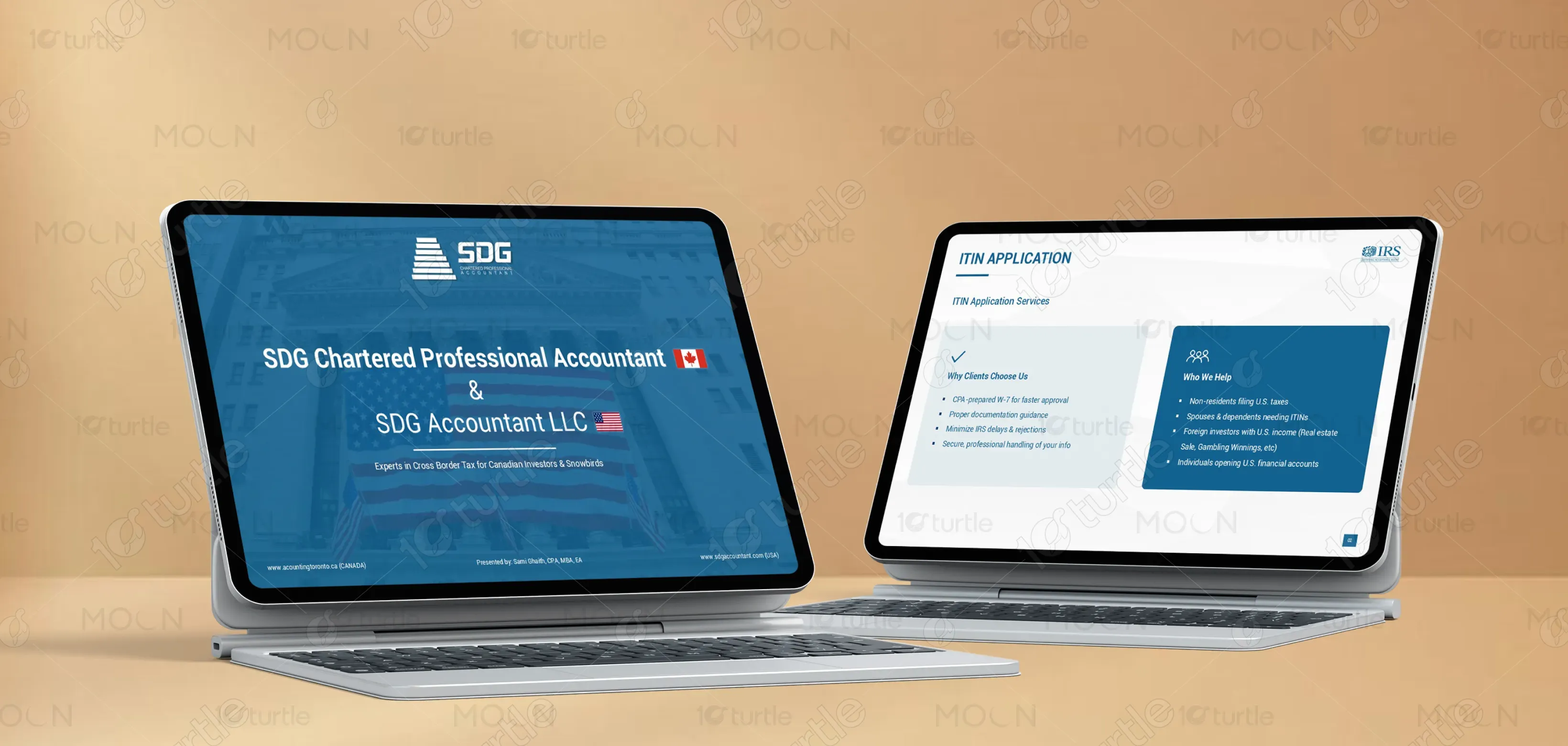
The design follows a clean, corporate layout focused on clarity and trust. Structured sections, bold headings, and minimal typography create strong hierarchy. Neutral tones with strategic highlights emphasize professionalism, while consistent spacing ensures readability across slides. Iconography and categorized content blocks simplify complex services. The visual direction balances financial credibility with modern simplicity, allowing users to quickly grasp offerings, making the deck suitable for both client presentations and professional consultations.
Pitch Deck
Graphic Design
Industry
Finance, Legal & Insurance
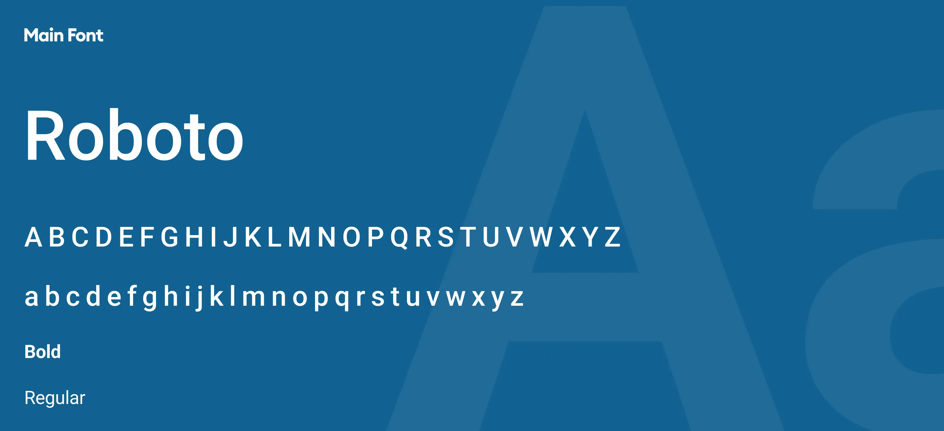
Tools we used


Project Completion
2025
Key Market
Global
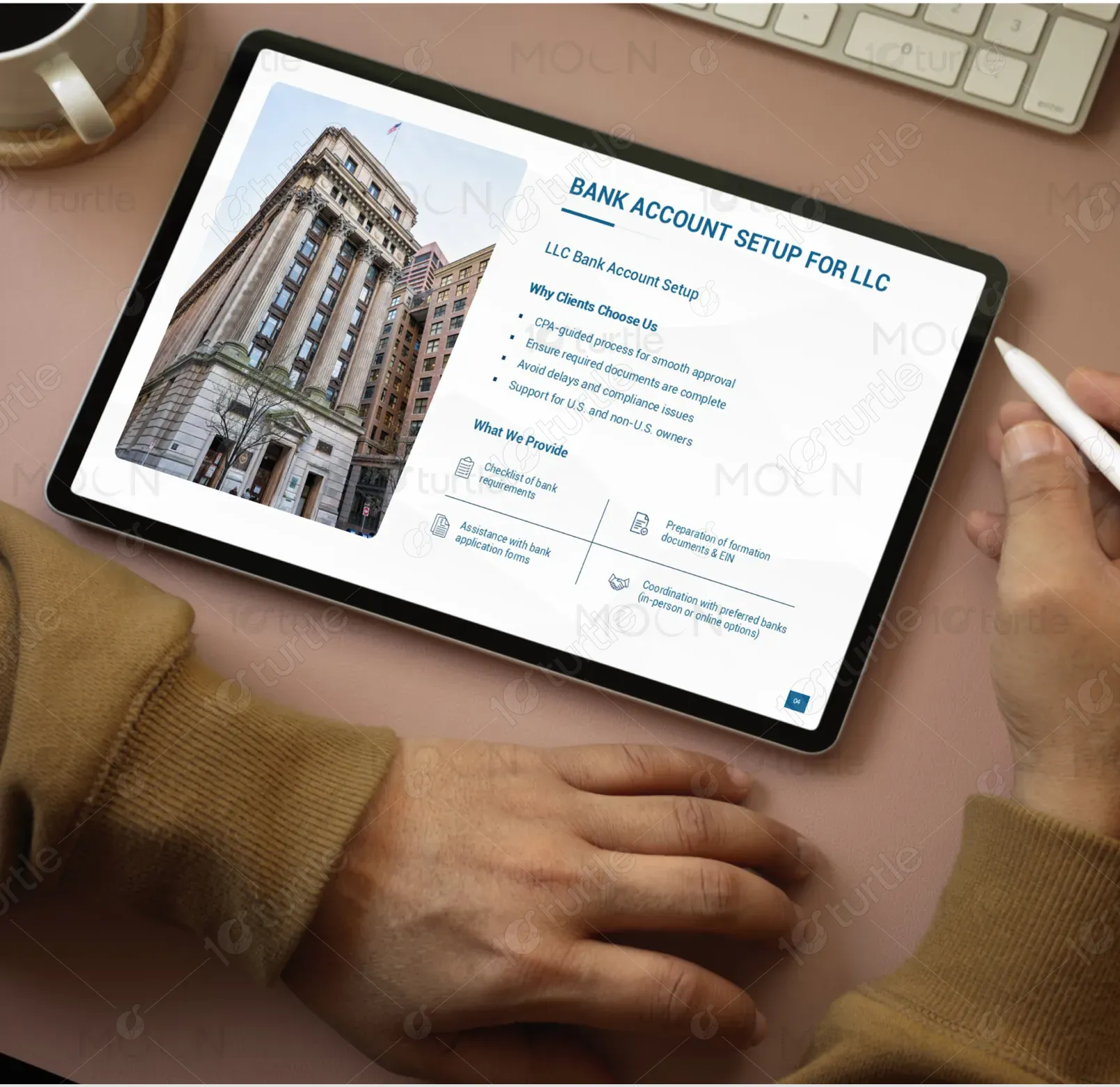
This pitch deck represents a comprehensive financial and business service offering tailored for individuals and businesses operating across the U.S. and Canada. It highlights services such as ITIN applications, LLC setup, tax preparation, and investment support. The primary goal is to communicate expertise, reliability, and end-to-end solutions in cross-border financial management. It positions the brand as a trusted partner for navigating complex regulatory environments while delivering practical, client-focused outcomes.

Industry
Finance, Legal & InsuranceWhat we did
Pitch DeckGraphic DesignPlatform
-Individuals and businesses dealing with cross-border financial activities often face confusion due to complex regulations, documentation requirements, and compliance risks. Lack of clear guidance leads to delays, errors, and missed opportunities. Many struggle with understanding tax treaties, setting up entities, or maintaining compliance across jurisdictions. This creates stress, financial inefficiencies, and potential legal risks, ultimately affecting trust and decision-making when engaging in international investments or business operations.
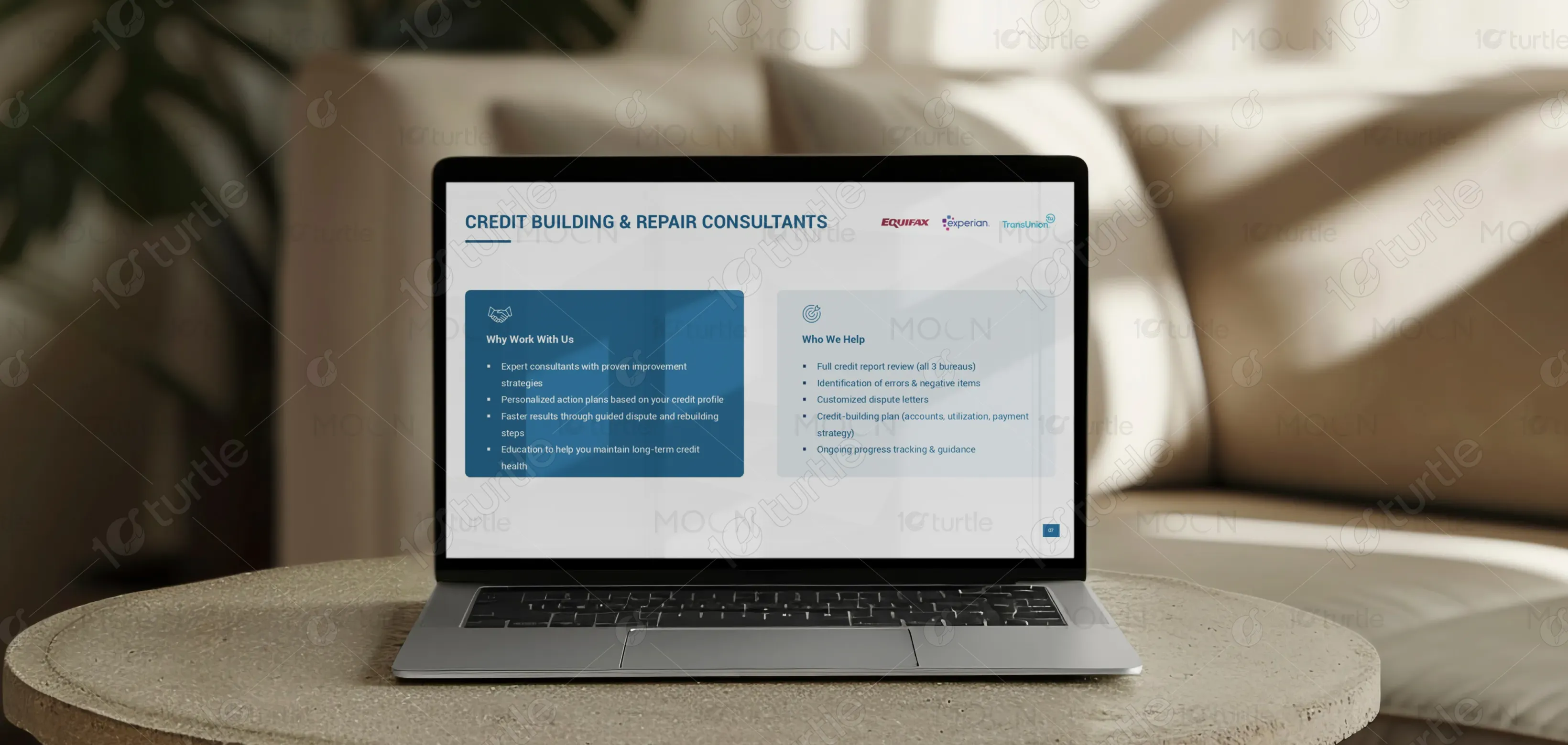
The design addresses these challenges through structured communication and clear service segmentation. Each offering is presented with concise explanations and supporting benefits, reducing complexity for the viewer. A user-centric layout ensures logical flow, guiding audiences from problems to solutions seamlessly. Visual consistency and professional tone reinforce credibility, while simplified messaging improves comprehension. This approach enables clients to quickly identify relevant services and understand how the brand delivers efficient, compliant, and reliable solutions.

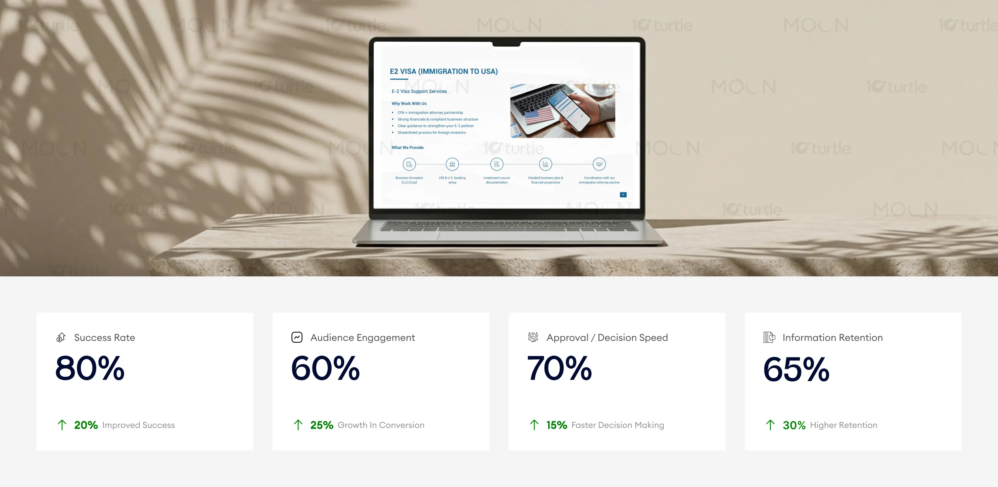
This design performs well in both client presentations and professional consultations by creating a straightforward and visually appealing experience. Its clear structure and minimal design enhance comprehension, leading to faster decision-making and higher engagement. To further improve these metrics, refining the presentation’s interactivity and personalizing the content for target audiences could increase both retention and success rates.
The long-term vision is to establish a globally recognized financial service brand specializing in cross-border solutions. The design supports scalability, allowing easy adaptation across digital platforms, presentations, and marketing materials. It reinforces a consistent identity rooted in trust, expertise, and clarity. Over time, the brand aims to become a go-to partner for international financial navigation, building lasting relationships through reliable service delivery and clear communication across diverse client segments.
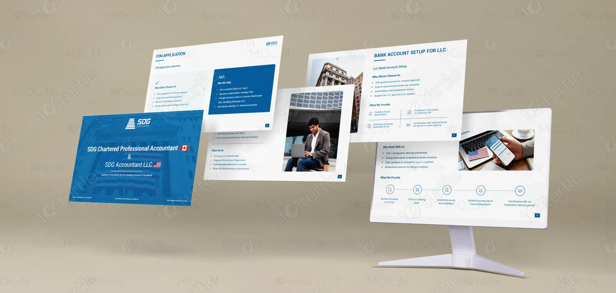

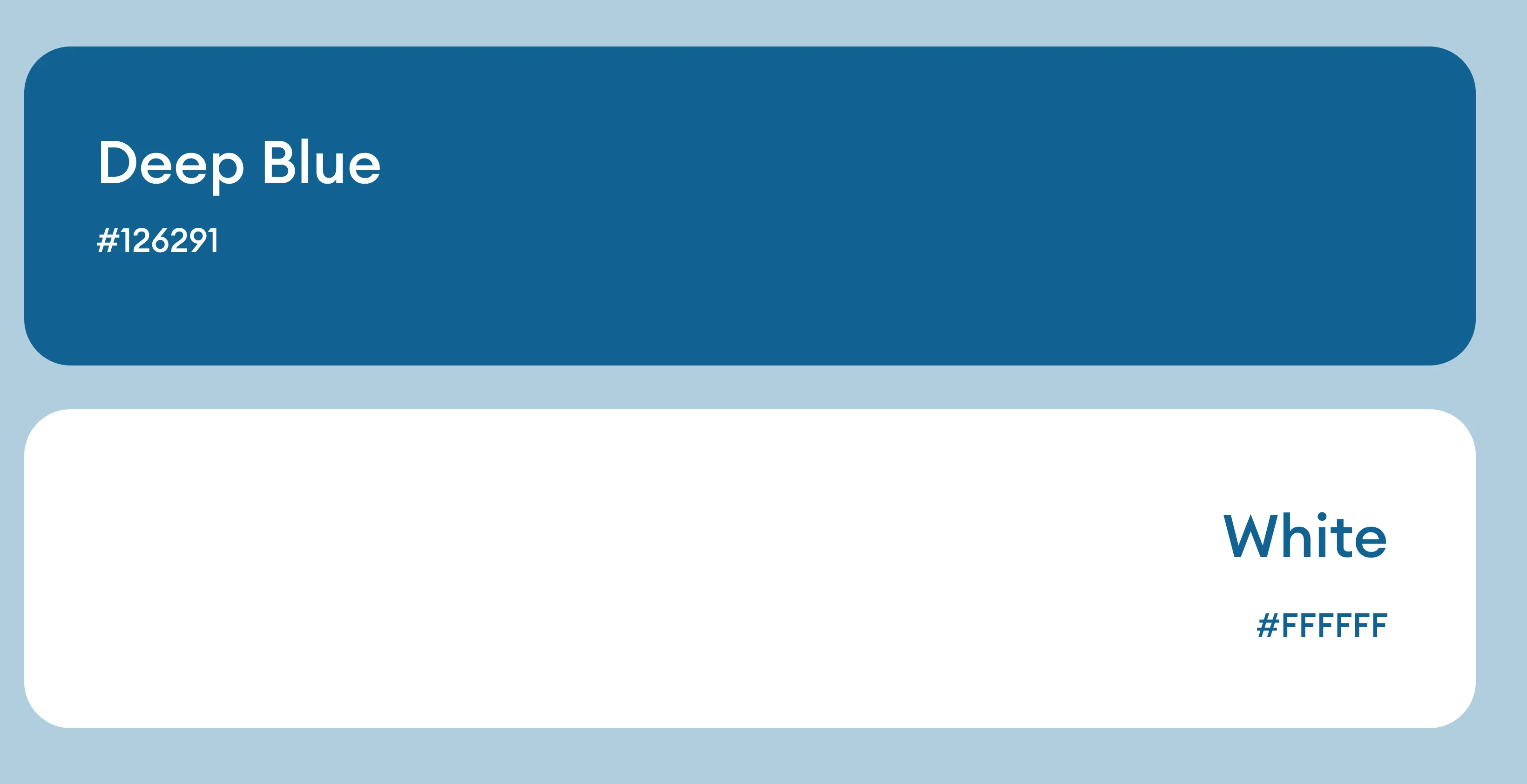
The color palette leans toward professional neutrals such as white, grey, and deep blue, symbolizing trust, stability, and expertise. Accent tones are used sparingly to highlight key information and guide attention. Typography is clean and modern, ensuring readability across formats. Visual elements remain minimal yet purposeful, supporting clarity without distraction. This cohesive visual language enhances brand recognition while maintaining a polished and authoritative tone suitable for financial and corporate communication.