The design approach balances modern minimalism with a functional aesthetic, ensuring clarity and visual impact. Clean typography, structured layouts, and strategic use of whitespace enhance readability and engagement. The color palette reinforces brand personality while maintaining harmony across all slides. Visual hierarchy directs focus to key information, complemented by subtle iconography and imagery. The overall creative direction aims to blend professionalism with approachability, making the presentation versatile for diverse audiences while preserving consistency, impact, and a polished brand identity.
PPT Design
Graphic Design
Industry
Property, Construction & Real Estate
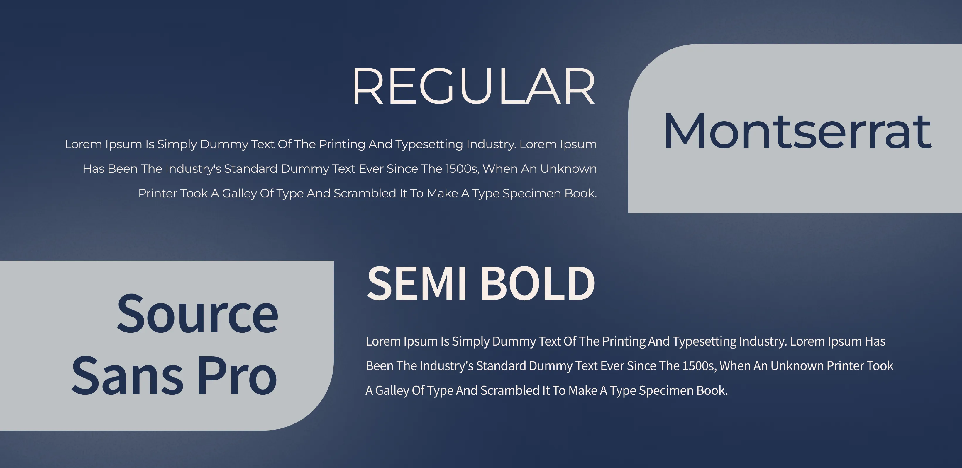
Tools we used


Project Completion
2025
Key Market
Global
This design concept transforms complex information into a clear, visually engaging format. Built for businesses, startups, or organizations seeking to communicate with impact, it merges storytelling with modern presentation design. Its unique selling points include a modular slide structure, adaptable layouts, and an elegant yet approachable style that elevates any pitch or report. The design appeals to professionals who value both aesthetics and functionality, fitting seamlessly into competitive markets where clarity, confidence, and brand alignment are critical.

Industry
Property, Construction & Real EstateWhat we did
PPT DesignGraphic DesignPlatform
-In today’s fast-paced digital landscape, audiences disengage quickly when overwhelmed by cluttered or text-heavy presentations. Many presentations lack visual consistency, fail to align with brand identity, or struggle to translate data into compelling narratives. This results in missed opportunities, whether in securing investment, educating stakeholders, or driving decisions. For instance, startups often lose investor interest due to unpolished slides, while corporate teams risk diluting their message with inconsistent formatting. The challenge lies in balancing aesthetics with clarity, relevance, and memorability.
This design solves the problem by offering a visually cohesive, brand-aligned presentation system. Each slide emphasizes simplicity, clear hierarchy, and audience-focused communication. Data visualization is enhanced with infographics, charts, and icons that make complex insights easy to understand. Modular layouts allow customization without losing design integrity, ensuring adaptability for varied content. By combining functional design principles with aesthetic appeal, the product empowers presenters to deliver impactful messages that resonate, inspire confidence, and leave lasting impressions on diverse audiences.
The long-term vision is to establish this design as a benchmark for professional storytelling across industries. It aspires to evolve into a scalable system adaptable to multiple formats—digital presentations, interactive reports, and even marketing collateral. Beyond aesthetics, the design aims to influence how organizations communicate by setting new standards of clarity and engagement. The goal is not only to elevate presentations but also to shape audience expectations, creating enduring brand impressions and driving stronger connections between presenters and their audiences.

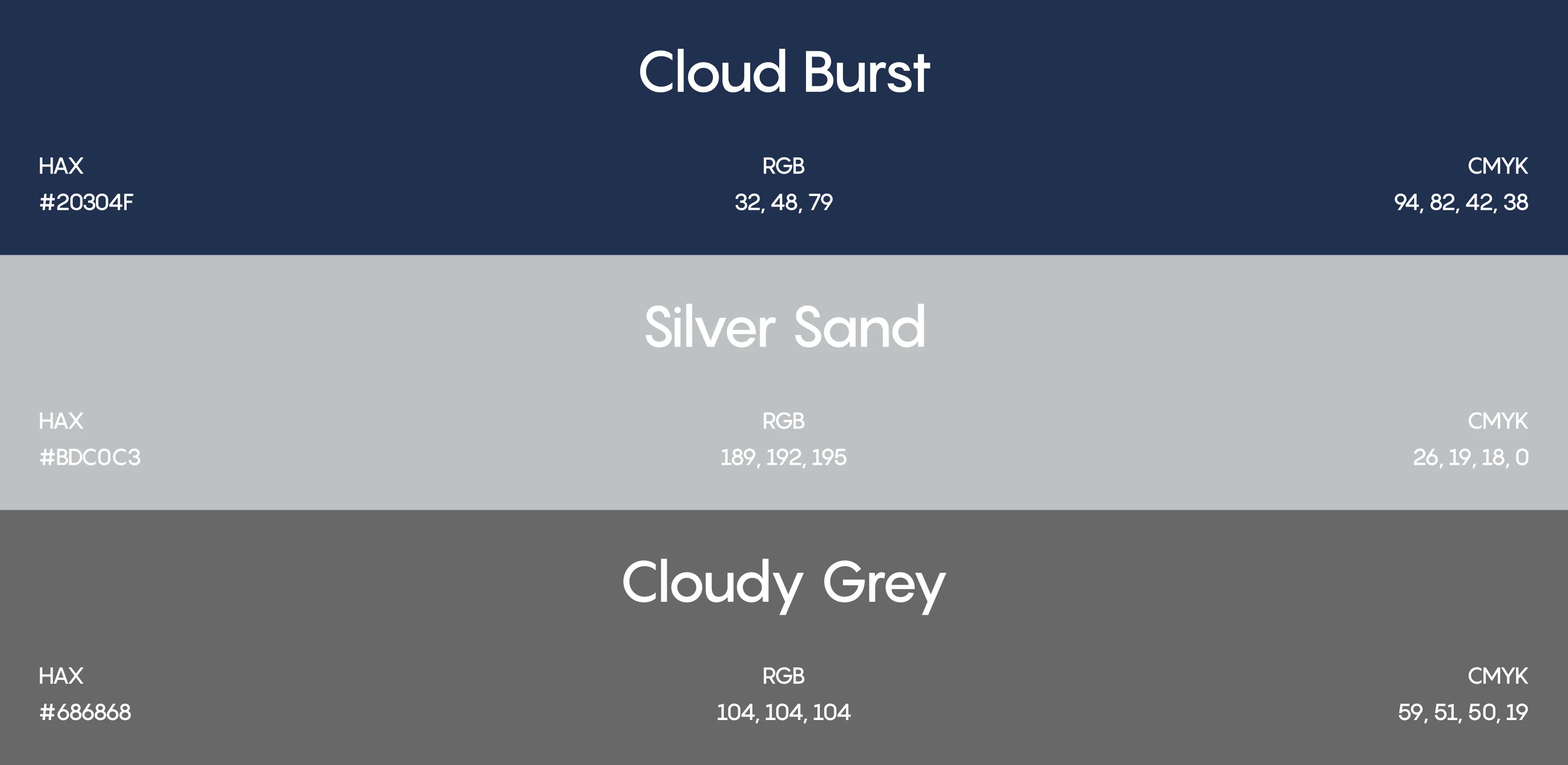
The chosen color palette reflects a balance between professionalism and modernity. Core hues (e.g., deep navy or charcoal gray) provide authority and stability, while accent colors (such as teal, gold, or coral) introduce vibrancy and highlight key elements. This blend ensures both trustworthiness and visual appeal. Neutral tones create a clean backdrop, enhancing legibility and focus. The palette aligns with the brand identity, evokes confidence, and strategically guides audience attention—making the overall design sophisticated, approachable, and emotionally engaging.