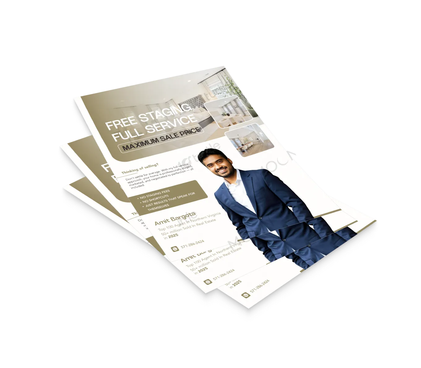
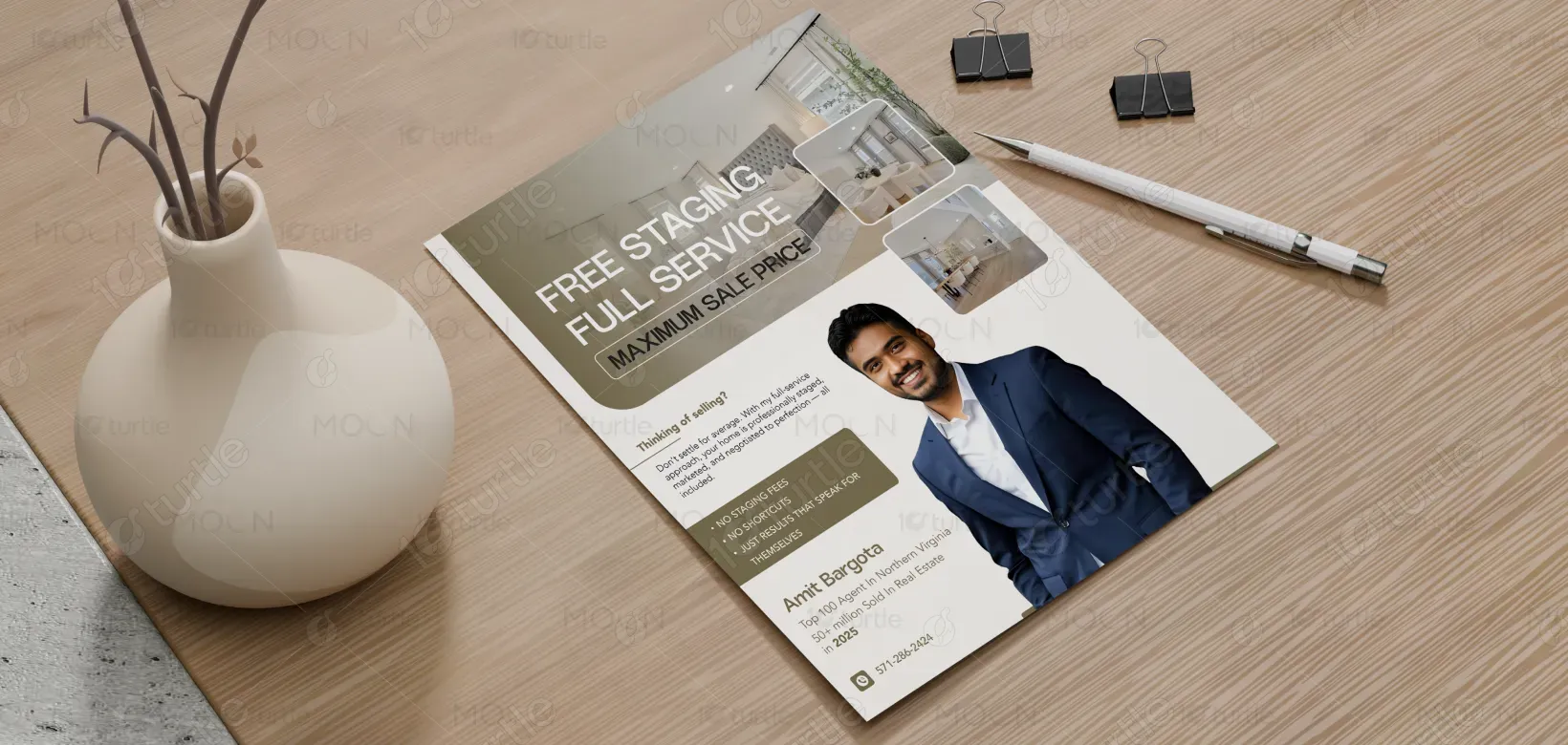
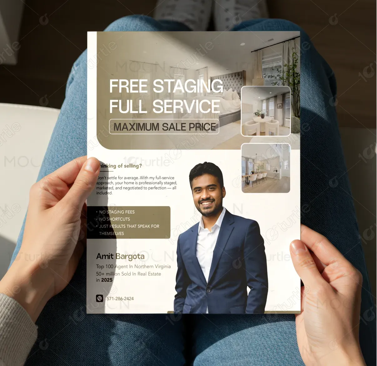
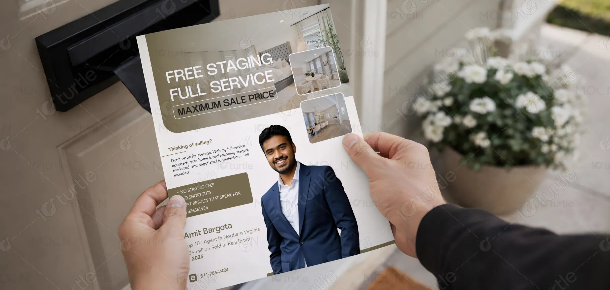
The flyer is structured around a premium, authority-driven visual approach that immediately highlights the three core value propositions at the top for maximum impact. Large, professionally staged interior imagery establishes aspiration and credibility, while supporting room visuals reinforce the quality of presentation. The agent’s portrait anchors trust and personal connection in the lower section. Clean, bold typography ensures clarity, and the neutral, gold-accented color palette enhances perceived value. The layout balances imagery and information to maintain hierarchy, readability, and visual consistency.
Flyer Design
Graphic Design
Industry
Property, Construction & Real Estate
Tools we used


Project Completion
2025
Key Market
Global
This design represents a full-service real estate offering focused on maximizing property value for homeowners preparing to sell. It communicates complimentary staging, comprehensive service management, and expert negotiation as key differentiators. Positioned within a competitive regional market, the flyer emphasizes measurable credibility through professional recognition and sales volume. Its primary function is to generate seller inquiries and reinforce a premium service positioning.
Industry
Property, Construction & Real EstateWhat we did
Flyer DesignGraphic DesignPlatform
-Many homeowners encounter fragmented services, added staging costs, inconsistent marketing efforts, and limited negotiation expertise when selling their property. As a result, homes may lack visual impact, remain on the market longer, or sell below potential value. Additionally, unclear messaging from agents often creates hesitation and reduces seller confidence during the selection process.
The design addresses these challenges by presenting a clear and immediate value hierarchy. The core benefits are emphasized prominently to ensure instant comprehension. Professional imagery demonstrates tangible results, while credential highlights reinforce authority. The inclusion of “No Staging Fees” removes a common financial objection. Structured typography and a clean layout improve readability and strengthen trust, guiding the viewer toward direct contact action.

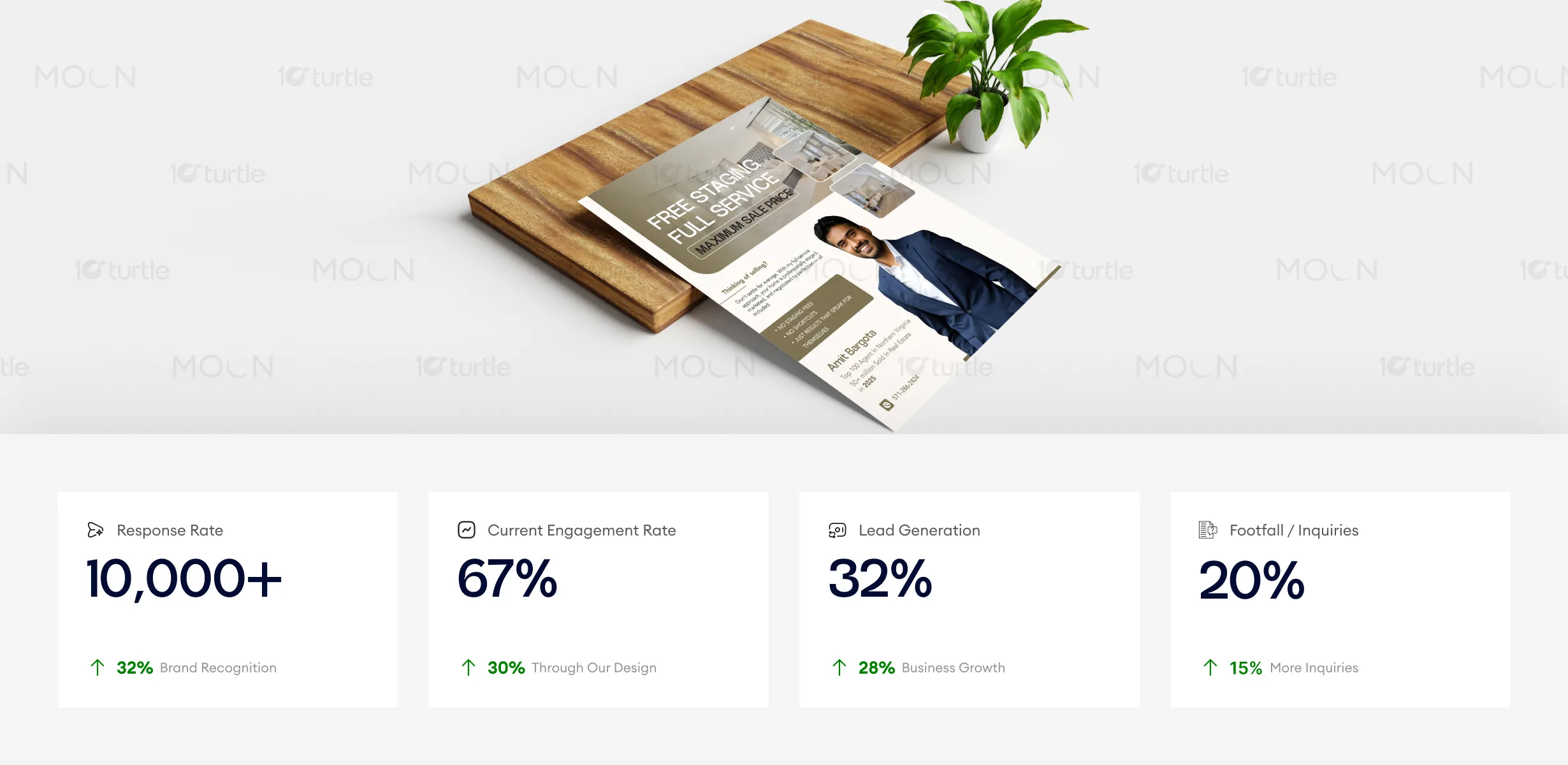
The flyer’s premium design and effective use of visual hierarchy boost engagement, response rates, and foot traffic. By emphasizing core benefits, incorporating aspirational imagery, and fostering trust with the agent’s portrait, the design encourages action, improving lead generation and increasing inquiries. Enhanced clarity and credibility are key drivers for business growth in this context.
The long-term vision positions the agent as a premium, results-focused real estate professional rather than a transactional intermediary. The design system supports consistent application across future marketing materials, strengthening brand recognition and authority over time. By maintaining clarity, professionalism, and measurable credibility, the brand builds sustained trust and market presence.
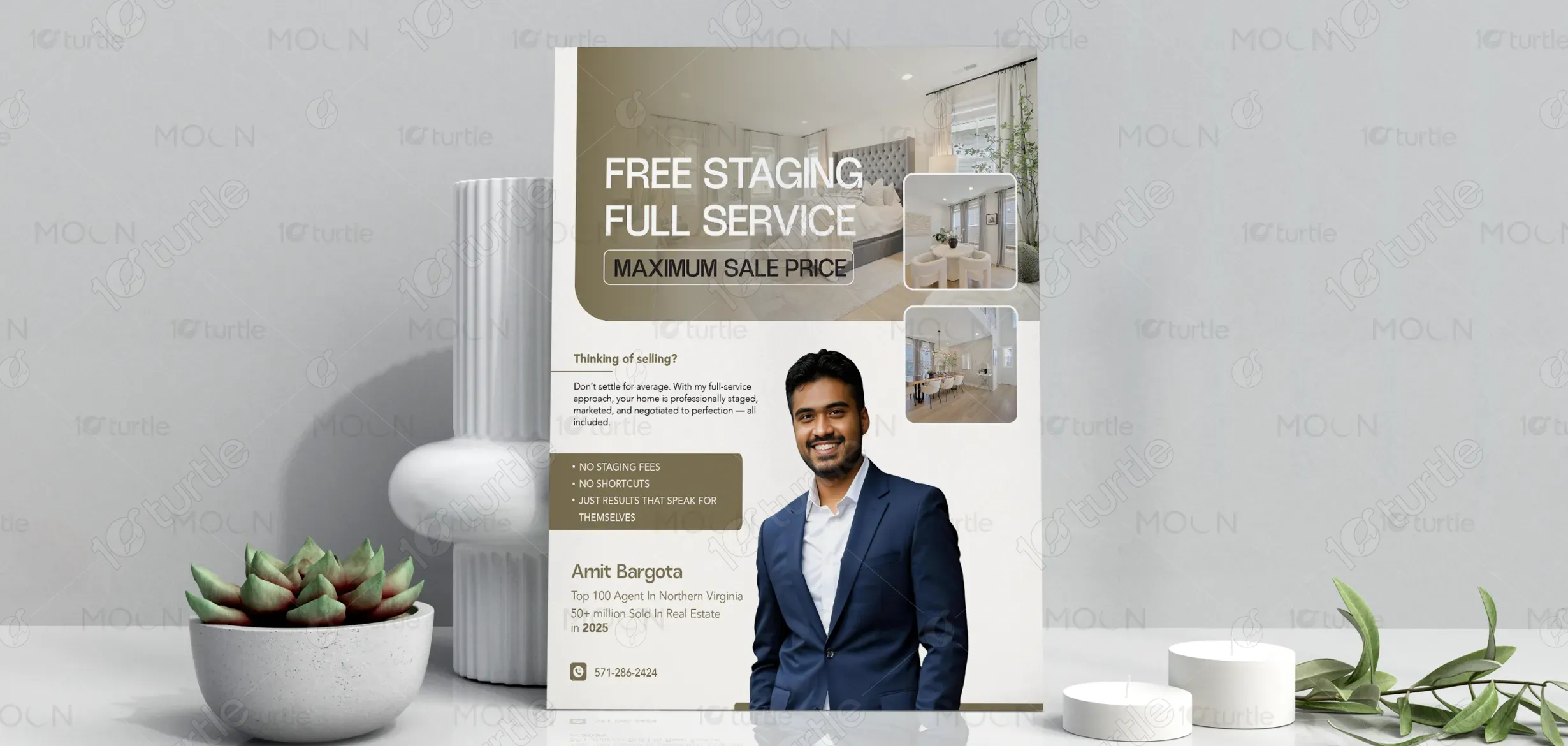
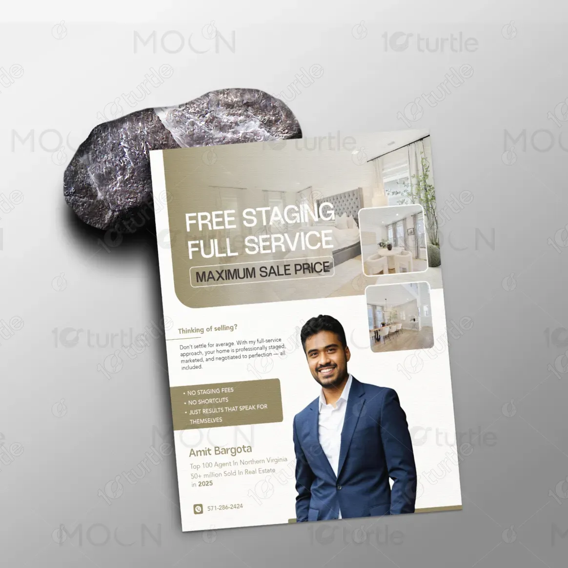

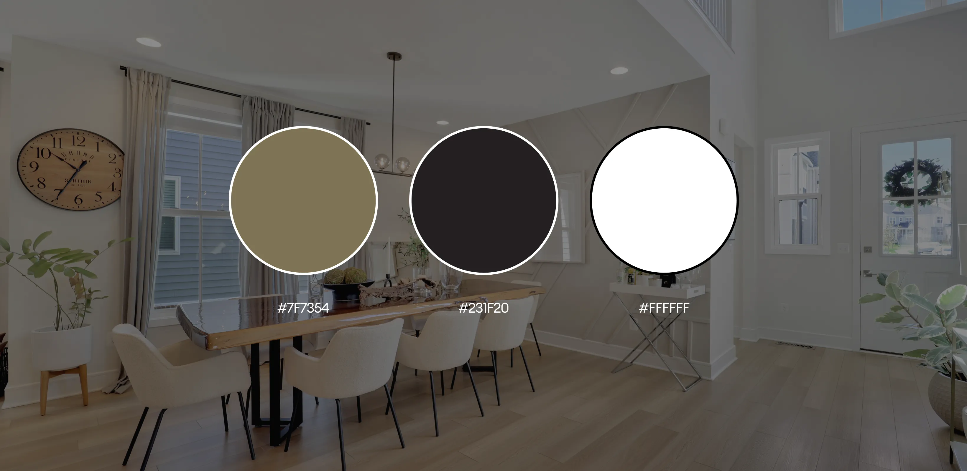
The color scheme uses refined neutral tones with warm beige and muted gold accents to communicate sophistication and stability. White space enhances clarity and mirrors the clean aesthetic of staged interiors, while dark typography ensures strong readability. Rounded image frames and high-resolution property photography contribute to a polished, cohesive visual language that reinforces professionalism and premium positioning.