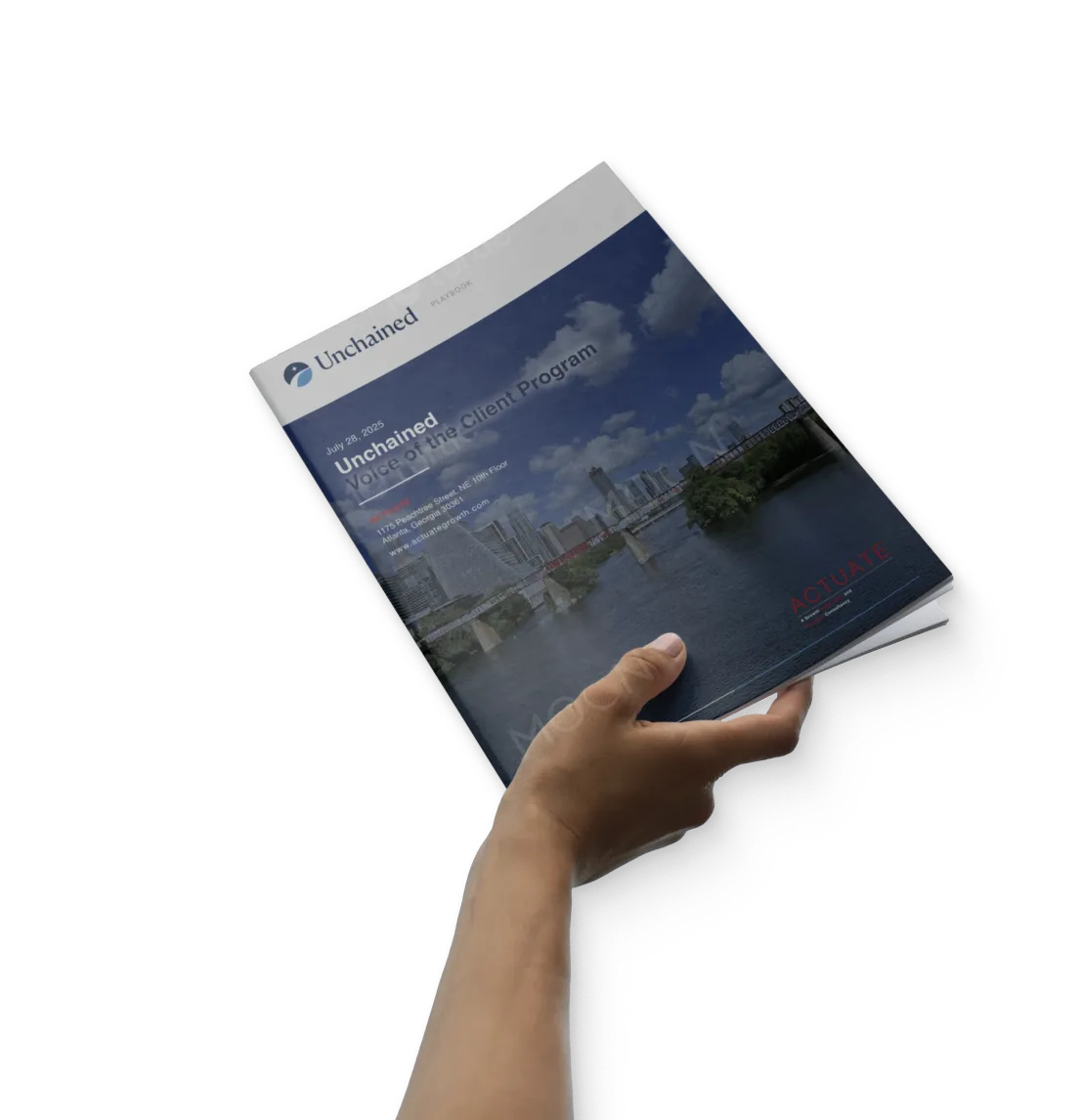
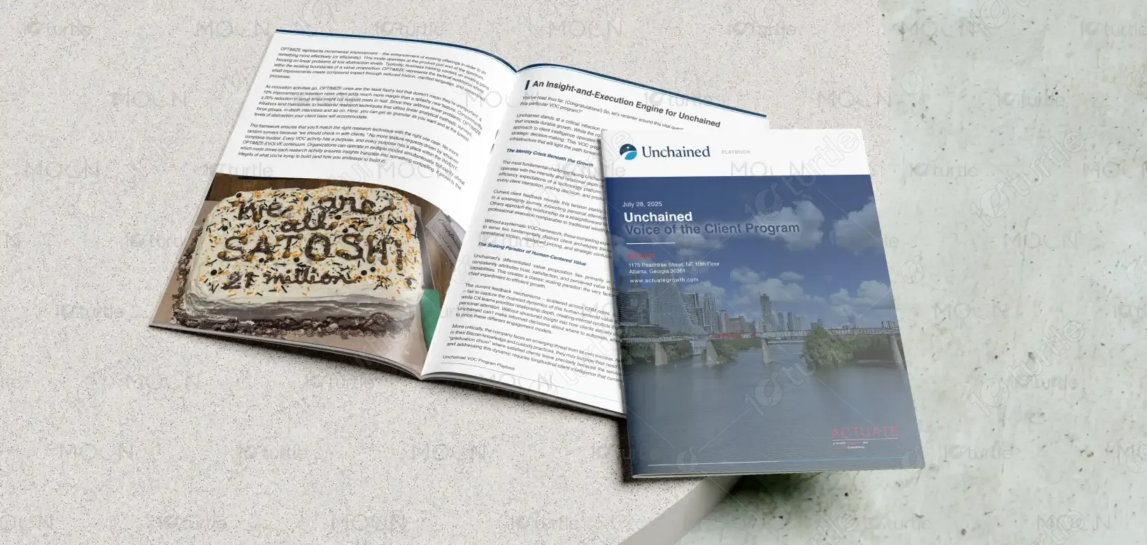
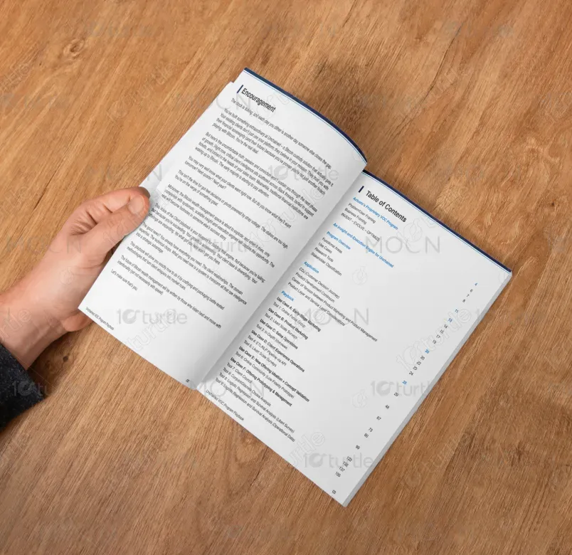
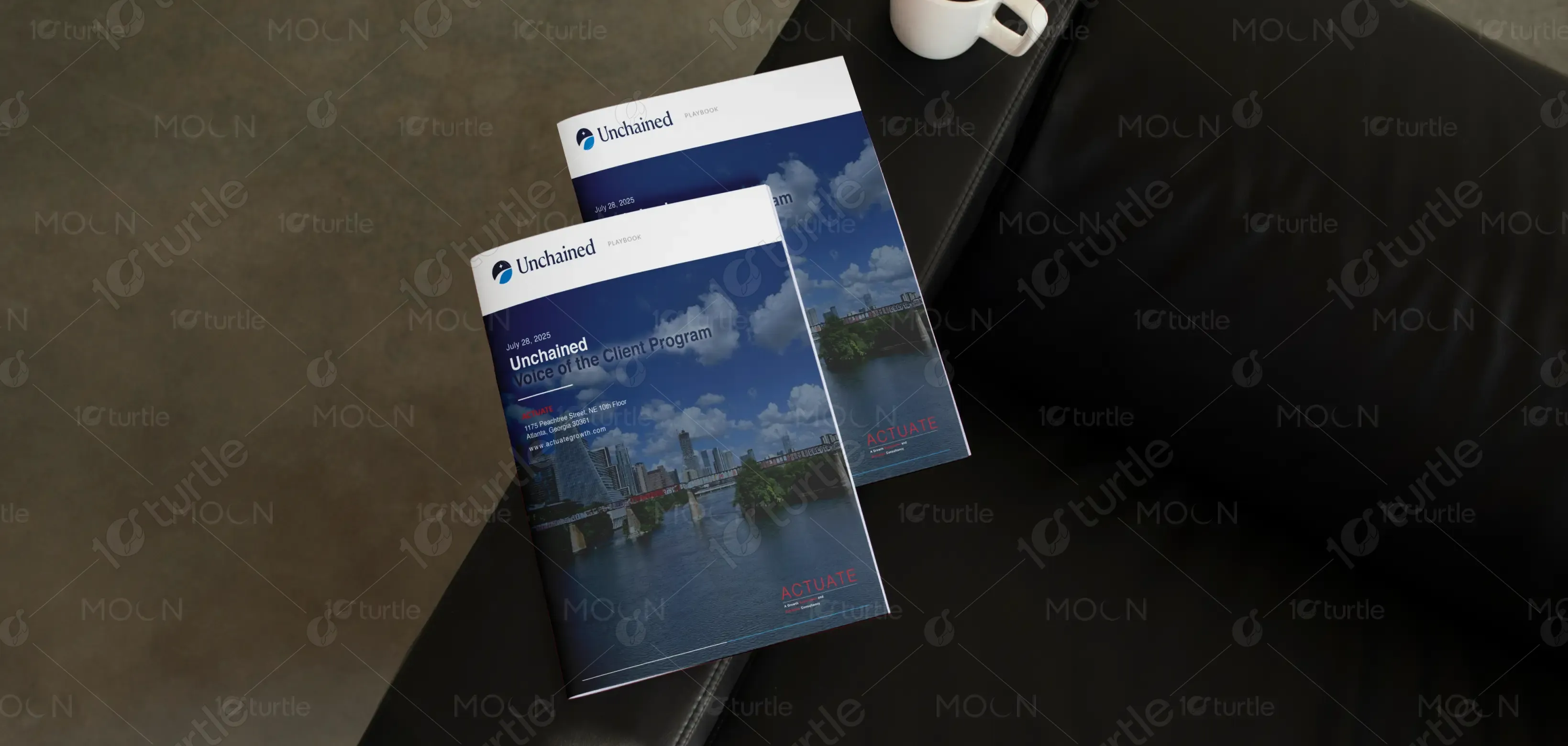
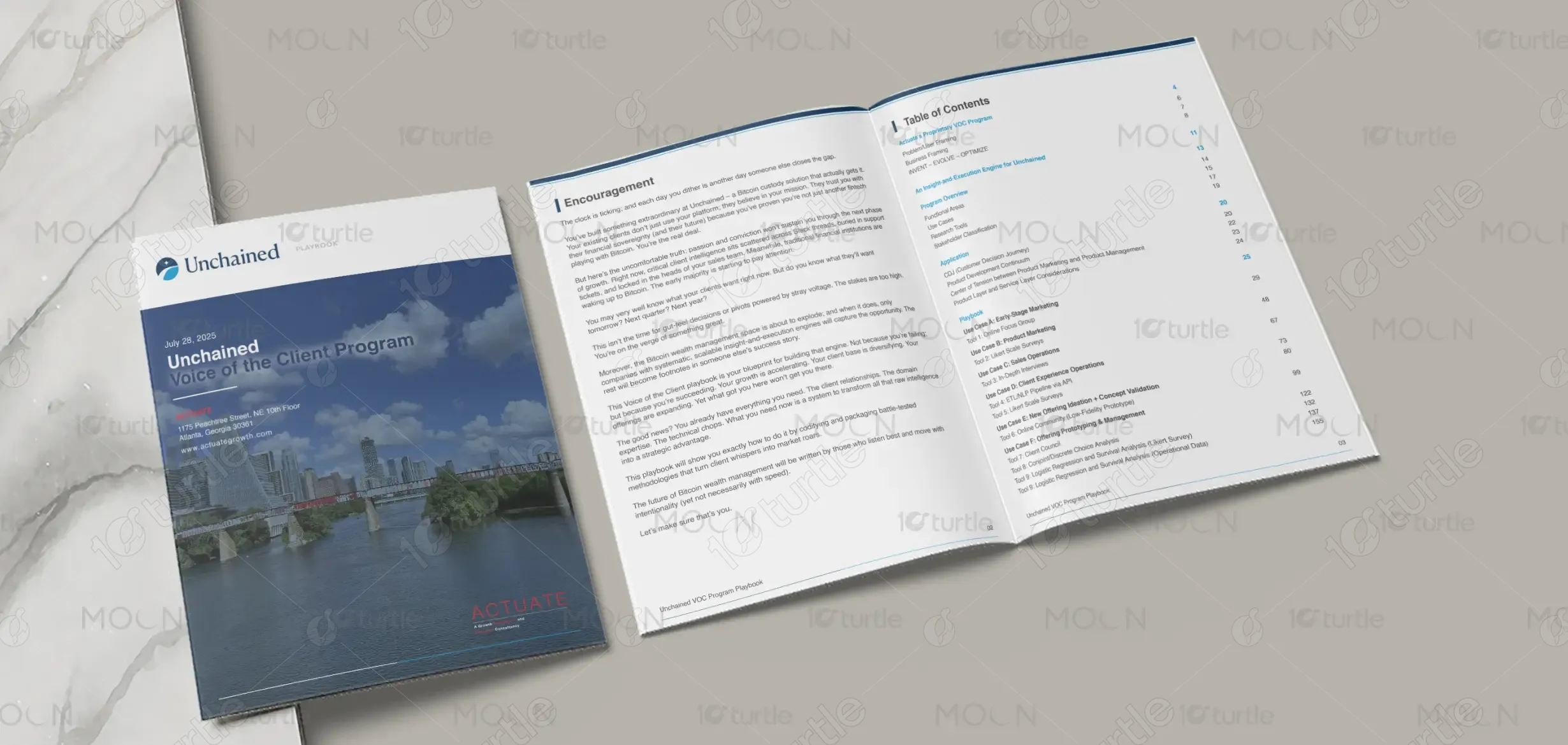
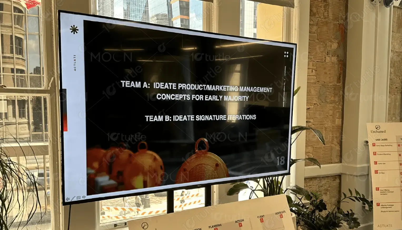
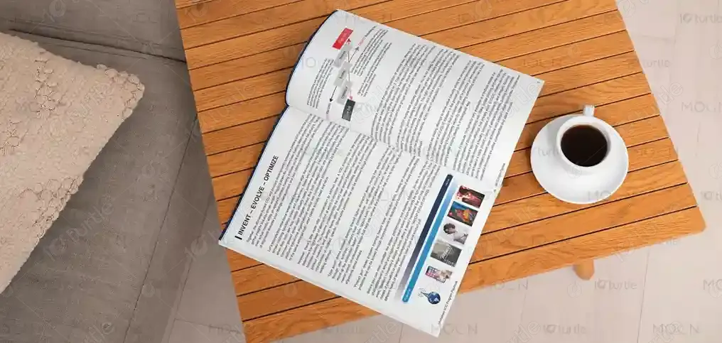
The report design follows a clean, structured, and modern aesthetic focused on clarity and professionalism. Minimalist layouts, well-defined grids, and balanced white space ensure easy readability. The design integrates consistent typography, subtle iconography, and an elegant visual hierarchy to guide the reader smoothly through the content. By blending corporate sophistication with creative simplicity, the report delivers information in a visually appealing, organized, and brand-aligned manner that enhances comprehension and engagement.
Report Design
Graphic Design
Industry
Finance, Legal & Insurance
Tools we used


Project Completion
2025
Key Market
Global
This report design is created to communicate data, insights, and findings in a visually engaging and easy-to-digest format. It serves as a strategic tool for businesses, organizations, or institutions aiming to present their annual reports, research, or corporate performance. The design stands out through its balance of professionalism and creativity—combining strong typography, meaningful infographics, and a cohesive layout system that builds credibility and visual harmony. Its adaptable framework allows customization across different sectors and themes.

Industry
Finance, Legal & InsuranceWhat we did
Report DesignGraphic DesignPlatform
-The main challenge in report design lies in transforming dense, text-heavy data into a visually engaging and easy-to-understand layout. Many reports fail because they overwhelm readers with information and lack visual hierarchy, making it hard to extract key insights. In the corporate and research sectors, this leads to low engagement and poor communication of valuable findings. The design challenge, therefore, is to merge clarity with creativity—ensuring both information accuracy and visual appeal.
This report design solves the problem by implementing a user-centric approach—organizing information through structured grids, impactful headings, and simplified visuals. Infographics, charts, and icons are used strategically to break down complex data into digestible formats. The design leverages modern typography and a balanced color palette to maintain readability while adding subtle sophistication. This approach not only enhances comprehension but also strengthens brand perception and engagement across stakeholders.
The long-term vision is to set a new standard for professional reporting—where design is not just decorative but functional, persuasive, and strategic. The goal is to make data storytelling more interactive, clear, and emotionally resonant. Over time, this design framework can evolve into a digital-friendly format adaptable for presentations, dashboards, and web-based reports, helping organizations communicate insights seamlessly and leave a lasting impression of trust and innovation.
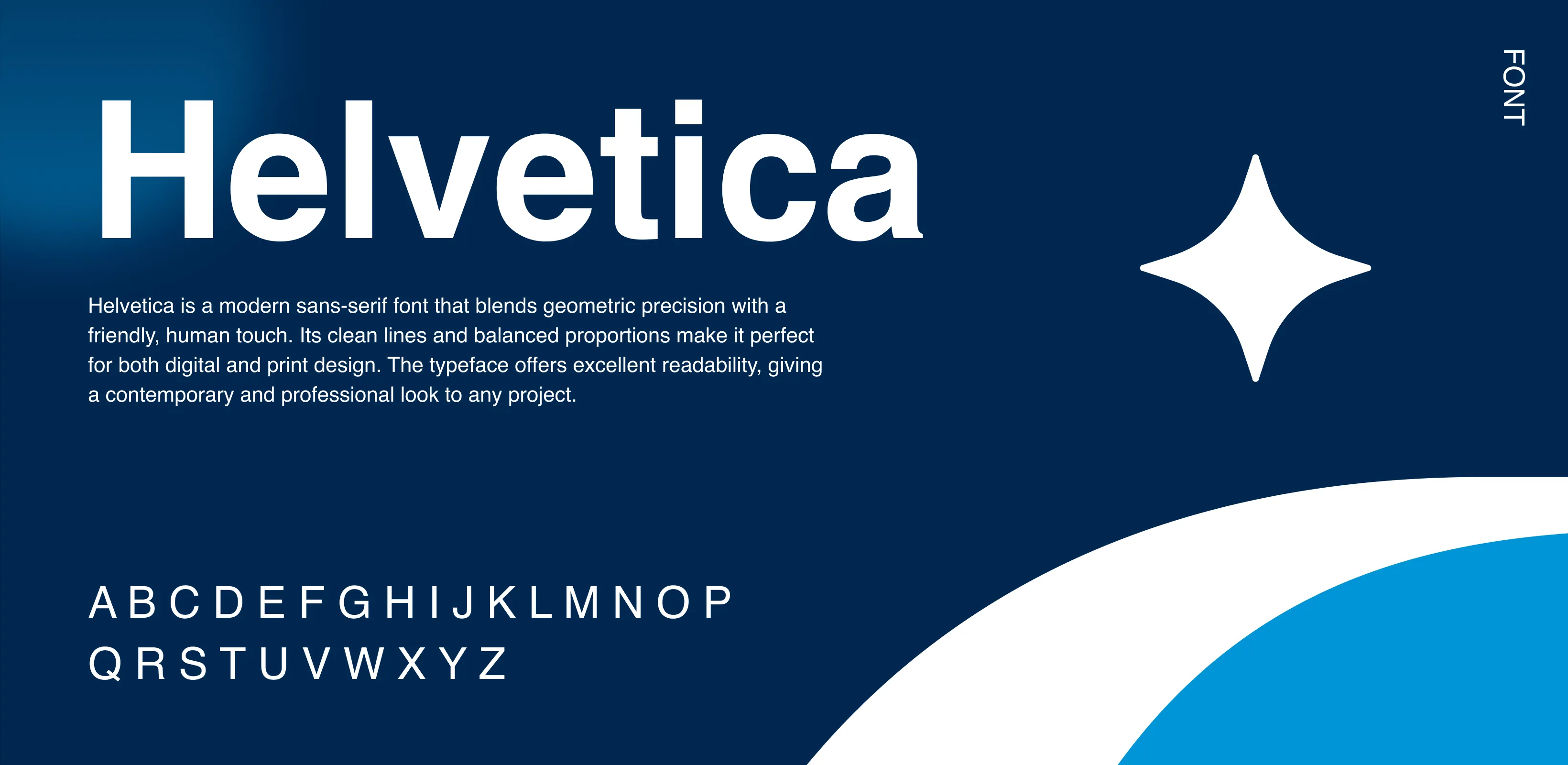
The color palette features a refined mix of neutral tones paired with a single accent color (e.g., yellow or blue) to emphasize key elements. This combination conveys both professionalism and energy—creating visual contrast without overwhelming the reader. Neutral backgrounds enhance readability, while the accent color draws attention to critical data and highlights. The palette aligns with the brand’s identity, evoking confidence, clarity, and modernity throughout the report.