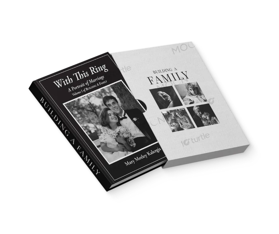
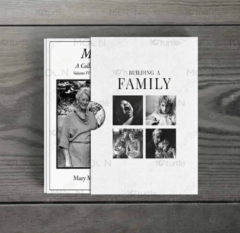
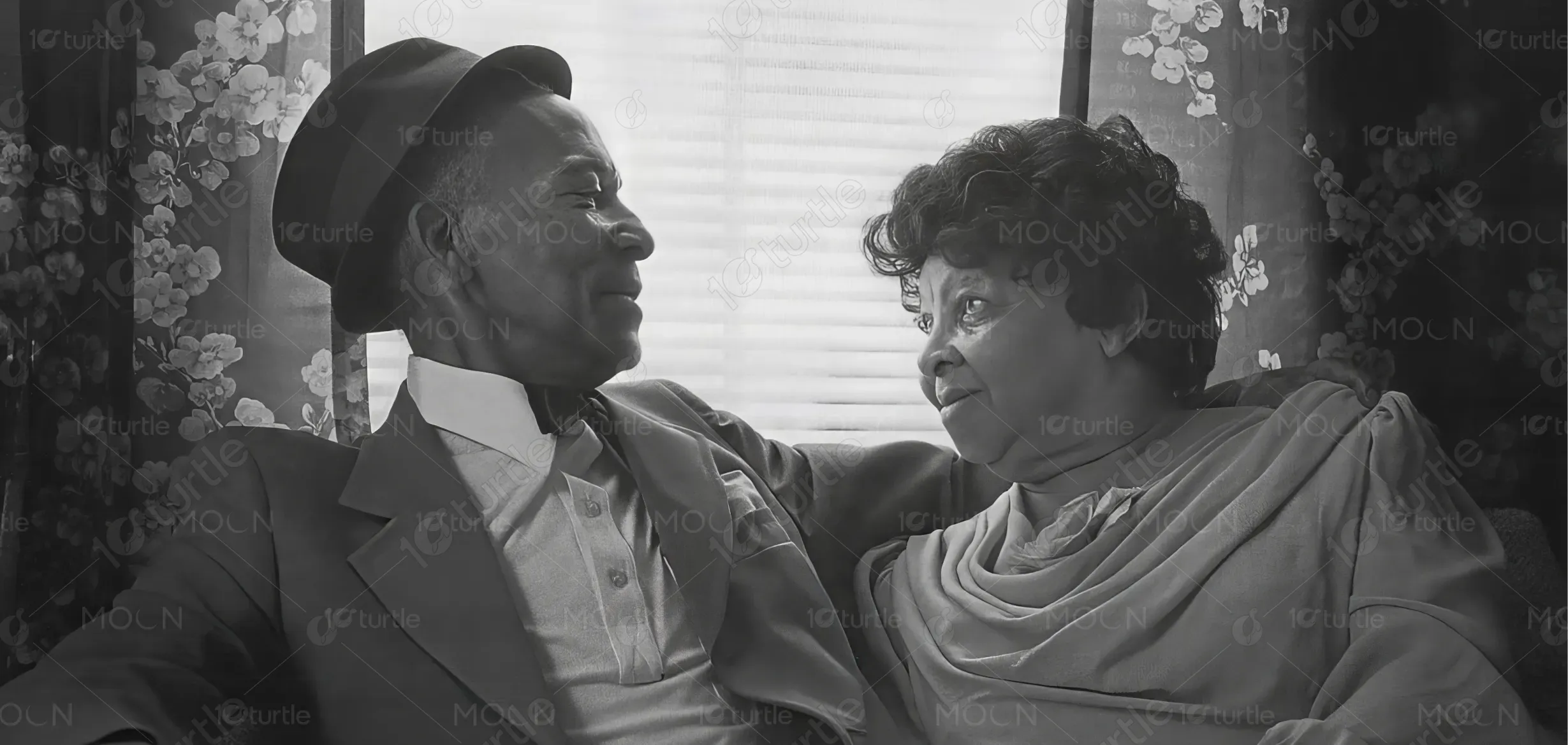
The design embraces a timeless, elegant aesthetic that reflects the emotional depth of family and marriage. Using black-and-white imagery, refined serif typography, and clean composition, the slipcase creates a classic and documentary-style visual experience. The layout balances warmth and sophistication, highlighting authentic life moments while maintaining a premium book-collectible feel. The contrast between the linen-texture slipcase and smooth book cover enhances tactility, showcasing a cohesive visual story centered on legacy, relationships, and the beauty of family.
Slipcase Design
Book Design
Graphic Design
Industry
Arts, Culture & Entertainment
Tools we used


Project Completion
2025
Key Market
Global
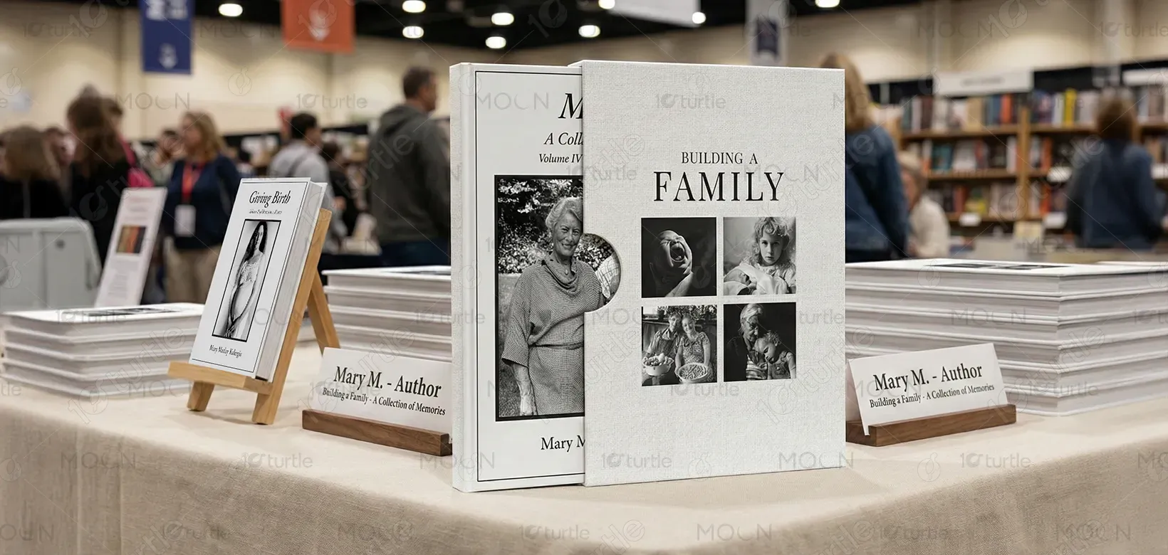
This slipcase design presents a curated two-volume series celebrating marriage and family. It merges storytelling photography with refined editorial design to create a premium keepsake product. The concept targets readers who appreciate documentary-style visuals, sentimental themes, and collectible book formats. Its unique appeal lies in the harmonious blend of emotional imagery, elegant typography, and archival presentation, making it suitable for bookstores, gift markets, and personal memory collections.

Industry
Arts, Culture & EntertainmentWhat we did
Slipcase DesignBook DesignGraphic DesignPlatform
-The challenge was creating a slipcase that communicates emotional depth without feeling cluttered or overly sentimental. In many family-themed products, visuals tend to become busy or inconsistent, reducing their premium appeal. Additionally, combining multiple life-stages—marriage, childhood, and generational moments - within one cohesive design can be visually overwhelming. The goal was to avoid these common pitfalls while still delivering a meaningful, unified narrative that resonates with diverse audiences.
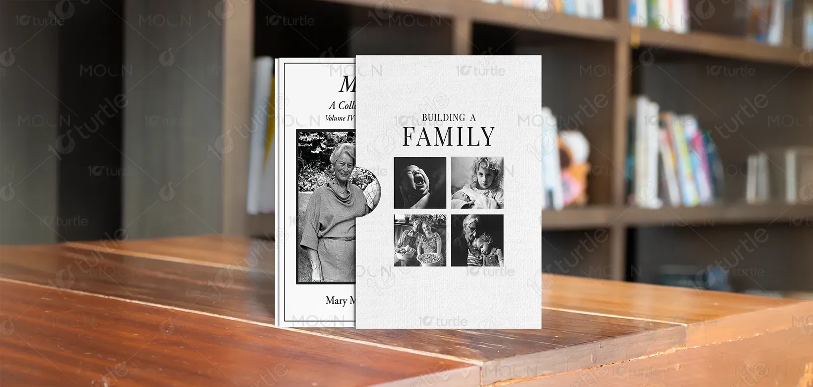
A minimalist, photography-driven layout was developed to unify the themes of marriage and family. The monochrome palette ensures visual harmony across different photos, while the structured grid system on the slipcase creates order and balance. Serif typography reinforces a timeless, archival quality, adding literary elegance. The contrast between textured slipcase material and smooth book cover creates a tactile experience, elevating the product into a premium, collectible edition. Together, these elements present a clean, cohesive, emotionally compelling design.
The long-term vision is to establish this series as a cherished archival collection that grows with future volumes celebrating different aspects of family, relationships, and legacy. The design aims to remain timeless, ensuring relevance for decades. As the series expands, it aspires to become a recognizable visual identity within the family-documentary book category and inspire an emotional connection strong enough to make it a treasured heirloom for readers.

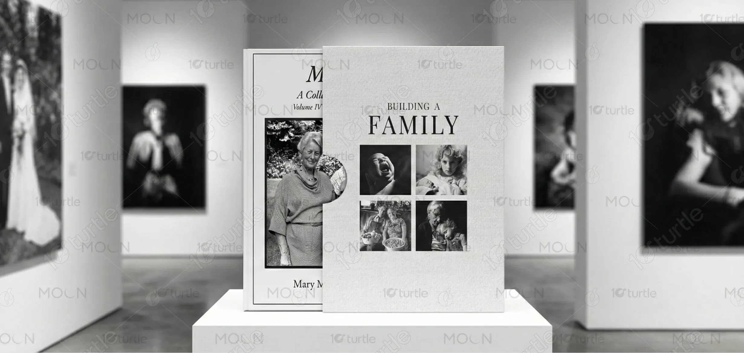
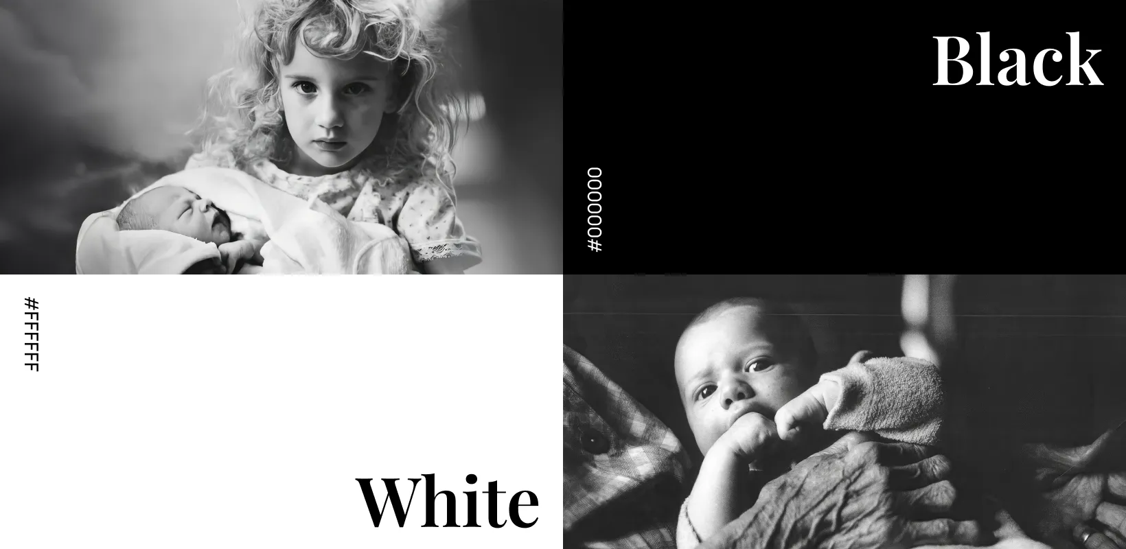
The design uses a monochromatic black-and-white palette, chosen for its timeless elegance and ability to unify diverse photographs into a cohesive visual story. Black conveys sophistication and structure, while white represents purity, nostalgia, and emotional clarity. This palette enhances the archival, documentary tone of the product, aligning perfectly with the themes of legacy and family. The simplicity of the colors ensures the imagery remains the focal point while maintaining a refined, premium aesthetic.