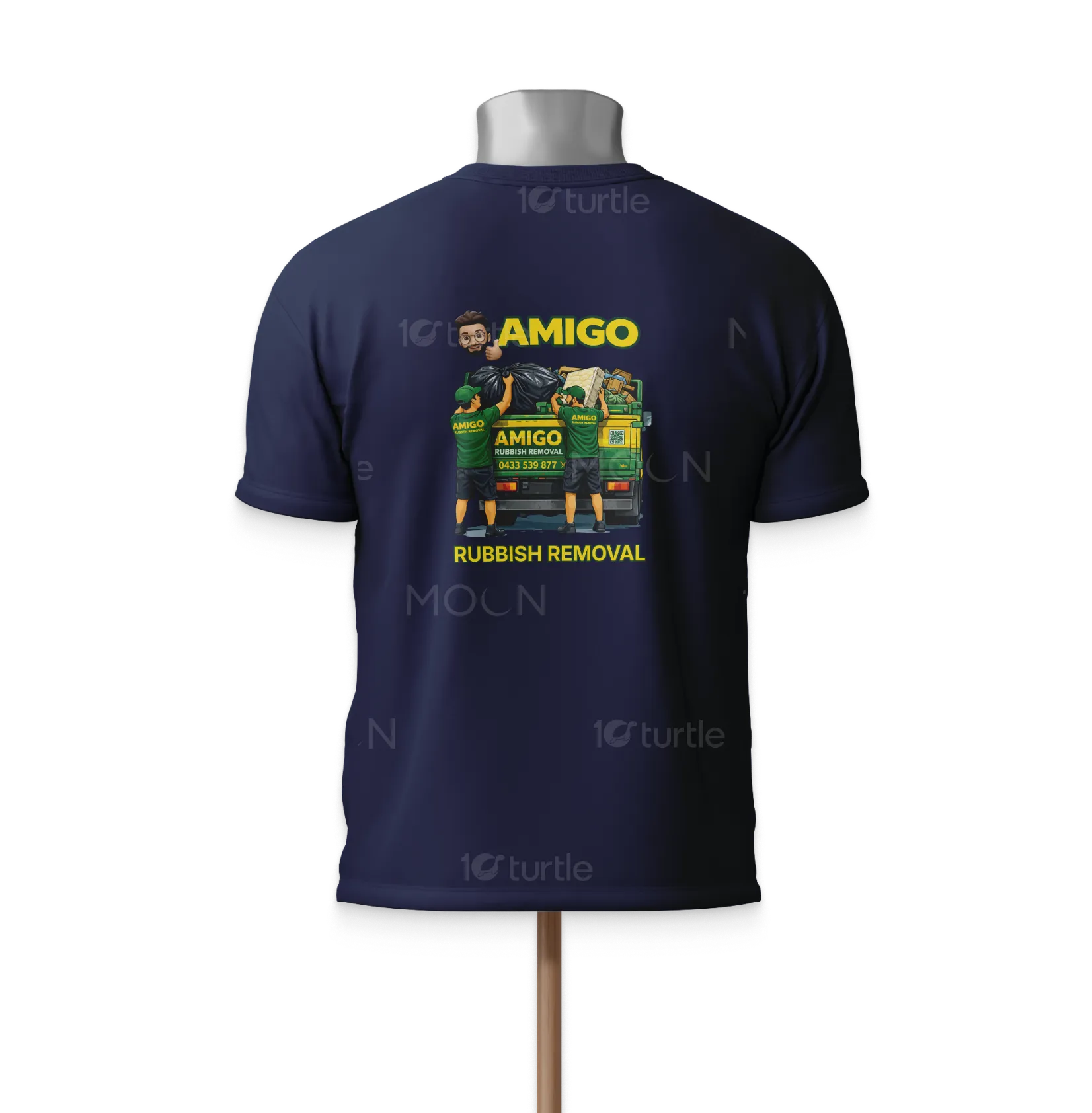
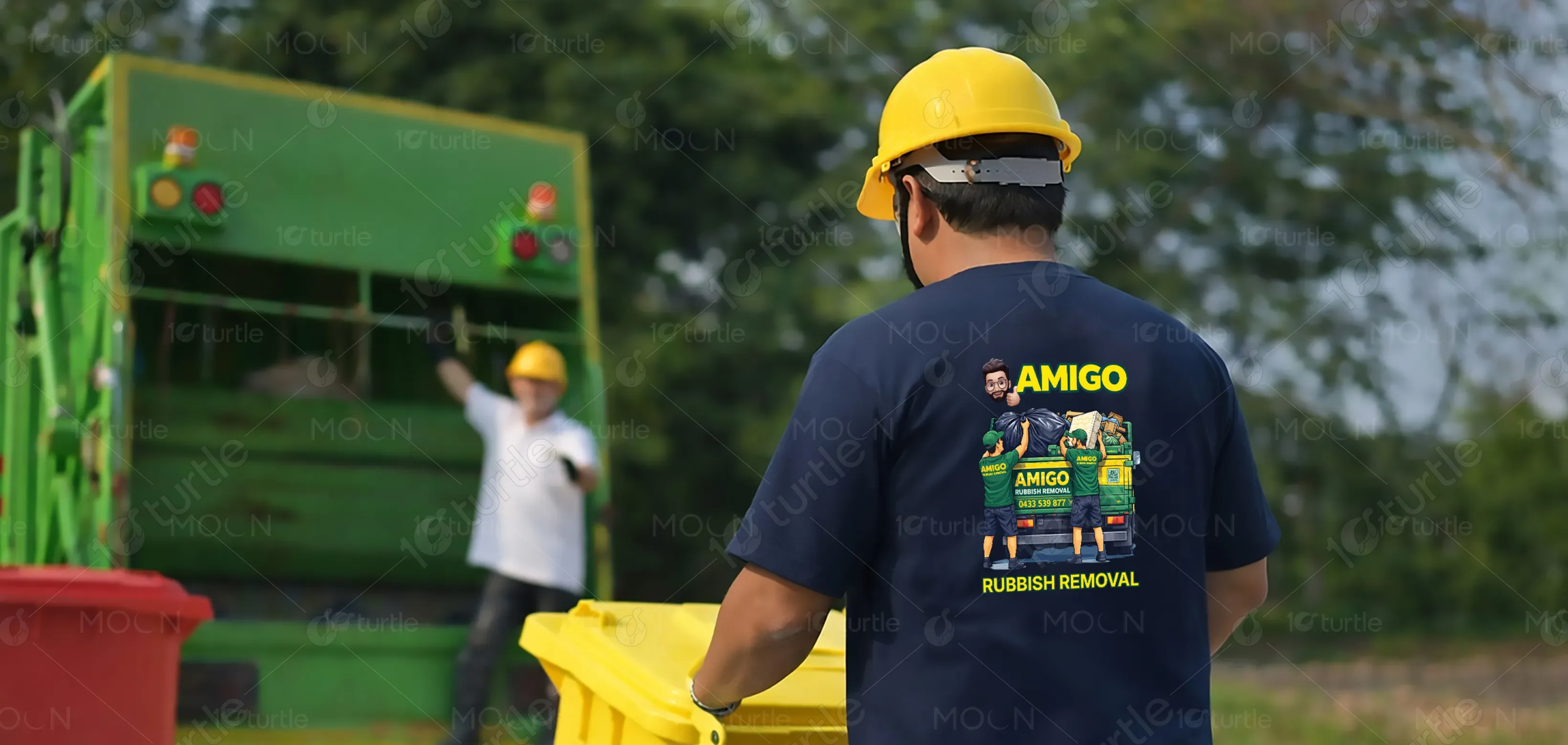
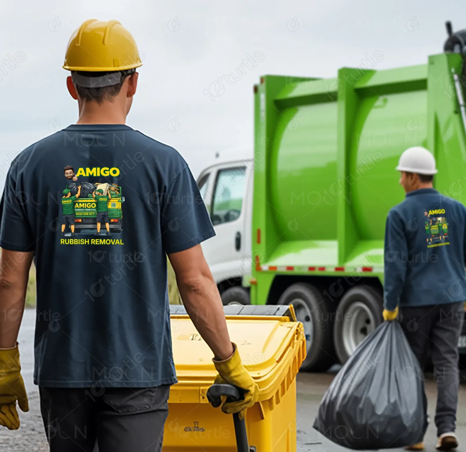
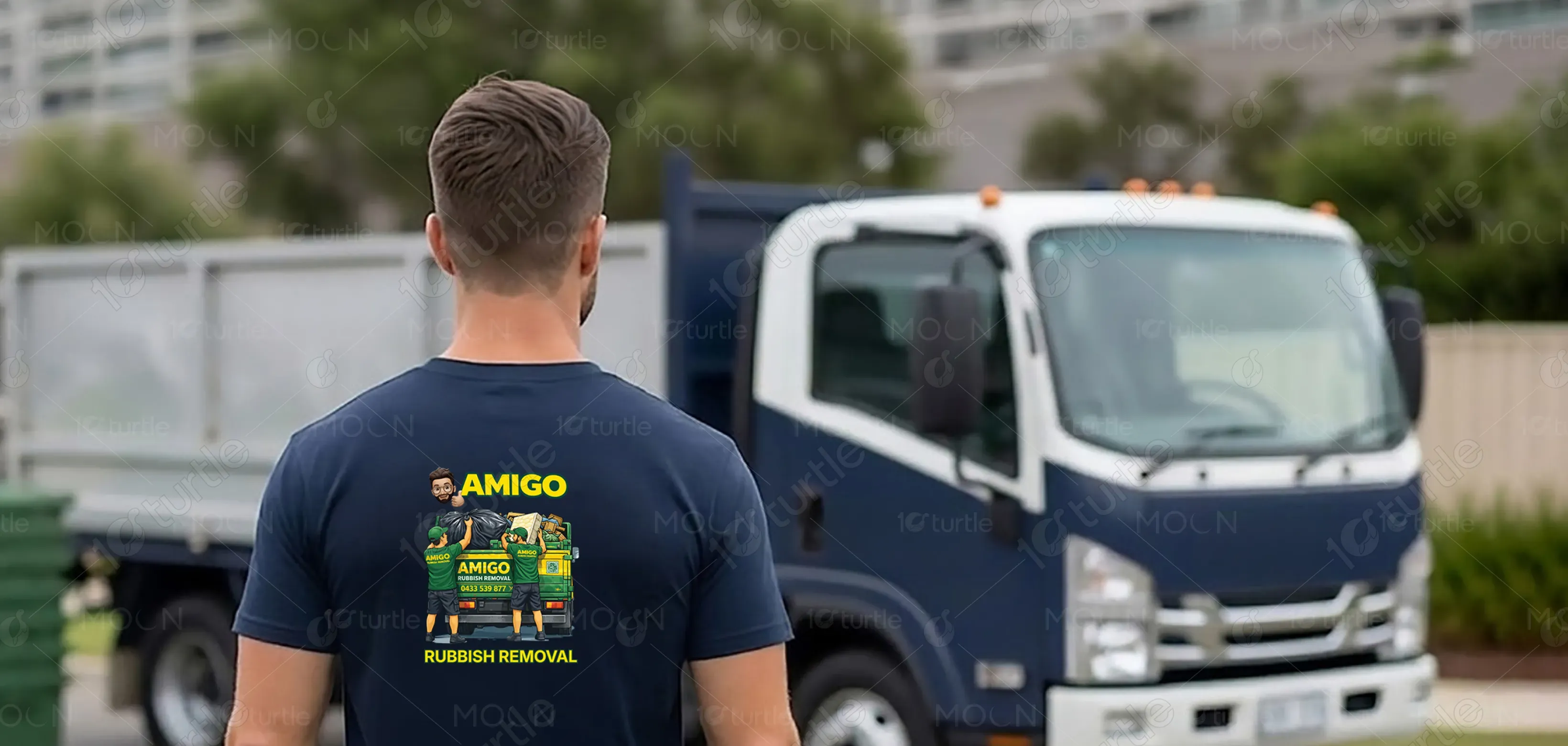
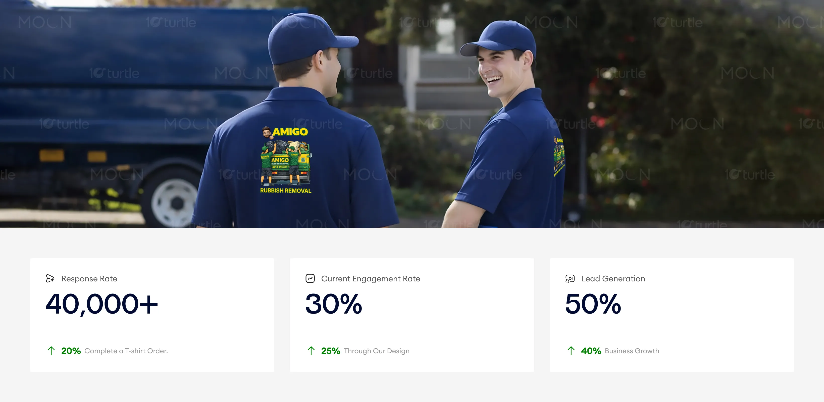
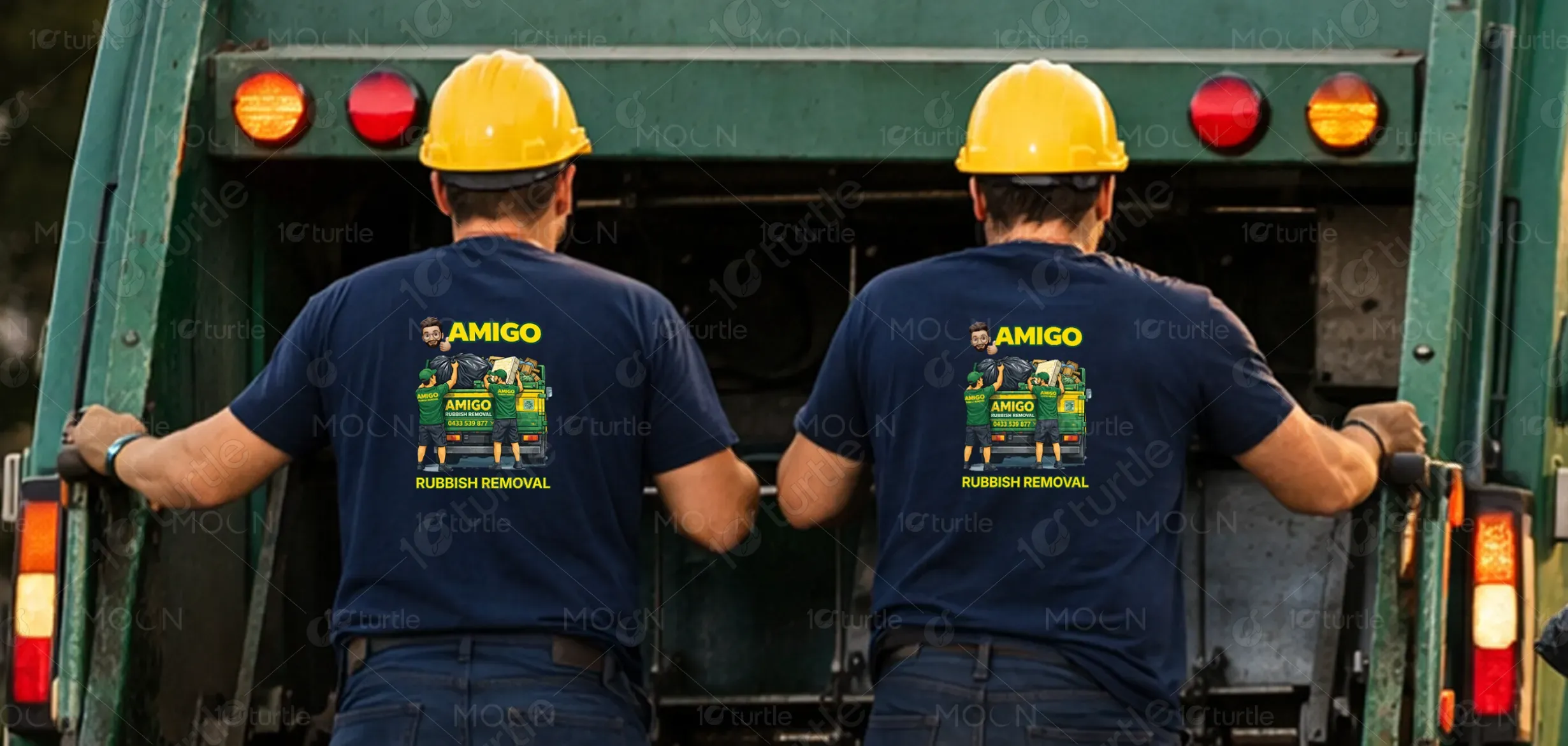
This bold, illustrative design centers on two workers loading a branded truck, instantly communicating the service through action. The symmetrical, centered layout provides balance and immediate focus, while heavy sans-serif typography ensures readability and projects reliability. A green and yellow palette emphasizes eco-friendliness and high visibility. By prioritizing the "AMIGO" brand name and supporting it with "Rubbish Removal" and a QR code, the design functions as an approachable, professional "moving advertisement" perfectly optimized for high-impact apparel.
T-Shirt Design
Graphic Design
Industry
Transport, Automotive & Logistics
Tools we used


Project Completion
2025
Key Market
Global
This design represents a rubbish removal service brand identity applied to wearable media (T-shirt), created to function beyond aesthetics and serve as a practical marketing tool. Its primary purpose is to promote the business in real-world environments, build strong brand recognition during daily service operations, and communicate professionalism and trust at a glance. By integrating clear visuals and branding elements, the design transforms workers into walking advertisements, ensuring constant visibility in residential and commercial areas. At the same time, it maintains a clean, consistent, and professional visual identity that reinforces the brand’s reliability and credibility.

Industry
Transport, Automotive & LogisticsWhat we did
T-Shirt DesignGraphic DesignPlatform
-Waste management businesses often suffer from low visibility and forgettable branding, hindering their ability to stand out. Generic aesthetics and unprofessional appearances can erode customer trust and perceived reliability. Without a clear, immediate visual communication of services, companies miss vital organic marketing opportunities. These combined factors lead to poor brand recall and reduced credibility within a highly competitive marketplace.
The design solves visibility issues through a clear, action-oriented illustration that instantly communicates the service. Prominent typography ensures high brand recall, while the professional composition builds immediate trust. By integrating a phone number and QR code, the apparel becomes a functional lead-generation tool. Ultimately, this strategic blend of color and layout transforms simple workwear into a high-conversion branding solution.
The design acts as a mobile advertisement, effectively using its clean, bold visual style to catch attention and communicate key services. Its combination of high visibility and clarity on t-shirts creates a high-impact tool for increasing brand recall and customer interaction. The increase in inquiries and orders can be attributed to its ability to communicate service value while engaging users directly through visual appeal and QR code functionality.
The long-term vision positions the brand as a trusted operational partner for private equity and high-growth SaaS firms. By establishing repeatable operating models, companies shift focus from fixing issues to accelerating strategic expansion. This approach strengthens the ability to manage complex integrations while maintaining efficiency. The design highlights operational discipline as a competitive advantage, helping organizations achieve higher valuations, smoother exits, and sustainable growth within the private equity ecosystem.
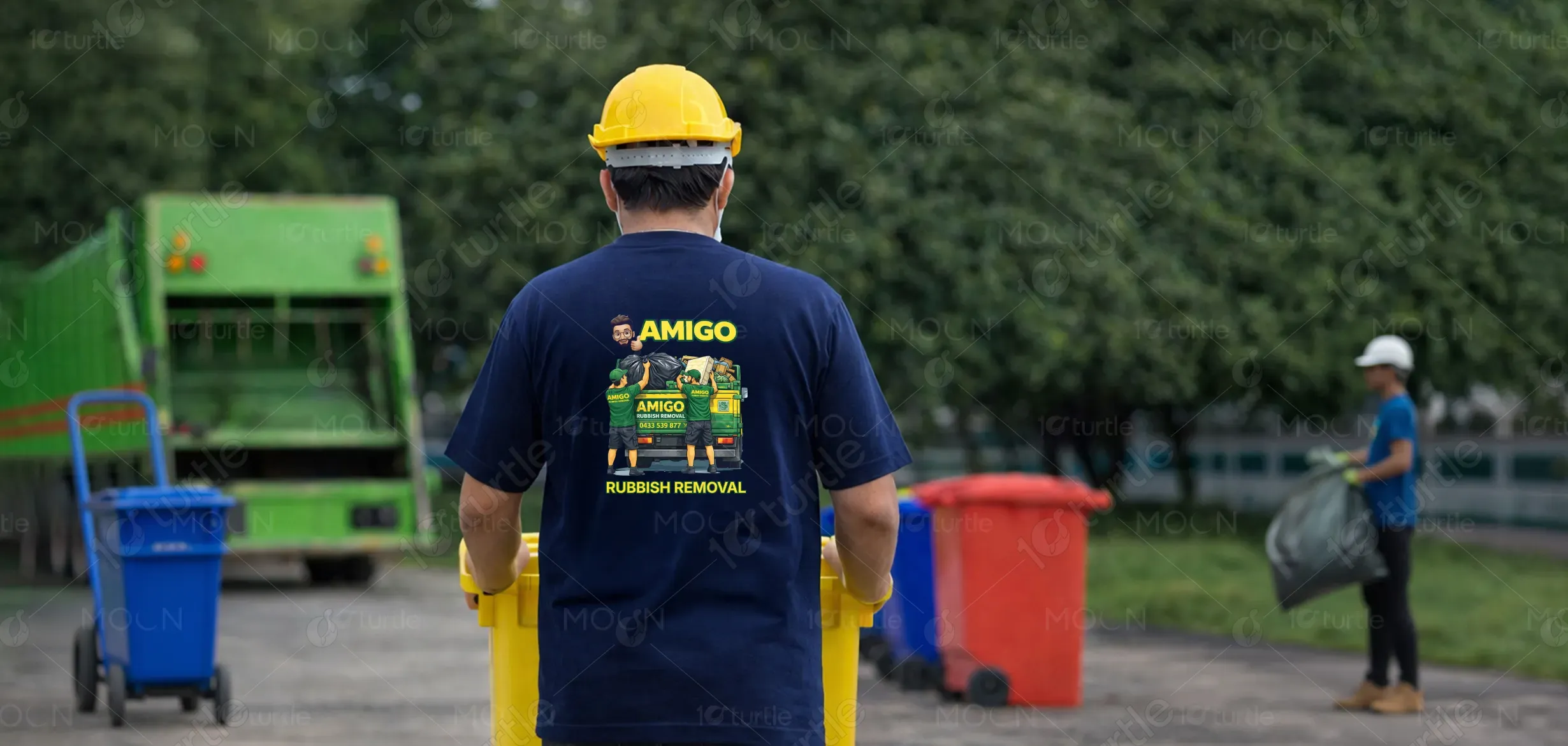
The design utilizes a high-contrast green and yellow palette to symbolize sustainability and ensure high visibility. A dark base enhances readability, while bold outlines and clean vectors maintain clarity at any scale. By using friendly character illustrations, the brand adds a relatable human touch. This streamlined visual language ensures effortless comprehension and memorability across both physical streets and digital platforms.