We designed a seamless and data-driven platform for Odyssey, empowering organizations to evaluate employee performance, track goals, and gather continuous feedback efficiently. By integrating clear dashboards, automated review cycles, and insightful analytics, the platform enhances transparency, engagement, and overall productivity in the workplace.
UX Design
UI Design
Dashboard Design
Web App Design
Industry
Human Resources & Employee Management
Tools we used


Project Completion
2023
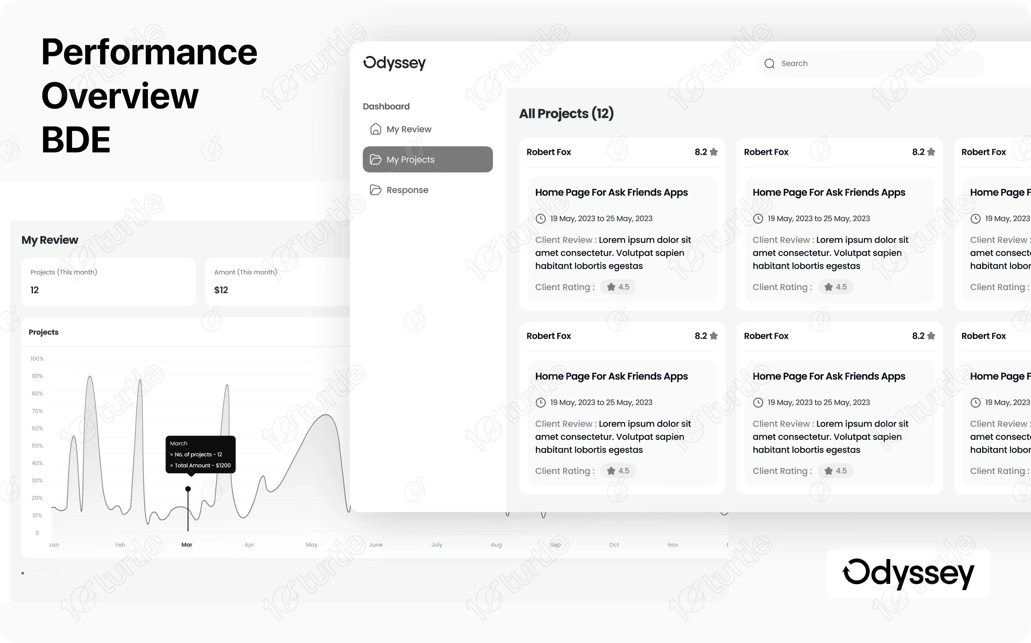
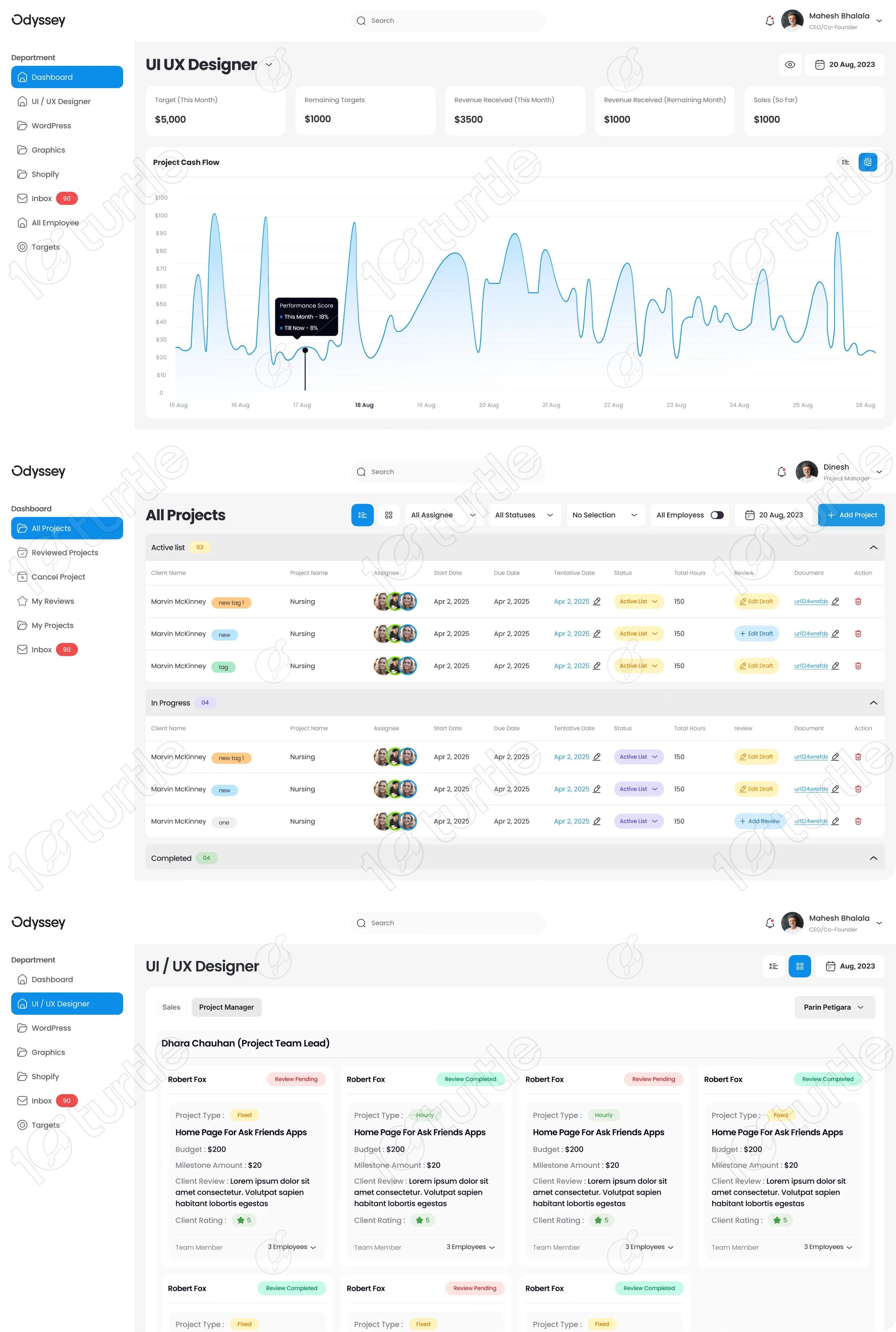
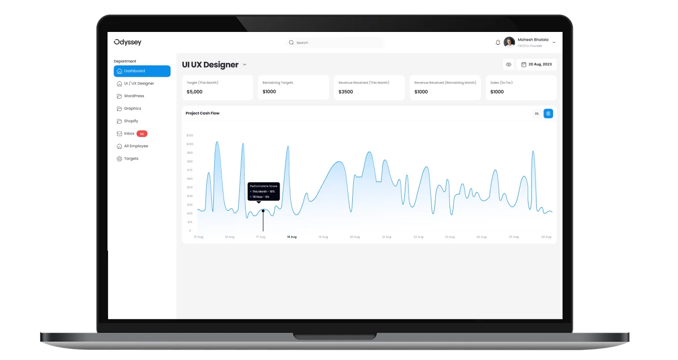
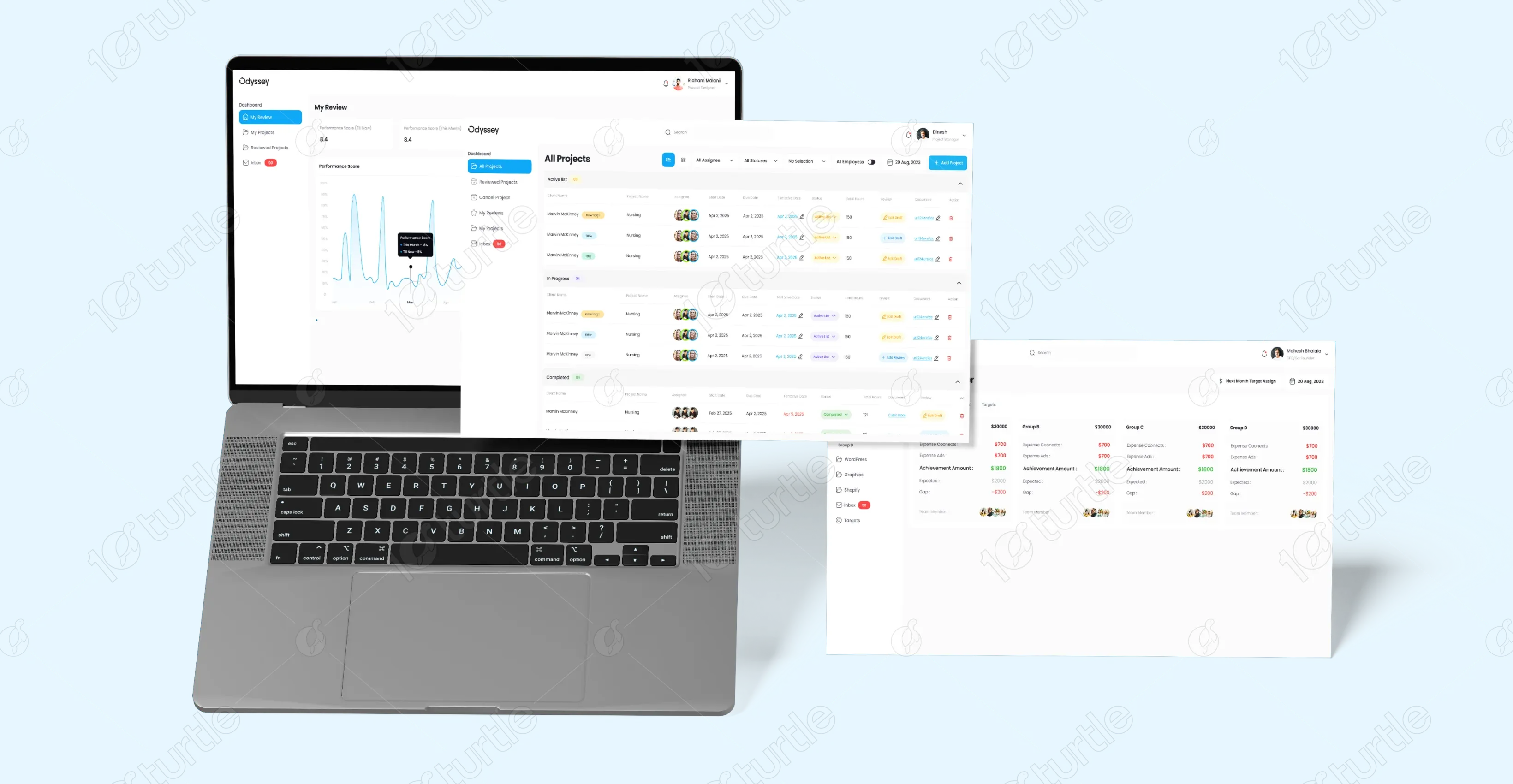
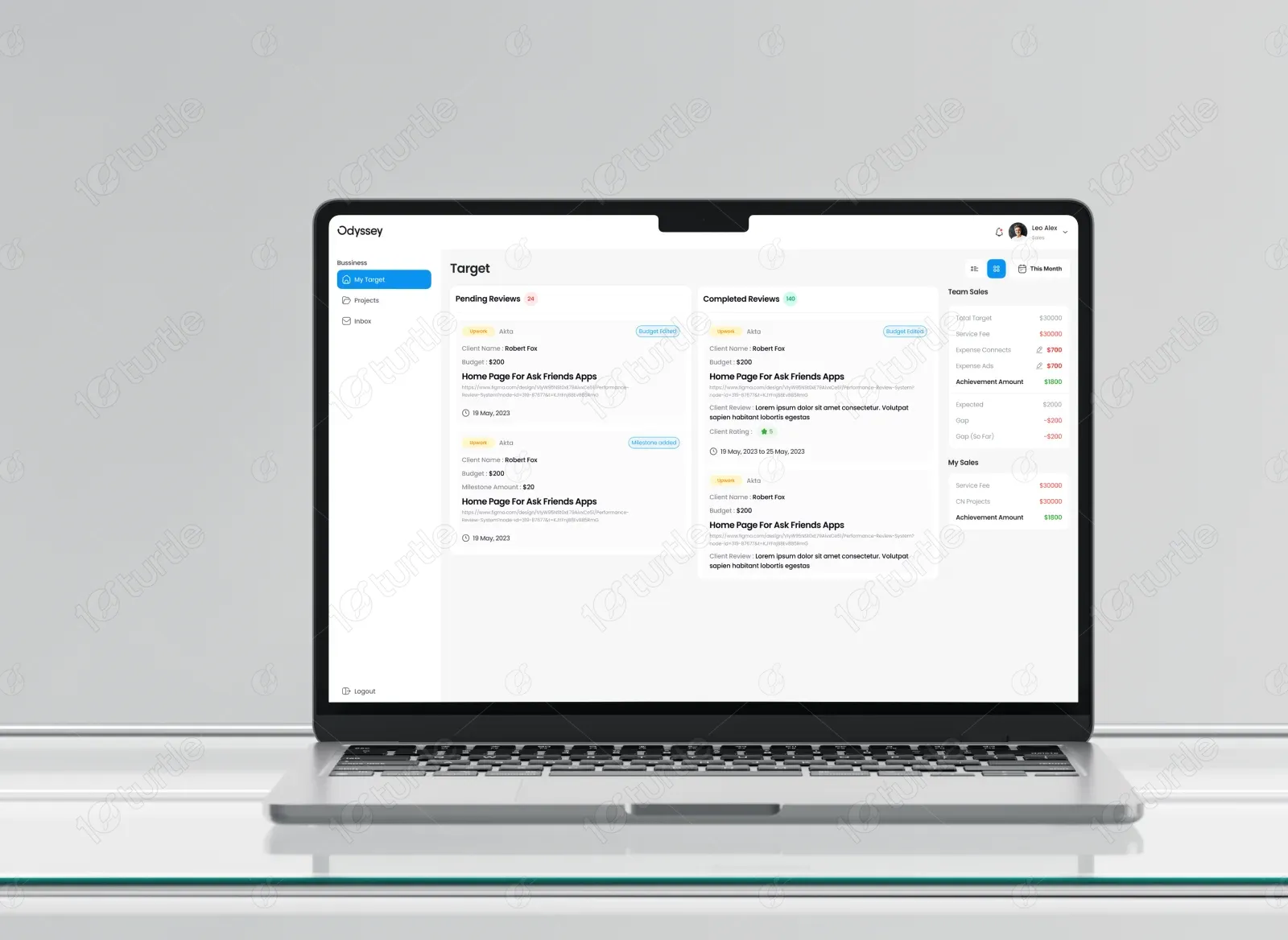
Odyssey is a performance review system built to help organizations simplify employee evaluations and promote continuous growth. The goal was to design a platform that feels intuitive, transparent, and human-centered, turning performance tracking into a positive, collaborative experience. With a focus on clarity and usability, the interface brings together feedback forms, goal tracking, and progress analytics in one cohesive dashboard — empowering teams to manage reviews with ease and precision.
Industry
Human Resources & Employee ManagementWhat we did
User ResearchUX/UI Design SystemDashboard ArchitectureResponsive Web DesignData VisualizationPlatform
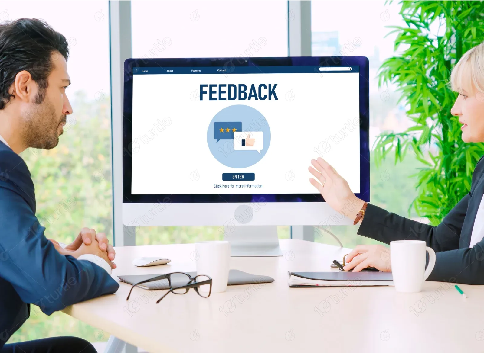
WebsiteDashboard softwareTraditional performance review systems often feel complex and disconnected, resulting in inconsistent feedback, delayed assessments, and low employee engagement. Managers struggle to get actionable insights, while employees find the process unclear or unmotivating — leading to inefficiency and lack of alignment with company goals.
We developed a streamlined digital ecosystem that transforms performance reviews into an insightful and engaging process. Odyssey’s dashboard enables HR teams to manage review cycles, set measurable goals, and visualize progress through clear, interactive charts. The result is a design that promotes clarity, accountability, and growth, aligning people and performance with company success.
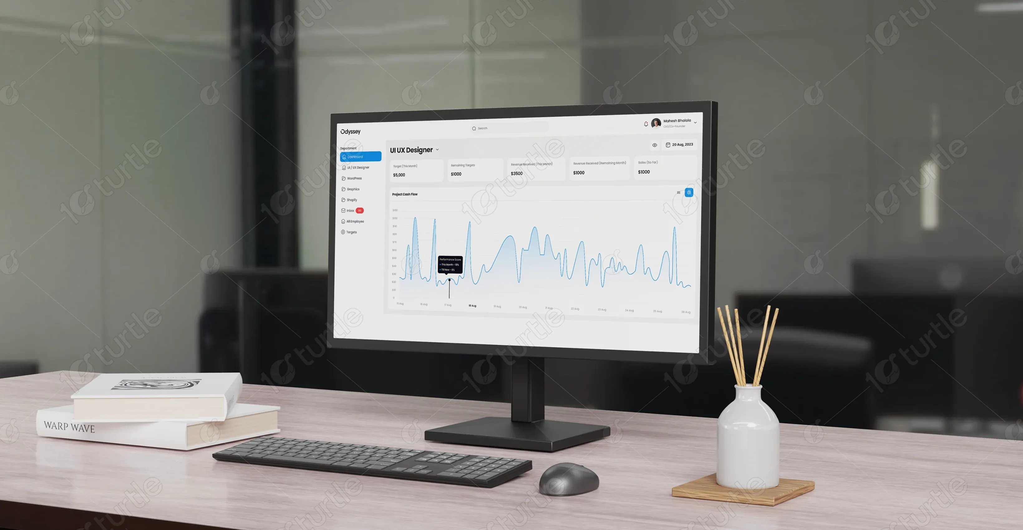
Odyssey’s vision was to move beyond traditional evaluation systems by creating an environment that encourages continuous learning and meaningful feedback. The platform was designed to merge analytics with empathy, combining data-driven insights with clean visual storytelling. By integrating modular layouts, color-coded metrics, and simplified navigation, Odyssey delivers a fluid and rewarding experience, ensuring users can focus on growth, not complexity.
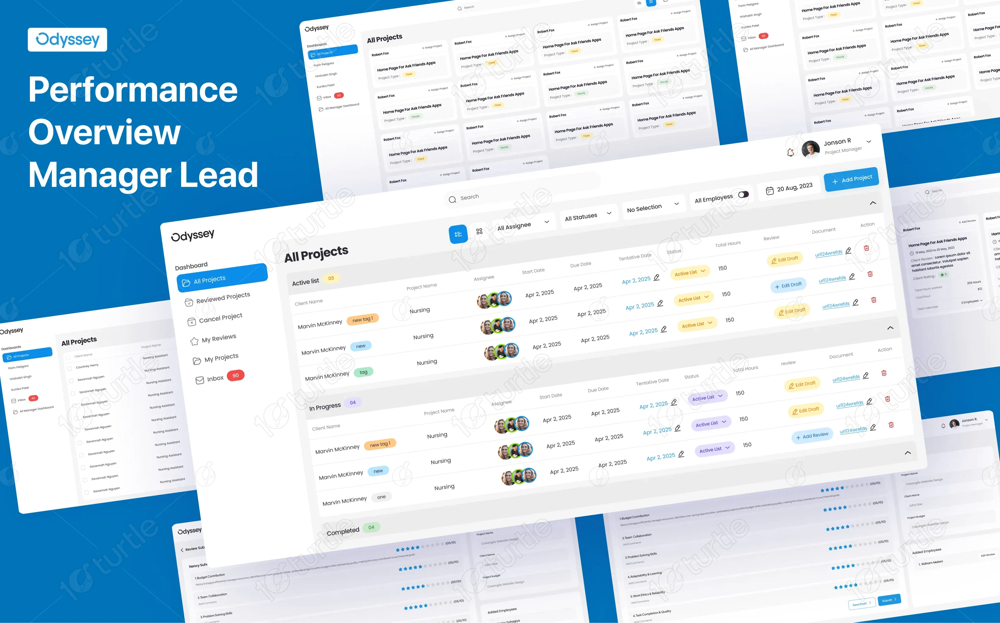

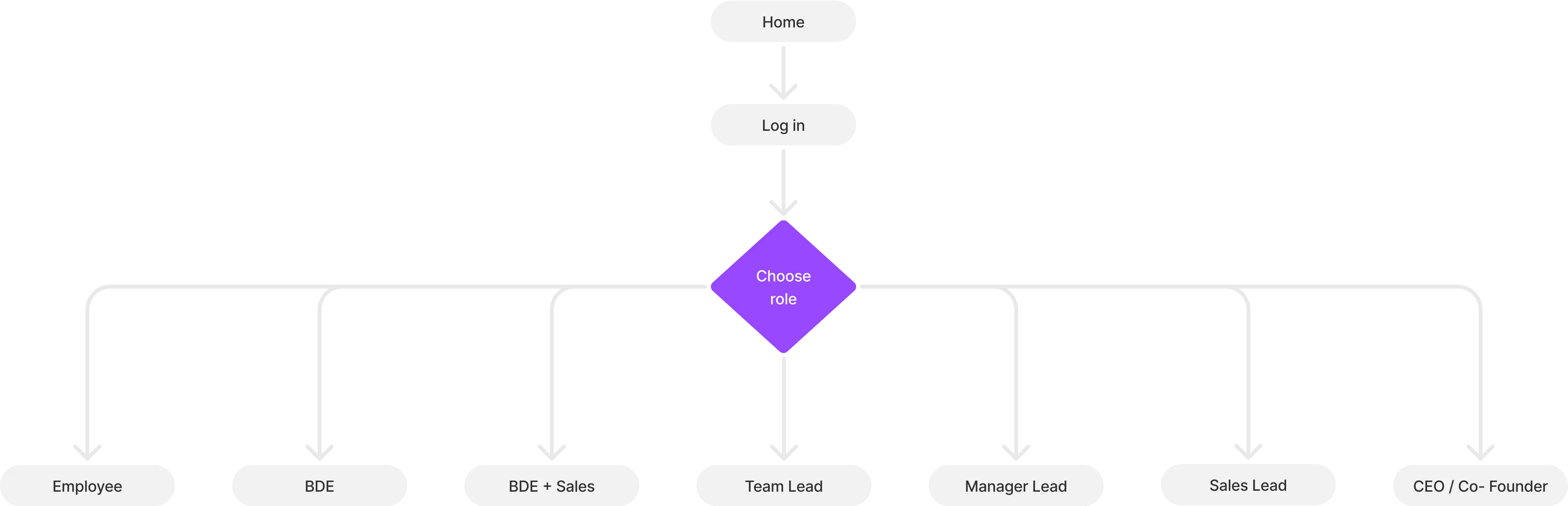
The Odyssey user journey was mapped to guide managers and employees through a simple, outcome-driven flow. From logging in and viewing goals to providing feedback and analyzing performance reports, each step was crafted for clarity and efficiency.
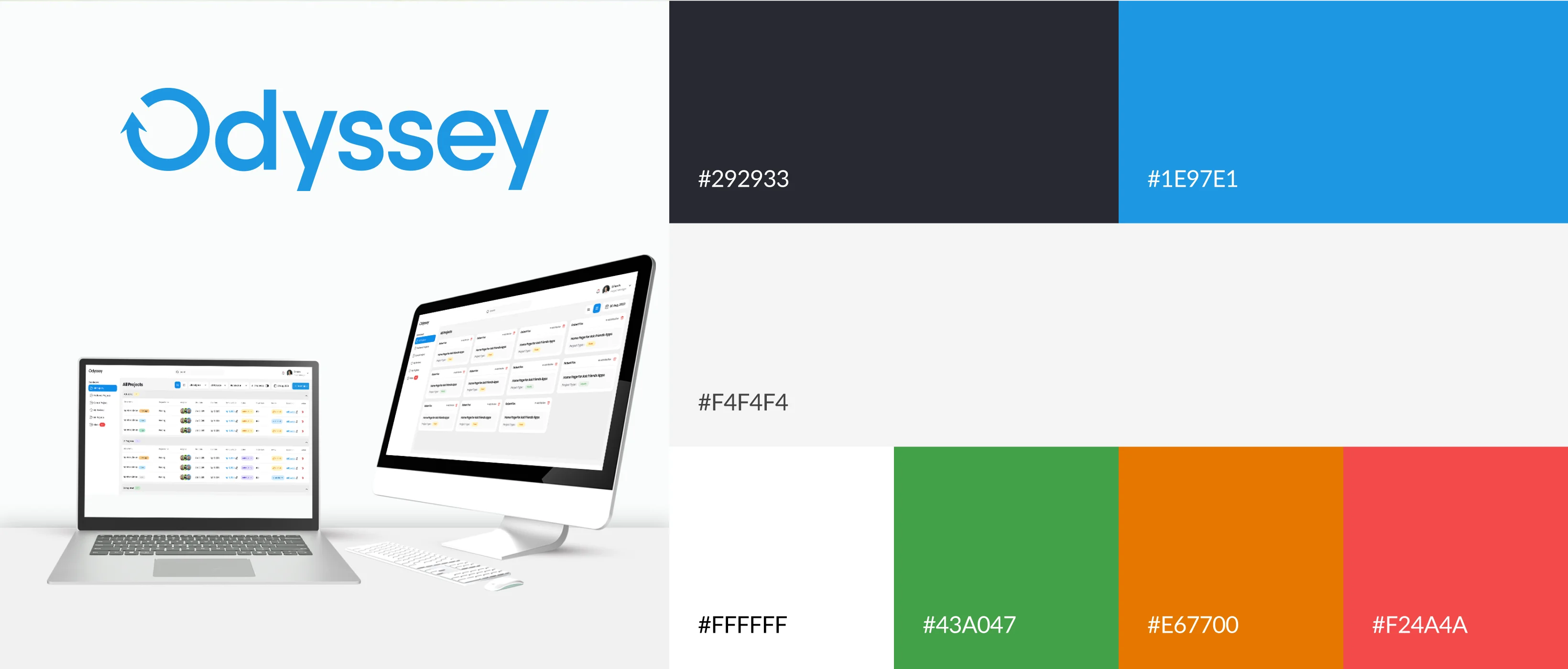
The Odyssey logo represents growth, progression, and focus — symbolizing the upward journey of individual and organizational performance. Its clean geometric form captures stability and intelligence, while the circular motif reflects balance and continuity. The logotype uses a modern sans-serif style, ensuring clarity across all digital mediums and reinforcing the brand’s confident, forward-thinking identity.
Odyssey’s color palette combines professional clarity with energetic vibrance. Cool tones of blue and slate express trust and stability, while soft neutrals ensure readability and focus. Accent hues of orange and teal highlight interactive elements, adding warmth and energy to the data-driven interface. Together, these colors create a brand identity that feels modern, trustworthy, and human.
The wireframes were designed to establish a structured and intuitive layout, emphasizing user accessibility and data visualization. Each section was tested for clarity, ensuring that managers and employees could easily navigate reviews, goals, and reports. This stage helped define key user journeys and interaction points before moving into high-fidelity visuals.