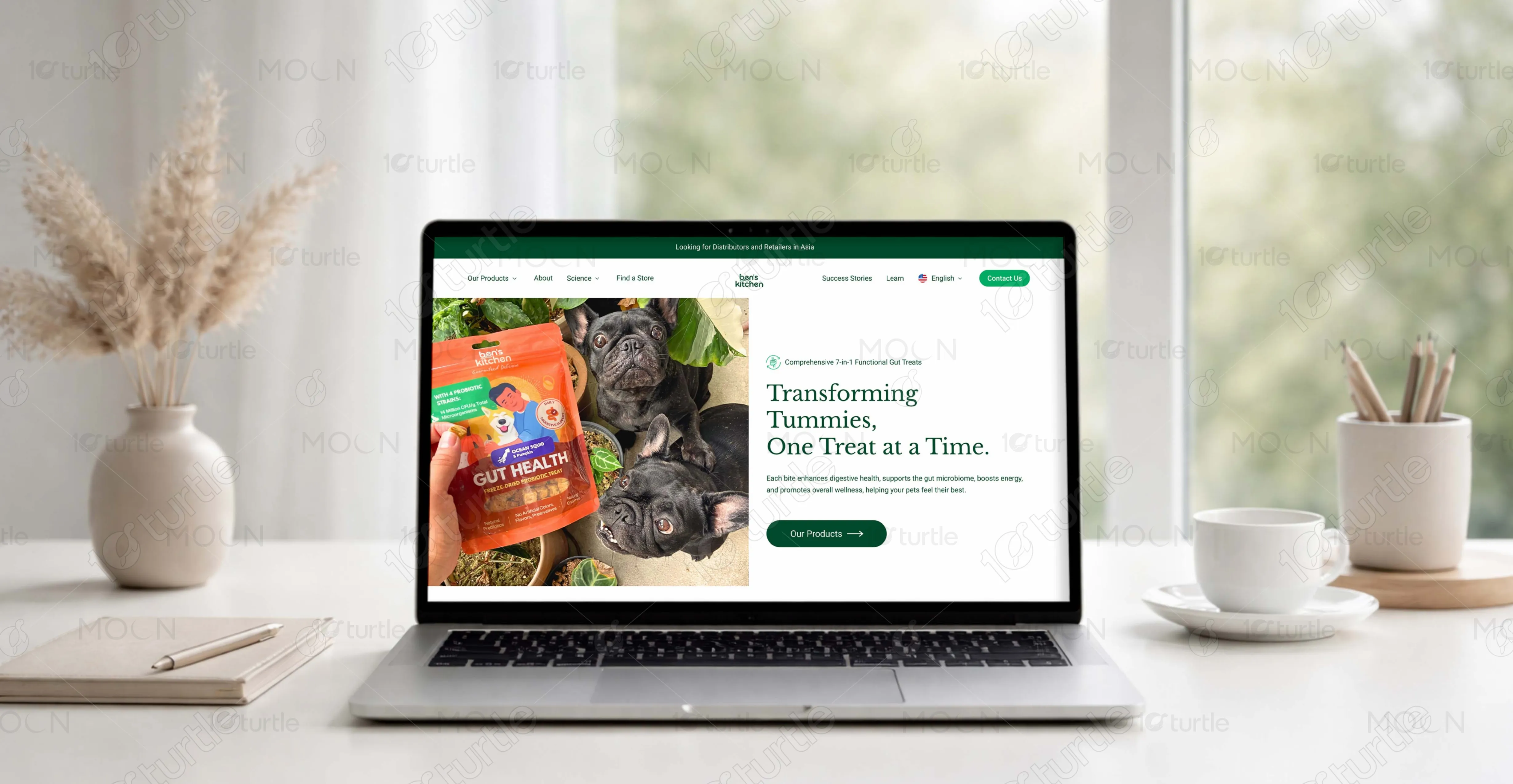
Ben’s Kitchen’s website feels warm and trustworthy. Soft sage backgrounds and deep green tones create a premium feel. The layout balances education with product discovery, guiding pet parents through research and confident purchases.
UX Design
UI Design
Research
Website Design
Industry
Customer goods & retail
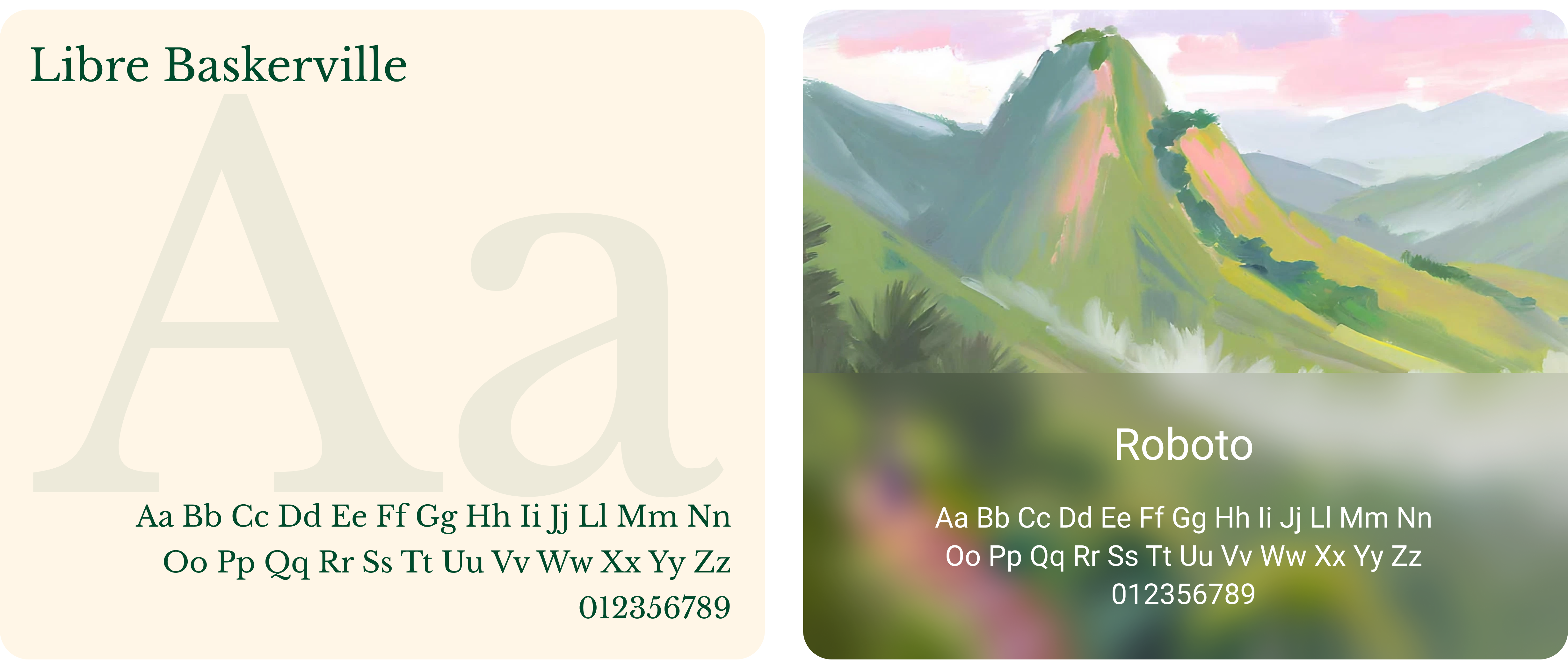
Tools we used


Project Completion
2025
Live Url
https://www.benskitchen.pet/
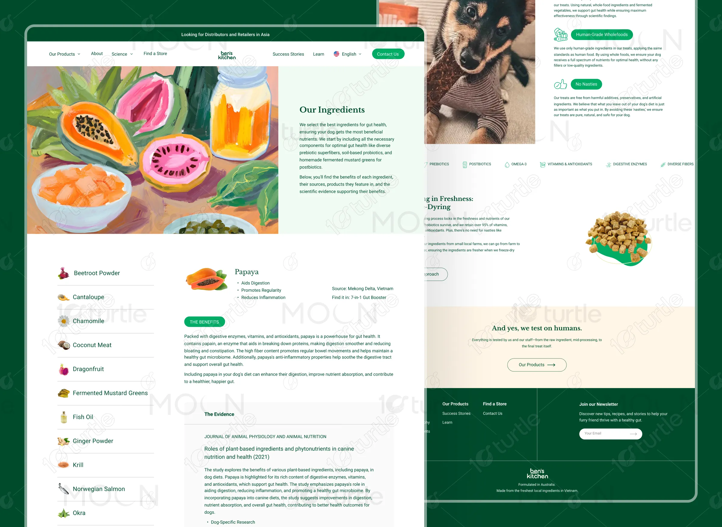
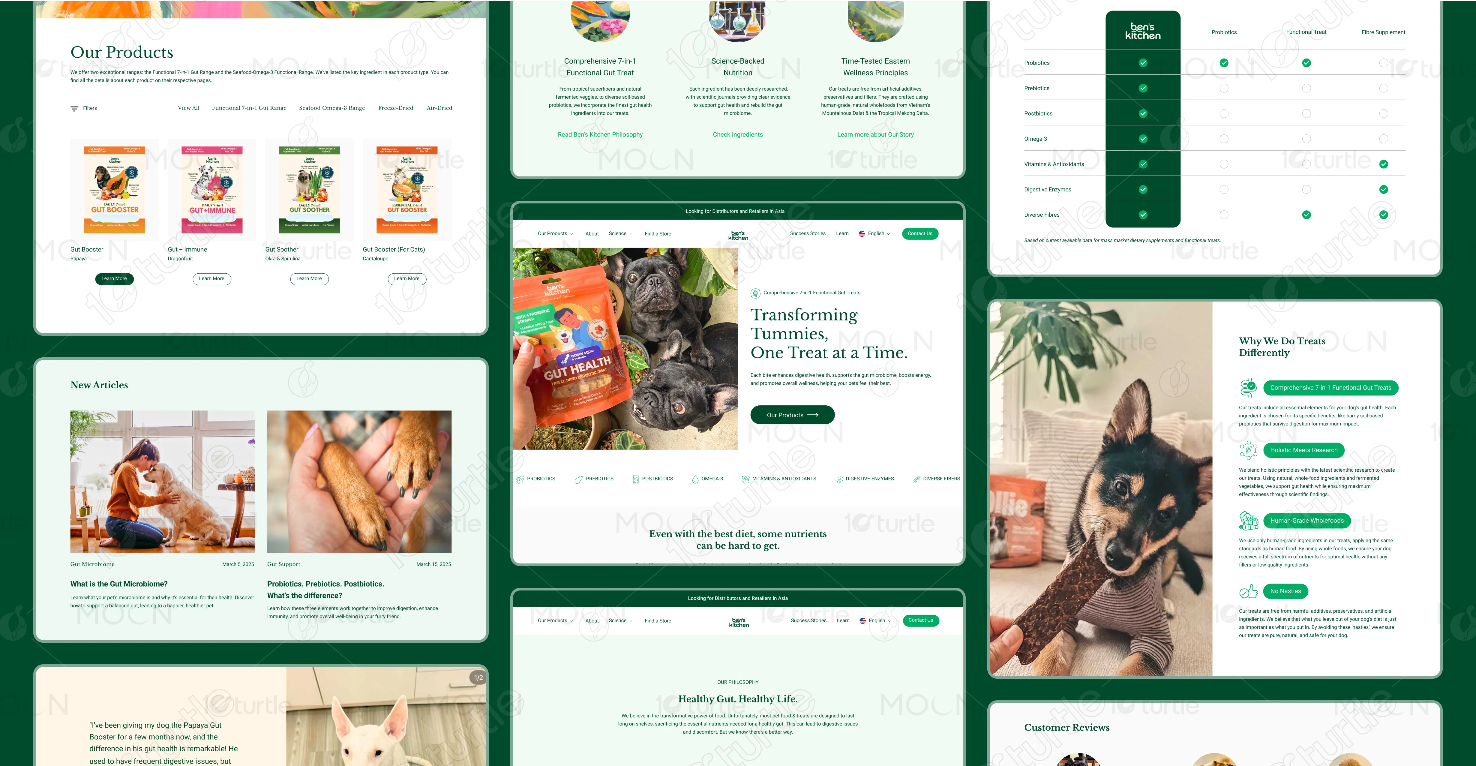
The design blends clean structure with organic warmth. Earthy greens communicate health and safety, while rounded components soften the interface. Educational sections, ingredient transparency, testimonials, and product highlights are carefully layered to build trust. The experience feels informative yet approachable, reflecting both scientific credibility and heartfelt pet care.
Industry
Customer goods & retailWhat we did
User ResearchUI UX DesigningResponsive ExperiencePlatform
WebFlowBen’s Kitchen needed a platform to differentiate its gut treats from generic snacks. The challenge was to educate pet owners about microbiome science while maintaining warmth and trust.
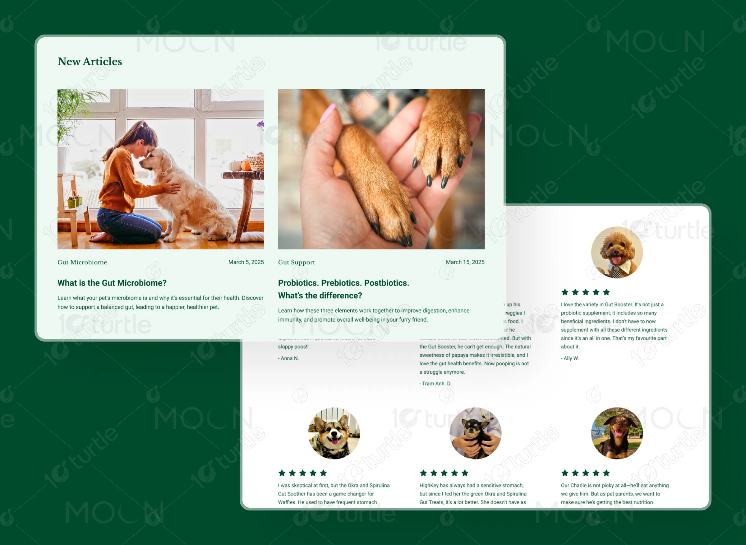
The website focuses on education-first storytelling. Sections on microbiome science, ingredient transparency, and benefits build authority. Product pages balance nutrition details with highlights. Trust elements like testimonials and clean design reinforce credibility and simplify the buying journey.
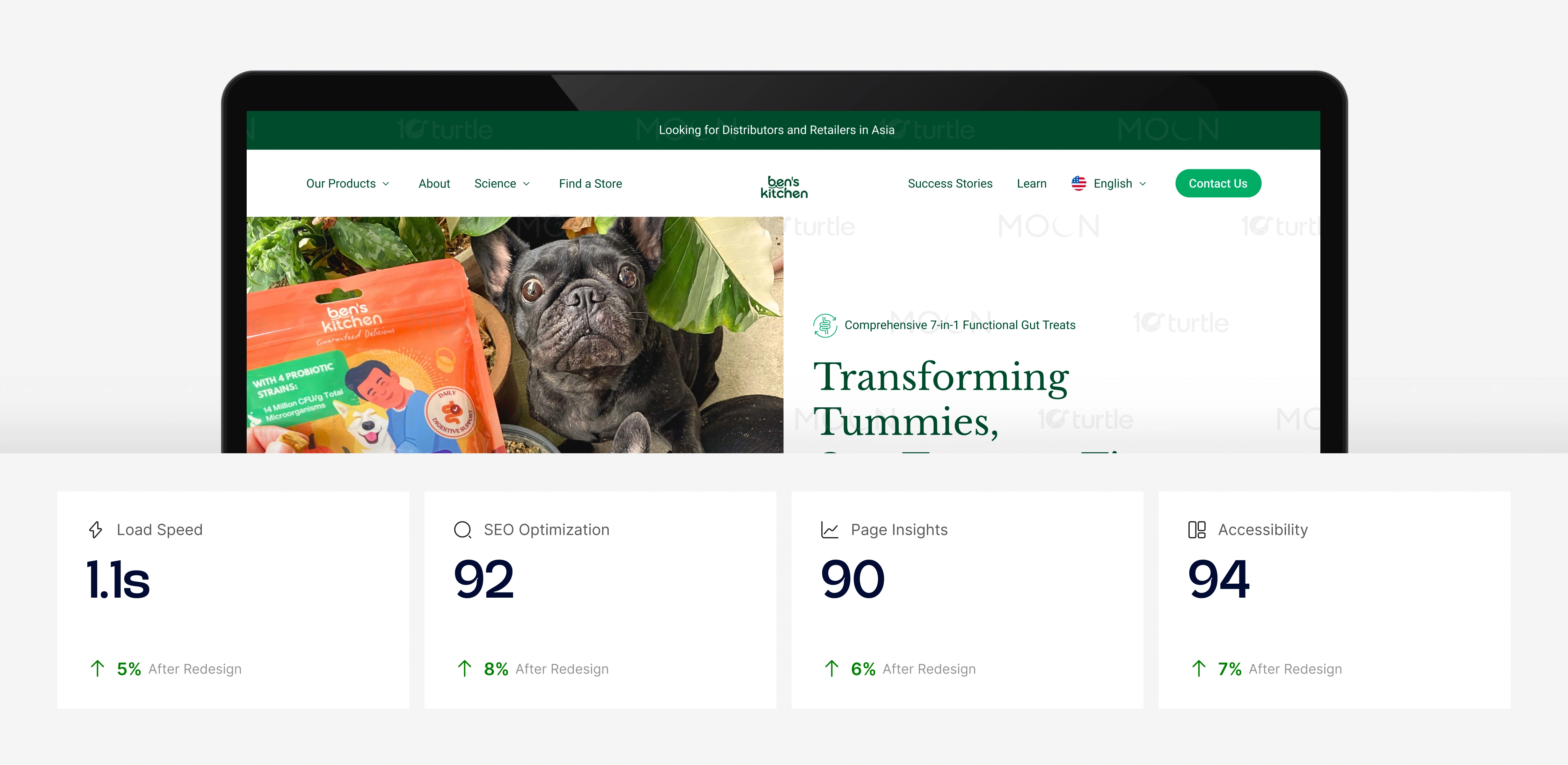
Optimized imagery, clean code structure, and streamlined content hierarchy improved loading speed and usability. Clear semantic structure supports SEO, especially for educational blog content. Accessibility improvements ensure readability and inclusive navigation, while simplified product flows reduce friction and increase confidence-driven conversions.
By pairing research-backed content with soft visuals and approachable language. We separated scientific explanations into digestible sections, used icons for clarity, and supported claims with real imagery and testimonials. The balance between structured information and warm storytelling ensures credibility without sacrificing emotional connection.
The Ben’s Kitchen logo is simple, friendly, and handcrafted in feel. The soft curves and lowercase typography reflect warmth and authenticity, aligning with the brand’s family-founded story. Its minimal design ensures versatility across packaging and digital platforms while reinforcing a wholesome, trusted pet wellness identity.
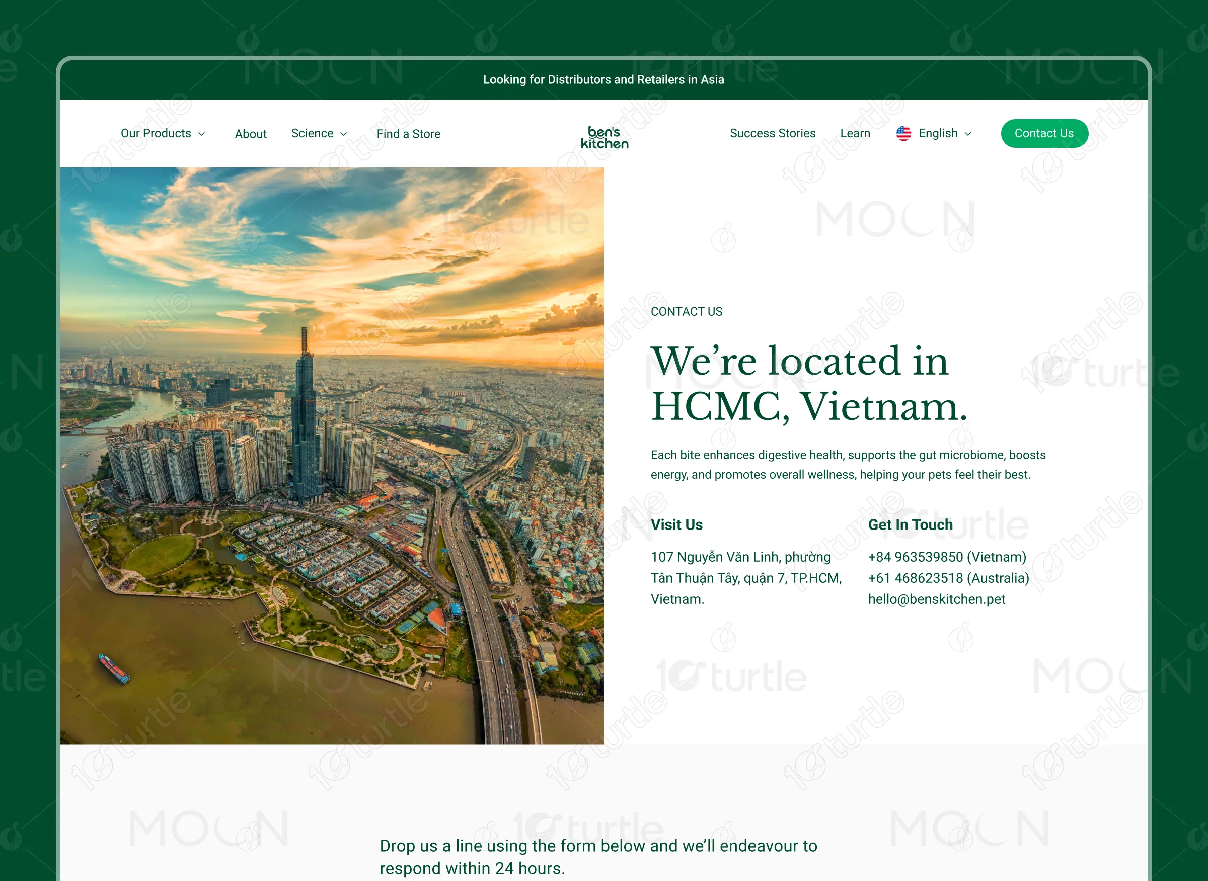
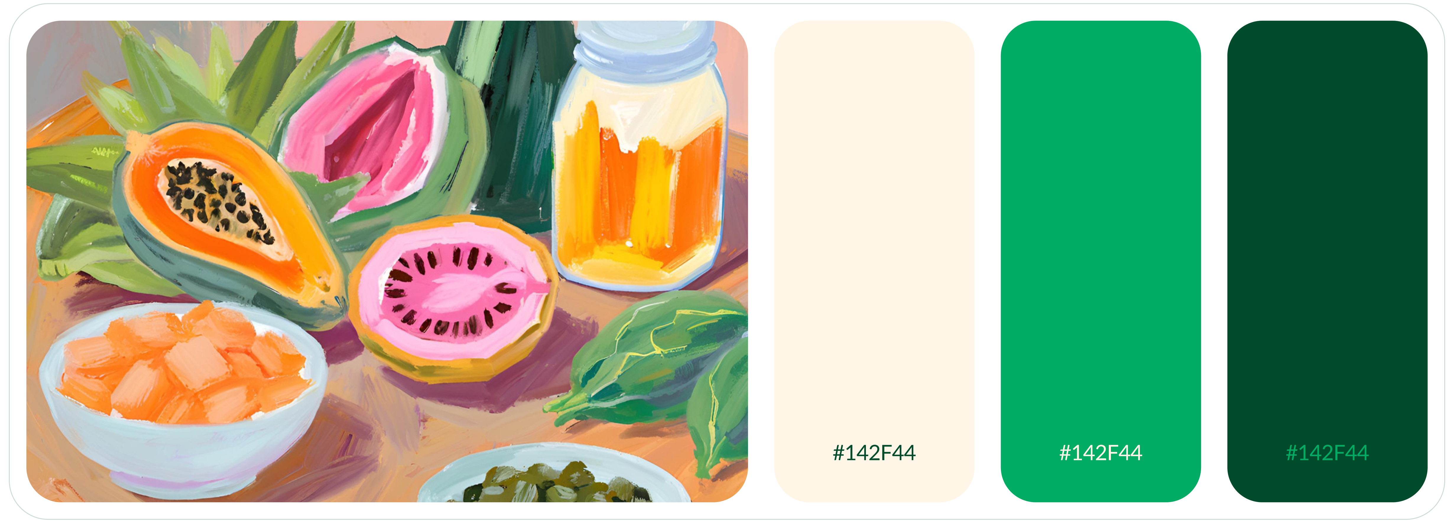
The palette centers on deep forest green, sage, soft beige, and muted natural tones. Green communicates health, trust, and organic quality. Beige sections create warmth and contrast. Accent buttons use deeper green shades to maintain brand consistency while clearly guiding user actions across the site.
The wireframe follows a layered storytelling approach: hero introduction, educational positioning, product benefits, ingredient transparency, testimonials, and strong CTAs. Product pages prioritize imagery, key benefits, and nutritional details. Informational pages use structured content blocks to prevent overwhelm and maintain smooth scroll progression.