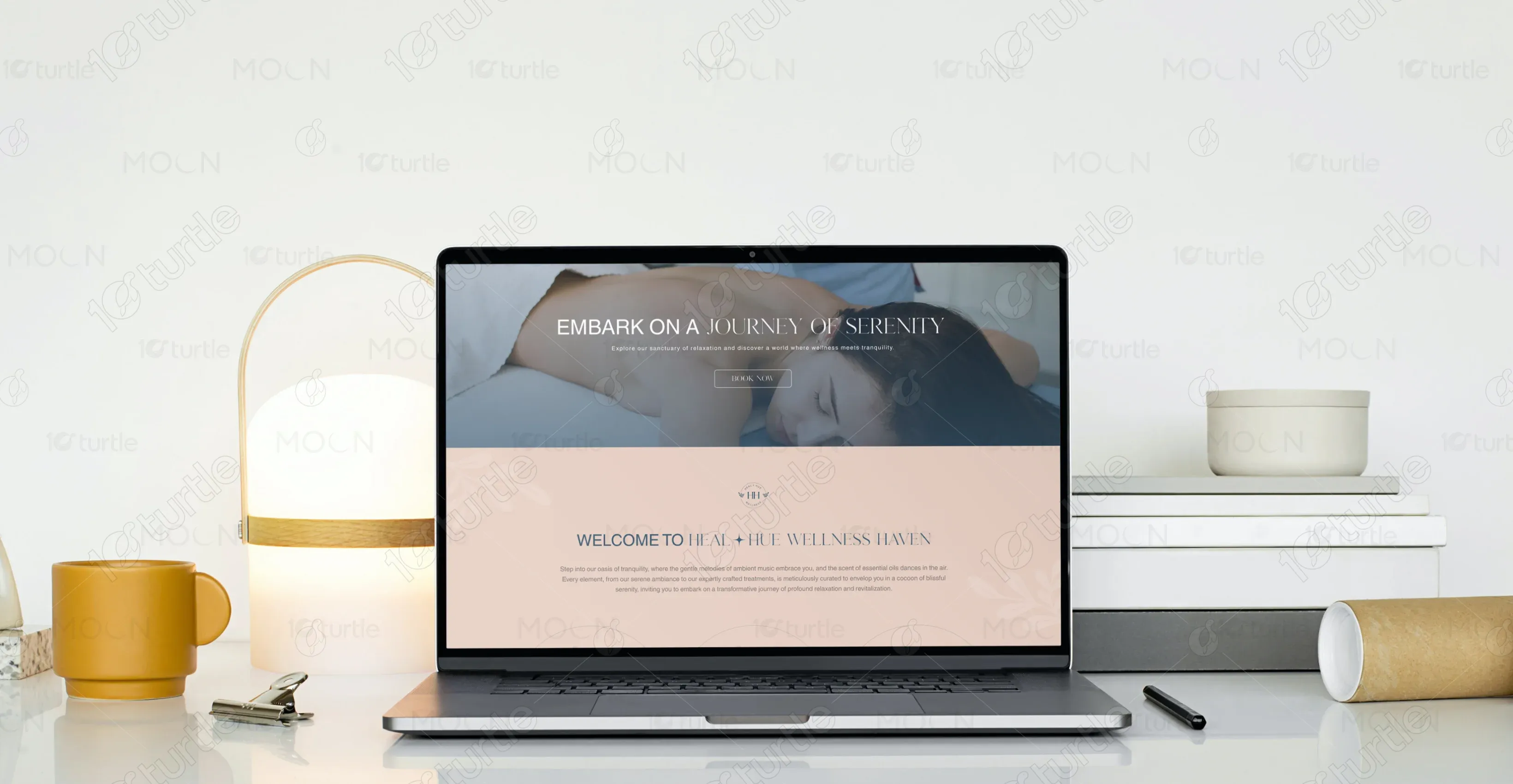
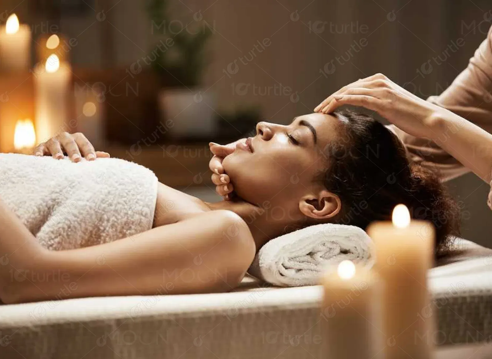
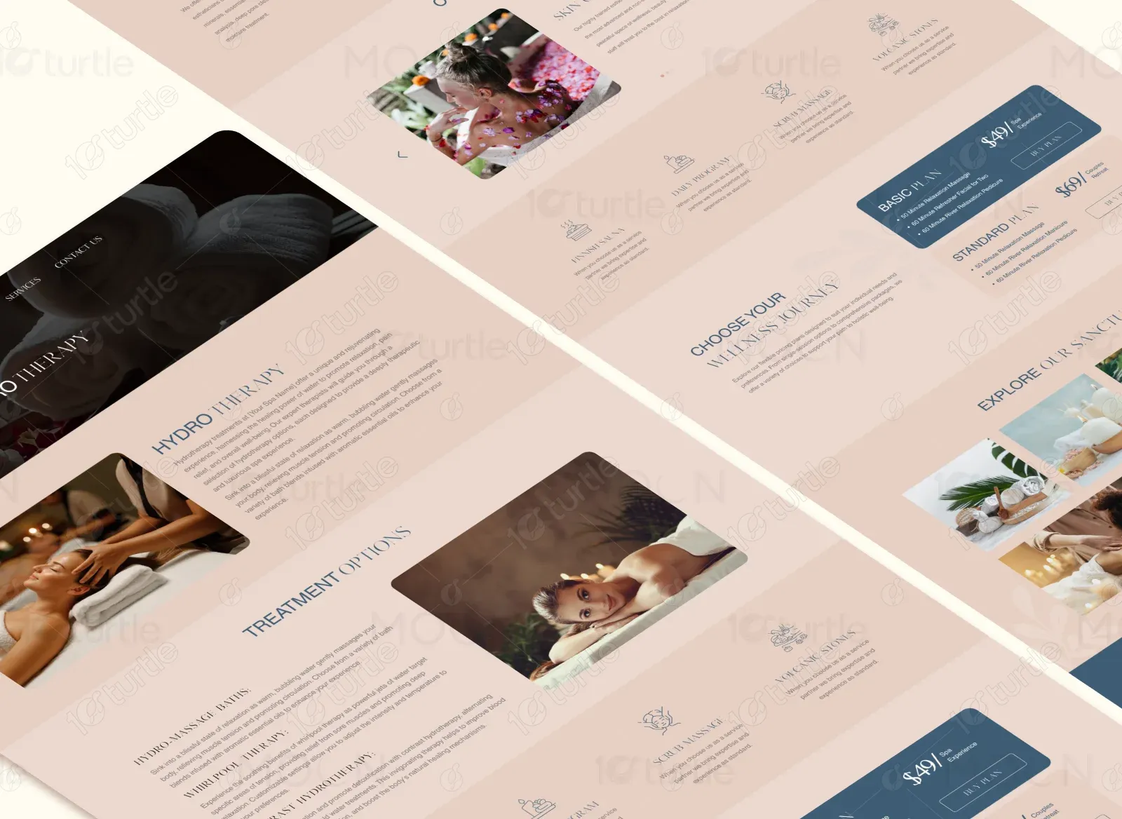
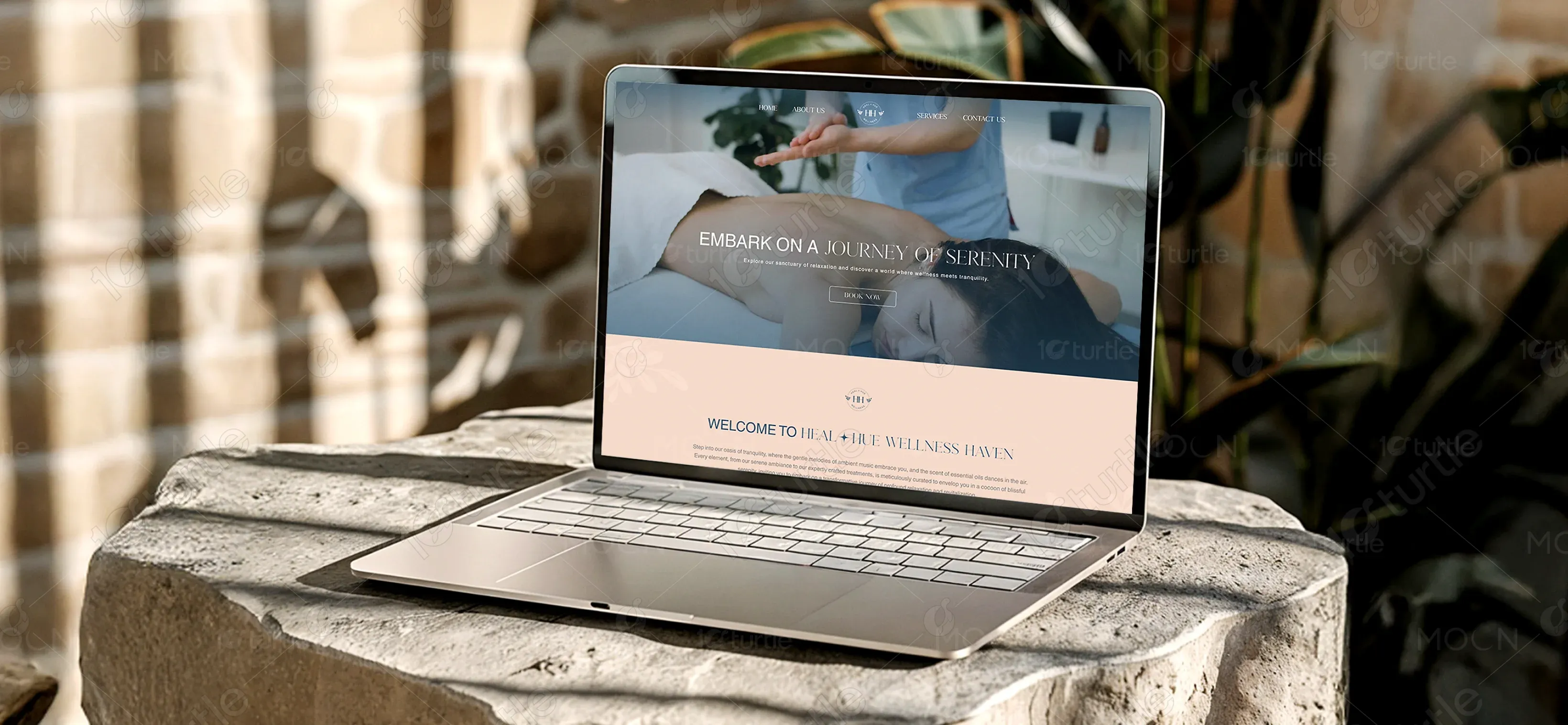
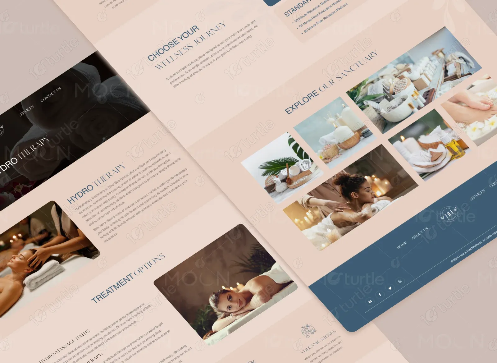
Heal & Hue Wellness Haven is a sanctuary where tranquillity meets care. The brand specializes in services such as hydrotherapy, deep tissue massage, and reflexology, along with a variety of holistic and beauty treatments. The website is designed to reflect a peaceful and welcoming environment, offering clients an easy path to wellness and relaxation.
UX Design
Websites Design
UI Design
Industry
Health & Wellness
Tools we used


Project Completion
2024
The client wanted to build an online platform that mirrors the calming atmosphere of their physical space. The website needed to express the brand's dedication to wellness, embody elegance, and provide users with essential information about services, pricing plans, and spa offerings while facilitating bookings.
Industry
Health & WellnessWhat we did
User ResearchUI UX DesigningPlatform
-Clients often find it overwhelming to browse and book spa services due to cluttered, uninspiring websites. Heal & Hue Wellness needed a platform that could eliminate confusion, offer a clear view of their offerings, and reflect the calm, nurturing space they provide.
We designed a gentle, aesthetically refined website that communicates peace and professionalism. Key sections were crafted to highlight the brand’s signature services, pricing plans, and wellness philosophy, while integrating imagery and soft color tones that mirror the ambiance of a luxury spa.
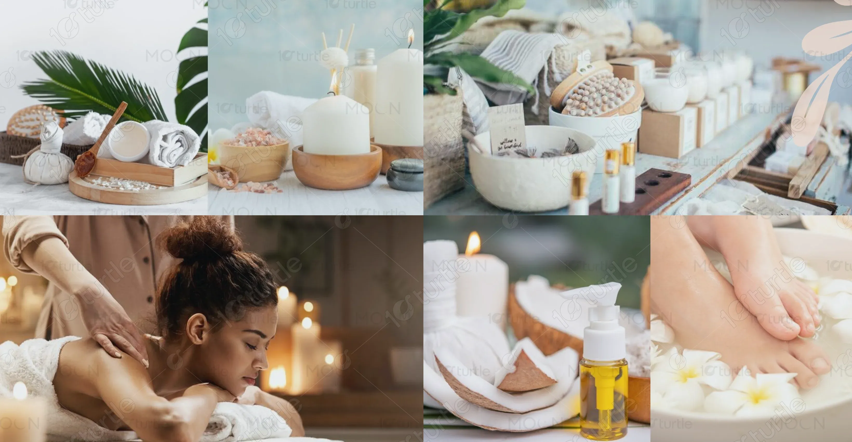
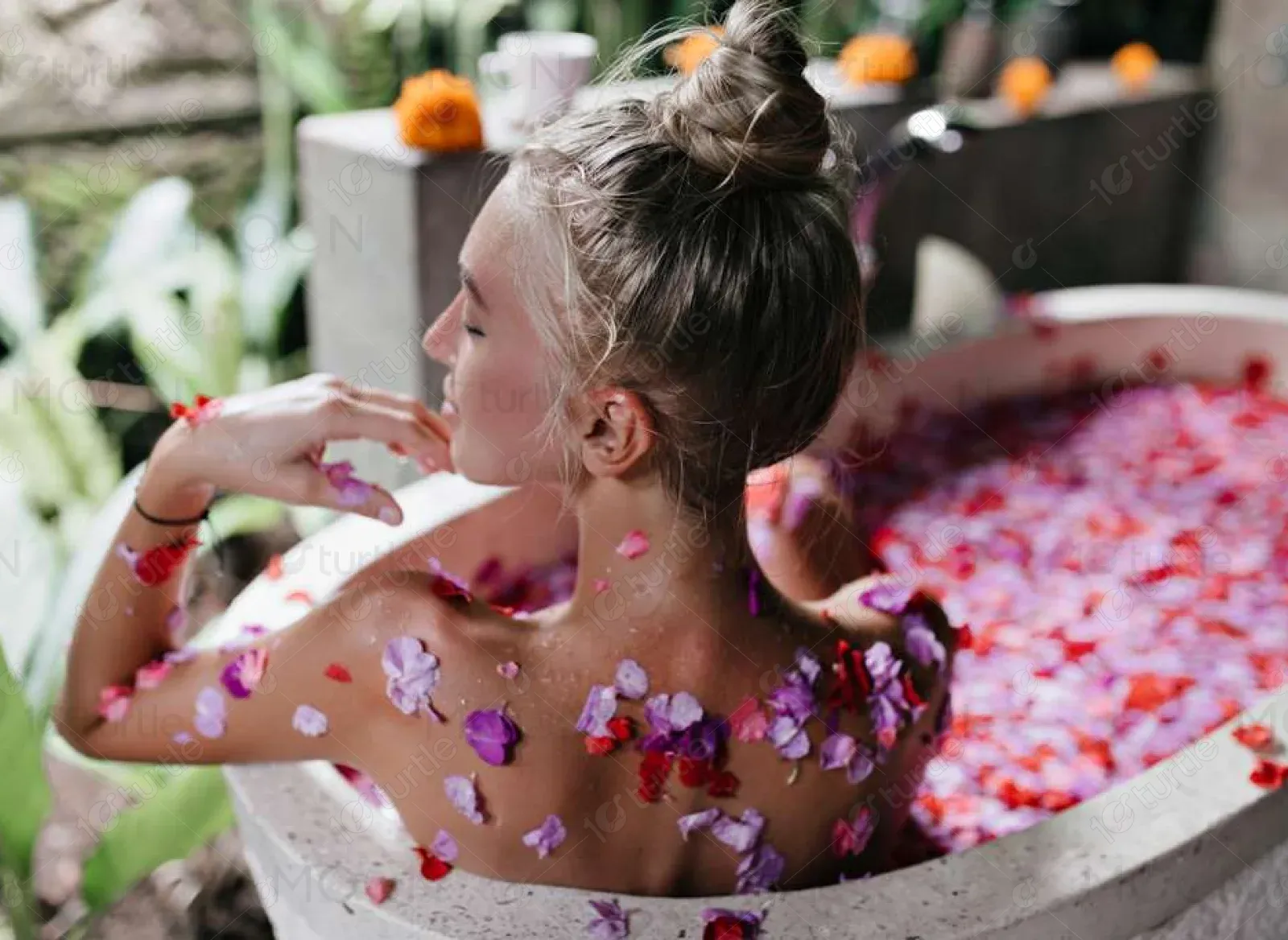
The client envisioned a website that felt serene, elegant, and feminine. They requested a clean layout, floral elements, and curated images to represent their treatments and peaceful spa atmosphere. Inspired by nature and softness, the design aimed to convey luxury and care.
The Heal & Hue logo is a minimalist emblem featuring a soft serif typeface with delicate spa icons and a balanced layout. It reflects harmony, care, and luxury, aligning perfectly with the brand's soothing identity.
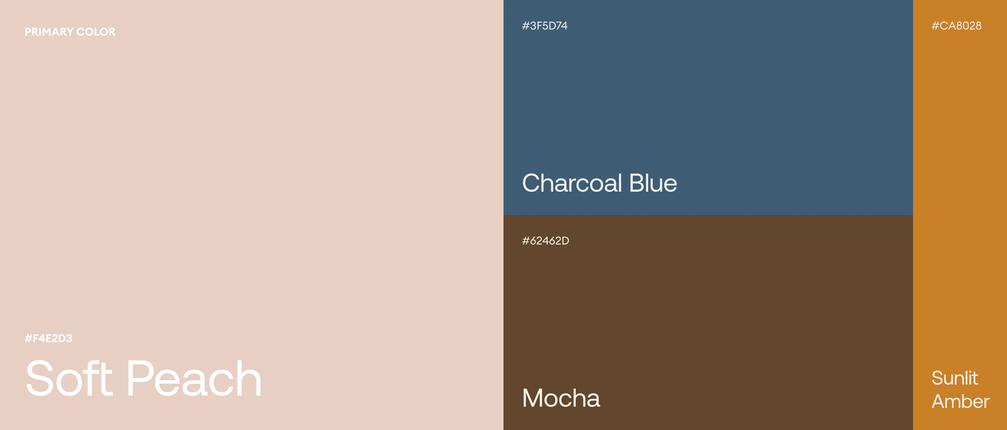
The website uses a soft, calming palette that promotes tranquility. The primary color is #F4E2D3 (Soft Peach), which also serves as the background to maintain warmth throughout. Secondary shades include #37404A (Charcoal Blue) and #62462D (Mocha), offering balance and depth. Accent colors such as #CA8028 (Sunlit Amber) and #FF6347 (Warm Coral) add vibrancy and a touch of natural luxury. These shades were chosen to invoke comfort, warmth, and serenity.
The wireframes were developed with a focus on simplicity, intuitive flow, and service visibility. The layout prioritizes wellness journeys, treatment options, and seamless navigation between sections. Booking CTAs and pricing plans are placed for easy user access.