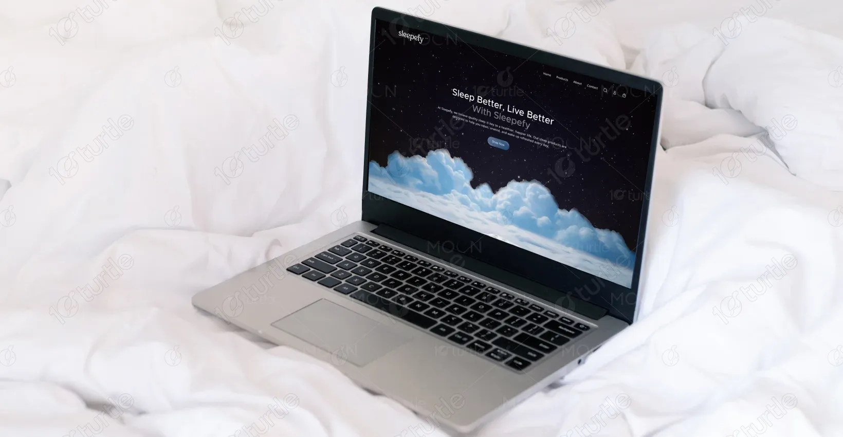
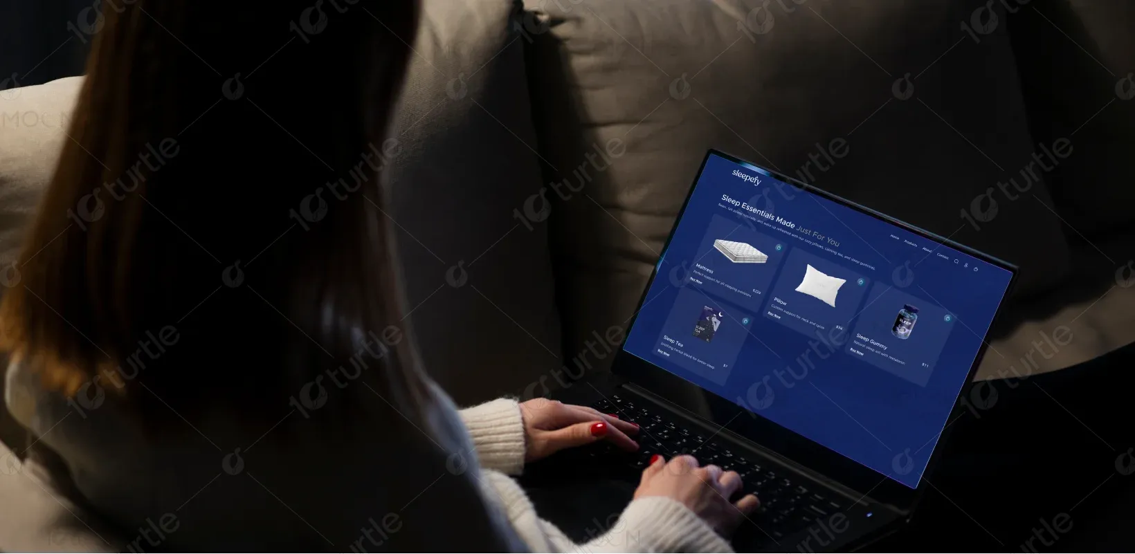
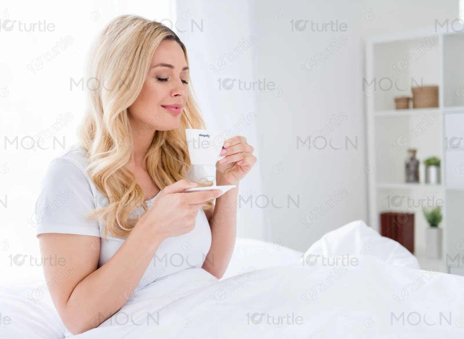
Sleepefy is a wellness-focused brand offering thoughtfully designed sleep products that support rest, recovery, and relaxation. The homepage introduces users to a peaceful digital environment that mirrors the brand’s promise of deep, uninterrupted sleep and overall well-being.
UX Design
UI Design
Research
Website Design
Industry
E-Commerce
Tools we used


Project Completion
2025
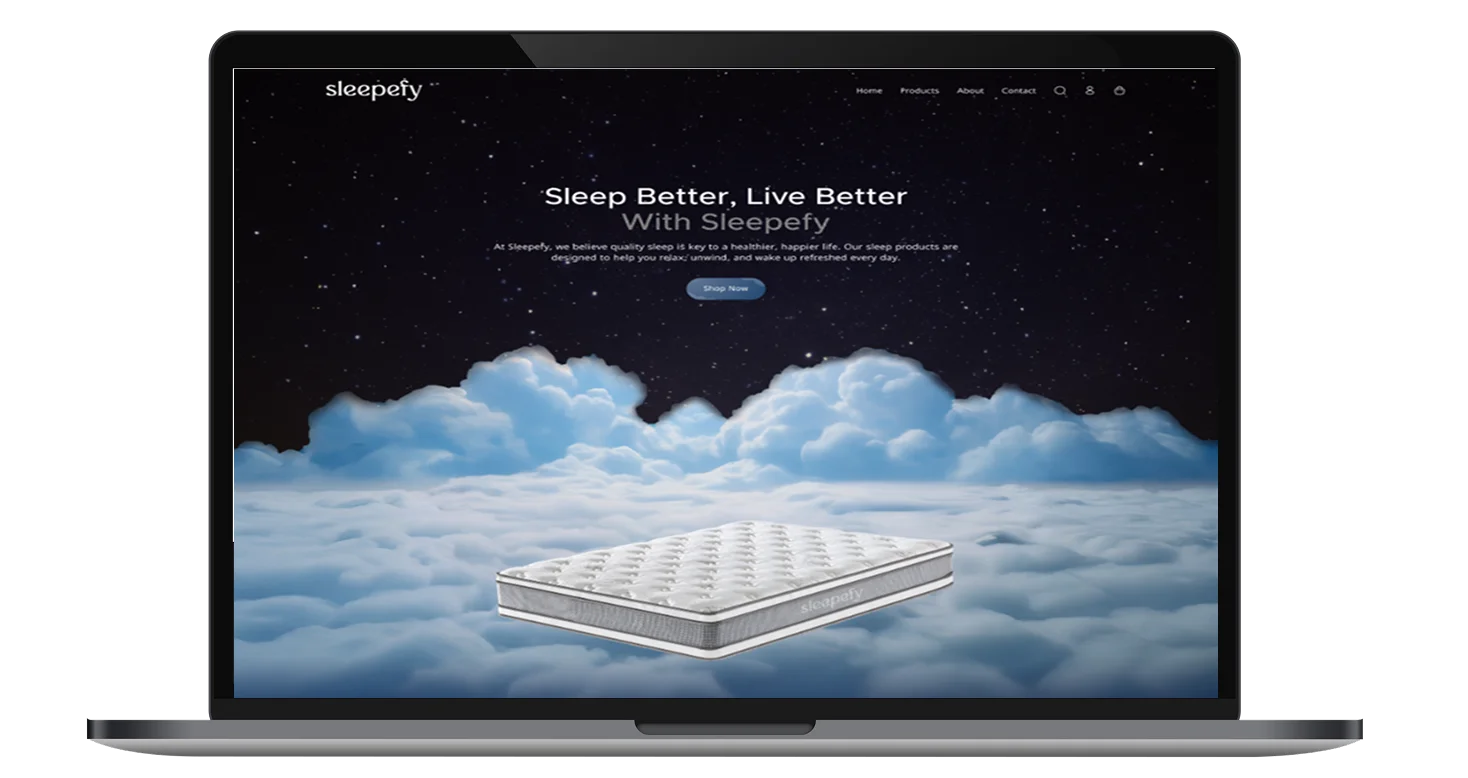
The objective of this project was to design a visually calming, immersive homepage that communicates trust, comfort, and quality. The client wanted a strong emotional connection with users while clearly presenting multiple product categories. The scope included homepage UX, visual storytelling, and brand-consistent UI design.
Industry
E-CommerceWhat we did
User ResearchUI UX DesigningResponsive ExperiencePlatform
-Sleep wellness brands often struggle to convey comfort and effectiveness through digital experiences. The challenge was to avoid a cluttered, sales-heavy layout while still showcasing multiple products. The design needed to instantly create a sense of calm while guiding users toward product discovery.
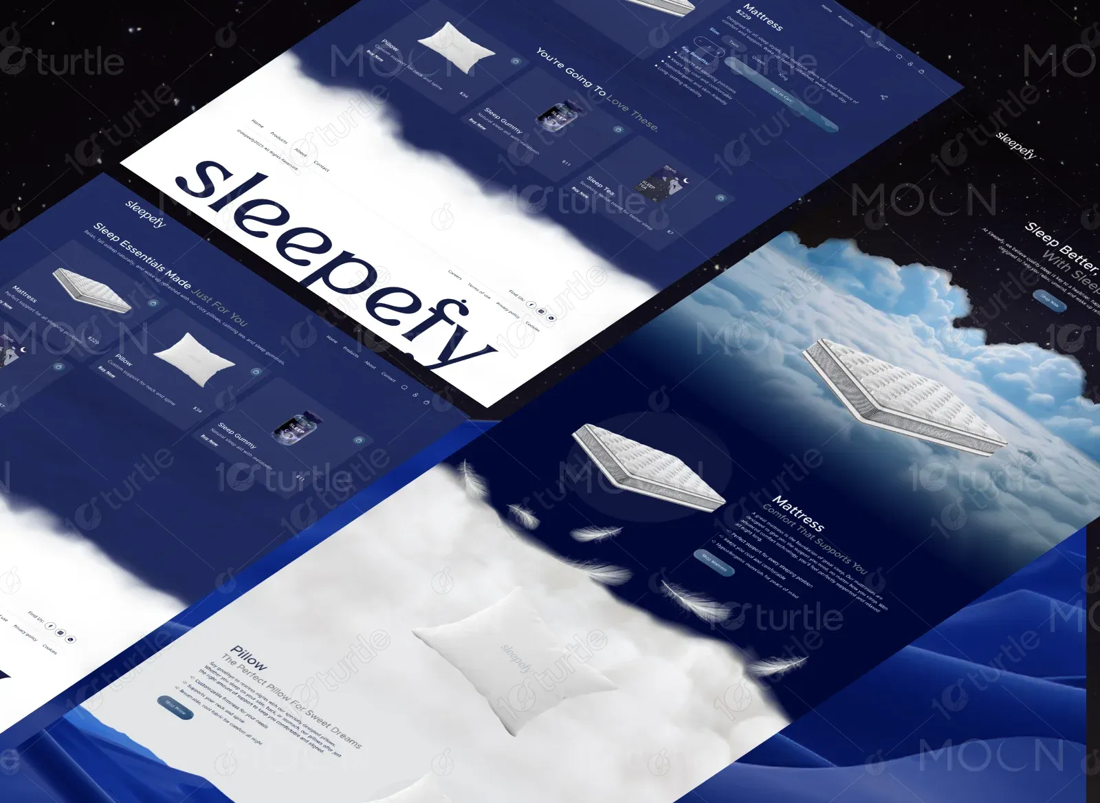
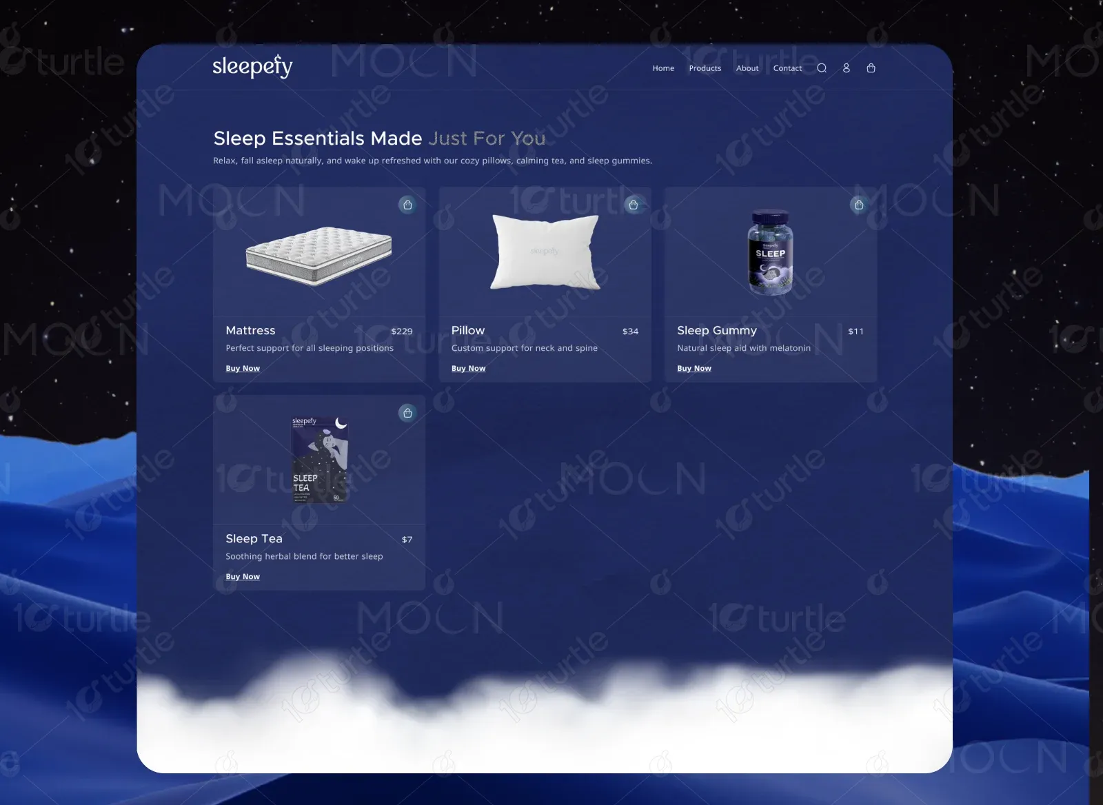
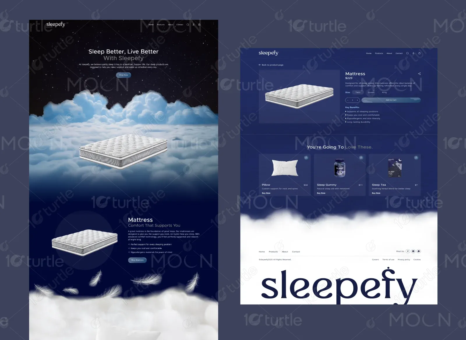
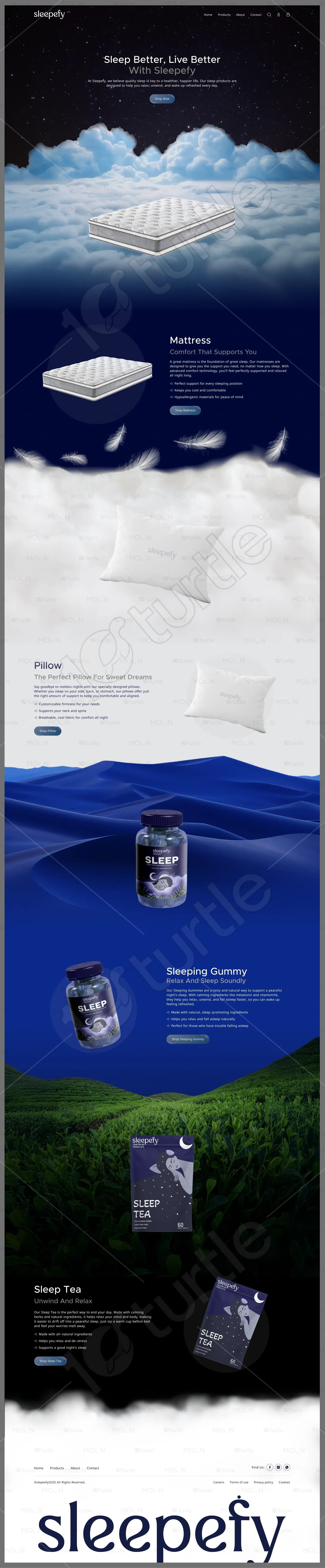
A story-driven homepage was designed using layered visuals, soft transitions, and product-focused sections. The layout mimics a sleep journey, starting from comfort essentials to wellness supplements. Minimal UI elements, clear CTAs, and spacious composition help users stay relaxed and engaged.
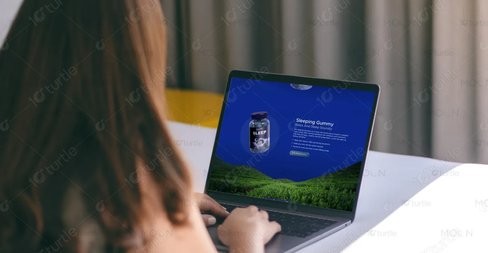
The client envisioned a premium, night-inspired aesthetic with a dreamy atmosphere. They requested soft gradients, cloud imagery, and a dark-to-light visual flow to reflect the transition into restful sleep. The design needed to feel soothing, modern, and trustworthy.
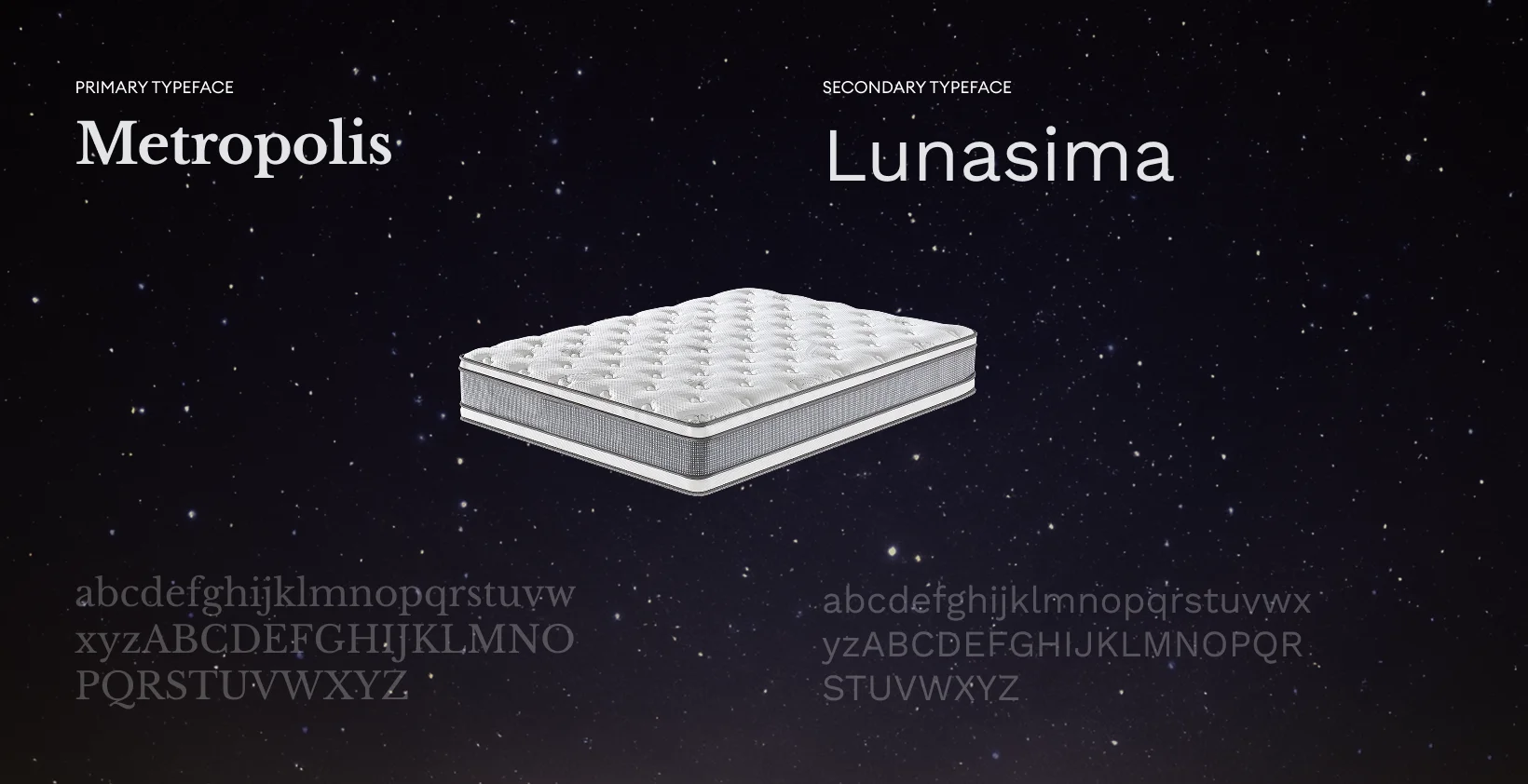
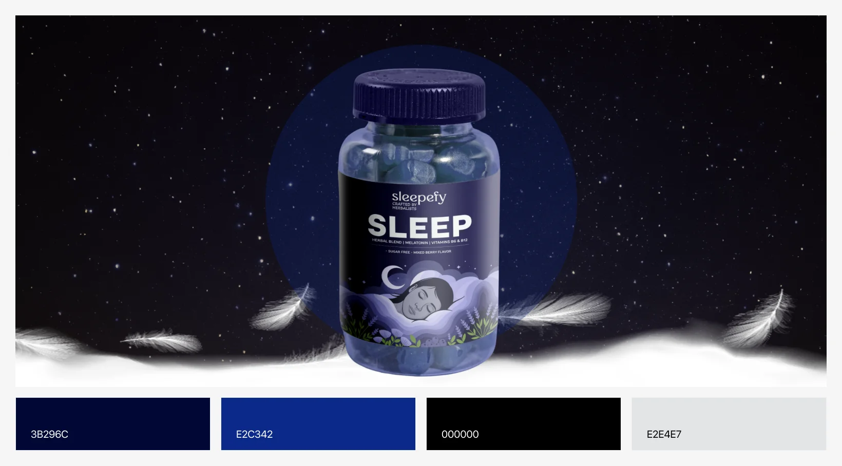
The Sleepefy logo is clean and minimal, designed to feel soft yet confident. Its rounded typography and subtle detailing reflect comfort, trust, and nighttime calm. The logo integrates seamlessly across dark and light backgrounds without overpowering the visual experience.
The color palette is inspired by night skies, clouds, and deep sleep environments. Dark blues create depth and calm, while soft whites and muted tones add comfort and balance. These colors reinforce trust, relaxation, and a sense of nighttime serenity.
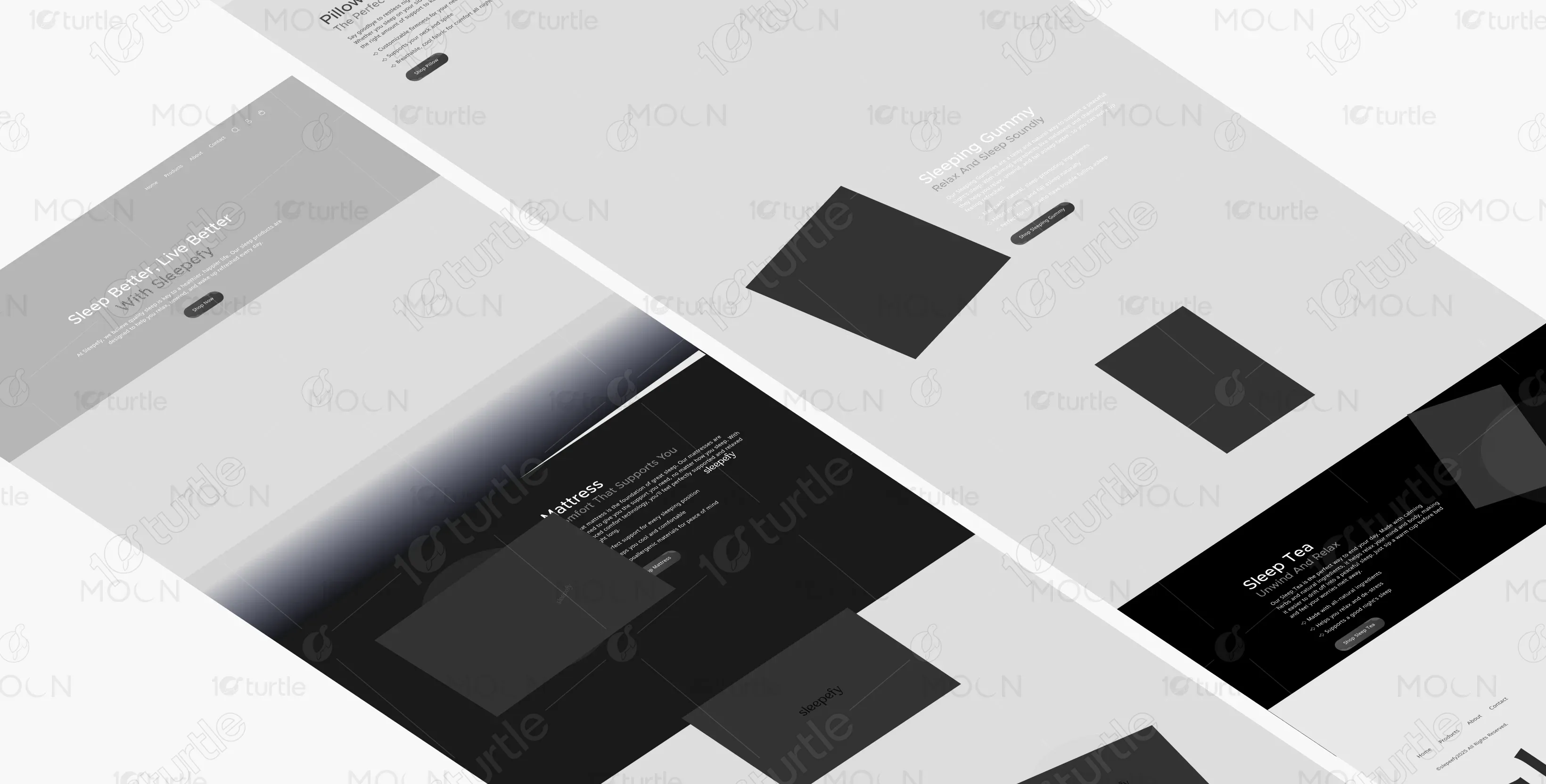
Initial wireframes focused on vertical storytelling and product separation. Each section was planned to feel like a chapter in a sleep routine, ensuring smooth transitions and visual breathing space. The structure prioritizes clarity, flow, and emotional pacing.


.webp)


