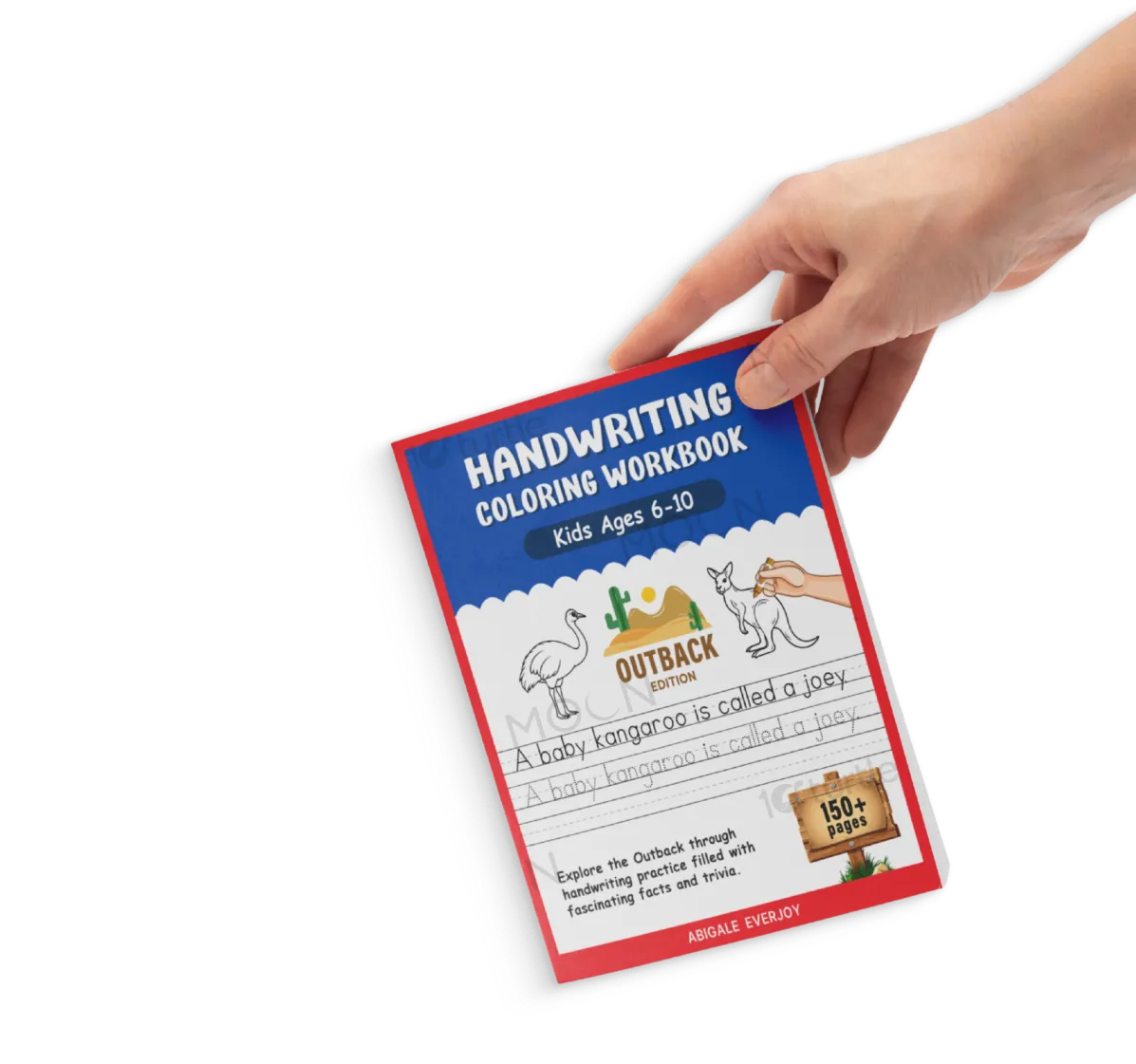
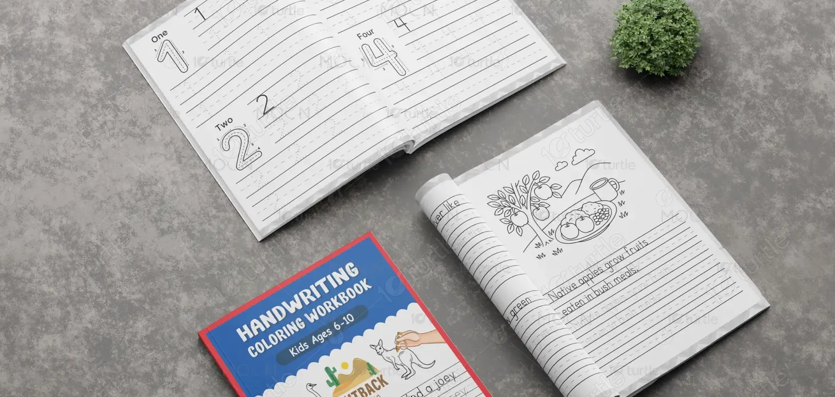
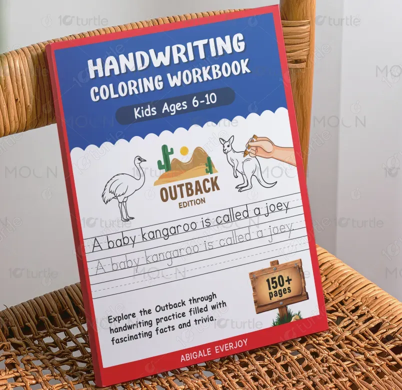
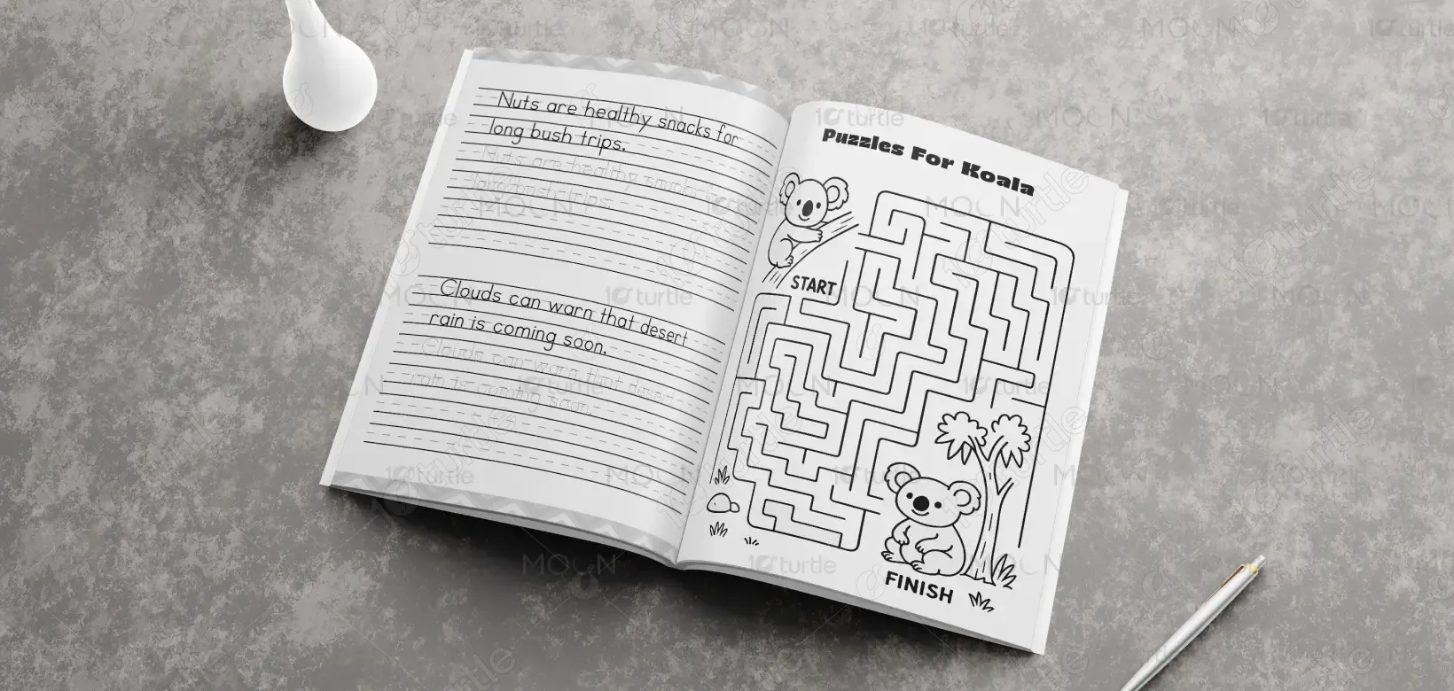
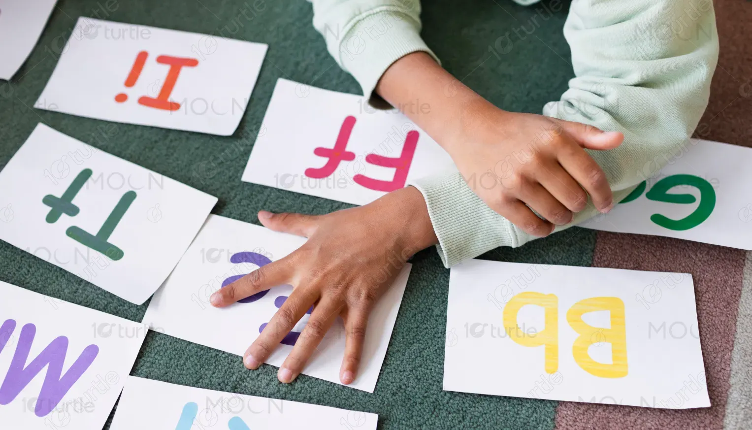
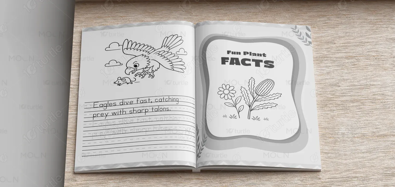
The workbook design follows a clean, child-friendly, and structured visual direction aligned with early education standards. A clear typographic hierarchy separates headlines, tracing exercises, and fact sections to ensure easy readability. Bright yet balanced colors reflect an engaging learning environment without overwhelming young users. Illustrative animal and nature references support the Australian Outback theme, while generous spacing improves clarity and focus. The layout prioritizes simplicity, making the content intuitive for children, parents, and educators across both print and digital platforms.
Workbook Design
Graphic Design
Industry
Education & Training
Tools we used


Project Completion
2025
Key Market
Global
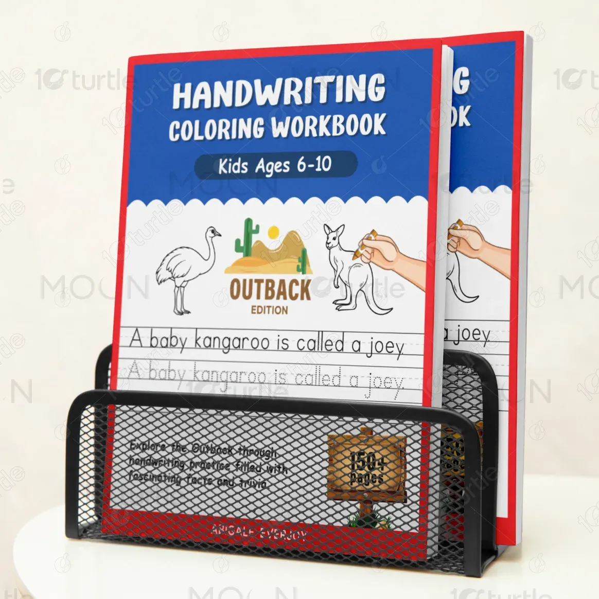
This design represents an educational children’s workbook centered around alphabet tracing, numbers, puzzles, and Australian wildlife facts. Its primary purpose is to combine handwriting development with engaging subject-based learning. Positioned within the Education & Training sector, the workbook bridges foundational literacy skills with thematic knowledge, adding contextual learning value. The design functions as both a structured academic tool and a visually stimulating activity book, making it suitable for classrooms, homeschooling, and independent practice.

Industry
Education & TrainingWhat we did
Workbook DesignGraphic DesignPlatform
-Many early learning materials either lack thematic engagement or present overcrowded layouts that overwhelm children. Common issues include unclear visual hierarchy, low attention retention, and limited differentiation from generic tracing books. These challenges reduce learning enthusiasm and limit repeated use. For parents and educators, this affects engagement levels and perceived educational value.
The design solves these issues through a balanced and child-centric layout. Clear spacing between tracing lines enhances usability and motor skill development. Consistent typography improves readability, while themed animal, plant, and survival content increases curiosity-driven learning. The structured progression—from letters to facts to puzzles—encourages cognitive variety. Visual consistency ensures scalability across social posts, print materials, and promotional assets without losing clarity.
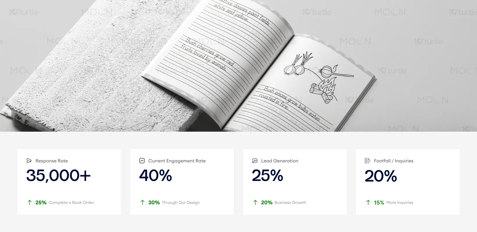
This workbook’s design ensures that educational content is accessible and enjoyable for children. The use of playful yet clear typographic and visual cues engages young learners and prompts higher engagement from parents and educators. With well-structured content and appealing visuals, this design can increase customer retention and attract new leads, especially as the workbook resonates in educational and homeschooling environments.
The long-term vision is to position the workbook as part of a broader themed educational series that integrates skill-building with experiential learning. The design system supports expansion into digital worksheets, teacher resources, and additional regional themes. By maintaining consistency in visual language and layout principles, the brand can build recognition and trust within the early education market while adapting across future learning formats.
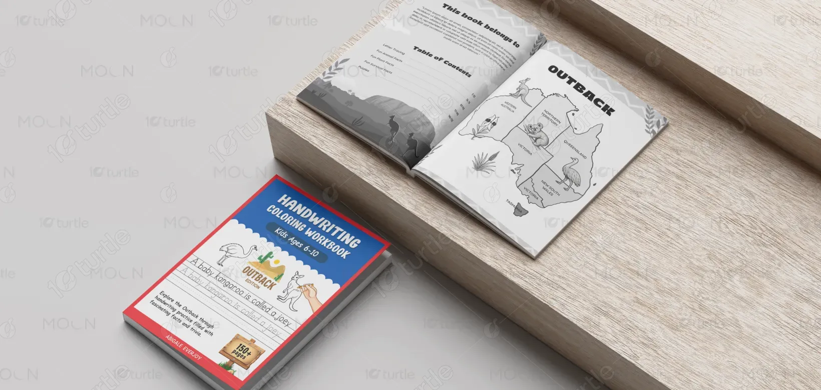
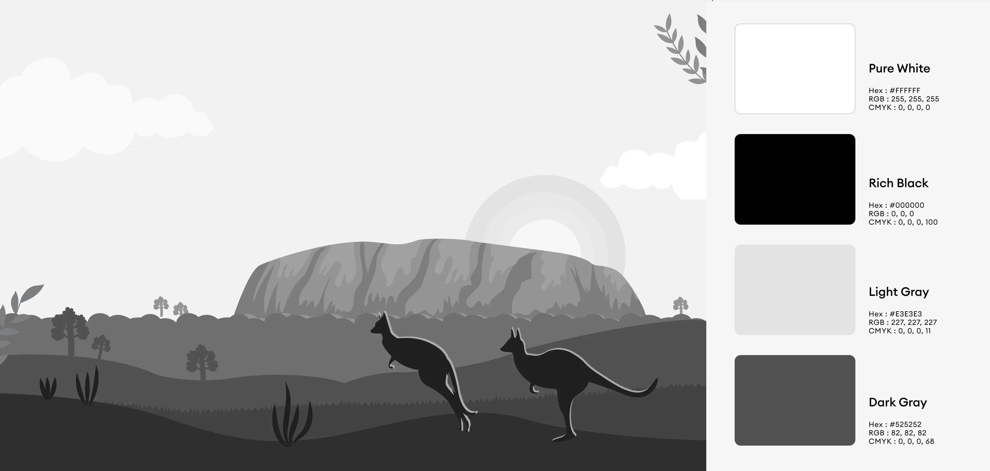
The color palette uses bright yet controlled tones inspired by the Australian landscape—warm earth shades, natural greens, and balanced accent colors. These choices evoke curiosity, warmth, and adventure while maintaining readability. Clean typography and structured spacing reinforce clarity and educational reliability. Supporting visual elements remain minimal to ensure focus on content, creating a friendly yet academically grounded visual identity suitable for both children and decision-making adults.