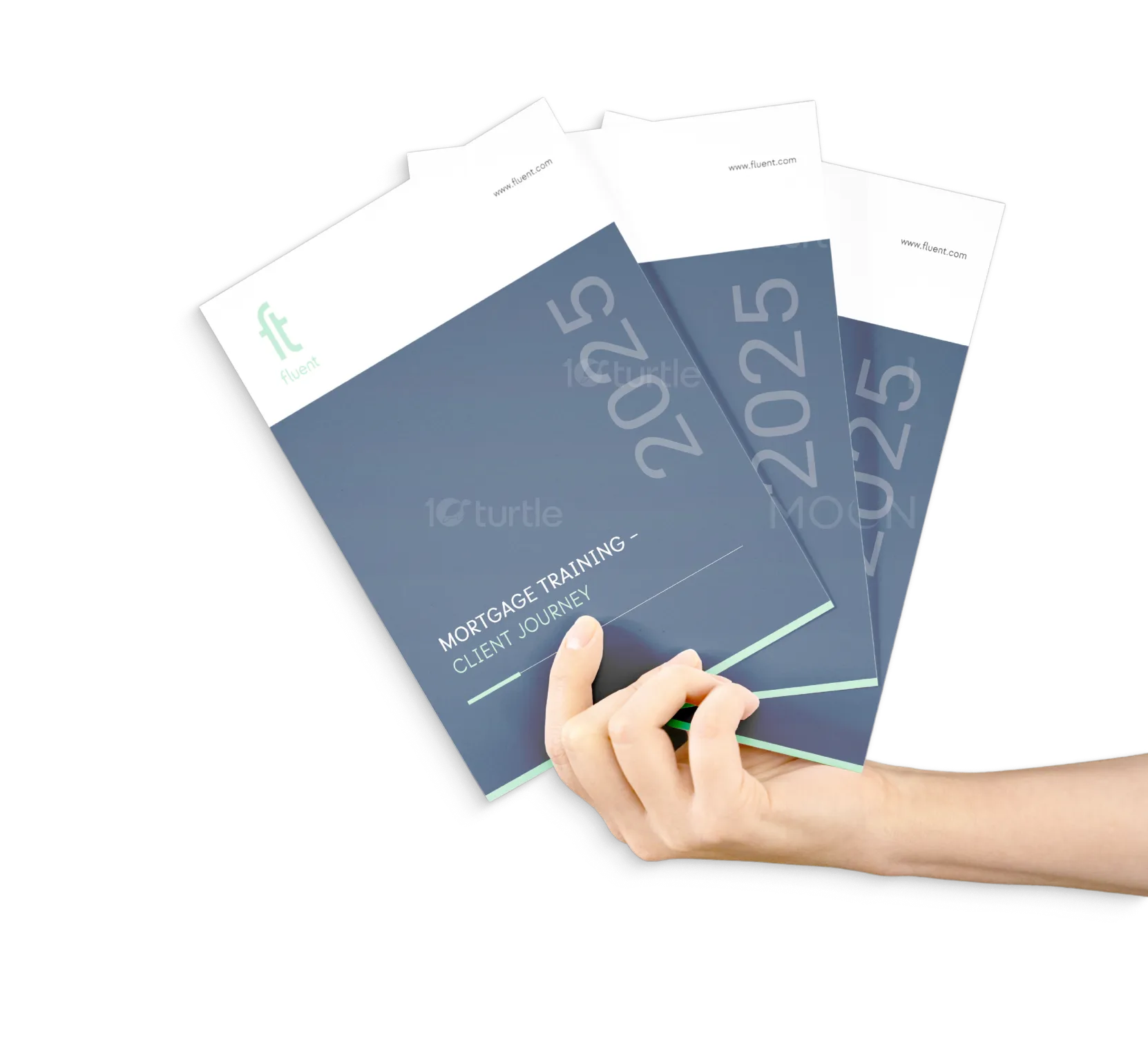
The design of this manual combines a professional, clean aesthetic with a contemporary touch. The minimalist approach highlights functionality while keeping the user experience intuitive. Bold typography and a balanced layout enhance readability. The use of green and navy blue tones symbolizes trust and professionalism, while the structured layout with clear section headers ensures the content is easily digestible. The overall design evokes a sense of organization and clarity, aligning with the manual's purpose of providing valuable training materials.
Manual Design
Graphic Design
Industry
Finance, Legal & Insurance
Tools we used


Project Completion
2025
Key Market
Global
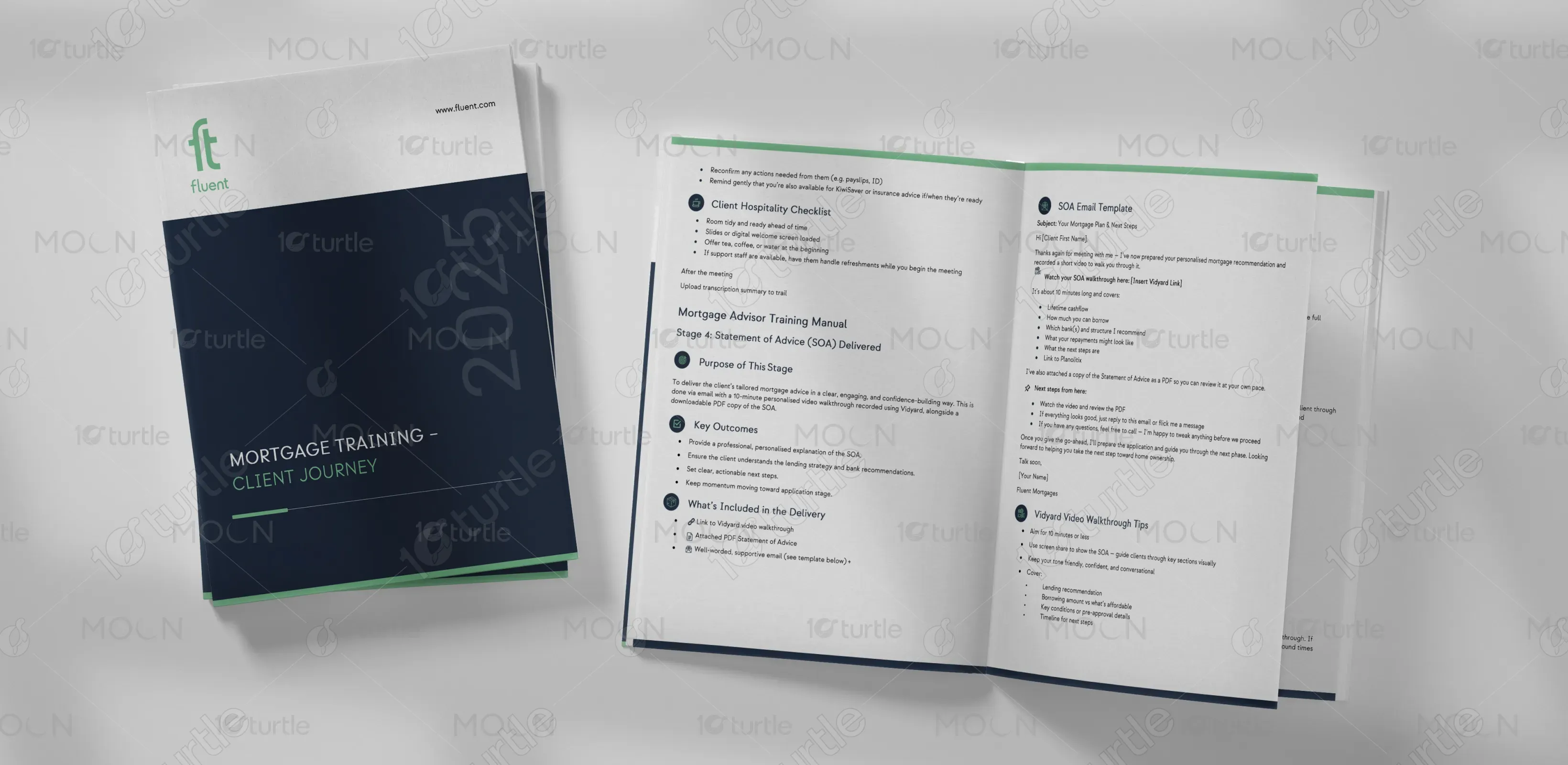
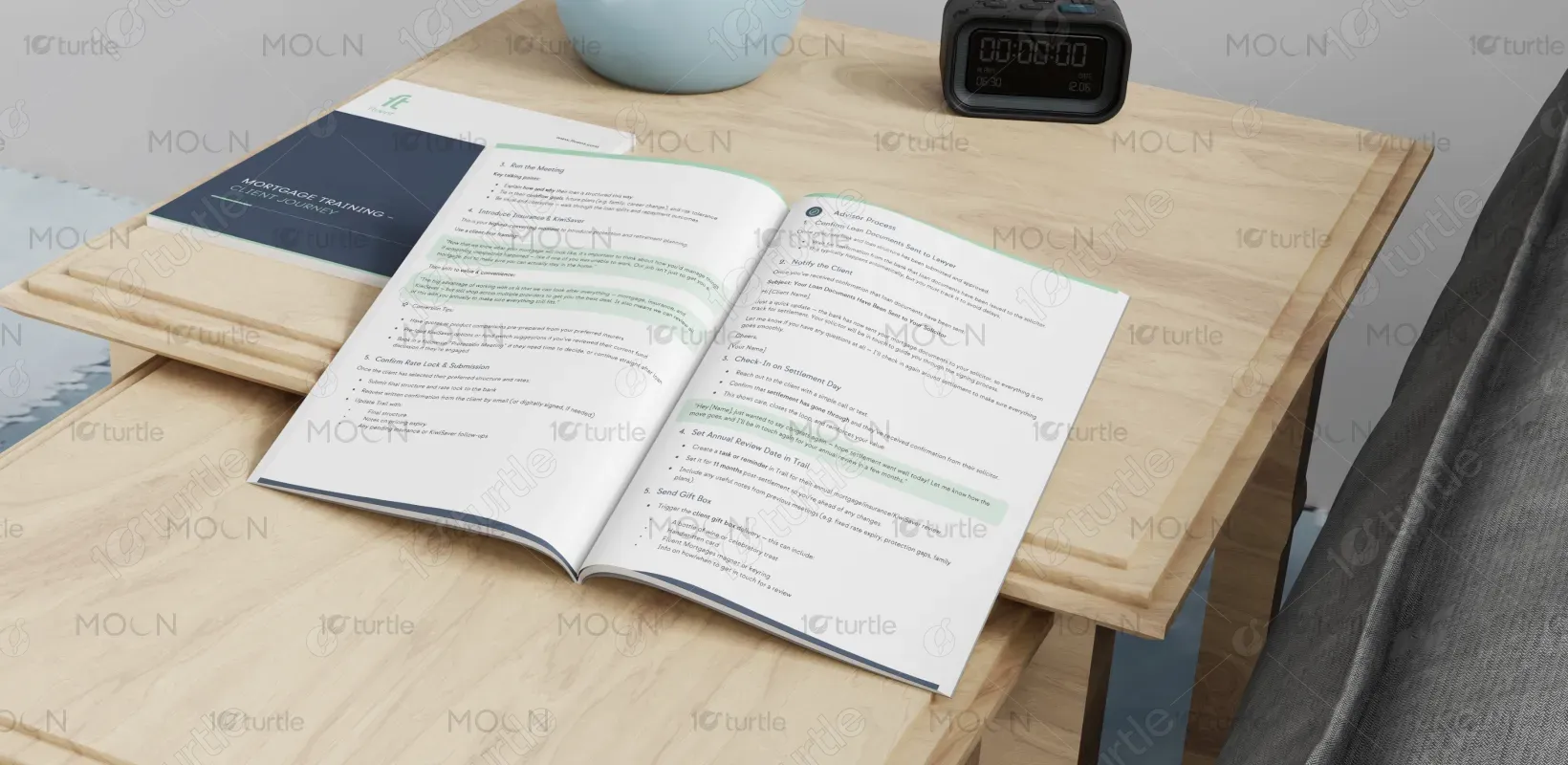
This manual is designed as a comprehensive training guide, focusing on the mortgage advisory process. It includes detailed steps for key outcomes, advisor processes, and essential support elements. The manual's purpose is to educate new advisors, guiding them through the necessary stages of the client journey, from initial meetings to the finalization of mortgage deals. Its clean design and strategic use of color make it both functional and visually appealing, ensuring that the material is both accessible and professional.

Industry
Finance, Legal & InsuranceWhat we did
Manual DesignGraphic DesignPlatform
-The primary challenge in designing this manual lies in presenting complex processes in an easily navigable format. Many training manuals in the financial services sector can be overwhelming due to dense text and lack of visual clarity. This issue is particularly pressing for new advisors who need quick and straightforward access to information. A cluttered or overly technical design can hinder the learning experience, leaving advisors frustrated and less likely to retain key information.
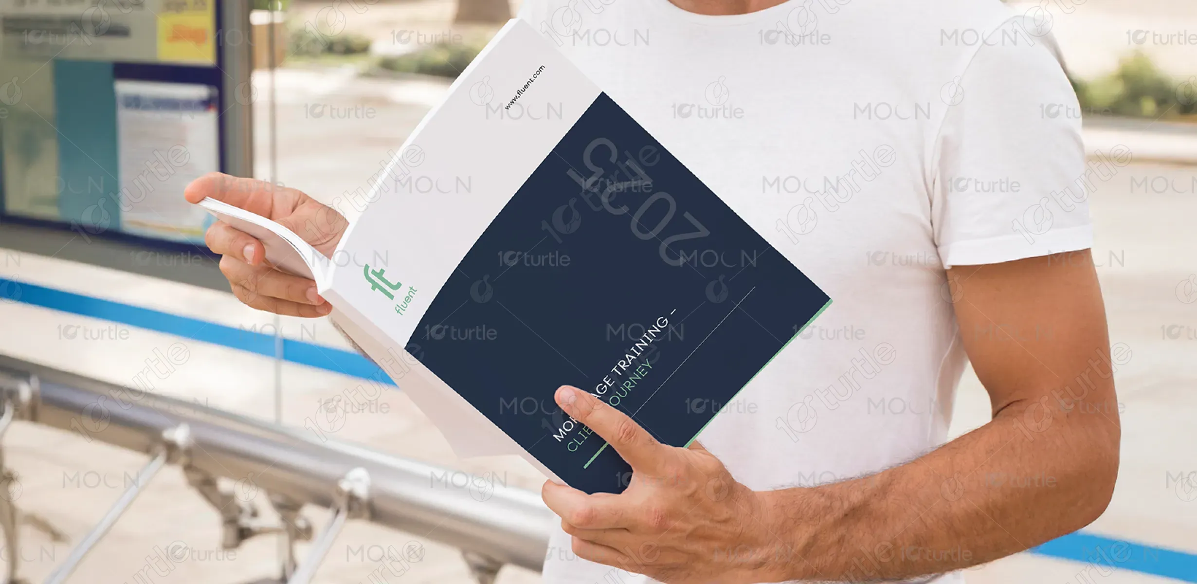
This manual addresses the challenge by employing a clear, structured layout with concise content. Each section is segmented with headers and subheadings, making it easy for users to find specific information. The use of icons and bullet points simplifies complex processes, while color coding provides visual cues to guide users through the content. The overall user-centric approach ensures that the training process is engaging, efficient, and less intimidating for new advisors.

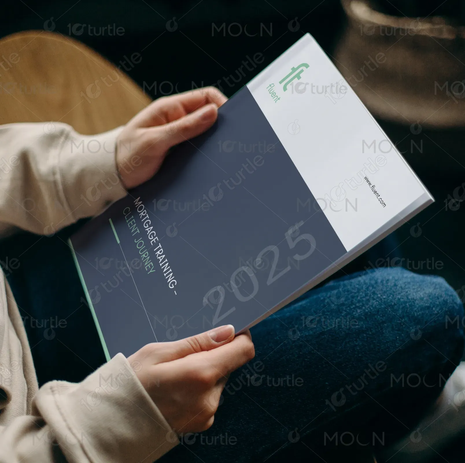
The vision for this manual is to provide a tool that not only serves immediate training needs but evolves into an essential reference guide for mortgage advisors. Over time, the design aims to expand, incorporating interactive elements such as digital formats and video tutorials to complement traditional learning. The manual's adaptable design ensures that it remains relevant as new processes and technologies emerge in the industry, positioning it as a trusted resource in the long run.

The chosen color palette consists of navy blue and green. The navy blue conveys professionalism, stability, and trust—qualities essential for the financial sector. The green adds a sense of balance, growth, and prosperity, reinforcing the theme of helping clients through important life decisions. These colors work together to create a harmonious aesthetic that is both approachable and authoritative. The palette also ensures the design is modern and clean, with enough contrast to maintain legibility without overwhelming the reader.