Home / Blog / Beyond the Pixel: Crafting Iconic App Designs That Capture Hearts in the USA!
Ever wondered why some apps instantly grab your attention, while others just… exist? In the bustling digital landscapes of New York City to the tech hubs of Silicon Valley, the secret often lies in the humble yet powerful app icon. This blog dives into the vibrant world of icon design, exploring how a perfectly crafted tiny graphic can transform user engagement and brand perception across the United States. We'll uncover the magic behind these miniature masterpieces, offering insights into creating visuals that don't just sit on a screen, but truly resonate with users from Los Angeles to Chicago, making your app unforgettable.
2 Nov, 2025
1. The First Impression: Why Your App Icon is Your Digital Handshake
Imagine you're strolling down a digital Main Street, perhaps the App Store, much like browsing Fifth Avenue in New York City or the bustling markets of Miami. What catches your eye? Often, it's that tiny, vibrant square – your app icon. This isn't just a pretty picture; it's your brand's digital handshake, the very first interaction a potential user has with your product. In a crowded marketplace, with over 3.5 million apps available on Google Play and 1.6 million on the Apple App Store, making a memorable first impression is not just crucial, it's existential. A well-designed icon communicates purpose, personality, and professionalism, instantly telling users what to expect. Think of it as your app's miniature billboard; if it doesn't grab attention, users will scroll right past. We've all been there, haven't we? Quickly judging a book by its cover, or in this case, an app by its icon. It’s a snap decision, often made in milliseconds, so make those milliseconds count!
2. The Psychology Behind the Pixel: Colors, Shapes, and Emotional Connections
Icon design is less about just drawing and more about understanding human psychology. Colors evoke emotions: a vibrant blue might suggest trustworthiness (think finance apps in Wall Street), while a lively orange could signal creativity and fun (like a gaming app enjoyed by students in Austin). Shapes also play a huge role; rounded corners feel friendly and approachable, whereas sharp angles convey strength and precision. In Silicon Valley, where innovation is key, designers are constantly experimenting with these elements to forge an emotional connection with users even before they tap. Studies show that nearly 70% of consumers make purchasing decisions based on emotional responses, not just rational ones. So, when you're designing, ask yourself: what feeling do I want to evoke? Calm, excitement, efficiency? If you're building a cutting-edge app, integrating AI Services into your design process can even help predict user responses to different icon variations. It's like having a mind-reader for your pixels! You can explore more about the science behind effective icons on Medium's Design Bootcamp.
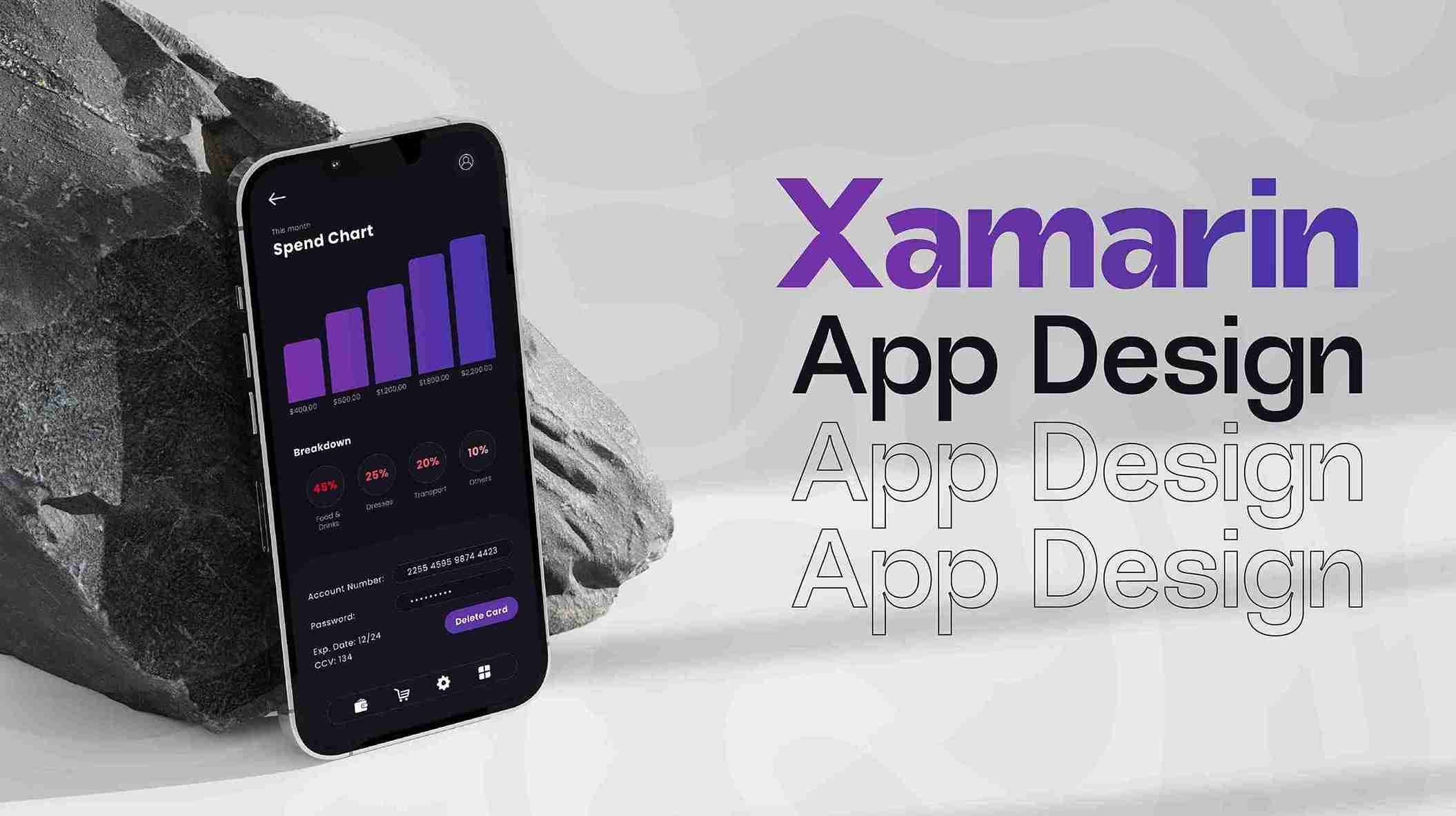
3. Crafting Unforgettable Icons: A Designer's Toolkit for the Modern App World
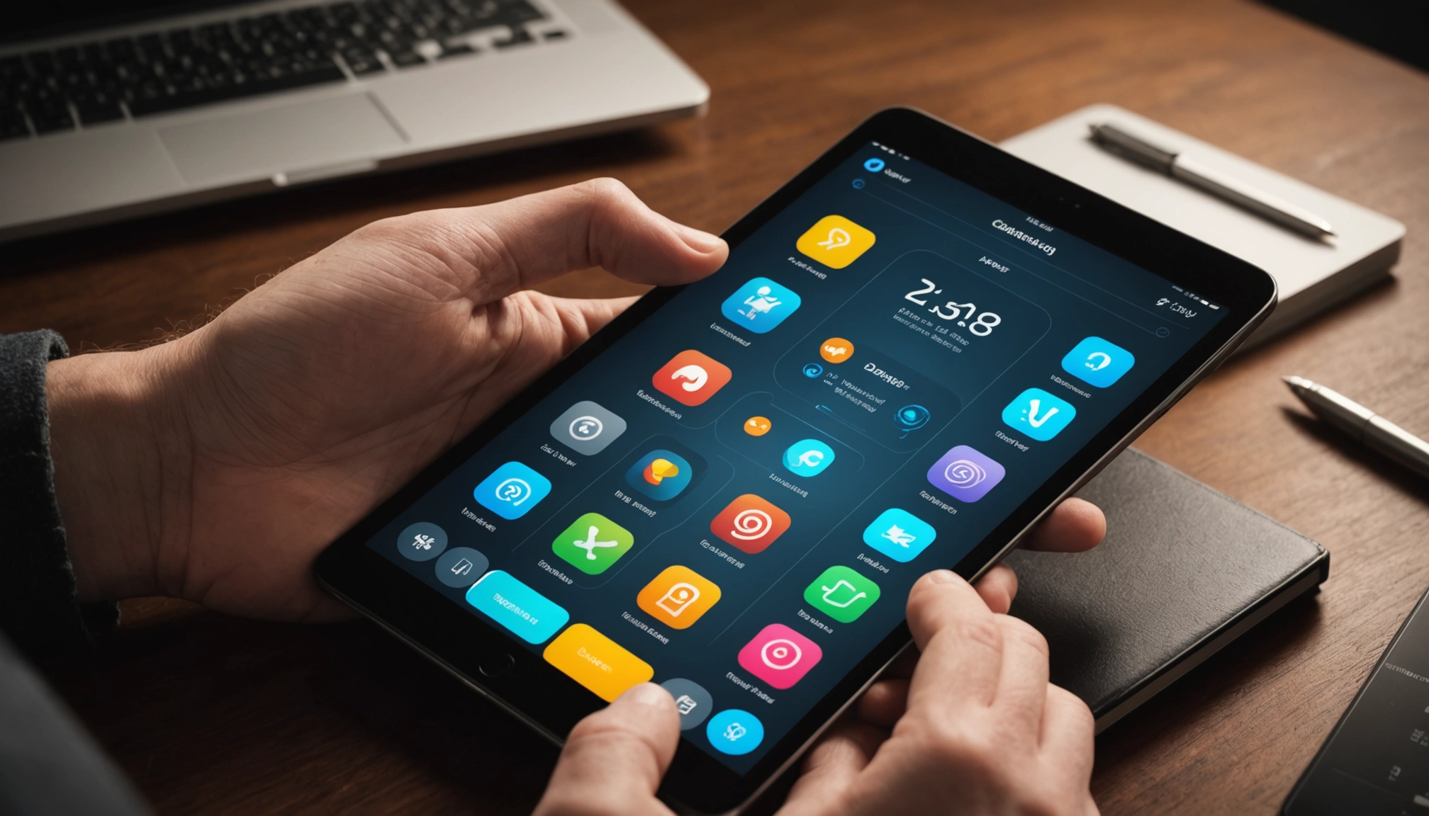
So, how do you go from a concept to a captivating icon? It starts with simplicity and clarity. An icon isn't a miniature billboard filled with text; it's a symbol, instantly recognizable. Think of the Apple logo – iconic, isn't it? Designers across the US, from the bustling studios of Los Angeles to the creative agencies in Chicago, swear by a few key principles: keep it unique, scalable, and consistent with your brand. Leveraging robust Graphics & Design services can ensure your icon stands out. For quick prototypes or internal ideation, tools like Canva can be surprisingly effective for exploring different visual directions. The goal is to create something that not only looks good on a tiny smartphone screen but also retains its impact on a larger tablet display. Remember, a great icon isn't just seen; it's understood.
4. The User Experience Angle: Icons That Speak Volumes Without Words
In the world of UI/UX, app icons are silent storytellers. They guide users, clarify functionality, and contribute significantly to the overall user experience. Imagine navigating a foreign city like Seattle without clear street signs; that's what a poorly designed or confusing icon feels like. Good icon design removes friction, reduces cognitive load, and enhances usability. It’s not just about aesthetics; it’s about functionality. This is particularly vital for any Mobile App aiming for global appeal, as universal symbols transcend language barriers. According to a Google study, good UX design can increase conversion rates by up to 200%. So, before you finalize that tiny graphic, consider how it truly serves the user. Is it intuitive? Is it memorable? Does it solve a problem, even a small one, just by existing?
5. Beyond Static: Animated Icons and the Future of Digital Expression
While static icons have ruled the roost, the future is increasingly dynamic. Animated icons, though subtle, can add an extra layer of engagement and delight, much like a vibrant digital art installation in a gallery in San Francisco. Imagine a banking app icon subtly glowing when a new notification arrives, or a weather app icon showing a tiny cloud passing by. These micro-interactions, powered by services like Video & Animation, can significantly enhance the user's emotional connection and improve retention. For bespoke applications, even Custom Software development might incorporate unique animated icon sets to stand out. Furthermore, the rise of Blockchain & Web3 technologies is opening new avenues for unique, verifiable digital assets, including highly stylized and animated icons, pushing the boundaries of digital expression. The digital canvas is expanding, and your icons should evolve with it.
6. The Business Impact: How Iconic Designs Fuel Growth and Recognition
Let's talk business. An iconic app design isn't just about looking good; it's a powerful tool for growth and recognition. A distinctive icon helps your app stand out in search results, improves click-through rates, and ultimately drives downloads. This directly impacts your Digital Marketing efforts, making your campaigns more effective. Think of the iconic Starbucks logo – instantly recognizable worldwide, even from across Times Square. Your app icon can achieve a similar level of recognition. Businesses from startups in Boston to established enterprises in Dallas understand that strong visual branding is key to market penetration and user loyalty. Forbes highlights design as a secret weapon for brand building, underscoring its pivotal role. Whether it's for a new app or a redesign of an existing web platform using Web Development services, the icon remains a central piece of your brand's visual identity. Don't underestimate its power to drive your bottom line!
Conclusion
From the sprawling tech campuses in Palo Alto to the vibrant startup scenes of Atlanta, icon design is more than just an aesthetic choice; it’s a strategic imperative. Your app icon is the face of your digital product, a tiny canvas with monumental potential to communicate, engage, and convert. It’s the visual shorthand for your brand, demanding careful thought, creativity, and an understanding of user psychology. Just as a well-designed landmark like the Golden Gate Bridge defines San Francisco, a perfectly crafted app icon can define your digital presence. Invest in exceptional icon design, and watch your app flourish, capturing hearts and minds across the United States. Make every pixel tell your story!
FAQs
1. How important is an app icon for user acquisition in the US market?
Extremely important! A compelling app icon acts as a visual hook, significantly influencing a user's decision to tap and explore, especially in competitive markets like Los Angeles or New York City. It's often the first point of contact.
2. Should my app icon be minimalistic or detailed?
Generally, minimalistic designs perform better. They are clearer, more scalable, and easier to recognize quickly, which is crucial for visibility on crowded smartphone screens across the nation.
3. How often should I consider redesigning my app icon?
Consider a redesign if your brand evolves, if user feedback suggests confusion, or if your icon feels outdated compared to market trends in tech hubs like Seattle or Austin. Aim for relevance and freshness.
4. Can different app stores require different icon specifications?
Yes, absolutely! Apple App Store and Google Play Store have distinct guidelines for icon sizes, formats, and design elements. Always check specific requirements to ensure compatibility and optimal display.
5. What role does color play in app icon effectiveness?
Color is critical for evoking emotion and brand recognition. Choose colors that align with your app's purpose and target audience, considering cultural perceptions across different regions of the United States.
Source Links:
10 Essential UI/UX Design Principles For Effective Product Development (Forbes)
Why Design Is The Secret Weapon For Brand Building (Forbes)
The Science Behind Icon Design: What Makes An Icon Usable (Medium)
A Quick Guide to App Icon Design 2023 (Medium)
Browse
Resources