Home / Blog / A Step-by-Step Framework for Scaling Your Brand Identity & Logo Architecture
Discover a step-by-step framework for scaling your brand identity and logo architecture as your business grows. Learn how to create a consistent visual identity, organize brand and sub-brand logos, establish clear design guidelines, and maintain brand recognition across multiple products, services, and markets. Explore practical strategies to build a scalable brand system that supports business growth, strengthens brand consistency, and creates a cohesive experience across every customer touchpoint.
28 Oct, 2026
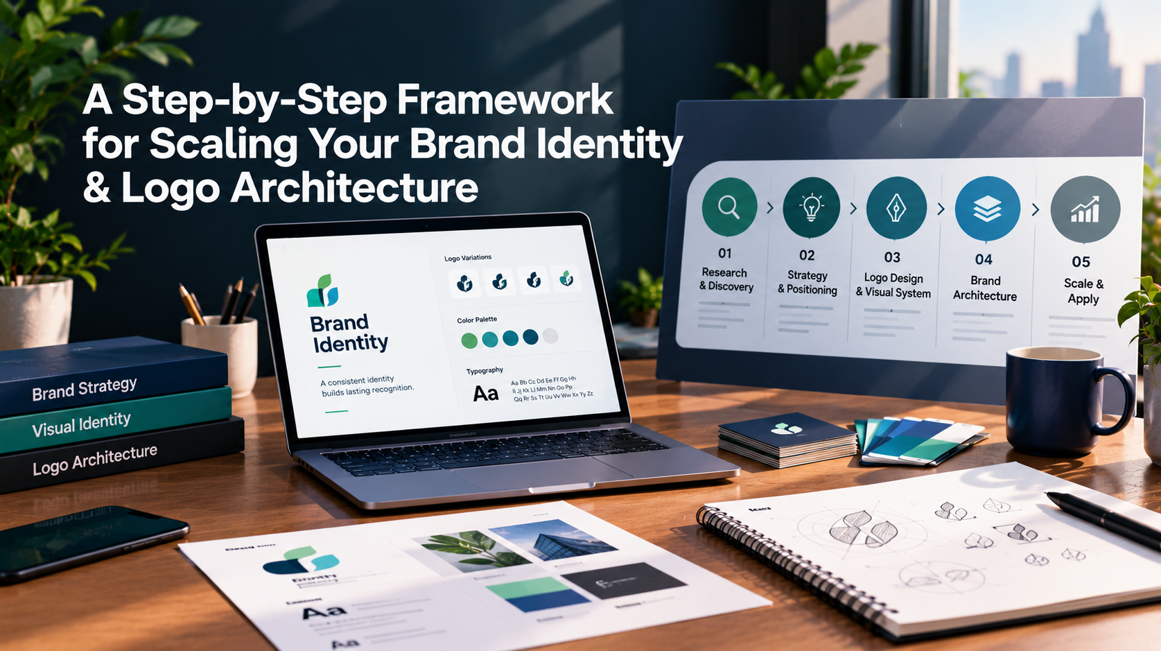
A logo that looks right in a website header often breaks the moment it lands on a favicon, an app icon, a product label, or a partner's sponsor slide. That is usually a structure problem, not a design problem. This brand identity framework shows how to plan logo architecture so your identity holds up as you add products, channels, and team members. It is written for US businesses that already have a brand, or are about to build one, and want it to scale without constant rework.
Logo architecture is the set of logo versions your brand uses, plus the rules for when each one appears. A typical set includes a primary logo, a horizontal and a stacked layout, a compact icon or submark, a single-colour version and a reversed version for dark backgrounds.
It sits inside a wider system. Brand strategy defines who you serve and how you are positioned. Brand architecture defines how a parent company, products and sub-brands relate to one another. Visual identity covers colour, typography, imagery and graphic elements. The logo is one asset within that system, which is why scaling it means planning all of those layers together.
Teams that plan the structure before volume arrives tend to avoid a familiar pattern: a designer is asked for "a smaller version," improvises one, and six months later five unofficial variants are in circulation.
A defined framework gives marketing, sales, and external vendors approved assets to pull from, so production is faster and less dependent on one person's memory. New product launches become easier because the sub-brand rules already exist. Digital use is covered from the start, so the identity works on screens as well as in print.
It also reduces handoff problems. When a website, a pitch deck, and a packaging run are produced by separate vendors, each one interprets the brand slightly differently. 10turtle positions itself as one accountable partner across web, branding, and AI automation, with dedicated specialists in each area coordinated together, which is one way to keep those touchpoints aligned.
If you are building a brand from zero, skip ahead to step 2. If you are rebuilding or extending an existing identity, collect every place the brand currently appears: website, social profiles, email signatures, decks, packaging, invoices, signage, and merchandise. Note which logo versions are in use and where they conflict.
The goal is a clear list of inconsistencies, not a verdict on the design. 10turtle's free audit looks at brand consistency alongside areas such as performance, conversion, accessibility, and SEO, and can serve as a starting point if you want an outside review.
Write down your positioning, audience, voice, and the few ideas the brand should always communicate. Decisions about logo shape, colour, and tone are far easier to defend when they trace back to this core. Skipping this step is the most common reason a logo refresh looks different without being any more useful.
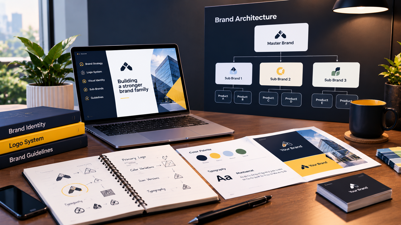
If you have, or expect to have, more than one product or service line, decide how they relate:
Pick the model that matches how customers actually buy. A business whose reputation travels from product to product usually suits a monolithic or endorsed model. One that serves very different audiences may need more separation.
Specify each version and the situation it belongs to: primary lockup, stacked layout for square spaces, icon for tiny placements, wordmark-only for narrow headers, and one-colour and reversed versions. Add minimum sizes and clear-space rules. Test the smallest version at the sizes you will really use, such as a browser tab or a social avatar, before approving it.
Define colour values for screen and print, a typography hierarchy, an approach to imagery, and any icon or pattern language. Include accessibility from the start, for example, checking text and background colour contrast so the palette works for readers with low vision. Where the identity will be used in a website or product interface, work with the UX team early so brand rules translate into interface components. This is where UI/UX design and branding overlap most.
Mock up the identity in the places it will live: homepage, mobile screens, a pitch deck, a product label, an email header, a social ad. Look for places where the logo crowds other elements, loses contrast, or becomes unreadable. Fix the system, then update the rules, rather than patching individual files.
Brand guidelines should tell someone who was not in the room what to do: which logo to use, where, at what size, and what never to do. Pair them with a shared library of final files in the formats your teams need. Keep it simple enough that people use it.
Decide who approves exceptions, where the current files live, and how new sub-brands or campaigns request assets. Review the system on a schedule, for example when you launch a product line or enter a new market, so it grows deliberately instead of by accident. Many teams also find it useful to keep the brand name, descriptions, and logo consistent across directories and profiles, since consistent information is easier for people and for AI assistants to interpret. That helps clarity, though no brand can be guaranteed a recommendation from any AI system.
If you would like professional support designing the full system, 10turtle's brand identity design work covers logo, visual identity, and rebranding for both new and existing brands.
Before rolling out a new or updated identity, confirm that you can answer yes to each of these:
A brand scales well when its rules are clear enough for other people to apply without guessing.
What is logo architecture?
Logo architecture is the structured set of logo versions a brand uses, such as primary, stacked, icon, and single-colour, together with rules for where each one appears. It keeps the logo legible and consistent across websites, apps, packaging, social profiles and print as the brand grows into more places.
What is the difference between brand identity and brand architecture?
Brand identity is how a single brand looks and sounds, including logo, colours, typography and tone. Brand architecture is how multiple brands within one company relate to each other, for example, a parent brand with endorsed sub-brands. A growing business usually needs both defined.
How long does it take to build a scalable brand identity system?
It depends on scope, the number of products or sub-brands, how much already exists, and how quickly decisions are approved. A new identity with a full logo set and guidelines usually takes longer than a refresh of an existing system. Ask any provider for a timeline based on your specific scope.
Do I need brand guidelines if I only have a small team?
Yes, even a short set helps. Small teams still hand work to freelancers, printers and developers, and guidelines prevent each of them from guessing. A concise document covering logo use, colours, fonts and tone is often enough to keep early materials consistent.
Browse
Resources






_1_11zon-1762758103181.webp)