Home / Blog / Minimal Logo Design: When It Works and When It Doesn’t
Minimal logo design has become a popular trend for modern brands, but it doesn’t work for every business. This blog explains when minimal logo design is effective, when it fails, and how small businesses can use simplicity strategically without losing brand identity, clarity, or impact.
29 Apr, 2026
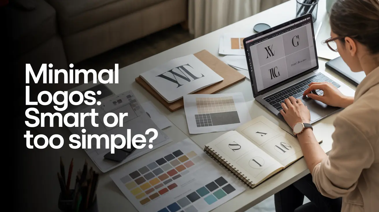
Minimal logo design is everywhere.
From startups to global brands, simplicity has become the default direction.
Clean lines, fewer colors, and stripped-down visuals create a modern, polished look.
But minimal design is often misunderstood.
Removing elements doesn’t automatically make a logo better.
In many cases, oversimplification leads to generic, forgettable branding.
Minimal logo design works only when it’s backed by clarity and strategy not just aesthetics.
Let’s break down when it works, when it doesn’t, and how to approach it correctly.
Minimalism is powerful when used intentionally.
Minimal logos depend on clear brand positioning.
Why It Works:
Example Thinking:
If your brand already has a strong identity, a simple logo can act as a clean symbol rather than a detailed explanation.
Minimal logos perform better across different sizes and platforms.
Why It Works:
In a digital-first world, scalability is a major advantage.
Certain audiences respond better to clean, minimal aesthetics.
Best Fit For:
Minimal logos often signal sophistication and modern thinking.
A minimal logo works best when supported by other branding elements.
Why It Works:
Minimalism is effective when it’s part of a system—not a standalone decision.
Minimal design can fail when it removes meaning instead of noise.
One of the biggest risks of minimalism is losing uniqueness.
Why This Is a Problem:
What Happens:
A logo may look clean but fails to create any lasting impression.
Minimal logos rely heavily on brand understanding.
Why This Is a Problem:
Without clarity, simplicity turns into confusion.
Not every brand can afford to be minimal.
Why This Is a Problem:
Some brands need a bit more visual detail to communicate effectively.
Minimalism is often chosen because it’s trendy not because it fits the brand.
Why This Is a Problem:
Trends fade. Strategy doesn’t.
Minimal design is not about removing everything.
It’s about removing what’s unnecessary while keeping what matters.
A strong minimal logo:
A weak minimal logo:
The difference is intention.
Check how the logo looks on:
Minimal doesn’t mean invisible.
Your logo should still stand out.
Minimalism reduces visual elements but increases the need for clarity.
Without strategy:
With strategy:
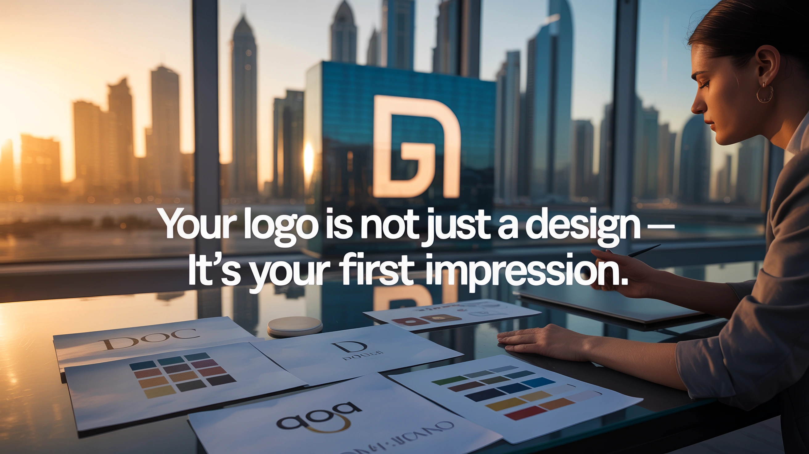
At 10Turtle, minimal design is not treated as a trend.
The approach focuses on:
The goal is not to make logos smaller but to make them smarter.
Q-1. What is minimal logo design?
A-1. Minimal logo design focuses on simplicity by using fewer elements, clean shapes, and limited colors to create a clear and modern identity.
Q-2. Are minimal logos always better?
A-2. No. Minimal logos work only when they align with brand clarity and purpose. Otherwise, they can feel generic or meaningless.
Q-3. Why do many brands choose minimal logos?
A-3. Minimal logos are scalable, modern, and adaptable across digital platforms, making them suitable for today’s design needs.
Q-4. Can a minimal logo still be unique?
A-4. Yes, if it uses distinctive shapes, typography, or concepts instead of generic symbols.
Q-5. Should small businesses use minimal logo design?
A-5. Only if it fits their brand strategy. Simplicity should not come at the cost of clarity or differentiation.
Q-6. What is the biggest mistake in minimal logo design?
A-6. Over-simplifying to the point where the logo loses meaning and becomes indistinguishable.
Q-7. How do I know if my logo is too minimal?
A-7. If it lacks recognition, meaning, or uniqueness, it may be overly simplified.
Browse
Resources


_1_11zon-1762758103181.webp)


