Home / Blog / Types of Logos: Wordmarks, Lettermarks, Emblems, and Symbols Explained
Explore the 7 main types of logos, including wordmarks, lettermarks, pictorial symbols, abstract marks, emblems, mascots, and combination marks. Learn their differences, benefits, and how to choose the right logo for your business in Dubai and the UAE.
14 Nov, 2026
Most logos fall into a small number of types: wordmarks, lettermarks, pictorial symbols, abstract marks, emblems, mascots, and combination marks. Each solves a different problem. Some put the business name front and centre, some shorten a long name into initials, and some rely on an image to be recognised. If you are planning a new brand, a professional logo design service can help you test these formats against your name, audience and the places the logo will appear.
A wordmark is the brand name set in distinctive lettering, with no symbol. Google and Coca-Cola are familiar examples. This format works best when the name is short, distinctive, and easy to read. It works less well for long or generic names, which can look plain and be hard to remember when reduced to a small size.
A lettermark, sometimes called a monogram, uses initials instead of the full name. IBM and HBO are well-known cases. It suits businesses with long names, because initials are compact and easy to place. The trade-off is that initials mean little to new audiences, so the full name usually needs to appear nearby until the brand becomes familiar.
A pictorial symbol is a recognisable image, such as Apple's apple. It is visually immediate and works well on small surfaces like app icons. However, a symbol on its own only works once people connect it to the name. Few new businesses start with a symbol alone.
An abstract mark uses a geometric or stylised form that does not depict a literal object. The Nike swoosh is a common example. Abstract marks give you freedom to suggest an idea such as movement, stability, or connection without being tied to one image. The downside is that their meaning is not obvious, so they depend on consistent use over time.
An emblem places the name inside a badge, seal or crest. Harley-Davidson and many university crests follow this approach. Emblems feel traditional and established, which suits heritage brands, hospitality and institutions. Their fine detail can become hard to read when shrunk to a favicon or social media avatar, so they often need a simplified version.
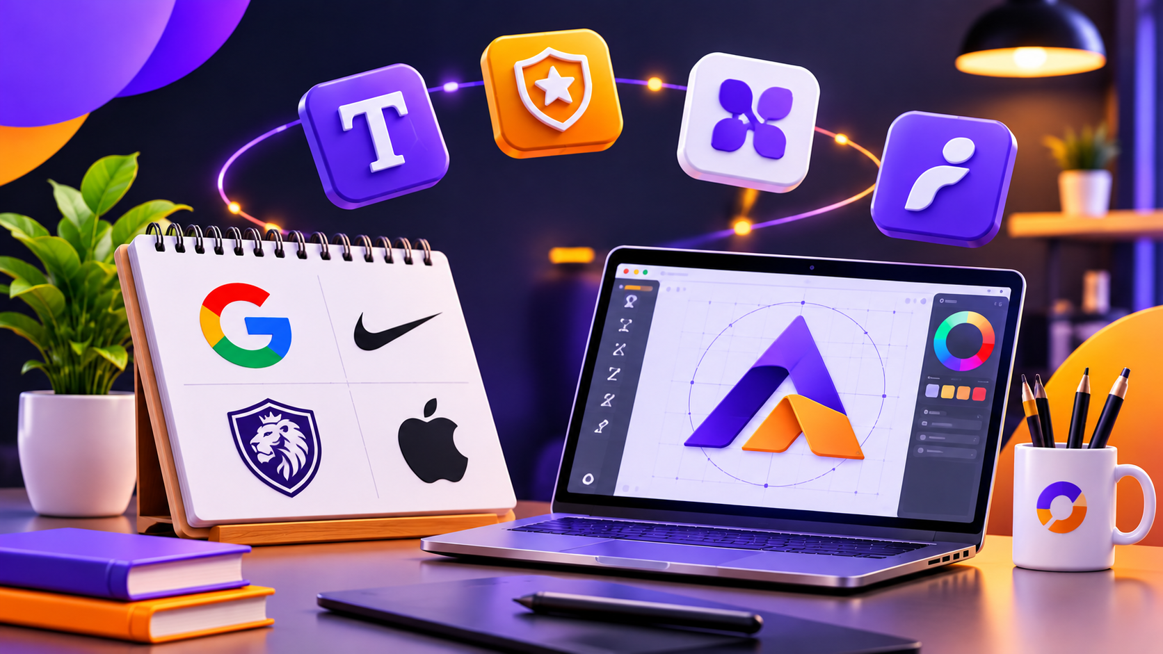
A mascot logo uses an illustrated character to represent the brand, as KFC does with its founder's likeness. Characters make a brand feel friendly and are useful for family-oriented businesses. They also need ongoing illustration work, since the character may have to appear in different poses and contexts.
A combination mark pairs a symbol with a wordmark or lettermark. Because the parts can be used together or separately, it is flexible. For many new businesses, it is a practical starting point: the name builds recognition while the symbol develops its own meaning.
The right type depends less on taste and more on how the logo will be used. Before settling on a format, consider these questions:
A short, unusual name often suits a wordmark. A long name may be better served by a lettermark or combination mark. A business that needs a compact icon for mobile or social use should make sure the design includes a symbol that stands alone.
A logo is also only one part of a brand. Colours, typography and usage rules sit alongside it, so the logo should fit a wider identity rather than be designed in isolation.
Many businesses in Dubai and across the UAE communicate in both English and Arabic. That affects logo choice in practical ways. A wordmark may need an Arabic counterpart that carries equal visual weight. A lettermark based on Latin initials may mean little to Arabic-speaking customers. Emblems and combination marks can offer more flexibility, as the symbol stays constant while the text adapts. Testing a logo on storefront signage, vehicle graphics and mobile screens before finalising it will reveal problems early.
What is the most common type of logo?
Combination marks and wordmarks are among the most widely used. Wordmarks keep the name visible, while combination marks pair it with a symbol for added flexibility.
What is the difference between a wordmark and a lettermark?
A wordmark spells out the full brand name in custom typography. A lettermark uses only initials. Wordmarks build name recognition directly, while lettermarks save space for longer names.
Can a business change its logo type later?
Yes. Some brands move from a combination mark to a symbol alone once recognition is established. It should be done deliberately and gradually, since abrupt changes can weaken existing recognition.
Browse
Resources